| When most people think of Web pages, they think of them displayed on a screen. But sooner or later, most people want to print at least some Web pages. What looks good on the screen, however, does not always look good when printed. Even more so, what looks good on a typical computer monitor may not even show up on a handheld Web-enabled device like a mobile phone or PDA. However, most designers only consider the computer monitor when they are creating their masterpieces. CSS lets us tell the browser to use different style sheets depending on the media on which your HTML is being rendered (Table 2.5). However, unless you are creating pages specifically for one of the media, your primary concern will be for screen, print, and possibly handheld devices. Table 2.5. Media ValuesVALUE | INTENDED FOR |
|---|
screen | Computer displays | tty | Teletypes, computer terminals, and older portable devices | tv | Television displays | projection | Projectors | handheld | Portable phones and PDAs | print | Paper | braille | Braille tactile readers | speech | Speech synthesizers | all | All devices |
The sidebar "Looking Good in Print (on the Web)" offers some suggestions for creating Web pages that print as cleanly as possible, but the most important trick is to set up a separate style sheet for your medium and then use the media attribute in the link or style tags to apply it. In this example (Figures 2.48 and 2.49), I've created two external style sheets, and then placed two link tags in the head of my HTML document, using the media attribute to define which should be used for screen and which should be used for print. Figure 2.48. What the screen displays is completely different than… 
Figure 2.49. …what the printer prints. 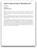
Looking Good in Print (on the Web) I have never seen a paperless office and would be quite surprised if I ever did. But the big promise that came along with the computer was the elimination of paper from our livesno more filing cabinets, clutter, or dead trees, just an entropy-free utopia in which electrons were constantly recycled and reused, just like in Star Trek. But something tells me that we'll have the technology to fly between the most distant stars before we eliminate paper from our lives. With the advent of laser and inkjet printers, we seem to be buried under mounds of perfectly printed paper. Even the Web seems to increase the amount of paper we use. If a Web page is longer than a couple of scrolls, most people print it. But the Web was created to display information on the screen, not on paper. Web graphics look blocky when printed, and straight HTML lacks much in the way of layout controls. That said, you can take steps to improve the appearance of printed Web pages. Looking good in print on the Web may take a little extra effort, but your audience will thank you in the long run. Here are eight simple things you can do to improve the appearance of your Web page when it gets printed: Define your media. CSS allows you to define different style sheets to be used depending on the way the page is displayedusually on a screen or on paper. Use page breaks before headers to keep them with their text. Separate content from navigation. Try to keep the main contentthe part your audience is interested in readingin a separate area of the design from the site navigation. You can then use CSS to tell the navigation not to display for the print version. Avoid using transparent colors in graphics. This is especially true if the graphic is on a background color or a graphic other than white. The transparent area of a GIF image usually prints as white regardless of the color behind it in the window. This situation is not a problem if the graphic is on a white background to begin with, but the result is messy if the graphic is supposed to be on a dark background. Avoid using text in graphics. The irony of printing stuff off the Web is that text in graphics, which look smooth in the window, look blocky when printed, but regular HTML text, which may look blocky on the screen, prints smoothly on any decent printer. Try to stick with HTML text as much as possible. Avoid dark colored backgrounds and light colored text. Generally you want to keep white as your background color for most of the printed page, and black or dark gray for the text. Do not rely on color to convey your message when printed. Although color printers are quite common these days, many people are still printing on black-and-white printers or printing in black and white on color printers to save money.
|
To specify a style sheet for a particular medium: 1. | Create two external style sheets: one optimized for use on a computer screen and the other tailored for the printed page (see "Adding Styles to a Web Site" earlier in this chapter).
In this example, the screen version (Code 2.25) has white text on a black backgroundwhich, although it looks cool on the screen, would not only look messy if printed, but also eat through the toner cartridge. The print version (Code 2.26) reverses this with black text on a white (paper) background.
Code 2.25. screen.css: This defines how the HTML page in Code 2.27 should be displayed on the screen.| [View full width] Body { color: white; font-family: arial, helvetica, geneva, sans-serif; background: black url(alice23.gif) no-repeat; word-spacing: 1px; position: relative; top: 200px; left: 165px; width: 480px; } h1,h2 { font:small-caps bold italic 2.5em 'minion web', Georgia, 'Times New Roman', Times,  serif; } h2 { font-style: normal; font-variant: normal; font-size: 1.5em; color: #999; } p.authorName { margin: 8px 0px; font: bold 1em Arial, Helvetica, sans-serif; color: #999; } h2 .chapterName { display: block; margin-bottom: 8px; font-size: smaller; color:#fff; } p.dropCap:first-letter { font: 300%/100% serif; color: #999999; } serif; } h2 { font-style: normal; font-variant: normal; font-size: 1.5em; color: #999; } p.authorName { margin: 8px 0px; font: bold 1em Arial, Helvetica, sans-serif; color: #999; } h2 .chapterName { display: block; margin-bottom: 8px; font-size: smaller; color:#fff; } p.dropCap:first-letter { font: 300%/100% serif; color: #999999; }
|
Code 2.26. print.css: This defines how the HTML page in Code 2.27 should be displayed when printed.| [View full width] Body { color: black; font-size: 10pt; line-height: 12pt; font-family: "Book Antiqua", "Times New Roman", Georgia, Times, serif; background: white no-repeat; text-align: justify; position: relative; top: 10px; left: 40px; width: 575px; } h1,h2 { color: black; font: italic small-caps bold 2.5em "minion web Georgia", "Times New Roman", Times, serif; } h2 { color: black; font-style: normal; font-variant: normal; font-size: 1.5em; } p.authorName { margin: 8px 0px; font: bold 1em Arial, Helvetica, sans-serif; } h2 .chapterName { display: block; margin-bottom: 8px; font-size: smaller; color:black; } p.dropCap:first-letter { font: 300%/100% serif; color: #999999; }
|
| | | 2. | <link href= "print.css" rel="style sheet" media="print">
In the head of your HTML document (Code 2.27, type a <link> tag that references the print version of the CSS and define media as print.
Code 2.27. index.html: The HTML code links to two different CSS files: One is to be used if the file is output to the screen; the other is to be used if the file is output to a printer.| [View full width] <!DOCTYPE html PUBLIC "-//W3C//DTD XHTML 1.0 Strict//EN" "http://www.w3.org/TR/xhtml1/DTD/ xhtml1-strict.dtd"> <html xmlns="http://www.w3.org/1999/xhtml"> <head> <meta http-equiv="Content-Type" content="text/html; charset=utf-8" /> <title>CSS, DHTML & Ajax | Setting the CSS for the Output Medium</title> <link href="print.css" rel="style sheet" type="text/css" media="print" /> <link href="screen.css" rel="style sheet" type="text/css" media="screen" /> </head> <body> <div > <div> <h1>Alice's Adventures in Wonderland</h1> <p >Lewis Carroll</p> <h2>Chapter I<br /> <span >Down the Rabbit-Hole</span></h2> </div> <div > <p >Alice was beginning to get very tired of sitting by her sister on the bank...</p> </div></div> </body></html>
|
| 3. | <link href= "screen.css" rel="style sheet" media="screen">
Immediately after the <link> tag that references the printer version of the CSS, add another <link> tag that references the screen version of the CSS, and define media as screen.
|
 Tips Tips
Although several media types are availableincluding aural, Braille, projection, and handheldmost common Web browsers only support screen, projection, and print. Handhelds are increasingly becoming a factor in Web design, and you may want to consider style sheets tailored for this growing medium. If you structure your page correctly, though, it shouldn't be difficult to tailor it for smaller screens. That said, many popular handhelds aren't designed to use the "handheld" media type, and will still try to use the "screen" media type.
Setting Page Breaks for Printing One problem you'll encounter when trying to print a Web site is that pages break wherever they happen to break. A Web page may actually contain several printed pages. So the header for a section might appear at the bottom of a page and its text at the top of the next page (Table 2.6). Table 2.6. Page-Break-Before and Page-Break-After ValuesVALUE | COMPATIBILITY |
|---|
auto | IE4, FF1, S1, O305, CSS2 | always | IE4, FF1, S1, O5, CSS2 | avoid | FF1, O3.5, CSS2 | left | IE4, O3.5, CSS2 | right | IE4, O3.5, CSS2 | inherit | FF1, O4, CSS2 |
If you want to force a page break when printing a Web page, use the following code to define an HTML tag (see "Adding Styles to an HTML Tag" earlier in this chapter). In this example (Figure 2.50), the Web page has a new chapter starting in the middle of the screen. When this page is printed, this header might appear anywhere on the page. By adding a page break in the <h2> tag, however, you can force the chapter title to appear at the top of a new page when printed (Figure 2.51). Figure 2.50. The screen presents a single scrollable page… 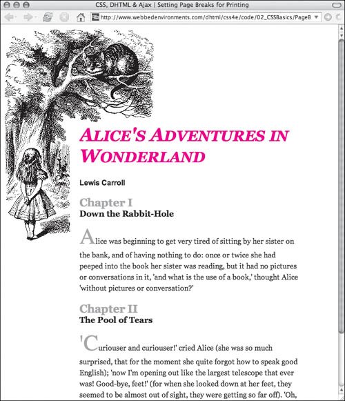
Figure 2.51. …but the pages are split when printing. 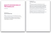
To define a page break for printing: | | 1. | style type="..."
This CSS property works only if it is included in the style attribute of an HTML tag (Code 2.28).
Code 2.28. Page breaks have to be set directly in the HTML tags using inline styles.| [View full width] <!DOCTYPE html PUBLIC "-//W3C//DTD XHTML 1.0 Strict//EN" "http://www.w3.org/TR/xhtml1/DTD/ xhtml1-strict.dtd"> <html xmlns="http://www.w3.org/1999/xhtml"> <head> <meta http-equiv="Content-Type" content="text/html; charset=utf-8" /> <title>CSS, DHTML & Ajax | Setting Page Breaks for Printing</title> <style type="text/css" media="all"> body { font-size: 1em; font-family: Georgia, 'Times New Roman', times, serif; color: #000000; background-color: #fff; margin: 1in; } h1 { font:small-caps bold italic 2.5em Georgia, 'Times New Roman', times, serif; color: red; } h2 { color:#999; margin-top: 1in; } #content { position: relative; background-color: white; } #content #copy { line-height: 1.5; } p.authorName { margin: 8px 0px; font: bold 1em Arial, Helvetica, sans-serif; } h2 .chapterName { display: block; margin-bottom: 8px; font-size: smaller; color:black; } p.dropCap:first-letter { font: 300%/100% serif; color: #999999; } </style> </head> <body> <div > <div> <h1>Alice's Adventures in Wonderland</h1> <p >Lewis Carroll</p> <h2>Chapter I<br /> <span >Down the Rabbit-Hole</span></h2> </div> <div > <p >Alice was beginning to get very tired of sitting by her sister on the bank...</p> </div> <div> <h2 style="page-break-before: always;">Chapter II<br /> <span >The Pool of Tears</span></h2> </div> <div > <p >'Curiouser and curiouser!' cried Alice... </p> </div></div> </body></html>
|
| 2. | page-break-before:
Within the quotes, type the page-break-before or page-break-after property name, followed by a colon (:), in the CSS declaration list.
| 3. | always;
Type one of the following values to designate how you want page breaks to be handled:
always, forces a page break before (or after) the element auto, allows the browser to place the page breaks
|
Tip
|