Determining the Page's Visible Dimensions Knowing the size of the browser window is nice (see the previous section, "Determining the Browser Window's Dimensions"), but a much more useful ability is finding the dimensions of the live area in which your content will be displayed. This is the actual area you have in which to display your Web page, taking into account the current size of the window as well as all of the browser's chrome. These dimensions are available in the clientHeight and clientWidth objects for Internet Explorer (Figure 13.24) and innerHeight and innerWidth for all other browsers (Figure 13.25). Figure 13.24. general syntax for the clientWidth and clientHeight objects. 
Figure 13.25. The general syntax for the innerWidth andinnerHeight objects. 
In this example (Figure 13.26), when the page loads an alert displays the width and height of the display area of the window. If you resize the window, the alert will display again with the new values (Figure 13.27). Figure 13.26. Loading the page triggers an alert that returns the dimensions of the browser window's live area. 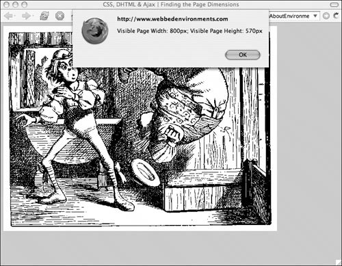
Figure 13.27. Resizing the window will change the values in the alert. 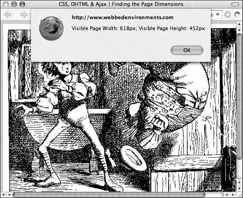
To find the dimensions of the live area: | | 1. | function findLivePageHeight() {...}
Add the function findLivePageHeight() to your JavaScript (Code 13.7). This function uses feature sensing to ensure that document.body.clientHeight can be used with the browser and then returns the browser's live display height.
Code 13.7. The functions findLivePageHeight() and findLivePageWidth() return the dimensions of the browser window's live area, in pixels .| [View full width] <!DOCTYPE html PUBLIC "-//W3C//DTD XHTML 1.0 Strict//EN" "http://www.w3.org/TR/xhtml1/DTD/  xhtml1-strict.dtd"> <html xmlns="http://www.w3.org/1999/xhtml"> <head> <meta http-equiv="Content-Type" content="text/html; charset=utf-8" /> <title>CSS, DHTML & Ajax | Finding the Page Dimensions</title> <style type="text/css" media="screen"> body { font: 1em Georgia, "Times New Roman", times, serif; color: #000; background-color: #ccc; margin: 8px; } </style> <script type="text/javascript"><!-- function findLivePageHeight() { if (window.innerHeight) { return window.innerHeight; } if (document.body.clientHeight) { return document.body.clientHeight; } return (null); } function findLivePageWidth() { if (window.innerWidth) return window.innerWidth; if (document.body.clientWidth) return document.body.clientWidth; return (null); } function pageDim() { livePageHeight = findLivePageHeight(); livePageWidth = findLivePageWidth(); alert ('Visible Page Width: ' + livePageWidth + 'px; Visible Page Height: ' + livePageHeight + 'px'); } //--> </script> </head> <body onresize="self.location.reload()" onload="pageDim()"> <div> <img src="/books/3/292/1/html/2/alice17.gif" height="480" width="640" border="0" alt="alice" /> </div> </body> </html> xhtml1-strict.dtd"> <html xmlns="http://www.w3.org/1999/xhtml"> <head> <meta http-equiv="Content-Type" content="text/html; charset=utf-8" /> <title>CSS, DHTML & Ajax | Finding the Page Dimensions</title> <style type="text/css" media="screen"> body { font: 1em Georgia, "Times New Roman", times, serif; color: #000; background-color: #ccc; margin: 8px; } </style> <script type="text/javascript"><!-- function findLivePageHeight() { if (window.innerHeight) { return window.innerHeight; } if (document.body.clientHeight) { return document.body.clientHeight; } return (null); } function findLivePageWidth() { if (window.innerWidth) return window.innerWidth; if (document.body.clientWidth) return document.body.clientWidth; return (null); } function pageDim() { livePageHeight = findLivePageHeight(); livePageWidth = findLivePageWidth(); alert ('Visible Page Width: ' + livePageWidth + 'px; Visible Page Height: ' + livePageHeight + 'px'); } //--> </script> </head> <body onresize="self.location.reload()" onload="pageDim()"> <div> <img src="/books/3/292/1/html/2/alice17.gif" height="480" width="640" border="0" alt="alice" /> </div> </body> </html>
|
| 2. | function findLivePageWidth() {...}
Add the function findLivePageWidth() to your JavaScript. This function uses feature sensing to ensure that document.body.clientWidth can be used with the browser and then returns the browser's live display width.
| | | 3. | function pageDim() {...}
Add a function that calls the findLivePageHeight() and findLivePageWidth() functions. In this case, we're simply using the functions to display an alert for the current dimensions.
| 4. | onload="pageDim();"
Add an event handler to trigger the pageDim() function from Step 3.
|
 Tips Tips
One common use for determining the screen size is to help with creating a dynamic layout. However, more than often you may have a fixed width for your layout and allow extra screen space to simply remain blank. For more considerations on screen size and layout, see the sidebar "What Screen Size Should I Use for My Web Site?" What Screen Size Should I Use for My Web Sites? Although an 800 x 600-pixel screen size has become the design standard for most Web designers, 58 percent of Web users are now using screens as large as 1024 x 768 pixels (according to StatMarket, statmarket.com). Keep in mind, however, that large screen sizes don't necessarily mean that the browser window will be open to that size. Significant content and design elements should be placed "above the fold" so that they're visible without vertical scrolling, and all important user-interface elements must be visible without horizontal scrolling within the 800 x 600 screen. As with any design issue, it's important to keep your audience in mind. Always try to find out the average size of the monitor being used by the people likely to view your Web site. Although it's useful to know what the average Web browser is using, it could be that 100 percent of your audience falls in that 42 percent of viewers with smaller screen sizes. |
If you're creating a page with content layout dependent on the live page area, you may want to force the page to reload if the user resizes the browser, by placing the following code in the <body> tag: onresize="self.location.reload();"
|