Section 9.2. Seven Elementary Controls
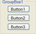
9.2. Seven Elementary ControlsThe Group Box Control Group boxes are passive objects used to group related sets of controls for visual effect. You rarely write event procedures for group boxes. The preceding group box has a group of three text boxes attached to it. When you move the group box, the attached controls follow as a unit. If you hide the group box, the attached controls will be hidden as well. To attach a control to a group box, just create the control any way you like, and drag it inside the group box. As shown later in this section, the group box control is particularly important when working with groups of radio button controls. The standard prefix for the name of a group box is grp. The title sunk into the border can be set with the Text property. Although group boxes cannot receive the focus, they can have an access key that sends the focus to the first control inside the group box that can receive the focus. The Check Box ControlA check box, which consists of a small square and a caption (set with the Text property), presents the user with a yes/no choice. The form in Example 1 uses four check box controls. The Checked property of a check box has the value False when the square is empty and True when the square is checked. At run time, the user clicks on the square (or its accompanying caption) to toggle between the unchecked and checked states. So doing also triggers the CheckedChanged event. Example 1. |
 The following program allows an employee to compute the monthly cost of various benefit packages:
Private Sub Tally(...) Handles chkDrugs.CheckedChanged,_ chkDental.CheckedChanged,_ chkVision.CheckedChanged, chkMedical.CheckChanged Dim sum As Double = 0 If chkDrugs.Checked Then sum += 12.51 End If If chkDental.Checked Then sum += 9.68 End If If chkVision.Checked Then sum += 1.5 End If If chkMedical.Checked Then sum += 25.25 End If txtTotal.Text = FormatCurrency(sum) End Sub [Run, and then click on the desired options.] |
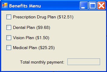
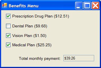
When a check box has the focus, the spacebar can be used to check (or uncheck) the box and invoke the CheckedChanged event. In addition, the state of a check box can be toggled from the keyboard without first setting the focus to the check box, if you create an access key for the check box by including an ampersand in the Text property. (At run time, access keys appear underlined after the Alt key is pressed.) For instance, if the Text property for the Dental Plan in Example 1 is set as "&Dental Plan", then the user can check (or uncheck) the box by pressing Alt + D.
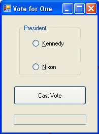
The Radio Button Control
Radio buttons are used to give the user a single choice from several options. The name "radio button" comes from a reference to the first car radios, which had buttons that pressed in. Pressing one button would move the dial to a preset station and would raise any other button that was depressed.
Normally, a group of several radio buttons is attached to a group box. Each button consists of a small circle accompanied by a caption that is set with the Text property. (As with a button and a check box, an ampersand can be used to create an access key for a radio button.) When a circle or its accompanying caption is clicked, a solid dot appears in the circle and the button is said to be "on." At most, one radio button in a group can be on at the same time. Therefore, if one button is on and another button in the group is clicked, the first button will turn off. By convention, the names of radio buttons have the prefix rad. A single form can have several groups of radio buttons. However, each group must be attached to its own group box or to the form itself (with only one group on the form).
The Checked property of a radio button tells if the button is on or off. The property
radButton.Checkedis True when radButton is on and False when radButton is off. The statement
radButton.Checked = Trueturns on radButton and turns off all other buttons in its group. The statement
radButton.Checked = Falseturns off radButton and has no effect on the other buttons in its group.
The CheckedChanged event for a radio button is triggered when an off button is turned on or an on button is turned off. Therefore, CheckedChanged events are usually triggered in pairs, and provide limited value. In most programming situations, the best way to determine which button is selected is to employ a button control as in Example 2.
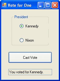
Example 2.
| The following voting program allows undervotes (voting for neither), but prevents overvotes (voting for both):
Private Sub btnVote_Click(...) Handles btnVote.Click If radCandidate1.Checked Then txtVote.Text = "You voted for Kennedy." ElseIf radCandidate2.Checked Then txtVote.Text = "You voted for Nixon." Else txtVote.Text = "You voted for neither." End If End Sub [Run, click on one of the radio buttons, and then click the Cast Vote button.] |
The Timer Control
The timer control, which is invisible during run time, triggers an event after a specified amount of time has passed. (When you double-click on the timer control in the Toolbox, it appears in a separate pane called the tray, at the bottom part of the Form designer) The length of time, measured in milliseconds, is set with the Interval property to be any integer from 1 to 2,147,483,647 (about 596 hours). The event triggered each time Timer1.Interval milliseconds elapses is called Timer1.Tick. In order to begin timing, a timer must first be turned on by setting its Enabled property to True. A timer is turned off by setting its Enabled property to False. The standard prefix for the name of a timer control is tmr.
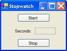
Example 3.
| The following program creates a stopwatch that updates the time every tenth of a second.
Private Sub btnStart_Click(...) Handles btnStart.Click txtSeconds.Text = "0" 'Reset watch tmrWatch.Enabled = True End Sub Private Sub btnStop_Click(...) Handles btnStop.Click tmrWatch.Enabled = False End Sub Private Sub tmrWatch_Tick(...) Handles tmrWatch.Tick 'Next line displays the time rounded to one decimal place txtSeconds.Text = CStr((CDbl(txtSeconds.Text) + 0.1)) End Sub [Run, click the Start button, wait 10.5 seconds, and click the Stop button.] |
The Picture Box Control
The picture box control is designed to hold drawings created with graphics commands or pictures stored in graphics files such as .BMP files created with Windows Paint, ICO files of icons that come with Visual Basic, or GIF and JPEG images used on the World Wide Web.
A statement of the form
picBox.CreateGraphics.DrawRectangle(Pens.Blue, x, y, w, h)where x, y, w, h are of type integer, draws a blue rectangle of width w pixels and height h pixels in the picture box. The upper-left corner of the rectangle will be x pixels from the left side and y pixels from the top side of the picture box. To get a feel for how big a pixel is, the initial size of the form when you create a new project is 300 pixels by 300 pixels.
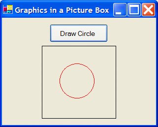
The color Blue can be replaced by other colors. If DrawRectangle is replaced with DrawEllipse, the statement just displayed will draw the ellipse that would be inscribed in the rectangle just described. Also, if w and h have the same value, the ellipse will be a circle with a diameter of that value. In Figure 9.4, the picture box has a size of 140 by 140 pixels and a FixedSingle border style. The circle is drawn with the statement
picBox.CreateGraphics.DrawEllipse(Pens.Red, 35, 35, 70, 70)Figure 9.4. Picture box containing red circle.
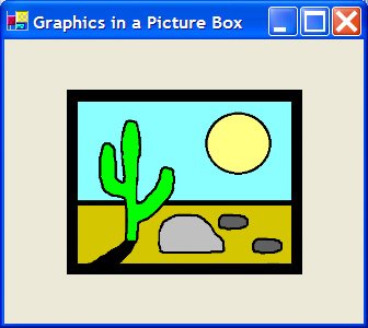
A picture can be placed in a picture box control with the Image property. If you double-click on the Image property during design time, an Open dialog box appears and assists you in selecting an appropriate file. However, prior to setting the Image property, you should set the SizeMode property. If the SizeMode property is set to AutoSize, the picture box control will be resized to fit the picture. If the SizeMode property is set to StretchImage, the picture will be resized to fit the picture box control. Therefore, with the StretchImage setting, pictures can be reduced (by placing them into a small picture box control) or enlarged (by placing them into a picture box control bigger than the picture). Figure 9.5 shows a picture created with Paint and reduced by StretchImage to fit the picture box. By convention, names of picture box controls have the prefix pic.
Figure 9.5. Picture box with desert scene.
A picture also can be assigned to a picture box control at run time. However, a statement such as
picBox.Image = filespecwill not do the job. Instead, we must use the Image object with a statement such as
picBox.Image = Image.FromFile(filespec)The SizeMode property can be altered at run time with a statement such as
picBox.SizeMode = PictureBoxSizeMode.AutoSizeThe Horizontal and Vertical Scroll Bar Controls
Figure 9.6 shows the two types of scroll bars. When the user clicks on one of the arrow buttons, the scroll box moves a small amount toward that arrow. When the user clicks between the scroll box and one of the arrow buttons, the scroll box moves a large amount toward that arrow. The user can also move the scroll box by dragging it. The main properties of a scroll bar control are Minimum, Maximum, Value, SmallChange, and LargeChange, which are set to integers. At any time, hsbBar.Value is a number between hsbBar.Minimum and hsbBar.Maximum determined by the position of the left side of the scroll box. If the left side of the scroll box is halfway between the two arrows, then hsbBar.Value is a number halfway between hsbBar.Minimum and hsbBar.Maximum. If the scroll box is near the left arrow button, then hsbBar.Value is an appropriately proportioned value near hsbBar.Minimum. When an arrow button is clicked, hsbBar.Value changes by hsbBar.SmallChange and the scroll box moves accordingly. When the bar between the scroll box and one of the arrows is clicked, hsbBar.Value changes by hsbBar.LargeChange and the scroll box moves accordingly. When the scroll box is dragged, hsbBar.Value changes accordingly. The default values of Minimum, Maximum, Value, SmallChange, and LargeChange are 0, 100, 0, 1, and 10, respectively. However, these values are usually set at design time. Vertical scroll bars behave similarly.
Figure 9.6. Horizontal and vertical scroll bars.
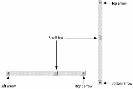
Note: The setting for the Minimum property must be less than the setting for the Maximum property. The Minimum property determines the values for the left and top arrows. The Maximum property determines the values for the right and bottom arrows.
The Scroll event is triggered whenever any part of the scroll bar is clicked.
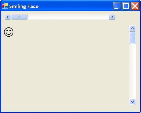
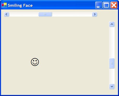
Example 4. (This item is displayed on pages 479 - 480 in the print version)
| The following program uses scroll bars to move a smiling face around the form. The face is a large Wingdings character J inside a label. The values lblFace.Left and lblFace.Top are the distances in pixels of the label from the left side and top of the form. (One inch is about 88 pixels.)
Private Sub hsbXpos_Scroll(...) Handles hsbXpos.Scroll lblFace.Left = hsbXpos.Value End Sub Private Sub vsbYpos_Scroll(...) Handles vsbYpos.Scroll lblFace.Top = vsbYpos.Value End Sub [Run, and move the scroll boxes on the scroll bars.] |
Practice Problem 9.2
| Q1: | What is the difference between a set of check boxes attached to a group box and a set of radio buttons attached to a group box? |
Exercises 9.2
In Exercises 1 through 16, determine the effect of setting the property to the value shown.
| 1. | GroupBox1.Text = "Income" |
| 2. | CheckBox1.Checked = True |
| 3. | CheckBox1.Checked = False |
| 4. | CheckBox1.Text = "&Vanilla" |
| 5. | RadioButton1.Checked = False |
| 6. | RadioButton1.Text = "Punt" |
| 7. | HScrollBar2.Value = HScrollBar2.Maximum |
| 8. | HScrollBar2.Value = CInt((HScrollBar2.Maximum + HScrollBar2.Min) / 2) |
| 9. | VScrollBar2.SmallChange = VScrollBar2.LargeChange |
| 10. | Timer1.Interval = 5000 |
| 11. | Timer1.Interval = CInt(intVar * 1000) |
| 12. | Timer1.Enabled = False |
| 13. | PictureBox1.SizeMode = PictureBoxSizeMode.StretchImage |
| 14. | PictureBox1.CreateGraphics.DrawEllipse(Pens.Blue, 20, 30, 100, 100) |
| 15. | PictureBox1.CreateGraphics.DrawRectangle(Pens.Green, 25, 50, 200, 100) |
| 16. | PictureBox1.Image = Image.FromFile("AIRPLANE.BMP") |
In Exercises 17 through 24, write one or more lines of code to carry out the task.
| 17. | Set the caption for RadioButton1 to "Yes". |
| 18. | Clear the small rectangular box of CheckBox1. |
| 19. | Turn off RadioButton2. |
| 20. | Move the scroll box of VScrollBar2 as high as possible. |
| 21. | Move the scroll box of HScrollBar2 one-third of the way from the left arrow to the right arrow. |
| 22. | Specify that Timer1 trigger an event every half second. |
| 23. | Draw a yellow circle of diameter 100 pixels in PictureBox1. |
| 24. | Specify that Timer1 cease to trigger the Tick event. |
In Exercises 25 and 26, determine the state of the two radio buttons after the button is clicked.
| 25. |
Private Sub Button1_Click(...) Handles Button1.Click RadioButton1.Checked = True RadioButton2.Checked = True End Sub |
| 26. | Private Sub Button1_Click(...) Handles Button1.Click RadioButton1.Checked = False RadioButton2.Checked = False End Sub |
| 27. | Which of the controls presented in this section can receive the focus? Design a form containing all of the controls, and repeatedly press the Tab key to confirm your answer. |
| 28. | Create a form with two group boxes, each having two radio buttons attached to it. Run the program, and confirm that the two pairs of radio buttons operate independently of each other. |
| 29. | Suppose that a group box has two radio buttons attached to it. If the statement GroupBox1.Visible = Falseis executed, will the radio buttons also vanish? Test your answer. |
| 30. | Why are radio buttons also called "option buttons"? |
A form contains a button and a group box with three check boxes named CheckBox1, CheckBox2, and CheckBox3 attached to it. In Exercises 31 and 32, write a Click event procedure for the button that displays the stated information in a text or list box when the button is clicked.
| 31. | The number of boxes checked. |
| 32. | The captions of the checked boxes. |
| 33. | A computer dealer offers two basic computers, the Deluxe ($1500) and the Super ($1700). The customer can order any of the following additional options: multimedia kit ($300), internal modem ($100), or 256MB of added memory ($50). Write a program that computes the cost of the computer system selected. |
| 34. | Item 37a of Form 1040 for the U.S. Individual Income Tax Return reads as follows: 37a. Check if: Write a program that looks at the four check boxes and displays the number of boxes checked in the text box. |
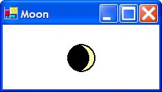
| 35. | The Programs\Ch09\Pictures folder contains files named MOON1.BMP, MOON2.BMP,..., MOON8.BMP, which show eight phases of the moon. Create a form consisting of a picture box control and a timer control. Every two seconds assign another file to the Image property of the picture box control to see the moon cycle through its phases every 16 seconds. One phase is shown in Figure 9.7. Figure 9.7. Form for Exercise 35. |
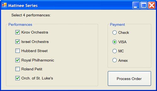
| 36. | Subscribers to the Matinee Series for a recent season at the Kennedy Center for the Performing Arts had to select four performances out of the six shown in the Matinee Series form in Figure 9.8 and had to indicate the method of payment. Write the Click event procedure for the button. The procedure should first determine whether exactly four performances have been checked. If not, the user should be so informed with a message dialog box. Then the method of payment should be examined. If no method has been indicated, the user must be reminded to select one. Depending on the method of payment, the user should be told with a message box to either mail in the check with the order form or give the credit card number with an input dialog box request. At the end of the process, the caption on the button should change to "Thank You". Figure 9.8. Form for Exercise 36. |
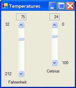
| 37. | Write a program to synchronize the two thermometers shown in the Temperatures form in Figure 9.9. When the scroll box of either thermometer is moved, the other thermometer moves to the corresponding temperature and each temperature is displayed above the thermometer. Note: C = (5/9)(F 32), F=(9/5)C + 32. Figure 9.9. Form for Exercise 37. |
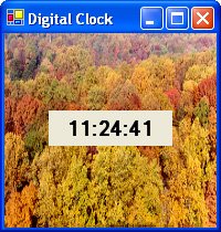
| 38. | Write a program to create a decorative digital clock. The clock in the Digital Clock form in Figure 9.10 is inserted in a picture box control containing the TREES.BMP picture. The values for hour, minute, and second can be obtained as Hour(Now), Minute(Now), and Second(Now). Figure 9.10. Form for Exercise 38. |
| 39. | Simulation of Times Square Ball. Create a form with a vertical scroll bar and a timer control. When the program is run, the scroll box should be at the top of the scroll bar. Each second the scroll box should descend one-tenth of the way down. When the scroll box reaches the bottom after 10 seconds, a message box displaying HAPPY NEW YEAR should appear. |
| 40. | Write a program to display a picture (contained in a .bmp file in the Windows directory) in a picture box. The .bmp file should be selected with an OpenFileDialog control. |
 37a
37a 
Solutions to Practice Problems 9.2
| A1: | With radio buttons, at most one button can be on at any given time, whereas several check boxes can be checked simultaneously. |
EAN: 2147483647
Pages: 164