| As you have seen so far in your explorations, Flex development is done in a number of standards-based languages, such as MXML (based on XML) and ActionScript 3.0 (based on ECMAScript). It should be no surprise to learn that styles are also applied in a standards-based way through the use of Cascading Style Sheets (CSS). There are several different ways to apply a style: by setting a single style on a particular component; by using CSS class selectors to set several styles together, which can then be applied to various components; or by using a type selector to specify that all components of a particular type should use a set of styles. In the next several exercises, you will have a chance to apply styles in all these different ways. Regardless of which way a style is being applied, you need to know the style property that will effect the changes you want. ASDoc, also known as the Adobe Flex 2 Language Reference (which ships with Flex), has a complete listing of all styles available for every built-in component in Flex. For example, any component showing text has the following styles: Style Property | Description |
|---|
Color | Color of text in the component, specified as a hexadecimal number. The default value is 0x0B333C. | disabledColor | Color of the component if it is disabled, specified as a hexadecimal number. The default value is 0xAAB3B3. | fontFamily | Name of the font to use specified as a String. Any font family name can be used. If you specify a generic font name (such as _sans), will be converted to an appropriate device font. The default value is Verdana. | fontSize | Height of the text specified as a number of pixels. The default value is 10. | fontStyle | String indicating whether or not the text is italicized. Recognized values are normal and italic. The default is normal. | fontWeight | String indicating whether or not the text is boldfaced. Recognized values are normal and bold. The default is normal. | marginLeft | Number of pixels between the container's left border and the left edge of its content area. The default value for Text controls is 0, but different defaults apply to other components. | marginRight | Number of pixels between the container's right border and the right edge of its content area. The default value for Text controls is 0, but different defaults apply to other components. | textAlign | String indicating the alignment of text within its container or control. Recognized values are "left", "right", or "center". The default value is "left". | texTDecoration | String indicating whether or not the text is underlined. Recognized values are "none" and "underline". The default value is "none". | textIndent | Offset of first line of text from the left side of the container, specified as a number of pixels. The default value is 0. |
Although these style properties are available for any component that has text, each component has its own unique list of style properties available, such as the selectionColor or rollOverColor (used in ComboBox, List, DataGrid, and so on), which accepts a color as a hexadecimal value, to indicate the color of the bar around an item when it is selected or has the mouse positioned over it. Setting Styles Inline with Tag Attributes Styles can be applied to individual instances of a component by setting an attribute of the tag of the component with the name of the style property you want to set and the value to be set; for example, to make a label have a larger font size, you could specify the following: <mx:Label text="Only a Test" fontSize="40"/>
In this exercise, you will set the rollOverColor and selectionColor for a ComboBox control in the second screen of the Checkout process (CCInfo.mxml). 1. | Open CCInfo.mxml from your views/ecomm directory.
If you skipped the lesson when this was created, you can open this file from the Lesson16/start/views/ecomm directory and save it in your views/ecomm directory.
| 2. | Find the declaration for the first ComboBox control with the id of cardType at about line 51. Add an attribute of the tag to specify the rollOverColor ot be #AAAAAA.
<mx:ComboBox rollOverColor="#AAAAAA"> <mx:dataProvider> <mx:Object label="American Express" data="AmericanExpress"/> <mx:Object label="Diners Club" data="DinersClub"/> <mx:Object label="Discover" data="Discover"/> <mx:Object label="MasterCard" data="MasterCard"/> <mx:Object label="Visa" data="Visa"/> </mx:dataProvider> </mx:ComboBox>
It should be noted that letters used as part of a hexadecimal number (such as #AAAAAA) are not case-sensitive; #aaaaaa works just as well.
| 3. | Add another attribute to the same tag to specify the selectionColor as #EA800C.
lt;mx:ComboBox rollOverColor="#AAAAAA" selectionColor="#EA800C">
You are now telling this one ComboBox control that when a user puts the mouse over one of the items, its color should be a pale gray (#AAAAAA) instead of the pale cyan (#0EFFD6), which it uses as a default.
| 4. | Save CCInfo.mxml. Open and run EComm.mxml. Click Checkout in the upper-right corner. On the Customer Information form, click the Continue button. Click the Credit Cart Type ComboBox and notice the color of selected and rolled-over items.
|
You can easily compare this with the default look of the ComboBox control because you have changed only one of the three on this screen. Open either of the other two to see the default selectionColor and rollOverColor. 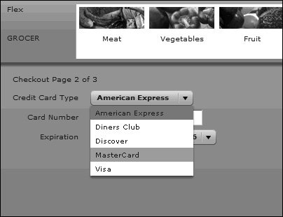
Tip  | It is also possible to set styles on individual instances in ActionScript using the setStyle() method. For example, the same style could have been applied with this code: cardType.setStyle("selectionColor",0xEA800C); cardType.setStyle("rollOverColor",0xAAAAAA);
|
Note  | When using setStyle(), colors are prefixed with 0x, which is the ECMAScript standard prefix for hexadecimal numbers. When applying a style in an attribute or <mx:Style> tag (as you will soon see), you can use a pound sign (#) instead of 0x. When set through ActionScript, numeric values (even those that are hexadecimal) do not have quotes around them. Although setStyle() is useful for times when styles need to change at run time, it should be used sparingly because it is a processor-intensive operation. |
Understanding Style Inheritance As you look at the ASDocs on various components, you can see that each style has a yes or no property for something called CSS inheritance.  For example, here you see a few styles of the ComboBox controlselectionColor and rolloverColor do allow CSS inheritance, whereas selectionDuration does not. What this means is that if a parent container of a ComboBox control has a value for selectionColor, and the ComboBox control itself does not, the container's value will be used. However, because selectionDuration does not support inheritance, even if a parent container had a value set for selectionDuration, the ComboBox control would use the default value because it does not inherit the value. Setting Styles with the <mx:Style> Tag Many of you use CSS in web pages you have built. You can also use many of the same CSS styles in your Flex applications. One way to do this is to add an <mx:Style> tag pair to any MXML document; you can write standard CSS style declarations between the open and close tags. Standard CSS tends to have style properties whose names are all lowercase and uses hyphens as a separator between words: background-color : #FFFFFF;
In the last exercise, you used multiword styles by declaring them with camel case syntax; that is, the style declaration started with a lowercase letter and each subsequent word started with an uppercase letter, with no spaces or hyphens used: <mx:ComboBox rollOverColor="#AAAAAA"/>
The reason for the difference is that a hyphen is not a valid character for an XML attribute, and MXML tags are all XML tags. To work around this, when style names are set via attributes, they must be set with the ActionScript equivalent of the style name, so you use backgroundColor instead of background-color. The lowercase hyphened versions of style properties are available only for properties that exist within traditional CSS. Any styles created specifically for Flex (such as rollOverColor) are available only in camel case. When you specify a style within an <mx:Style> tag, you can use either syntax, and it will be applied properly. <mx:Style> .customCombo{ background-color: #AAAAAA; selectionColor: #EA800C; } </mx:Style>
Another choice you have when using CSS styles is the type of selector to use. Flex supports the use of CSS class selectors or CSS type (or Element) selectors. A class selector defines a set of style properties as a single style class, which can then be applied to one or more components through the use of the component's styleName property. <mx:Style> .customCombo{ color: #FF0000; selectionColor: #EA800C; } </mx:Style> <mx:ComboBox styleName="customCombo"/>
Tip | Unlike CSS for HTML, Flex does not support ID selectors. |
Here, the ComboBox control is using the customCombo style class, which sets both the text color as well as the selectionColor. A type selector enables you to specify a set of styles that will be applied to all instances of a type of component. In HTML applications, you can do this to define the look of an <H1> tag for your site. The same syntactic structure works to define a set of styles to be applied to all instances of a type of Flex control, as in the following: <mx:Style> ComboBox { color: #FF0000; selectionColor: #EA800C; } </mx:Style> <mx:ComboBox /> <mx:ComboBox />
In this example, the color and selectionColor style properties are being applied to all ComboBox control instances. Tip | The terms type and class selector might seem counterintuitive if you didn't previously work with CSS. These terms come from CSS standards. The confusion is that a type selector is what you would use to affect all instances of an ActionScript class; a class selector has no relation to any ActionScript class, but instead defines a style class that can be used on several elements. |
In this next task, you will build a class selector and apply it to an <mx:Form> tag in CCInfo.mxml. This will not only showcase the use of a class selector, but you will also see style inheritance in use because the style will be inherited by all of the ComboBox controls in that form. | | 1. | Open CCInfo.mxml from the previous exercise.
If you didn't finish the previous exercise, you can open CCInfo_inline.mxml from Lesson16/intermediate and save it as CCInfo.mxml in your views/ecomm directory.
| 2. | Just after the root <mx:Canvas> tag, create an <mx:Style> tag pair.
<mx:Canvas xmlns:mx="http://www.adobe.com/2006/mxml"> <mx:Style> </mx:Style> <mx:Metadata>
You now have an <mx:Style> block, in which you can create type or class selectors.
| 3. | Inside the <mx:Style> block, create a class selector called customCombo that specifies a rollOverColor of #AAAAAA and a selectionColor of #EA800C.
<mx:Style> .customCombo{ selectionColor:#EA800C; rollOverColor:#AAAAAA; } </mx:Style>
Like traditional CSS, but unlike style properties set as attributes, no quotes are used around the values of the style properties.
| 4. | Remove the rollOverColor and selectionColor attributes of the ComboBox control. Instead, specify a styleName="customCombo" as an attribute on that ComboBox control.
<mx:ComboBox styleName="customCombo"/>
If you save and test the application, the one ComboBox control should behave as it did beforewith custom colorswhereas the other two show the default colors.
| 5. | Cut the styleName="customCombo" from the ComboBox and instead paste it as an attribute of the <mx:Form> tag.
<mx:Form width="100%" styleName="customCombo">
Because the form contains three ComboBox controls, applying these cascading styles to the form affect all the ComboBox controls within the form.
| 6. | Save and run the application.
Verify that the style is now applied to all three ComboBox controls in the form.
|
Setting Styles with CSS files You can use an <mx:Script> tag to either define a block of codeinline on the MXML document or you can use its source attribute to specify an external file to be compiled into the application. The <mx:Style> tag works in a similar way. Used as a tag pair, you can specify a series of styles inline in your MXML documents or you can use the source attribute to specify an external file. <mx:Style source="path/to/file.css"/>
One great advantage of using an external file is that you can share CSS files between multiple Flex applications, or even between Flex and HTML applications. This is possible because CSS parsers in both Flex and HTML are smart enough to ignore any declarations they don't understand. So even if Flex supports only a subset of standard CSS, and in fact creates a number of its own custom declarations, neither your HTML nor your Flex applications will be hurt by declarations they cannot understand. In this exercise, you will make use of a prebuilt CSS file to style the FlexGrocer application. 1. | Copy flexGrocer.css from Lesson16/assets to your flexGrocer directory.
Open up the file, and you will see a series of style definitions, some as type selectors(such as Application, DateChooser, and so on) and a number of class selectors (.formPage1, .borderBox, and so on). Styles that match traditional HTML styles (such as background-color, font-family, and so on) are all lowercase so they can work in both HTML andFlex applications, whereas any Flex-specific styles (headerColors, hGridLines, alternatingRowColors, and so on) are in only camel case.
| 2. | Open the CCInfo.mxml file you worked on in the previous task and remove the <mx:Style> block you added.
As a best practice, all styles for the application are defined in a single style sheet. This way, if you want to change the look and feel of the application at a later time, you don't need to dig through the code to find all the places where styles were applied; instead, you can restyle the application by changing only one file!
| 3. | Open EComm.mxml from your flexGrocer directory.
Alternatively, you can open this file from Lesson16/start and save it in your flexGrocer directory.
| | | 4. | Just after the <mx:Application> tag, use an <mx:Style> tag with the source attribute to read in the CSS file.
<mx:Style source="flexGrocer.css"/>
This instructs the Flex compiler to read in the CSS file, making all those type and class declarations available to you.
| 5. | Save the file and run the application.
Notice right away that any of the type selectors are automatically applied. This will become readily apparent as you notice that every ComboBox, DataGrid, List, and DateChooser control has the selectionColor and rollOverColor applied as they are specified in the Application type selector. This is because these two style properties are inheritable and they are applied at the topmost container (Application), so they will cascade to everything else within the application.
Application{ font-family: Arial, Helvetica, sans-serif; background-color: #333333; selectionColor: #EA800C; rollOverColor: #CECECE; }
Of course, more work needs to be done to the application because the default dark blue/green text on a dark gray background is nearly impossible to read. Don't worryyou will apply the other styles in the application to rectify it.
| 6. | Still in EComm.mxml, find the labels for the logo in the ApplicationControlBar (at about lines 35 and 38). Set a styleName attribute of the first label to be logoTop and the second logo to be logoBottom.
<mx:Label x="0" y="0" text="Flex" styleName="logoTop" click="ecommNav.selectedChild=homePage"/> <mx:Label x="0" y="41" text="GROCER" styleName="logoBottom" click="ecommNav.selectedChild=homePage"/>
The logoTop class selector specifies 40 point bold text with a #EA800C (orange) color. The logoBottom has the same color and bold, but with 19 point text instead.
| | | 7. | Still in EComm.mxml, find the <mx:ViewStack> tag withan id of ecommNav (at about line 60). Set a styleName attribute of this tag to be whiteBg.
<mx:ViewStack width="100%" height="100%" creationPolicy="all" styleName="whiteBg" >
This sets a white (#FFFFFF) background for the body of the application. Because the ViewStack container is the outermost container for everything in the body, setting its background color to white will also create a white background for all its children.
| 8. | Still in EComm.mxml, find the <mx:Label> that has the bottom branding (at about line 81). Set its styleName property to be bottomBranding.
<mx:Label text="©2006 flexGROCER. All rights reserved." right="10" bottom="10" styleName="bottomBranding"/>
The bottom text is set to be black, so it contrasts nicely with the white background.
| 9. | Save and test the application.
 You should see a white background on the body, the orange logo, and the properly sized and colored bottom branding. After you have seen and tested it, you can close EComm.mxml. The rest of the styles you will be applying will be in child components. You should see a white background on the body, the orange logo, and the properly sized and colored bottom branding. After you have seen and tested it, you can close EComm.mxml. The rest of the styles you will be applying will be in child components.
| 10. | Open Homepage.mxml from your views/ecomm directory.
Alternatively, you can open this file from the Lesson16/start/views/ecomm directory and save it in your views/ecomm directory.
| | | 11. | Find the Label control with an id of welcome. Assign it a styleName of homePageTitle.
<mx:Label text="Welcome" left="{image.x}" top="{image.height+image.y}" styleName="homePageTitle" />
The homePageTitle style class makes this label orange (#EA800C) with 90 point text, so it is very large.
| 12. | Find the <mx:Text> tag with an id of homePageText. Assign it a styleName of homePageText.
<mx:Text width="{image.width-30}" left="{image.x+30}" top="{welcome.y + (welcome.height/2)}" styleName="homePageText" >
The homePageText style class makes this text gray (#333333) with 13 point text.
| 13. | Save Homepage.mxml and run the application.
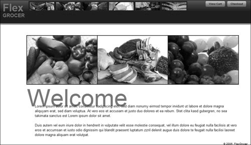 You should now see the home page text styled properly. Notice that the labels under the category navigation are still too dark to read against the dark gray background. In the next set of steps, you will fix it. You should now see the home page text styled properly. Notice that the labels under the category navigation are still too dark to read against the dark gray background. In the next set of steps, you will fix it.
After you see this rendering properly, you can save and close Homepage.mxml.
| | | 14. | Open TextAndPic.mxml from your views/ecomm directory.
Alternatively, you can open this file from the Lesson16/start/views/ecomm directory and save it in your views/ecomm directory.
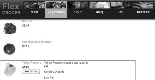
| 15. | Find the <mx:Label> tag. Assign it a styleName of categoryText.
<mx:Label text="{data.catName}" width="100%" styleName="categoryText" />
The categoryText style class makes this label white (#FFFFFF), 14 point, bold, and centered.
| 16. | Save TextAndPic.mxml and run the application.
 The category names should now be bigger, bolder, and white to make them visible against the dark background. However, if you click any of the categories, you will find that the text by each product seems very small, rendering in the default size of 10 point. You will address it next. The category names should now be bigger, bolder, and white to make them visible against the dark background. However, if you click any of the categories, you will find that the text by each product seems very small, rendering in the default size of 10 point. You will address it next.
| 17. | Open GroceryDetail.mxml from your views/ecomm directory.
Alternatively, you can open this file from the Lesson16/start/views/ecomm directory and save it in your flexGrocer directory.
| 18. | Find the <mx:Label> tag with an id of prodName (at about line 71). Assign it a styleName of standardOrange.
<mx:Label text="{groceryItem.prodName}" x="100" y="0" styleName="standardOrange" />
The standardOrange style class will be used throughout the application when orange (#EA800C), nonbold, 12-point text is desired. When you finish the styling, GroceryDetail is one of four files that will use this style.
| | | 19. | Find the <mx:Label> tag with an id of price (at about line 75). Assign it a styleName of standardBlackBold.
<mx:Label text="{curFormat.format(groceryItem.listPrice)}" x="100" y="20" styleName="standardBlackBold" />
The standardBlackBold style class will be used throughout the application when black (#333333), bold, 12-point text is desired. This same style will also be used once in the BillingInfo component.
| 20. | Find the <mx:VBox> tag added for the expanded state (at about line 51). Assign it a styleName of standardBlack.
<mx:states> <mx:State name="expanded"> <mx:AddChild> <mx:VBox width="100%" x="200" styleName="standardBlack" > ... </mx:VBox> </mx:AddChild> ... </mx:State> </mx:states>
By applying the standardBlack (#333333, 12 point) style to the VBox, all the text contained by the VBox will use this style.
The last thing to do in GroceryDetail is to add a black border around the item when it is in its expanded state.
| 21. | After the closing </mx:AddChild> tag that adds the <mx:VBox>, and before the <mx:SetProperty> tag that toggles the visibility of the Add button, add a new <mx:SetStyle> tag that will set the styleName property of the component to borderBox.
<mx:SetStyle name="styleName" value="borderBox"/>
Now, whenever the user moves the mouse over a product, in addition to showing the details, the borderBox style is also applied; it sets a dark gray (#333333) border around the entire component.
| | | 22. | Save GroceryDetail.mxml and run the application.
 As you run the application, clicking any of the categories should show all the styles now applied to the grocery details. As you run the application, clicking any of the categories should show all the styles now applied to the grocery details.
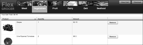
| 23. | Open Cart.mxml from your views/ecomm directory.
Alternatively, you can open this file from the Lesson16/start/views/ecomm directory and save it in your views/ecomm directory. If you navigated to the fullCart state, the default look and feel of the DataGrid control feels a bit flat compared with the rest of the styled application. In these next steps, you will make the DataGrid control feel more like the rest of the application.
| | | 24. | Find the <mx:DataGrid> tag. Assign this a styleName of cartGrid.
<mx:DataGrid dataProvider="{cart.aItems}" width="100%" height="100%" editable="true" draggableColumns="false" variableRowHeight="true" styleName="cartGrid" >
Looking back to the stylesheet, you can see that the cartGrid style class sets the header colors to fade between white (#FFFFFF) and orange (#EA800C). Take a closer look at how the fade was specified.
.cartGrid{ header-colors: #FFFFFF, #EA800C; horizontal-grid-lines: false; alternating-item-colors:#FFFFFF,#FFFFFF; vertical-grid-lines: false; }
Notice that two of the styles (header-colors and alternating-item-colors) have comma-delimited lists of values specified. If you look to ASDocs for the definitions of these styles, you will see that they are both built to accept an array. Because CSS is not a programming language, nor really part of the ActionScript language, you can't use traditional approaches for creating an array (such as square brackets or the new Array() command). Instead, you specify an array in a CSS by providing a comma-delimited list of the elements. Another important thing to note is that alternating-item-colors needs at least two elements, even if they are the same. If this were defined only as alternating-item-colors: #EAEAEA; a run-time error would be thrown because Flash Player is looking to find an array and instead is finding only a single number.
Tip | Elements that take an array, such as alternating-item-colors, are not limited to only two colors; you can usually specify several colors, and it will alternate between each of them. |
| 25. | Save Cart.mxml and run the application.
Choose a category, click the Add To Cart button for a few products, and then click the View Cart button. You should now see the Shopping Cart DataGrid control looking more like it belongs to this application.
 All that remains to have styles from the stylesheets applied to them are the pages of the checkout process. All that remains to have styles from the stylesheets applied to them are the pages of the checkout process.
| 26. | Open BillingInfo.mxml from your views/ecomm directory.
Alternatively, you can open this file from the Lesson16/start/views/ecomm directory and save it in your views/ecomm directory.
| | | 27. | On the root node of this document (an <mx:HBox> tag), apply a styleName of formPage1.
<mx:HBox xmlns:mx="http://www.adobe.com/2006/mxml" xmlns:u="utils.*" styleName="formPage1" >
The formPage1 style sets a labelWidth for all the form elements, so they now line up nicely and look less ragged than before. This also sets the indicatorGap style, which determines the space between the right edge of the label and the left edge of the controls.
| 28. | Find the <mx:Label> tag, which tells the user they are on "Checkout Page 1 of 3", and apply a styleName attribute of standardOrangeBold to it.
<mx:Label text="Checkout Page 1 of 3" styleName="standardOrangeBold" />
The standardOrangeBold style is the orange (#EA800C) version of the standardBlackBold style you applied to the price label in the GroceryDetail component.
| 29. | On the next line, apply a styleName of standardBlackBold to the <mx:FormHeading> tag.
<mx:FormHeading label="Customer Information" styleName="standardBlackBold" />
As was mentioned earlier, this style class sets black, 12-point bold text.
| 30. | Save BillingInfo.mxml and run the application.
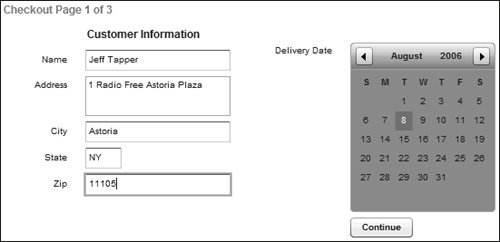 While running the application, click the Checkout button in the top-right corner of the screen. You should see the form items line up nicely, and have bold orange text for the step numbers, and bold black text for the form heading. The <mx:DateChooser> control has had styles applied to it, too (There is a type selector in the CSS file that sets the DateChooser control header colors, and it is inheriting the selectionColor and rollOverColor styles from the application.). While running the application, click the Checkout button in the top-right corner of the screen. You should see the form items line up nicely, and have bold orange text for the step numbers, and bold black text for the form heading. The <mx:DateChooser> control has had styles applied to it, too (There is a type selector in the CSS file that sets the DateChooser control header colors, and it is inheriting the selectionColor and rollOverColor styles from the application.).
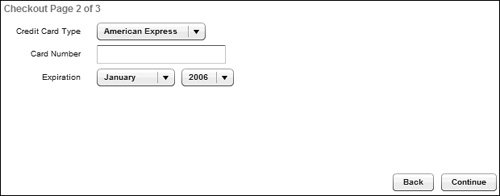
| 31. | Open CCInfo.mxml from your views/ecomm directory.
Alternatively, you can open this file from the Lesson16/start/views/ecomm directory and save it in your views/ecomm directory.
| | | 32. | Find the <mx:Form> tag (at about line 47). Replace the styleName attribute you set earlier (customCombo) with the value formPage2.
<mx:Form width="100%" styleName="formPage2" >
The formPage2 style is similar to the formPage1 style you used in the previous document, except that it needs a larger labelWidth to accommodate longer text.
| 33. | On the next line, set the styleName of the <mx:Label> to be standardOrangeBold.
<mx:Label text="Checkout Page 2 of 3" styleName="standardOrangeBold" />
Because you want to keep a consistent look and feel across the checkout process, the same style is used on the text to tell users where they are in the process.
| 34. | Save CCinfo.mxml and run the application.
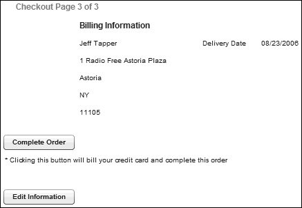
 | 35. | Open OrderConf.mxml from your views/ecomm directory.
Alternatively, you can open this file from the Lesson16/start/views/ecomm directory and save it in your flexGrocer directory.
| 36. | Find the <mx:Form> tag (at about line 23). Set its styleName attribute to be formPage1.
<mx:Form styleName="formPage1" >
This form, like the first, uses shorter labels, so the formPage1 style is more appropriate for it.
Because you want to keep a consistent look and feel across the checkout process, in the next few steps you will add the same style to similar elements on the different pages to help the users know where they are in the process.
| | | 37. | On the next line set the styleName of the <mx:Label> to be standardOrangeBold.
<mx:Label text="Checkout Page 3 of 3" styleName="standardOrangeBold" />
| 38. | On the next line, set the styleName of the <mx:FormHeading> to be standardBlackBold.
<mx:FormHeading label="Billing Information" styleName="standardBlackBold" />
| 39. | On the next line, set the styleName of the <mx:HBox> to be formHBox.
<mx:HBox styleName="formHBox" >
This style sets only the horizontalGap of the HBox. On this page, it represents the distance between the first and second columns of data.
| 40. | Save OrderConf.mxml and run the application.
|
Styles have now been consistently applied throughout the application. |