Recipe 2.26. Adjusting the Spacing Between Letters and Words
ProblemYou want to adjust the space between letters and words within HTML text as in Figure 2-42. Figure 2-42. Default spacing between letters and words in HTML text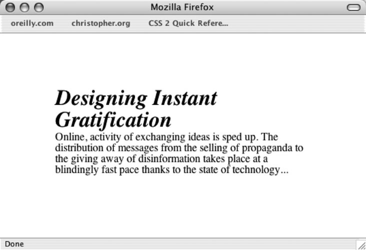 SolutionTo adjust the space between the letters use the letter-spacing property (see Figure 2-43): h2 { font: bold italic 2em "Helvetica Nue", serif; margin: 0; padding: 0; letter-spacing: -0.1em; } Figure 2-43. The adjusted letter spacing of the text in the heading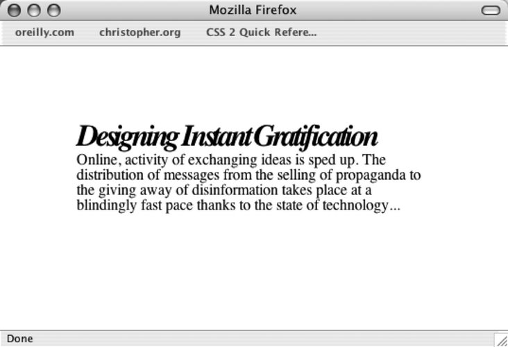 To adjust the space between words, use the word-spacing property (see Figure 2-44): h2 { font: bold italic 2em "Helvetica Nue", serif; margin: 0; padding: 0; word-spacing: 0.33em; }Figure 2-44. Words in the heading are spaced farther apart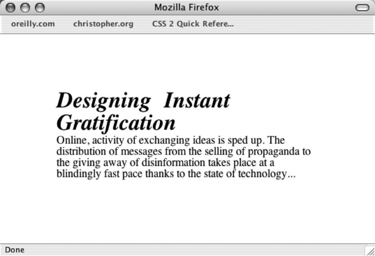 DiscussionOne of the main strengths of CSS is how the technology handles web typography. Web designers and developers had to use a puzzling array of nested font, b elements, and SPGs to create compelling text treatments. An effect like adjusting the space between two letters or separating whole words within a paragraph is something that CSS can render with ease. The adjustment of the space between letters to create a better aesthetic is an old tradition in graphic design. There are two terms that describe how the change in the space is adjusted onto text: kerning and tracking. Kerning is a design term used to describe the changing of the space between a pair of letters to create a better visual effect. An example of kerning is adjusting just the space between an uppercase letter T and a lowercase letter i. Tracking is defined as adjusting the space between letters in a large amount of text, not just between a pair of letters. The word-spacing property is supported in Firefox, Internet Explorer for Windows 6+, Internet Explorer for the Macintosh 4+, Netscape Navigator 6+, Opera 3.5+, and Safari. For best practices, the unit values of letter-spacing and word-spacing should be set in relative unit sizes instead of absolute length units. Since users can redefine the font sizes of their browsers, a fixed width value of 5 points originally intended for font size at 12 pixels will still be 5 points even if the user resizes the text to a larger value. In other words, the 5 point spacing between letters is barely going to be noticeable when the font size is set to 72 pixels or larger. With relative units like em, however, a value of 1.5em for the letter-spacing property scales along with the resizing of the text. Also, it's best to employ the text effects so that the text being styled is still legible. If communication is important to you or your client, a subtle effect is better than creating esoteric text elements. If the text becomes illegible, you may annoy the very people you are trying to reach. See AlsoRead the CSS 2.1 specification for letter-spacing at http://www.w3.org/TR/CSS2/text.html#propdef-letter-spacing and word-spacing at http://www.w3.org/TR/CSS2/text.html#propdef-word-spacing; learn more about kerning and tracking at http://desktoppub.about.com/cs/typespacing/a/kerningtracking.htm.
|
EAN: 2147483647
Pages: 235