Recipe 9.9. Designing an Asymmetric Layout
ProblemYou want to create a flexible, asymmetric or organic layout, like the one in Figure 9-38. SolutionFirst, mark up the content with div elements by using the id attributes that contain appropriate values representing their placement on the page: <div > [...] </div> <div > [...] </div> <div > [...] </div> <div > [...] </div> Figure 9-38. The asymmetric placement of the content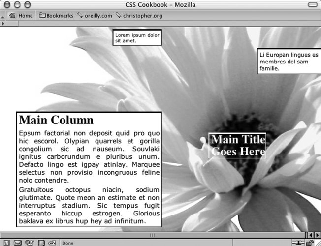 Next, use the position property in each column, setting the value to absolute while setting the placement of the columns with the left and top properties, using percentages. Also, use percentage values for positioning a background image (see Figure 9-39): body { margin:5px 0 0 5px; background-image: url(flower5.jpg); background-position: 50% 35%; background-repeat: no-repeat; } #header { position: absolute; left: 65%; top: 50%; width: 125px; font-size: small; } #columnSmall { position: absolute; left: 35%; width: 15%; top: 1%; background: #fff; font-size: small; } #columnMain { position: absolute; left: 5%; width: 45%; top: 40%; background: #fff; text-align: justify; border-width: 0; font-size: large; } #columnMedium { position: absolute; left: 80%; width: 20%; top: 10%; background: #fff; } Figure 9-39. The default rendering of the page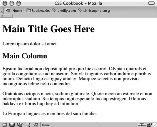 DiscussionAlthough web sites seem to use traditional column layouts, CSS enables web developers to come up with new ways to present their documents. Through the position, top, and left properties, you can break up the content into chunks, stylize them separately, and place them in unique arrangements. The background image moves with the content if the browser window is resized because you used a percentage value to set the position of the background image. Instead of changing the values for the position, top, and left properties by hand, you can more easily place div elements with a WYSIWYG application such as Macromedia Dreamweaver. If you want to create an asymmetric or organic layout with fixed-width columns instead of making this layout resizable, use length units to dictate the exact position of both the content and the background image: body { margin:5px 0 0 5px; background-image: url(flower5.jpg); background-position: -400px -200px; background-repeat: no-repeat; } #header { position: absolute; left: 500px; top: 200px; width: 125px; font-size: small; } #columnLeft { position: absolute; left: 200px; width: 125px; top: 10px; background:#fff; font-size: small; } #columnInnerLeft { position: absolute; left: 50px; width: 375px; top: 175px; background: #fff; text-align: justify; border-width: 0; font-size: large; } #columnInnerRight { position: absolute; left: 600px; width: 150px; top: 50px; background: #fff; }See AlsoRecipes 3.3 and 3.4 for setting background images on a web page; for working with CSS and Adobe Dreamweaver, see Recipe 1.17. For more information about Adobe Dreamweaver, see http://www.dreamweaver.com. |
EAN: 2147483647
Pages: 235