CBuilder IDE Features
C++Builder IDE Features
C++Builder offers a powerful environment with many options. This section covers its core features and some of the newest, most advanced features.
Main Window and Toolbars
The main window of the IDE fits to the upper section of your desktop. It contains various toolbars, including the menu bar, all of which can be moved. You can add or remove buttons by picking Customize from the pop-up menu on any of the toolbars. You can drag and drop from any of the commands listed under the dialog Commmands tab onto any of the toolbars. Unfortunately, you have to piggyback on the existing toolbars ”you cannot create your own.
You can also remove buttons while customizing by dragging them off the toolbar that holds them.
Project Manager
The Project Manager is not displayed in the default window configuration, but is usually important to have available. Pick Project Manager from the View menu to show the manager for the current project.
As you've seen, the project manager displays the current project files. You can control the build order for those files by rearranging them in the Project Manager window. You can also set local options and perform a variety of other tasks by using the pop-up menu available for each file or project.
The Project Manager will be covered in more detail later in this chapter.
Arranging Windows in the IDE
Many of the IDE windows can be docked to each other. This enables you to customize the user interface layout to your own needs.
If it weren't for the need to have separate form windows, you might dock all the windows into a tiled user interface. However, some experimentation will show you what works best docked while still allowing access to the form.
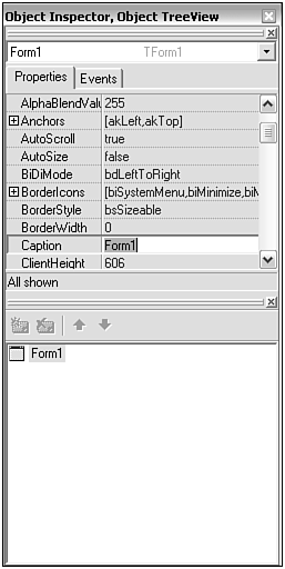
As you drag windows onto each other for docking, you will see the outline that tells where the docked window will go. Figure 2.1 shows an example of the Object Tree View at the bottom of the Object Inspector Window, before starting docking. Figure 2.2 shows the outline that indicates where the dragged window will fall, and Figure 2.3 shows the window after.
Figure 2.1. The two windows to participate in the drag and drop.
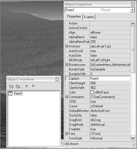
Figure 2.2. The drop outline on the Object Inspector window shows where the dropped window will go.
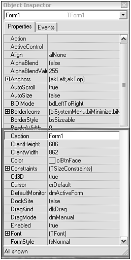
Figure 2.3. The window after the drop has occurred.
There are several places you can dock a window (called dock sites), though not every window supports every dock site possibility.
-
Bottom, Top, Left, Right ” Fills the bottom, top, left, or right of the destination window with the dropped window.
-
Center ” Adds the newly dropped window as a tabbed page to the drop-site window.
One of the most useful arrangements is to dock the Project Manager, the Object Inspector, and the Object Tree View window into a single window.
After windows are docked, you can resize the proportion of each using the flat part of the bar that separates them. Look for the cursor to turn into a double-headed arrow when it's over the splitter bar.
Object Inspector
As you've seen, the Object Inspector displays the properties for the currently selected component or form. You can also use the instance drop-down list at the top of the Object Inspector to pick a specific component.
Figure 2.4 shows the Object Inspector window.
Figure 2.4. Object Inspector.
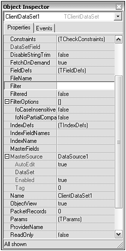
This view of the Object Inspector shows its features. In this case, the properties are for a TclientDataSet component, but similar properties exist for every class of component.
You can see that some properties have a plus sign ( + ) next to them. Some of those are enumerated properties with true/false flags next to each enumeration, such as FilterOptions . Others, such as MasterSource , are references to another component on the form, and the Object Inspector displays the properties of that component when the + has been clicked.
In addition to the plus sign, the Object Inspector uses color to show the nature of the property. Red property names indicate references to other components . Green property names indicate the properties of those referenced components brought over into the current object's inspector for convenience (making it easy to change related components' properties).
Finally, the plus sign can also be used for instances that are contained within the current instance being examined. Font is an example of this type of property.
The colors for various elements of the Object Inspector can be set from the Object Inspector tab of the IDE Tools, Environment dialog.
Property Categories in the Object Inspector
In Chapter 1 we described how the IDE's Object Inspector can be used to display and edit component properties and event handler functions. C++Builder 5 introduced the idea of property categories. All properties (including events that are also properties) can be arranged by category in the Object Inspector, as well as the normal alphabetical listing. The purpose of categories is to allow the logical grouping of related properties. A property might belong to more than one category, if appropriate. Additionally, it is possible to hide a property from the Object Inspector by hiding its category. This is referred to as filtering .
Filtering works on properties in the Object Inspector window, and also applies to the entries on the Events tab.
Using Property Categories
By default the Object Inspector displays properties alphabetically . To view by category, right-click the working area of the Object Inspector and select Arrange, By Category from the pop-up menu. The property categories will now be displayed in the Object Inspector. These can be expanded or collapsed by clicking the + (expand) or “ (collapse) icon (by default they are initially collapsed). If a category is expanded and the properties are viewed by name before viewing them again by category, the category remains expanded. If another component is selected and it has properties in the same category, those will also be shown expanded.
To filter which property categories are displayed in the Object Inspector, right-click again and select View. A category is checked or unchecked: Unchecked categories are hidden.
Selecting View, All automatically checks all categories, selecting View, None unchecks all categories (and therefore hides them), and selecting View, Toggle toggles the state of the categories. That is, checked categories become unchecked and vice versa. It doesn't matter which category is visible when you change a property that is a member of multiple categories ”you are changing the underlying value, not a separate entry in each category.
Using the Predefined Property Categories
There are 13 predefined property (and event) categories, 12 of which are used by the VCL in C++Builder. These are described in Table 2.1, with the kind of property contained in each category and example properties.
Table 2.1. Property Categories in C++Builder
| Category Name | Category Specification |
|---|---|
| Action | Contains properties that are managed by actions and whose behavior is related to runtime functionality. The Hint and Checked properties of TMenuItem are in this category. |
| Data | Contains properties that manage the data shown by a component. This category is not currently used by the VCL. It was originally used for the Text , EditMask , and Tag properties, but these can now be found in the Localizable, and Miscellaneous categories, respectively. |
| Database | Contains properties whose behavior is related to database operations. The DatabaseName , MasterSource , and OnCalcFields properties of TTable are in this category. |
| Drag, Drop, and Docking | Contains properties that arerelated to drag and drop or docking operations. The OnDragOver and DockSite properties of TForm are in this category. |
| Help and Hints | Contains properties (and events) that are related to help, hint, or assistance operations. The OnHint and HelpContext properties of TStatusBar are in this category. |
| Input | Contains properties that are related to controlling input to the component. The OnKeyPress , OnClick , and Enabled properties of TForm are in this category. |
| Layout | Contains properties that are related to the layout and visual display of a control at design time. The OnResize and Width properties of TForm are in this category. |
| Legacy | Contains properties that are now obsolete. The Ctl3D and OldCreateOrder properties of TForm are in this category. |
| Linkage | Contains properties that are related to the linking of one component to another. The PopupMenu property of TForm and the DataSource property of TDBGrid are in this category. |
| Locale | Contains properties that are related to international locales or compliance with international locale operating systems. The BiDiMode and ParentBiDiMode properties of TForm are in this category. |
| Localizable | Contains properties that are subject to possible change, depending on where the application is deployed. The BiDiMode , Hint , and Font properties of TForm are in this category. |
| Miscellaneous | Contains properties that have not been categorized, do not fit into any category, or do not require categorization. The Tag and Name properties of TForm are in this category. |
| Visual | Contains properties that are related to the layout and visual display of the control at runtime. The BorderStyle , Color , and Width properties of TForm are in this category. |
The Object Tree View
The Object Tree View is an important adjunct to the Object Inspector. For one thing, the Object Inspector drop-down list can become unwieldy when there are more than ten or twenty items. The Object Tree View window, shown in Figure 2.5, shows the objects in their parent/child relationships, and, of course, is scrollable. This is especially valuable in situations where a child component completely fills or covers its parent, and thus cannot be clicked with the mouse on the form.
Figure 2.5. Object Tree View.
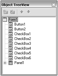
Entries in the Object Tree View have a pop-up menu. The most important feature of this menu is its capability to Edit (Copy, Cut, Paste), which enables you to create copies of the selected item.
Source Code Editor
The source code editor window is a window with tabs for each file currently opened. Figure 2.6 shows the Source Code Editor and the docked Class Explorer.
Figure 2.6. Source Code Editor.
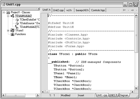
This is used to show and edit a variety of file types, including
-
C++ header and implementation files ( .cpp , .h , and .hpp , which are Delphi interface sections translated into C++)
-
Delphi files ( .pas )
-
Text files ( .txt or any other extension)
-
Text format of a form, data module, project makefile, and so on
-
SQL statements from the Tquery , and other similar database components
The tabs across the top of the source code editor show the name of the file; these tabs can be reordered by drag and drop. The title bar shows the path to the file being edited, unless it is in the current directory. If it is in the current directory, only the name will be shown.
Each file has at least one tab at the bottom. A .cpp file has a tab for the .cpp file and the .h file, as well as a diagram.
The editor also allows for custom surface designers, which are used to provide the diagram editor and the special editors for Professional and Enterprise Edition WebSnap applications.
The Diagram Tab
This tab reveals a diagram editor you can use to help document the component.
Figure 2.7 shows the diagram editor in use.
Figure 2.7. Source Code Diagram Editor.
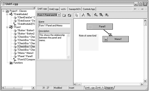
The Diagram tab is only present for top-level components such as forms and data modules. When you click the tab, the Object Tree View switches to show the correct top-level component and its children. You can then drag components from the Object Tree View to the diagram editor. The diagram editor will automatically connect the components if they have a relationship such as parent/child.
You can also add notes to the diagram to indicate the function of specific components or design rationales, or other similar information.
The components in the diagram are live in the sense that deleting them from the form or Object Tree View will delete them from the diagram. The reverse, however, is not true ”the component can be deleted from the diagram without affecting the actual instance of that component in your project.
On the other hand, if you click the component in the diagram you select the component on the form and the Object Tree View. This suggests the most important use of diagrams ”clustering components into meaningful groups that are separate from the parent/child or positioning relationships. This is helped by the ability to have multiple diagrams for each top-level component.
The toolbar allows, from left to right:
-
Selection of the diagram to edit
-
Creation of a new diagram, deletion of the current diagram
-
Selection of a diagram element
-
Adding a sticky note
-
Drawing a relationship line between two components
-
Drawing a property navigation line between two components (though this is performed automatically for most components that refer to each other)
-
Drawing a master detail relationship between two data sets
-
Drawing a lookup relationship between two data sets
Each diagram must have a name and can have a description.
When the project is saved, the diagram is saved with it, apparently in the .bpr (project) file.
Code Insight
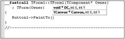
The Code Insight feature of the IDE is an important one. A difficult challenge for a developer is getting to know all the many functions of class libraries and their parameters. Code Insight enables you to see these methods and parameters as you type in the Source Code Editor. Figure 2.9 shows Code Insight offering a set of possible methods for the object to the left of the pointer to member operator. As you type a possible method name, the number of entries shown shrinks to those whose initial characters match what you've typed so far. Functions with void return are displayed in teal (bluish green) and functions with return values are dark blue.
Figure 2.8. Code Insight offers a function definition.
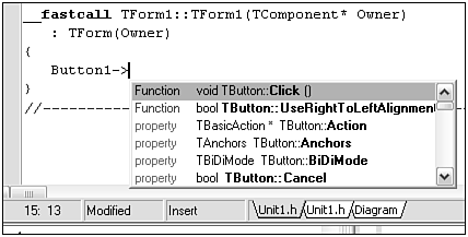
Figure 2.9 shows Code Insight offering two possible argument lists because there are two separate overloaded functions for the PaintTo capability.
Figure 2.9. Code Insight offers an argument list.
The OpenTools API enables you to create custom code completion managers. See Chapter 23, " Open Tools API," for more information.
If you Ctrl-click any entry in the list, the Source Code Editor retrieves the header file that contains the declaration of the function, positioned right on the function.
You can also resize the code completion pop-up window, and that size is remembered across sessions.
If you have the Professional or Enterprise Edition, you also get code completion for HTML documents.
Forms ”Save As Text
This feature saves forms as text rather than in binary form and is the default.
Right-click any project form to get the context menu. The Text DFM option is checked by default.
When the form unit or project is saved, the form will be stored as plain text in its DFM file. An example text DFM file is shown in Listing 2.1.
Listing 2.1 An Example DFM File Saved as Text
object Form1: TForm1 Left = 192 Top = 107 Width = 311 Height = 158 Caption = 'Text Form' Color = clBtnFace Font.Charset = DEFAULT_CHARSET Font.Color = clWindowText Font.Height = -11 Font.Name = 'MS Sans Serif' Font.Style = [] OldCreateOrder = False PixelsPerInch = 96 TextHeight = 13 object Label1: TLabel Left = 13 Top = 24 Width = 277 Height = 20 Caption = 'This form is saved as text (default)' Font.Charset = DEFAULT_CHARSET Font.Color = clWindowText Font.Height = -16 Font.Name = 'MS Sans Serif' Font.Style = [fsBold] ParentFont = False end object Button1: TButton Left = 114 Top = 72 Width = 75 Height = 25 Caption = 'OK' TabOrder = 0 OnClick = Button1Click end end
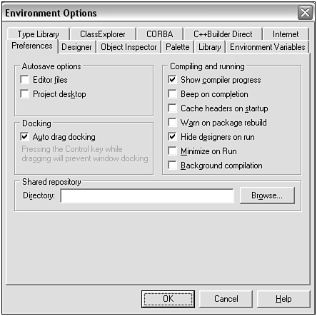
Unchecking the Text DFM option of a form will cause the form to be saved as binary. You can make this the default for all new forms by unchecking the New Forms as Text option on the Preferences tab of the Environment Options dialog box, shown in Figure 2.10. This is reached by selecting Tools, Environment Options from the main C++Builder menu.
Figure 2.10. The Preferences tab of the Environment Options dialog box.
Note, however, that the text version of a form is much less likely to be incompatible with prior or following versions than the binary version.
 |
| |
| Top |