Introduction to Maya Windows Structures
Introduction to Maya Windows Structures
A user interface window in Maya is similar in many ways to geometric objects that are built in Maya; that is, their structures are hierarchical. Various elements are nested within each other, placed relative to each other, and are referred to by their familial lineage.
Windows
At the root of any Maya UI window is, and this should come as no surprise, the window . Windows exist as floating panels, and can be dismissed by either the user or by the issuance of a MEL command. Although optional, most windows use the title bar , and the minimize button . Although it is possible to have a maximize button , many leave this particular element off their user interfaces. The window also gets a free additional element of an optional menu bar. All these options are seen in Figure 10.1, with the code to draw the window seen in Example 10.1.
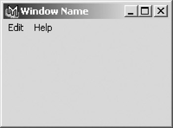
Figure 10.1: A window with all options on.
Example 10.1: The MEL code that created the window in Figure 10.1.
string $window = `window -title "Window Name" -iconName "Icon Name" -widthHeight 200 350 -menuBar on -menuBarVisible on -minimizeButton on -maximizeButton on -sizeable on -titleBar on`; menu -label "Edit" -tearOff false; -label "Nothing"; menu -label "Help" -tearOff 0; menuItem -label "Script Information"; menuItem -divider 1; menuItem -label "Visit Charles River Media Homepage" -command "showHelp absolute \"http:\//www.charlesriver.com\""; showWindow $window;
A window is by default invisible. While it might seem strange and somewhat counter-intuitive to have invisible windows, making a window visible is simply a matter of issuing the showWindow command. The reason being is that in between the two commands is where the actual window is built. First, the window is created, and once all of its elements are in place, the window is made visible. This entire process takes mere fractions of a second in most cases, but the process is important.
As designers, we have a fair amount of control over how a window initially appears. Window size and placement are under the control of the scripter ”initially. Unfortunately, the engineers at AliasWavefront insist on giving those pesky end users control over how their windows will appear, remembering their position and size when they are closed. We can turn this option off, either in the Maya preferences or via the MEL command windowPref “remove windowName , which will allow us to explicitly size and place the window every time.
To this point, we have only discussed windows for UIs you want to create yourself. There are, however, a variety of situational windows available to a MEL scripter. These windows allow for simple interaction and feedback with the end user. The most important of these windows are the Confirm dialog , the Prompt dialog , and the Progress window . We call these Modal windows .
The Confirm Dialog window acts as a safety measure in scripts. Often, it is good practice and simply polite to include a Confirm dialog in a script, which through its most basic functionality is destructive or can take an extraordinary long time to complete. The actual window, seen in Figure 10.2 is created with the command confirmDialog , with the options seen in Example 10.2.
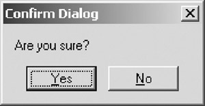
Figure 10.2: The typical Confirm dialog.
Example 10.2: The MEL code that created the window in Figure 10.2.
confirmDialog -title "Confirm Dialog" -message "Are you sure?" -button "Yes" -button "No" -defaultButton "Yes" -cancelButton "No" -dismissString "No";
When called from a script, the execution of that script pauses while waiting for the user to respond. When the user issues his choice via the dialog, we capture that value and use it in an if statement to control the execution of the remainder of the script.
The Prompt Dialog window, such as that seen in Figure 10.3, provides a way for additional input to be provided to a script during the execution of the script.
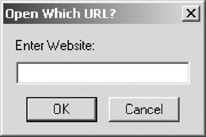
Figure 10.3: A Prompt dialog.
Example 10.3: The MEL code that created the window in Figure 10.3.
string $URL; string $result = `promptDialog -title "Open Which URL?" -message "Enter Website:" -button "OK" -button "Cancel" -defaultButton "OK" -cancelButton "Cancel" -dismissString "Cancel"`; if ($result == "OK") { $URL = `promptDialog -query`; showHelp -absolute $URL; } Prompt dialogs are very useful in scripts that need only a single piece of user provided information, especially if that information is text. By using the dialog, called with the promptDialog command as seen in Example 10.3, allows the command to be included in a menu or as a shelf button rather than using a variable passed to the procedure. This makes the script both more user friendly and more flexible, which should be the goal of any script after functionality is achieved. Because they are so easily implemented, a series of Prompt dialogs can be used to quickly add interaction to a script, while a more robust UI is developed. The Prompt dialog, unlike the Confirm dialog, needs to be queried before the data can be accessed and used.
The Progress window is one of the best additions to the MEL language since its introduction. Previously, the only way to let the user know his script was doing anything was to use the command waitCursor . However, as of Maya 4, it is now possible to give real-time feedback to the user as the script progresses. The Progress window, like the one seen in Figure 10.4, is issued updates from within the script, often in the default form as a percentage.
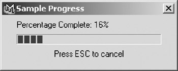
Figure 10.4: A Progress window.
The Progress window can be updated with an explicit value, but the total number of operations needed must be known. For this reason, it is almost never used in a while loop; rather, it is easy to use in a for loop, as seen in Example 10.4. The other extremely useful aspect of the Progress window is that it allows the user to cancel a process. For this reason alone, even if a script will not take 20 minutes to execute, it can be beneficial to implement one into loops .
Example 10.4: Creation of a Progress window.
int $amount = 0; progressWindow -title "Sample Progress" -progress $amount -status "Percentage Complete: 0%" -isInterruptable true; for ($amount = 0;$amount < 100 ;$amount++) { if (`progressWindow -query -isCancelled`) break; progressWindow -edit -progress $amount -status ("Percentage Complete: " + $amount + "%"); pause -seconds 1; } progressWindow -endProgress; Layouts
The window is, in effect, a holder, an empty vessel waiting to be filled. The first step is to add a layout . Layouts provide the basic framework for all the elements that will be placed within any given window. In the following section, we will first gain an understanding of the various layouts available, and then cover their positioning, sizing, and unique attributes.
A Column Layout , seen in Figure 10.5, places its children in a vertical column. In the example pictured, five buttons are stacked on top of each other. The code that draws this window is seen in Example 10.5.
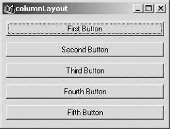
Figure 10.5: A columnLayout with five buttons.
Example 10.5: The MEL code that created the window in Figure 10.5.
window -title "columnLayout"; columnLayout -columnAttach "both" 5 -rowSpacing 10 -columnWidth 250; button -label "First Button"; button -label "Second Button"; button -label "Third Button"; button -label "Fourth Button"; button -label "Fifth Button"; showWindow;
Column Layouts are perhaps the most basic of all layouts, perhaps equaled only by the Row Layout . A Row Layout, like the one seen in Figure 10.6, places its children in a horizontal row. As seen in Example 10.6, the command to define the Row Layout is slightly more involved than the columnLayout command.
Figure 10.6: A rowLayout with five buttons.
Example 10.6: The MEL code that created the window in Figure 10.6.
window -title "rowLayout"; rowLayout -numberOfColumns 5 -columnWidth5 60 70 80 190 100 -adjustableColumn 2 -columnAlign 1 "right" -columnAttach 1 "both" 0 -columnAttach 2 "both" 0 -columnAttach 3 "both" 0 -columnAttach 4 "both" 0 -columnAttach 5 "both" 0 ; button -label "First Button"; button -label "Second Button"; button -label "Third Button"; button -label "Fourth Button"; button -label "Fifth Button"; showWindow;
Because of their simplicity, the Column and Row Layouts can be used to quickly and easily create UIs that do not require a large variety of controls or need to be built dynamically.
Although the Column Layout and the Row Layout are often used, there is a layout that simplifies their implementation. The rowColumn layout allows a user to create either a Row Layout or a Column Layout depending on the flags used during creation.
If you took a Row Layout and a Column Layout and combined them, you would get the Grid Layout , seen in Figure 10.7, and the corresponding code in Example 10.7.
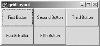
Figure 10.7: A gridLayout with nine buttons.
Example 10.7: The MEL code that created the window in Figure 10.7.
window -title "gridLayout"; gridLayout -numberOfColumns 3 -cellWidthHeight 90 50; button -label "First Button"; button -label "Second Button"; button -label "Third Button"; button -label "Fourth Button"; button -label "Fifth Button"; showWindow;
Grid layouts are limited by the fact that each cell has to be the same dimension.
Obviously, the previous examples provide simple holders of UI elements. Often, a UI will need to be somewhat more interactive. There are four layouts that provide ways of making windows more interactive, often allowing a large amount of controls to be compressed into a smaller window.
Perhaps the most infrequently used of all layouts is the Pane Layout , seen in Figure 10.8. Pane Layouts allow the end user to resize elements of the window by dragging a divider. Pane Layouts can be built with up to four sections.
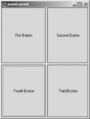
Figure 10.8: A four-paned paneLayout.
Example 10.8: The MEL code that created the window in Figure 10.8.
window -title "paneLayout" -widthHeight 280 370; paneLayout -configuration "quad"; button -label "First Button"; button -label "Second Button"; button -label "Third Button"; button -label "Fourth Button"; showWindow;
Note that when setting the sizing of the various panes, the values are percentages, rather than the pixel values used by most other layouts. The code used in Example 10.8 uses the default values.
The Tab Layout is a very easy way of putting a large number of controls in one window. Seen in Figure 10.9, the Tab Layout creates pages, each one containing its own set of controls. As seen in Example 10.9, the code used to draw this window uses child layouts to create the tabs. We will cover child layouts later in this chapter.
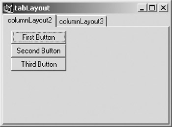
Figure 10.9: A window containing a tabLayout.
Example 10.9: The MEL code that created the window in Figure 10.9.
window -title "tabLayout" -widthHeight 280 370; tabLayout -innerMarginWidth 5 -innerMarginHeight 5; columnLayout -columnAttach "both" 5; button -label "First Button"; button -label "Second Button"; button -label "Third Button"; setParent..; columnLayout -columnAttach "both" 5; button -label "Fourth Button"; button -label "Fifth Button"; setParent..; showWindow;
One of the more useful interactive layouts is the Frame Layout . The Frame Layout surrounds its child with a frame that can be made collapsible. In Figure 10.10, the same frame layout is seen both open and collapsed . Note that while in Example 10.10 our frame layouts are created with the frames open, it is possible to close them from within code.
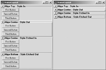
Figure 10.10: The same frameLayout, both open and closed.
Example 10.10: The MEL code that created the window in Figure 10.10.
window -title "frameLayout" -widthHeight 280 370; columnLayout -adjustableColumn true; frameLayout -label "Align Top : Style In" -labelAlign "top" -borderStyle "in" -collapsable true; -columnAttach "both" 5; button -label "First Button"; button -label "Second Button"; button -label "Third Button"; setParent..; setParent ..; frameLayout -label "Align Center : Style Out" -labelAlign "center" -borderStyle "out" -collapsable true; columnLayout -columnAttach "both" 5; button -label "First Button"; button -label "Second Button"; button -label "Third Button"; setParent..; setParent ..; frameLayout -label "Align Center : Style Etched In" -labelAlign "center" -borderStyle "etchedIn" -collapsible true; columnLayout -columnAttach "both" 5; button -label "First Button"; button -label "Second Button"; button -label "Third Button"; setParent..; setParent ..; frameLayout -label "Align Bottom : Style Etched Out" -labelAlign "bottom" -borderStyle "etchedOut" -collapsable true; columnLayout -columnAttach "both" 5; button -label "First Button"; button -label "Second Button"; button -label "Third Button"; setParent..; setParent ..; showWindow;
The last of the truly interactive layouts is the Scroll Layout . Scroll layouts provide just that, a scrolling window, similar to a Web browser or word processor, which allows a large amount of controls to fit into a single window. In Figure 10.11 we see the same window, first without a scroll layout, and then with a scroll layout holding the remaining controls. Example 10.11 shows how the scroll layout equipped window was created.
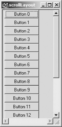
Figure 10.11: The same window; the second view has a scrollLayout.
Example 10.11: The MEL code that created the window in Figure 10.11.
window -title "scrollLayout" -widthHeight 70 100; scrollLayout -horizontalScrollBarThickness 10 -verticalScrollBarThickness 10; columnLayout -columnAttach "both" 5; for ($i = 0; $i < 20; $i++) button -label ("Button " + $i); showWindow; Maya has never been accused of not using all of its available screen real estate, so if a window does take up a fair amount of the screen by default, it is often a good idea to include a scroll layout to consider the inevitable resizing any end user will do, if the window allows it.
Although perhaps not the most interactive of user interface layouts, perhaps the most familiar and the easiest to add functionality to is the Shelf Layout . The shelf layout embeds a standard Maya shelf into a window. It has a sibling layout, the Shelf Tab Layout , which provides a shortcut to creating tabbed shelves , and includes the trashcan used for discarding shelf elements. A shelf layout is seen in Figure 10.12, created with Example 10.12.
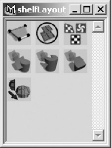
Figure 10.12: A shelfLayout.
Example 10.12: The MEL code that created the window in Figure 10.12.
window -title "shelfLayout" -widthHeight 150 200; shelfLayout PolyModel; -enableCommandRepeat 1 -enable 1 -width 34 -height 34 -manage 1 -visible 1 -annotation "Create Polygon Tool: Create polygon faces" -label "Create Polygon Tool" -image1 "polyCreateFacet.xpm" -style "iconOnly" -command "setToolTo polyCreateFacetContext ; polyCreateFacetCtx -e -pc `optionVar q polyKeepFacetsPlanar` polyCreateFacetContext" -doubleClickCommand "setToolTo polyCreateFacetContext ; polyCreateFacetCtx -e -pc `optionVar -q polyKeepFacetsPlanar` polyCreateFacetContext; toolPropertyWindow"; shelfButton -enableCommandRepeat 1 -enable 1 -width 34 -height 34 -manage 1 -visible 1 -annotation "Combine: Combine the selected polygon objects into one single object to allow operations such as merges or face trims" -label "Combine" -image1 "polyUnite.xpm" -style "iconOnly" -command "polyPerformAction polyUnite o 0" ; shelfButton -enableCommandRepeat 1 -enable 1 -width 34 -height 34 -manage 1 -visible 1 -annotation "Transfer: Select two objects to be crossed" -label "Transfer" -image1 "polyTransfer.xpm" -style "iconOnly" -command "performPolyTransfer 0" ; shelfButton -enableCommandRepeat 1 -enable 1 -width 34 -height 34 -manage 1 -visible 1 -annotation "Union: Performs a boolean Union on the selected polygon objects, creating a new object" -label "Union" -image1 "polyBooleansUnion.xpm" -style "iconOnly" -command "polyPerformAction \"polyBoolOp -op 1\" o 0"; shelfButton -enableCommandRepeat 1 -enable 1 -width 34 -height 34 -manage 1 -visible 1 -annotation "Difference: Performs a boolean Difference on the selected polygon objects, creating a new object" -label "Difference" -image1 "polyBooleansDifference.xpm" -style "iconOnly" -command "polyPerformAction \"polyBoolOp -op 2\" o 0"; shelfButton -enableCommandRepeat 1 -enable 1 -width 34 -height 34 -manage 1 -visible 1 -annotation "Intersection: Performs a Boolean Intersection on the selected polygon objects, creating a new object" -label "Intersection" -image1 "polyBooleansIntersection.xpm" -style "iconOnly" -command "polyPerformAction \"polyBoolOp op 3\" o 0"; shelfButton -enableCommandRepeat 1 -enable 1 -width 34 -height 34 -manage 1 -visible 1 -annotation "Mirror: Mirror geometry across an axis." -label "Mirror Geometry" -image1 "polyMirrorGeometry.xpm" -style "iconOnly" -command "waitCursor -state on; polyMirror 1 0 0 off; waitCursor -state off" -doubleClickCommand "performPolyMirror 1"; showWindow;
Although there are a few other infrequently used layouts, that provides an overview of all the major layouts except one ”the Form Layout . If there is a secret to creating good-looking interfaces in Maya, it is the form layout. Form Layouts allow the placement of its children either relative to each other or with absolute values. More detail on the use of the form layout and the placement of elements is found later in this chapter.
Layout Hierarchy
One thing that is key to creating useful and logical window designs is to nest and layer layouts. Some layouts, such as the tab layout, essentially require it, because they only allow one child. For example, in Figure 10.13 we see a row layout, which has three columns. Each of those columns contains a column layout, and each of those column layouts contains three buttons. The code for this window is seen in Example 10.13.
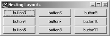
Figure 10.13: Nesting layouts.
Example 10.13: The MEL code that created the window in Figure 10.13.
window -title "Nesting Layouts"; rowLayout -numberOfColumns 3 -columnWidth3 100 100 100 -columnAlign 1 "right" -columnAttach 1 "both" 0 -columnAttach 2 "both" 0 -columnAttach 3 "both" 0 ; columnLayout -columnAttach "both" 5 -rowSpacing 2 -columnWidth 100; button; button; button; setParent..; columnLayout -columnAttach "both" 5 -rowSpacing 2 -columnWidth 100; button; button; button; setParent..; columnLayout -columnAttach "both" 5 -rowSpacing 2 -columnWidth 100; button; button; button; setParent..; showWindow;
By nesting layouts, it is quite easy to create incredibly dense and rich interfaces. For example, by nesting some column layouts within some frame layouts within some tab layouts, it would be possible to pack dozens of buttons in a small window, such as that seen in Figure 10.14.
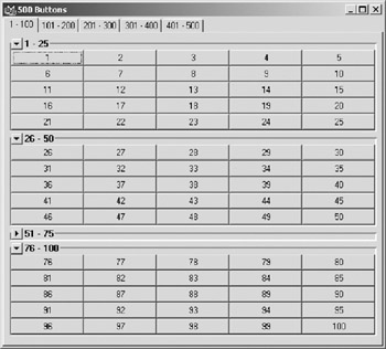
Figure 10.14: Packing 500 buttons into a single window.
Now that we have access to a variety of layouts, we need to begin adding the sliders, buttons, and other items that add functionality to an interface. These items, as a general class of items, are called controls .
Controls
Controls often have a basic form, and then a form that combines various controls into a single control to make UI creation theoretically easier. For example, the control Float Slider creates a control for entering in a single floating-point value using a slider. There is also a control entitled Float Slider Group , which creates a collection of a slider, a label, and a float field as a single control. While this could be useful, it is often better to construct the elements separately to achieve more precise control over the placement of various elements in the window.
There are a few classes of controls that differ only by what type of data they hold. Similar to variables , a control designed to hold a string can still hold a floating point, but not the other way around. This is not to say you need to explicitly have a control be the same type of number with which you want to interact. For example, if you are dealing with a percentage value, you might want to use an integer slider going from 0% to 100%. For the same value, you might instead want to use a floating-point slider going from 0.0% to 100.0%. The choice is made based on what the value is to be used for and how much control you want to give to the end user.
Control Types
The first of the basic classes of controls that exist for multiple data types is the field . Field controls allow the entry of data explicitly. In Figure 10.15, we see a window containing the three basic field controls ”the text field , the int field , and the float field . As seen in Example 10.14, even controls as simple as these have a wide variety of options and arguments.
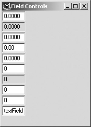
Figure 10.15: Various fields.
Example 10.14: The MEL code that created the window in Figure 10.15.
window -title "Field Controls" -widthHeight 190 500; columnLayout; floatField; floatField -editable false; floatField -minValue -20 -maxValue 20 -value 0; floatField -minValue 0 -maxValue 1 -precision 2; floatField -minValue -1 -maxValue 1 -precision 4 -step .01; intField; intField -editable false; intField -minValue -10 -maxValue 10 -value 0; intField -minValue -1000 -maxValue 1000 -step 10; textField -text "textField"; showWindow;
In addition to the basic fields, each also has a version representing a control group. Control groups allow multiple fields to be created by and accessed with a single control command. The choice to use a field group rather than multiple individual fields is often defined by what data is held in the control and the desired appearance of the UI. For example, in Figure 10.16, we see two possible control setups. The first control is a float field group containing, in this pretend example, the translate data for some object. The second control is actually three individual float fields, but by constructing them separately, each can be given its own label, as well as a vertical orientation to the three fields. In Example 10.15, it is evident that creating these structures as individual elements is not significantly more complex than using the control groups.
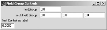
Figure 10.16: Using groups vs. individual elements.
Example 10.15: The MEL code that created the window in Figure 10.16.
window -title "Field Group Controls" -widthHeight 390 110; columnLayout; floatFieldGrp -numberOfFields 1 -label "fieldGroup"; floatFieldGrp -numberOfFields 3 -label "multiField Group"; text -label "Text Control as label"; floatField; showWindow;
In addition to the three basic fields, there are some additional fields that are more specialized in their functionality. For example, the Name Group creates a text field linked to the name of an object in the Maya scene. When the object is renamed , the field updates, or you could use the field to rename the object. Another control related to the text field is the Scroll Field , which creates a large scrolling area for text entry.
Two basic control types that are similar are scrolls and sliders . Seen in Figure 10.17, which shows an Integer Slider and an Integer Scroll , the differences between scrolls and sliders might seem to be mainly cosmetic. However, the addition of the arrows on the scroll allows for finite tuning of the value the control influences. Example 10.16 shows how the window was constructed .
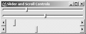
Figure 10.17: A slider vs. a scroll control.
Example 10.16: The MEL code that created the window in Figure 10.17.
window -title "Slider and Scroll Controls"; columnLayout -adjustableColumn true; intSlider; intSlider -min 0 -max 100 -value 0 -step 1; floatScrollBar; floatScrollBar -min 0 -max 100 -value 0 -step 1 -largeStep 10; showWindow;
Both sliders and scrolls can be oriented either horizontally or vertically. Moreover, like fields, sliders can be created in groups. In addition, there exists specialty sliders, the Color Slider Group and the Color Index Slider Group , designed specifically to pick colors, either any RGB/HSV value in the case of the Color Slider, or one of the user s index color values by the latter. In both cases, clicking on the color swatch automatically brings up the appropriate editor. In Figure 10.18 we see both controls, and although they appear nearly identical, they are separate control types, evident in the code seen in Example 10.17.
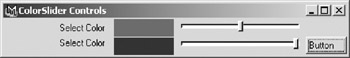
Figure 10.18: Color Picking Sliders.
Example 10.17: The MEL code that created the window in Figure 10.18.
window -title "ColorSlider Controls"; columnLayout -adjustableColumn true; colorIndexSliderGrp -label "Select Color" -min 0 -max 20 -value 10; colorSliderButtonGrp -label "Select Color" -buttonLabel "Button" -rgb 1 0 0; showWindow;
In addition to the scroll controls that are linked to numeric values, the Text Scroll List control allows for a listing of text elements. It is possible to define whether the end user is allowed to select only a single element in the list, or multiple items. Text scroll lists are extremely effective in interfaces in which a user needs to interact with a string array, and are often used for mass editors, such as a tool to quickly access every light in the scene, for example. A Text Scroll List is used in the window seen in Figure 10.19, drawn with the code in Example 10.18
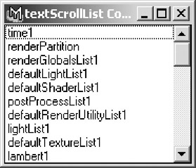
Figure 10.19: The textScrollList control.
Example 10.18: The MEL code that created the window in Figure 10.19.
string $sceneList[] = `ls`; window -title "textScrollList Control"; columnLayout -adjustableColumn true; string $scroll = `textScrollList -numberOfRows 10 -allowMultiSelection true`; for ($each in $sceneList) textScrollList -edit -append $each $scroll; showWindow;
The other two control types that are most often used to control data are the checkbox and the radio button . Checkboxes are used for controlling Boolean attributes or variables, such as the visibility of an object. Like previous controls, checkboxes can be created in groups of up to four individual checkboxes. A window showing four individual checkboxes is seen in Figure 10.20, drawn with Example 10.19.
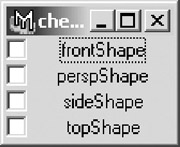
Figure 10.20: Checkboxes in use.
Example 10.19: The MEL code that created the window in Figure 10.20.
string $camList[] = `ls -type "camera"`; window -title "checkBox Controls"; columnLayout -adjustableColumn true; for ($each in $camList) checkBox -label $each; showWindow;
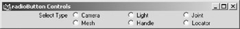
Radio buttons are actually elements of another control, the radio collection . Because only one of the individual radio buttons that contribute to a radio collection can be selected at any one time, radio collections are useful for accessing enum attributes, or for giving user interface interaction with a switch case conditional statement. There is a radio button group, and it is possible to link multiple groups together, allowing only one radio button across multiple groups to be selected. A radio collection is seen in the window shown in Figure 10.21. As is seen in Example 10.20, the radio collection is constructed of two smaller collections that are linked.
Figure 10.21: A six-button radio collection.
Example 10.20: The MEL code that created the window in Figure 10.21.
window -title "radioButton Controls"; columnLayout -adjustableColumn true; string $group1 = `radioButtonGrp -numberOfRadioButtons 3 -label "Select Type" -labelArray3 "Camera" "Light" "Joint"`; radioButtonGrp -numberOfRadioButtons 3 -shareCollection $group1 -label "" -labelArray3 "Mesh" "Handle" "Locator"; showWindow;
The final interactive UI control that sees frequent use is the button . Buttons general appearance is largely dictated by the operating system, but for the most part they are rectangular and can be of nearly any size. There are a variety of ways buttons can be constructed. The standard button allows for only a text label; however, it is possible to use the symbol button to assign an image to the button, allowing for iconic representation. One advantage of using buttons as opposed to a shelf layout is you are not limited to only a 32x32 pixel bitmap for the icon image. In Figure 10.22, we see a window with both standard buttons and a single, large symbol button. In Example 10.21, we use a standard Maya icon for the image, but it can be of nearly any size. It is also often a good idea to pass the custom image name as a complete path .
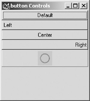
Figure 10.22: Various buttons.
Example 10.21: The MEL code that created the window in Figure 10.22.
window -title "button Controls" -widthHeight 200 225; columnLayout -adjustableColumn true; button -label "Default"; button -label "Left" -align left; button -label "Center" -align center; button -label "Right" -align right; symbolButton -image "circle.xpm"; showWindow;
It should be noted that many controls have an associated control group that includes a button object. While sometimes useful, it is often necessary to create each element individually to achieve a specific appearance.
While this does not represent a comprehensive list of every interactive interface control available, it does represent almost every control that is needed to build all but the most specialized interfaces. In addition to such specific controls as the layer button, there are also a large variety of controls that are used to create standard user interface features like the Channel Box or the Time Slider.
We have referred to the previous control items as interactive because the final three controls we will cover in any depth are the Text, Image , and Separator controls. While these controls can be changed and edited using MEL commands, the end user cannot directly modify them.
Use of the Text Control is often limited to creating labels and giving user feedback in the created user interface. In Figure 10.23, we have a Text Control to label the X, Y, Z fields of a collection of float fields, and another at the bottom of the interface, giving information on the interface purpose. Notice in Example 10.22 the use of the empty text control to fill in a layout "slot."
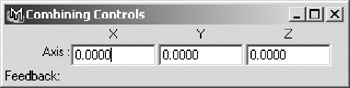
Figure 10.23: Using the text control for labeling.
Example 10.22: The MEL code that created the window in Figure 10.23. window
-title "Combining Controls" -widthHeight 320 80; columnLayout -adjustableColumn true; rowLayout -numberOfColumns 4 -columnWidth4 60 80 80 80 -columnAlign 1 right -columnAlign 2 center -columnAlign 3 center -columnAlign 4 center -columnAttach 1 both 0 -columnAttach 2 both 0 -columnAttach 3 both 0 -columnAttach 4 both 0 ; text -label ""; text -label "X" -align center; text -label "Y" -align center; text -label "Z" -align center; setParent..; rowLayout -numberOfColumns 4 -columnWidth4 60 80 80 80 -columnAlign 1 "right" -columnAttach 1 "both" 0 -columnAttach 2 "both" 0 -columnAttach 3 "both" 0 -columnAttach 4 "both" 0 ; text -label "Axis :"; floatField; floatField; floatField; setParent..; text -label "Feedback: " -align left; showWindow;
The Image Control is used to insert an image into the user interface. Images are often used in interfaces either to give instructions or provide some type of logo branding into an interface. One underused use of the image control is as labels for other controls. For example, a custom control UI window could use a mugshot somewhere within it to show which character the UI is for. Or, different phoneme shapes could be used to label sliders animating a blendshape node. In Figure 10.24, an image control is used in conjunction with a text control in a tab layout to give legal information, as well as a Web site URL.
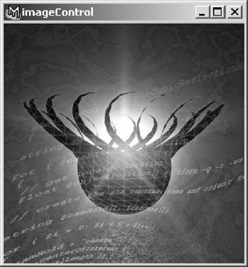
Figure 10.24: Placing an image in a window.
The Separator Control is simply that, a visual separator. Available in eight styles, separators are very useful for clarifying and organizing windows. Often, a window will have distinctly different sections, such as that seen in Figure 10.25. Using separator controls categorizes the sections, hopefully preventing any confusion a user might have when dealing with a complex window. See the code in Example 10.23 as a guide to the different separator types pictured.
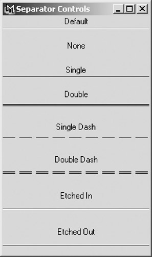
Figure 10.25: The different separators available.
Example 10.23: The MEL code that created the window in Figure 10.25.
window -title "Separator Controls" -widthHeight 220 370; columnLayout -adjustableColumn true; text -label "Default"; separator; text -label ""; text -label "None"; separator -style "none"; text -label ""; text -label "Single"; separator -style "single"; text -label ""; text -label "Double"; separator -height 15 -style "double"; text -label ""; text -label "Single Dash"; separator -height 15 -style "singleDash"; text -label ""; text -label "Double Dash"; separator -height 20 -style "doubleDash"; text -label ""; text -label "Etched In"; separator -height 20 -style "in"; text -label ""; text -label "Etched Out"; separator -height 20 -style "out"; text -label ""; showWindow;
Within a window, the sizing and placement of layouts and controls can sometimes be a frustrating process. As with the writing of script, planning is vital . It is often a good idea to sketch out a rough design of your window, or possibly construct a mockup in an image processing program before any real work is done.
Once a design has been decided upon, we need to break the window into its component elements. Often, it is possible to look at a single design and derive multiple solutions that will draw the window as we want.
Perhaps the most important thing to determine while designing a UI is what the hierarchy of layouts and controls is. In order to achieve the desired appearance of a window, it is necessary to build layouts in layers . For example, we see a typical window design in Figure 10.26.
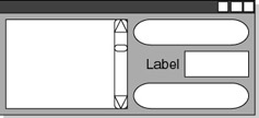
Figure 10.26: A window design diagram.
The secret, if it can be called that, to developing UIs is to learn to look at the big picture and carefully work our way through the layers, almost like an archaeologist. In our example, we can see that the window is mainly a horizontal layout, so we would use a Row layout, with two columns, seen in Figure 10.27.
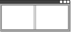
Figure 10.27: Breaking down the user interface elements.
In the left-hand column we need to place only a single control, the scrolling list of lights. However, in the second column, we want to add three different controls, two buttons with a float field separating them. To place all three of these in the second column, we need to place a column layout in the second column, as seen in Figure 10.28.
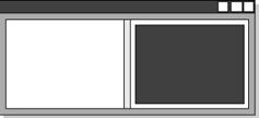
Figure 10.28: Designing the UI layout hierarchy.
We then can place the three controls into the column. When we discussed field controls, it was stated that to have finite control over the appearance of a UI it is often preferable to use separate controls for such things as labels and sliders. If we wished to do so here to label the float field, we would need to place a new row layout inside the column layout, otherwise the text control would be placed above the field control. Our layout design now looks like that seen in Figure 10.29.
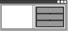
Figure 10.29: Further refinement of the UI hierarchy.
In the code to add the text and float field controls, we must then use the command setParent , to navigate back to the column layout. Similar to navigating a directory structure from a command line, we can either explicitly name the parent we want to navigate to, or simply move one level up by using setParent.. . After returning to the column layout, we would add the final button control and use setParent to return to the window level before using showWindow to make the window visible. It is often good practice to use the setParent.. form to add any additional controls to a layout.
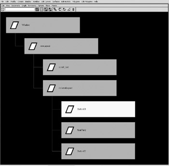
Figure 10.30: Visualizing the hierarchy in the Hypergraph with transforms.
This hierarchical relationship of controls and layouts and windows is absolutely vital to understand if we want to construct usable interfaces. It is a relationship that should already be familiar to any artist working in Maya, especially if we visualize it in a form more readily recognizable, like that seen in Figure 10.30.
Once all the familial relationships of the elements that make up a window are determined, decisions need to be made based on how the user is able to interact with the window. For example, will we allow the user to resize the window? If so, will the controls resize to fit or simply stay the same size and in the same position? If the controls do resize, will all of them, or just some of them?
The answers to these questions determine the options and arguments that will be used in the creation of the layouts and controls, specifically in regard to their adjustability and attachment properties.
Some layouts allow you to set the adjustability of one or more sections. For example, if a two-column row layout is created, we can set options so that neither column grows when the window is resized, that only the left or right column is resized, or that both are resized together.
Related to adjustability is the attachment argument available to most controls and layouts. Attachment allows controls to have their sides linked, or attached to the sides of a layout. This allows for very specific relationships among controls and layouts to be developed, keeping the appearance of UIs consistent and attractive even as a window is resized.
The concept of attachment is the key to what is regarded as the most powerful of all layouts available to a MEL scripter, the Form layout. In the form layout, each child is explicitly attached, either to the edges of the form layout itself, or to a sibling control or layout. It is also possible to attach the edges of controls to arbitrary division markers within the layout. By default, there are 100 divisions to a form layout in each direction, allowing, for example, a button to always occupy 75% of the width of the layout.
Using the form layout is often the best choice when creating user interfaces in which exacting control is needed. Although slightly more complex to construct than a simple column or row layout, the results, especially in more complex UIs, are well worth the effort. Because layouts can be nested, it is always a good idea to use form layouts as the final holder of your controls, even if they are the child of a tab layout or frame layout or even a simple column layout.
Naming
Like nodes within a Maya scene, every layout and control has to have its own unique name, and when the layout or control is created, the command returns a string giving the name of the created element. While capturing these names these names to variables can be useful when using the form layout, since controls are attached to each other by names , it is important to explicitly name any control you want to later query for information. In Example 10.24, we create a window with a text field control, which is seen in Figure 10.31.
Example 10.24: The MEL code that created the window in Figure 10.31.
string $window = `window testWindow`; string $textField = `textField -text "MEL is Cool!" testTextfield`; showWindow $window;
Figure 10.31: The textField window.
We can then reference the control, even from another procedure, seen in Example 10.25.
Example 10.25: Using the textField command to query the text in the control.
string $textInField = `textField -query -text testTextfield`; // Result : MEL is Cool!
It is also vital to name windows, and to check for the existence of a window before attempting to create the window. There are actually two approaches a programmer can take on the process of creating a window if there is a pre-existing window. The first is to delete the existing window and create a new version of the window. This method is demonstrated in Example 10.26.
Example 10.26: A conditional statement deletes the window if it already exists, and then recreates it.
if (`window exists testWindow`) deleteUI testWindow; string $window = `window testWindow`; string $textField = `textField -text "MEL is Cool!" testTextfield`; showWindow $window;
The other method is to create the window only if the window does not already exist. While both methods are valid approaches, the second, as seen in Example 10.27, is slightly more elegant.
Example 10.27: Nesting the window command in a conditional statement.
if (`window exists testWindow` != 1) { string $window = `window testWindow`; string $textField = `textField -text "MEL is Cool!" testTextfield`; showWindow $window; } UI Templates
In order to easily keep UI elements consistent, and to aid in the elimination of repetitive typing, it is possible to define templates for controls and layouts. Not only do templates aid in keeping UI elements consistent, but because the definitions held in the template are kept in a parsed state, UIs containing large numbers of the same element that can be largely defined in the template are built faster.
Working with UI templates requires the use of two commands, in addition to the commands for any UI element you want to define new default parameters for. The first step is to create the actual template. Again, as with every situation where we use MEL to create an object, we use an if statement to first confirm that it does not already exist. This confirmation, as well as the creation of a UI template called tmcUITemplate , is seen in Example 10.28.
Example 10.28: Adding a UITemplate.
if (`uiTemplate exists tmcUITemplate` != 1) uiTemplate tmcUITemplate;
After the template has been created, it is a simple matter of defining new default parameters for UI elements, such as that seen in Example 10.29, by using the flag “defineTemplate with the name of the desired template as the argument.
Example 10.29: Adding values to our template definition.
button -defineTemplate tmcUITemplate -height 25 -align "right"; columnLayout -defineTemplate tmcUITemplate -columnAttach "both" 5;
Now, in order to use the template, we have to tell Maya to make it the active template. After which, whenever a button control is used, it will conform to the new default values defined in Example 10.29. In Example 10.30, we build a window using the default variables for the controls.
Example 10.30: The MEL code that created the window in Figure 10.32.
window; columnLayout -rowSpacing 2 -columnWidth 250 ; button -label "Button One"; button -label "Button Two"; button -label "Button Three"; button -label "Button Four"; button -label "Button Five"; showWindow;
Giving us the result seen in Figure 10.32.
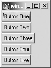
Figure 10.32: The window created using the default Maya values.
If we look at the results of this same window creation code, but with the template active, we get a different look. To make the template active, we use the setUITemplate command. This is seen in action in Example 10.31, with the results seen in Figure 10.33.
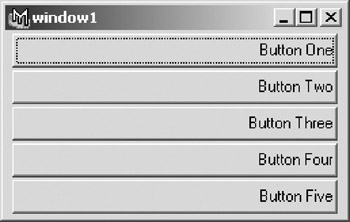
Figure 10.33: The same window, using our template.
Example 10.31: The MEL code that created the window in Figure 10.33.
window; setUITemplate -pushTemplate tmcUITemplate; columnLayout -rowSpacing 2 -columnWidth 250 ; button -label "Button One"; button -label "Button Two"; button -label "Button Three"; button -label "Button Four"; button -label "Button Five"; setUITemplate -popTemplate; showWindow;
Now that we have a fair understanding of the syntax and logic used to create interfaces, we will complete three projects dealing with common approaches to interface creation: Modal Dialogs, Using MEL Features to Dynamically Build a UI, and Building a Designed UI.
EAN: 2147483647
Pages: 101