Hack 26 Create Charts and Graphs from Raw Data
| < Day Day Up > |
Hack 26 Create Charts and Graphs from Raw Data Put a friendly face on your data before turning it into PDF . Instead of chilling readers with tables of raw data, invite them to understand your numbers by displaying them in charts or graphs. Popular word processors can create charts for you, or you can use free software to create graphs. 3.4.1 Microsoft Word 2002, Word 2000, and Word:Mac v.X Select and copy your table data. In Word, select Insert When you first create a chart, Word enters a special state called Microsoft Graph. Exit this state by clicking the document page outside the chart. Re-enter this state by double-clicking the chart. Within this state, you can update the chart's Datasheet, change the chart type (Chart 3.4.2 Corel WordPerfectWordPerfect's charts behave much like Word's. In WordPerfect, you can select a table's data, right-click, and choose Chart to rapidly create a chart. WP's chart gallery (right-click and choose Gallery . . . ) offers dozens of chart types (as does Word's). I find WP's charts the easiest to style. 3.4.3 Sun StarOffice and OpenOffice Sun's word processor includes chart features that resemble those in Microsoft Word. Select Insert 3.4.4 Create Standalone Plots with gnuplotYou can also create standalone plots using gnuplot. Easily create basic 2D or 3D plots from input data, or program gnuplot to precisely style the output. Preview plots on-screen, and then render them as PostScript, PNG, or one of the many other supported formats. Visit http://www.gnuplot. info for downloads, documentation, and examples. gnuplot is free software. Store your two-dimensional data points in a text file like so (from DEMO/1.DAT ): -20.000000 -3.041676 -19.000000 -3.036427 -18.000000 -3.030596 ... Store your three-dimensional data points in a text file like so (from DEMO/GLASS.DAT ): 0.568000 0.000000 -0.911000 0.518894 0.231026 -0.911000 0.380066 0.422106 -0.911000 ... Launch gnuplot and an interactive shell opens. By default, gnuplot renders plots on-screen. View a basic 2D plot of DEMO/1.DAT like so: gnuplot> plot 'DEMO/1.DAT' View a basic 3D plot of DEMO/GLASS.DAT like so: gnuplot> splot 'DEMO/GLASS.DAT' Create a PostScript file from your plot like so (the second set output releases the output file handle): gnuplot> set term postscript enhanced color solid gnuplot> set output 'DEMO/1.ps' gnuplot> plot 'DEMO/1.DAT' gnuplot> set output Run one of the DEMO scripts that come with the Windows distribution like so: gnuplot> cd 'DEMO' gnuplot> load 'WORLD.DEM' gnuplot has a good interactive help system. To learn about a keyword, type help keyword (e.g., help term ). The gnuplot newsgroup, comp.graphics.apps.gnuplot , can also help you. 3.4.5 Show Relationships with GraphvizA graph illustrates relationships between nodes by connecting them with edges . A directed graph uses one-way edges, indicated by arrowheads. An undirected graph does not. Use directed graphs to illustrate hierarchies or workflows. Graphviz is a set of open source tools for creating graphs from input data. Visit http://www.research.att.com/sw/tools/graphviz/ for documentation, downloads, and examples. The Graphviz program we'll use is called dot . Here is a basic example taken from the dot user 's manual. Label nodes and describe their relationships using a text file: // example_graph.dot digraph G { main -> parse; main -> execute; main -> init; main -> cleanup; parse -> execute; execute -> make_string; execute -> printf; init -> make_string; main -> printf; execute -> compare; } Pass this text file to dot and specify an output file format. We use PostScript, but you can also use PNG, SVG, or one of more than two dozen other formats: dot -Tps example_graph.dot -o example_graph.ps The results in Figure 3-11 look good and make sense. Figure 3-11. Graphviz illustrating hierarchies nicely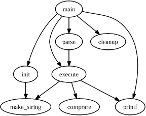 Graphviz can also create elaborate, colorful graphs. Visit the Graphviz web site to see some examples. |
 Picture
 | < Day Day Up > |
EAN: 2147483647
Pages: 158
- Chapter X Converting Browsers to Buyers: Key Considerations in Designing Business-to-Consumer Web Sites
- Chapter XII Web Design and E-Commerce
- Chapter XIII Shopping Agent Web Sites: A Comparative Shopping Environment
- Chapter XVII Internet Markets and E-Loyalty
- Chapter XVIII Web Systems Design, Litigation, and Online Consumer Behavior