TabControl
The TabControl control (for some reason, the word Control is part of the class’s name) displays a series of tabs attached to separate pages. Each page is a control container and can hold whatever controls you want for that tab. When you click a tab at design time or the user clicks one at runtime, the control displays the corresponding page.
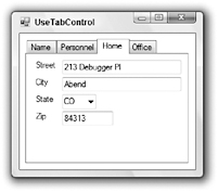
Figure G-24 shows a TabControl displaying information about an employee. The tabs contain the employee’s name and picture, personnel information (employee ID, Social Security number, and so on), home address, and office information (location and extension).

Figure G-24: A TabControl lets you easily display pages of related data.
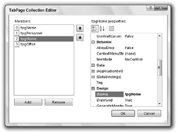
The control’s tabs are represented programmatically by TabPage objects contained in the control’s TabPages collection. To edit these objects interactively at design time, select the control’s TabPages property and click the ellipsis on the right to display the collection editor shown in Figure G-25.

Figure G-25: Use the TabPage Collection Editor to define a TabControl’s tabs.
The following table describes the TabPage object’s most useful properties.
| Property | Purpose |
|---|---|
| AutoScroll | If True, then the tab page automatically provides scroll bars if it is not big enough to display all of its contents. |
| BackColor | Determines the tab page’s background color. This affects the tab’s page, not the tab itself. |
| BackgroundImage | Determines the background image that tiles the tab’s page. This affects the tab’s page, not the tab itself. |
| BorderStyle | Determines the style of border around the tab’s page. This can be None, FixedSingle, or Fixed3D. |
| Font | Determines the font used by the controls contained in the tab’s page. To change the font used to draw the tabs, set the TabControl control’s Font property. |
| ImageIndex | If the TabControl control’s ImageList property is set to an ImageList control, this property determines the image within that list that the tab displays. |
| Text | Determines the text displayed on the tab. |
| ToolTipText | Determines the tooltip text displayed when the user hovers the mouse over the tab. This is ignored unless the TabControl control’s Show?Tool?Tips property is True. |
The TabPage object provides several events of its own. These include the usual assortment of events for a control container such as Click, Layout, Resize, Paint, and various mouse events.
The TabControl provides several properties that are useful for arranging the tabs. The following table describes the most useful of these properties.
| Property | Purpose |
|---|---|
| Alignment | Determines whether the control places its tabs on the Top, Bottom, Left, or Right. If you set this to Left or Right, then the control rotates its tabs’ text sideways. If a tab contains an image, the image is not rotated. |
| Appearance | Determines how the control displays its tabs. This property can take the value Normal, Buttons, or FlatButtons. |
| DrawMode | Determines whether the control draws the tabs automatically (DrawMode = Normal) or whether the code draws them (DrawMode = OwnerDrawFixed). See the discussion later in this section for an example. |
| Enabled | Determines whether the TabControl is enabled. If Enabled is False, then none of the tabs will respond to the user (although the tabs do not look disabled) and all of the controls on the tab pages are disabled. |
| Font | Determines the font that the control uses to draw its tabs. This does not affect the font used within the tab pages. |
| HotTrack | If this is True, then the tabs visually change when the mouse moves over them. For example, the tabs’ text may change color. |
| ImageList | Determines the ImageList control that provides images for the tabs. |
| ItemSize | Determines the height of all of the tabs. Also determines the width of fixed-width tabs (see the SizeMode property) and owner-drawn tabs (see the DrawMode property). |
| MultiLine | Determines whether the control allows more than one line of tabs. If MultiLine is False and the tabs won’t all fit, the control displays left-arrow and right-arrow buttons on the right to let the user scroll through the tabs. |
| Padding | Determines the horizontal and vertical space added around the tabs’ text and images. |
| RowCount | Returns the current number of tab rows. |
| SelectedIndex | Sets or gets the index of the currently selected tab. At design time, you can simply click the tab you want to select. |
| SelectedTab | Sets or gets the currently selected TabPage object. At design time, you can simply click the tab you want to select. |
| ShowToolTips | Determines whether the control displays the TabPage controls’ ToolTip values when the user hovers the mouse over the tabs. |
| SizeMode | Determines how the control sizes its tabs. This property can take the values Normal (tabs fit their contents), FillToRight (if the control needs more than one row of tabs, the tabs resize so each row fills the width of the control), and Fixed (all tabs have the same width). |
| TabCount | Returns the number of tabs. |
| TabPages | The collection of TabPage objects. |
The TabControl control’s most useful event is SelectedIndexChanged, which fires when the control’s selected tab index changes either because the user clicked a new tab, or because the code set the Selected?Index or SelectedTab property.
The following code shows how a program can draw ellipses on owner-drawn tabs, assuming that the TabControl control’s DrawMode property is set to OwnerDrawFixed. The code uses the DrawItem event handler parameters to get the tab’s bounds. It moves the bounding rectangle in from the upper-left corner and makes it a little smaller so it will fit completely inside the tab. The code outlines the ellipse on the selected tab with a wide line so it allows a little extra room if the tab it is drawing is currently selected. Next, the code checks the tab’s index and fills a green, yellow, or red ellipse. Finally, the program checks the tab’s state again and draws a black outline around the ellipse. If the tab is selected, it makes the outline four pixels wide.
' Draw ellipses in the tabs. Private Sub tabProject_DrawItem(ByVal sender As Object, _ ByVal e As System.Windows.Forms.DrawItemEventArgs) Handles tabProject.DrawItem ' Get the drawing bounds. Dim rect As Rectangle = e.Bounds If (e.State And DrawItemState.Selected) = DrawItemState.Selected Then ' Allow extra room for the selected tab. rect.X += 4 rect.Y += 4 rect.Width -= 8 rect.Height -= 8 Else rect.X += 2 rect.Y += 2 rect.Width -= 4 rect.Height -= 4 End If ' Fill the ellipse with the right color. Select Case e.Index Case 0 e.Graphics.FillEllipse(Brushes.Green, rect) Case 1 e.Graphics.FillEllipse(Brushes.Yellow, rect) Case 2 e.Graphics.FillEllipse(Brushes.Red, rect) End Select ' Outline the ellipse in black. If (e.State And DrawItemState.Selected) = DrawItemState.Selected Then ' Use a thick line for the selected tab. e.Graphics.DrawEllipse( _ New Pen(Color.Black, 3), _ rect) Else e.Graphics.DrawEllipse(Pens.Black, rect) End If End Sub The TabControl is ideal for displaying multiple pages of related information in a limited amount of space. It works particularly well when the information is naturally categorized and each tab represents a category of data. It doesn’t work as well if different tabs contain data that the user might want to compare to each other.
For example, suppose that the tabs contain information about a customer’s orders. Having different orders’ data on separate tabs makes it difficult for the user to compare two orders. If it is likely that the user will need to do that, you should consider some other method for displaying order data. For example, you could display orders in separate windows contained with an MDI container form.
EAN: N/A
Pages: 417