SplitContainer
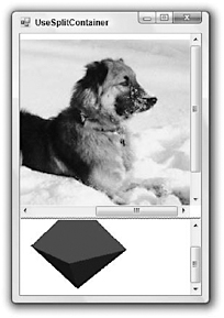
The SplitContainer control represents an area divided into two regions either vertically or horizontally. The control contains a bar (called the splitter) that the user can drag to adjust the amount of space given to each region. A SplitContainer divides the form in Figure G-21 vertically into two regions that contain pictures.

Figure G-21: This SplitContainer control divides an area vertically or horizontally.
Each of the SplitContainer control’s regions holds a Panel control. You can place other controls (such as the PictureBox controls used in Figure G-21) inside the Panels. You can also use the Panel control’s properties to affect their behavior. In Figure G-21, the Panel control’s AutoScroll properties were set to True so the Panel controls display scroll bars when either image cannot fit in its Panel.
The following table describes the SplitContainer control’s most useful properties.
| Property | Purpose |
|---|---|
| BorderStyle | Determines the control’s border style. |
| FixedPanel | Determines which panel keeps the same size when the control is resized. |
| IsSplitterFixed | Determines whether the user can drag the splitter. |
| Orientation | Determines whether the Panels are arranged vertically or horizontally. |
| Panel1 | Returns a reference to the first panel (left or top depending on Orientation). |
| Panel1Collapsed | Determines whether the first Panel is collapsed. When collapsed, a Panel is completely hidden and the user cannot get it back by dragging the splitter. |
| Panel1MinSize | Determines the minimum size (width or height depending on Orientation) of the first Panel. |
| Panel2 | Returns a reference to the second panel (right or bottom depending on Orientation). |
| Panel2Collapsed | Determines whether the second Panel is collapsed. When collapsed, a Panel is completely hidden and the user cannot get it back by dragging the splitter. |
| Panel2MinSize | Determines the minimum size (width or height depending on Orientation) of the second Panel. |
| SplitterDistance | Determines the distance from the control’s left or top edge (depending on Orientation) to the splitter. |
| SplitterIncrement | Determines the number of pixels by which the splitter will move when dragged. For example, if SplitterIncrement is 10, the splitter jumps in 10 pixel increments are you drag it. The default is 1. |
| SplitterRectangle | Returns a Rectangle representing the splitter’s current size and location within the SplitContainer. |
| SplitterWidth | Determines the splitter’s width in pixels. The default is 4. |
The SplitterContainer control’s most interesting events are SplitterMoving and SplitterMoved. You can catch these events if you need to take action when the user drags the splitter. You can also use the Panel controls’ sizing events Resize, ResizeBegin, ResizeEnd, and SizeChanged to take action when the Panel controls resize.
One rather confusing feature of the SplitterContainer is the way its contained Panel controls behave in the form designer. The drop-down list at the top of the Properties window lets you select the controls on the form, including the SplitterContainer. The Panel controls are contained inside the Splitter?Container, so they are not always listed in this drop-down. If you click on one of the Panel controls, then the drop-down lists the Panel and the Properties window lets you view and edit the control’s properties. If some other control is selected, however, the SplitterContainer is listed in the drop-down, but not its Panel controls.
EAN: N/A
Pages: 417