DateTimePicker
The DateTimePicker control allows the user select a date and time. The control can display one of several styles, depending on its property values.
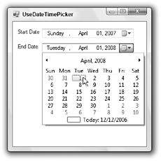
If the ShowUpDown property is True, the control displays small up and down arrows on its right, as shown at the top of Figure G-4. Click a date field (month, date, year) to select it, and use the up and down arrow buttons to adjust that field.
If ShowUpDown is False (the default), the control displays a drop-down arrow on its right, as shown in the second DateTimePicker in Figure G-4. If you click this arrow, the control displays the calendar shown under the control in Figure G-4. The right and left arrows at the top of the calendar let you move through months. If you click on the calendar’s month, the control displays a pop-up menu listing the months so that you can quickly select one. If you click on the year, the control displays small up and down arrows that you can use to change the year. When you have found the month and year you want, click a date to select it and close the calendar.
If you get lost while scrolling through the calendar’s months, you can click the Today entry at the bottom of the calendar to jump back to the current date. You can also right-click the calendar and select the Go to today command.

Figure G-4: The DateTimePicker control lets the user select a date and time.
Whether ShowUpDown is True or False, you can click a date field (month, date, year) and then use the up and down arrow keys to adjust the field’s value. You can also type a new value into numeric fields (such as the date and year).
The control’s Format property determines the way in which the control displays dates and times. This property can take the values Long, Short, Time, and Custom. The results depend on the regional settings on the computer. The following table shows typical results for the Long, Short, and Time settings in the United States.
| Format Property | Example |
|---|---|
| Long | Friday, February 20, 2004 |
| Short | 2/20/2004 |
| Time | 3:12:45 PM |
When the Format property is set to Custom, the control uses the date and time format string stored in the control’s CustomFormat property. For example, the DateTimePicker on the bottom in Figure G-4 has CustomFormat set to h:mm tt, MMM d, yyyy to display the time, abbreviated month, date, and year. See Appendix O for information on date and time format specifiers.
If the control displays time (either because Format is set to Time or because a CustomFormat value includes time fields), then the user can click a time field and use the arrow keys to adjust its value. You can also click a numeric field or AM/PM designator and type a new value.
The DateTimePicker control’s MinDate and MaxDate properties determine the first and last dates that the control will let the user select.
The control has several properties that determine the appearance of the calendar, if it displays one. These include CalendarFont, CalendarForeColor, CalendarMonthBackground, CalendarTitleBack?Color, CalendarTitleForeColor, and CalendarTrailingForeColor.
The program can use the control’s Value property to get or set the control’s date and time.
EAN: N/A
Pages: 417