Chapter 3: Summarizing Data
In the previous chapter, you saw that a frequency table is a convenient way of looking at the responses to a question. Frequency tables are easy to read, and they provide complete and detailed information. Sometimes, though, they provide too much information. To bring the information into focus and make the data come alive when communicating the findings of your study, you need to group and summarize your data. This chapter tells you how to do that.
DESCRIPTIVE STATISTICS
Think about a variable such as age, height, temperature, pressure, or weight. When you measure these variables, a lot of different responses are possible. The more finely you measure the variables , the larger the number of possible responses. For example, if you record height only to the nearest foot , the number of different heights is fairly limited. However, if you measure height to the nearest millimeter, it is possible that everyone in your sample might have a different measurement. What would happen if you made a frequency table for such a variable? You would probably end up with an enormous table with a lot of different values. Most of the codes in the table would show only a single case with that particular value. In fact, if every case had a different value, you would end up with nothing more than a list of all the responses. That kind of frequency table does not do much for you. You need some way to summarize the data further.
NOMINAL VARIABLES
The way to get further summaries depends on how the variable is measured. If you have a frequency table that shows the number of people who were born in each of 400 cities, you may not be able to summarize further at all. Since the name or ID number of the city is a nominal variable, you cannot group the cities into larger categories without further information, such as what state they are in. In other words, you cannot really summarize a name effectively. All you can do with the name or ID number is count the number of people for each one.
If you are going to report the results to an audience that has a short attention span, you might organize the frequency table so that it goes from the most frequent city to the least frequent. Then you could mention only the "top ten" cities. The "top" city has a statistical term you can use to describe it ” the mode .
Nominal variables with many categories simply do not lend themselves to summarization by computer. If you need to summarize, you have to rearrange the coding system. For example, you can combine cities in the same state, or you can group them by population. You can then make frequency tables based on the new, more compact classification.
ORDINAL VARIABLES
It is easier to summarize an ordinal variable than a nominal variable. If you make a frequency table and decide that you have too many categories (Extremely exciting, Greatly exciting, Moderately exciting, Mildly exciting, Slightly exciting, Almost but not quite exciting...), you can combine adjacent categories. One way to do this is to convert all the different codes that stand for varying degrees of excitement to a single code: Exciting. Similarly, you can combine the various codes for Routine and for Dull. The frequency table for the less elaborate coding scheme will be easier to read and probably just as informative.
A variable with ordered categories also gives you more choice in descriptive statistics. You can report the mode (the category that has the largest number of cases) for an ordinal variable, as you can for a nominal variable. The mode, remember, tells you which response occurred most frequently. In addition, another value, often more descriptive, can be computed for an ordinal variable. It is called the median. The median is the "middle" value ” the value that divides the observations into equal halves . Notice that you cannot have a middle value unless it makes sense to put the values in order. That is why the median is a useful statistic for ordinal variables but not for nominal variables.
If you ask five people to rate the president's performance on a scale of 1 to 5, and you get the answers 1, 1, 3, 4, 5, the median answer is 3. The value 3 divides the five responses into equal halves, when they are placed in order like this. The median is the middle observation when the values are ordered from smallest to largest. The median provides you with some idea of what a typical response is.
What if you have an even number of observations? There may not be a single median, since two numbers are in the middle. With the numbers 1, 2, 3, 4, the numbers 2 and 3 are equally in the middle. If this happens, you can still calculate the median. Identify those two middle numbers , and figure out what number would be in the middle of them in this way:
-
Add the two middle numbers together.
-
Take half of their sum.
In this example, you would add the middle numbers 2 and 3 to get 5. Half of 5, or 2.5, is then the median of 1, 2, 3, 4. Statistical software programs do this for you automatically.
INTERVAL OR RATIO VARIABLES
If your variable is measured on an interval or ratio scale, you can summarize it in many different ways. Your options for more powerful analyses are much greater than they were with the other types of data. You could still make a frequency table, but it would probably be unwieldy and not particularly informative. Transforming the frequency table into a bar chart probably would not help, since the chart would have as many bars as there are different values. It would be more useful to make another frequency table in which each line represents not a single response but several ones. In other words, you should group the responses into categories. This approach turns out to be more manageable and more expedient. You can then use a modification of the bar chart, called a histogram, to display the number of cases occurring in each of the categories. With most software programs, you can create both a frequency table and a histogram by identifying such a request under the FREQUENCY command. A histogram gives you information about the total count and the midpoint , shape, and spread of the distribution. The minimum, maximum, and increment specifications are optional. They determine the lowest and highest values shown, as well as the size of the interval. This is important because, as we are going to see later, you can use this information to determine the capability of a process just by utilizing the histogram.
The number of intervals you should use in a histogram depends on the data. If the intervals are very wide, you may not be able to see important differences. On the other hand, if they are too narrow, you may have more detail than you want to see. A good practice is to do several histograms and see which one summarizes the data most clearly. A rule of thumb for generating the groupings of the data is to calculate the square root of the number of observations. For example, if you have 100 observations, groups of ten would be appropriate because ![]() = 10.
= 10.
DIFFERENCES BETWEEN BAR CHARTS AND HISTOGRAMS
A histogram looks pretty much like a bar chart. Only two real differences exist:
-
In a bar chart, each bar represents a single code, while in a histogram the bars often represent the combined frequencies of several codes.
-
Bar charts and histograms treat codes with no cases (frequencies of zero) in different ways.
To make a bar chart, you do not have to assume anything about what the codes actually mean. If you are using the codes from 1 to 3, and no cases have a value of 3, there simply is no bar for that code. Since you can use whatever codes you want for nominal and ordinal variables, the computer cannot tell what codes were possible but did not occur. If a value has no cases, no line appears for it in a frequency table, and no bar appears in a bar chart.
On the other hand, if the variables are measured on an interval or ratio scale, you do want to know when some of the values do not occur in your data. When this happens, a histogram leaves a space for them with no bar. If no people were in a particular sample or category, the histogram would have room for that category, but the bar would have shrunk to zero. Conversely, if you made a bar chart of the ages, on the other hand, no space would be left for the particular category. The "holes" in the histogram tell you that some possible values did not occur at all. That makes it easier for you to see what the real distribution of values looks like. It is essential to know about the "holes" when you have an interval or ratio variable.
USES OF HISTOGRAMS
Histograms are useful whenever:
-
A variable has many different values.
-
It is reasonable to group adjacent values.
Never use a histogram to summarize a nominal variable. By looking at a histogram, you can see the shape of the distribution and therefore you can learn:
-
How often the different values occur.
-
How much spread or variability exists among the values.
-
Which values are most typical of the data.
These things are important, first of all, because they tell you a lot about your data. Also, some of the statistical procedures that we will be using later do not work properly unless the data come from particular types ( shapes ) of distributions.
DIFFERENT TYPES OF DISTRIBUTIONS
A variable such as age can have many different types of distributions, depending on the population you study. If you are studying children who are entering the first grade, you will discover that their ages are fairly similar. If you made a histogram of the ages, you would most likely end up with two long bars, one for 5-year-olds and one for 6-year-olds, with a few short fragments for 7- or 8-year-olds.
On the other hand, if you study college freshmen, you will find that the distribution of the ages spreads out more. Although the majority of college freshmen are either 18 or 19, there are always a few younger students who skipped grades, and surprisingly often there is an octogenarian catching up on what he or she missed. You find people of many different ages in this sample. Some values are more likely than others, but many different ones occur.
Finally, if you are studying the entire U.S. population, your sample includes people of all ages. The histogram of their age distribution would not look anything like that of the first graders or of the college freshmen.
It is fairly obvious that the distribution of the variable "age" will vary depending upon the group of people under study. In other situations, the fact that distributions vary in different populations may be less obvious ” but it is no less important. For example, consider the ambient temperature at which a particular product must operate . If you test the product in Arizona, Louisiana, Florida, and Alaska, you will get different responses at each site. If you collectively take responses from Mexico, the United States, and Canada, the distribution will look completely different from the distribution you would have obtained at one particular location. Figures 3.1 through 3.4 show histograms with different distributions.
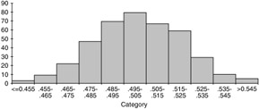
Figure 3.1: A typical histogram showing normality.
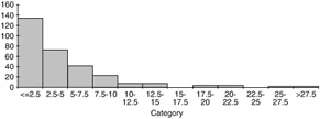
Figure 3.2: A typical histogram showing a positive skew distribution.
MORE DESCRIPTIVE STATISTICS
Often, you want to summarize data even further than a histogram allows. You would like to be able to report some numbers that describe the distributions more precisely. What sorts of descriptions might these be? The mode ” the most frequently occurring value ” is the simplest way to represent "typical." For a nominal variable, it is the only thing we can use. The median ” the middle value when values are arranged from smallest to largest ” is another way of representing "typical." Of course, you can only make sense of the median for a variable that is measured at least on an ordinal scale.
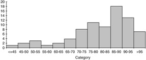
Figure 3.3: A typical histogram showing a negative skew distribution.
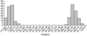
Figure 3.4: A typical histogram showing a bimodal distribution.
In addition to the mode and the median, other handy statistics can be used to describe your data.
Other Percentiles
The median is the value that splits the sample into two equal parts . Sometimes, though, it is useful to look at values that split up the cases in other ways. What is the value that cuts off the bottom quarter of the cases or the top quarter? These values are called percentiles because they tell the percentages of cases above and below them. The median is the 50 th percentile, since 50% of the cases have larger values and 50% have smaller values. The 25 th percentile is the value that splits the cases so that one quarter of them have values below it. (It follows that 75% of the cases exceed the 25 th percentile.) If you have made a frequency table, you can locate percentiles in the cumulative frequencies column. However, you can go about it in a simpler way. By identifying the subcommand percentiles in the frequency command, you will get the percentiles.
The Average or Arithmetic Mean
For interval and ratio variables, the arithmetic mean or average is usually a better measure of central tendency than either the mode or the median. It is simple to calculate. Just add up all of the values and divide the sum by the number of cases. When you are using a statistical software package, you can get this information just by requesting it.
When you calculate (or have your computer calculate) the mean, median, and mode of a set of data, you will often notice that the three values ” each of which represents the "typical" value of the distribution ” are different. Why are all of these "typical" values different? There is no reason for the numbers to be identical since they all define "typical" in different ways. The mode is the value that occurs most often; the median is the middle value when the numbers are arranged from smallest to largest; and the mean is the familiar "average" value. Which of these is the best measure of "typicalness" (more formally called central tendency )?
Mean, Median, or Mode?
Usually the mode is a poor measure of central tendency for an interval or a ratio variable. Though it satisfies one of the definitions of "typical," it ignores much available information about the data.
Although the median is a good measure of central tendency, it ignores a lot of the information that you have collected about a variable measured on an interval or ratio scale. For example, the median of the five ages 28, 29, 30, 31, and 32 is 30. The median for the five ages 28, 29, 30, 98, and 99 is also 30. The actual values of ages above and below the median are ignored. The median is 30 regardless of whether everyone's age is close to 30 or whether the values vary quite a bit.
When should you report the median, and when should you report the mean? If a variable is measured on an ordinal scale, the median is the statistic of choice. If a scale does not have intervals of equal length, it does not make sense to compute a mean. For a variable measured on an interval scale, the mean and the median are both useful numbers to report. The mean makes maximum use of the data since all of the values are actually used in computing it. (Remember, you add up all the numbers, then divide by the number of numbers.) In some situations, however, the mean may not really represent the data well.
Suppose you ask five people how many parking tickets they have received in the last year, and you get the following replies: 2, 5, 6, 7, 90. The mean number of tickets for this sample is 22. (Verify this: the sum is 110, and 110 divided by five is 22.) This statistic does not describe the data well. The person who hardly feeds a meter is making the other people in the sample look more delinquent than they really are. The median, six, describes the data better.
Whenever some cases have values much larger or smaller than the others, the mean may not be a good measure of central tendency. It is unduly influenced by extreme values (called outliers ). In this situation, you should report the median and mention that some of the cases had extremely large or small values. For example, you could say, "The median number of tickets for the sample is six. Eighty percent had seven or fewer tickets a year. One person reported 90 tickets."
EAN: 2147483647
Pages: 252