wxTreeCtrl
|
|
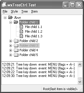
| A tree control presents information as a hierarchy, with items that may be expanded or collapsed. Figure 12-1 shows the wxWidgets tree control sample, displaying different font styles and colors. Each item is referenced by the wxtreeItemId type and has text and an optional icon that can be changed dynamically. A tree control can be created in single-selection or multiple selection mode. To associate data with tree items, derive a class from wxTRee ItemData and use wxTReeCtrl::SetItemData and wxTReeCtrl::GetItemData. The tree data will be destroyed when the item or tree is destroyed, so you may want to store only a pointer to the actual data within your tree item data objects. Figure 12-1. wxTReeCtrl
Because clicks on tree item images can be detected by the application, you can simulate controls within the tree by swapping the images according to the state you want to show for that item. For example, you can easily add simulated check boxes to your tree. The following fragment shows how to create a tree window with custom tree item data and an image list. #include "wx/treectrl.h" // Declare a class to hold tree item data class MyTreeItemData : public wxTreeItemData { public: MyTreeItemData(const wxString& desc) : m_desc(desc) { } const wxString& GetDesc() const { return m_desc; } private: wxString m_desc; }; // Images for tree items #include "file.xpm" #include "folder.xpm" // Create the tree wxTreeCtrl* treeCtrl = new wxTreeCtrl( this, wxID_ANY, wxPoint(0, 0), wxSize(400, 400), wxTR_HAS_BUTTONS|wxTR_SINGLE); wxImageList* imageList = new wxImageList(16, 16); imageList->Add(wxIcon(folder_xpm); imageList->Add(wxIcon(file_xpm); treeCtrl->AssignImageList(imageList); // Create a root showing the folder icon, and two items showing // the file icon wxTreeItemId rootId = treeCtrl->AddRoot(wxT("Root"), 0, 0, new MyTreeItemData(wxT("Root item"))); wxTreeItemId itemId1 = treeCtrl->AppendItem(rootId, wxT("File 1"), 1, 1, new MyTreeItemData(wxT("File item 1"))); wxTreeItemId itemId2 = treeCtrl->AppendItem(rootId, wxT("File 2"), 1, 1, new MyTreeItemData(wxT("File item 2"))); wxTreeCtrl StylesTable 12-1 lists the styles you can pass to the wxtreeCtrl constructor or Create function; also refer to the available styles for wxWindow in Table 4-1.
wxTreeCtrl EventswxTReeCtrl generates wxtreeEvent events, listed in Table 12-2. These events propagate up the window parent-child hierarchy.
wxTreeCtrl Member FunctionsThese are the important wxtreeCtrl functions. Use AddRoot to create the first item and then AppendItem, InsertItem, or PrependItem to add subsequent items. Remove an item with Delete, clear all items with DeleteAllItems, or remove all of an item's immediate descendants with DeleteChildren. Set an item's label with SetItemText; you can change the label's appearance with SetItemTextColour, SetItemBackgroundColour, SetItemBold, and SetItemFont. If you show images in your tree items, use SetImageList or AssignImage List to associate a wxImageList with the tree control. Each item can show an image for each of the possible item states: wxTReeItemIcon_Normal, wxTReeItemIcon_Selected, wxtreeItemIcon_Expanded, and wxTReeItemIcon_Selected Expanded. Use SetItemImage to pass an index into the tree control's image list and an optional state. If only the image for the normal state is specified, it will be used for the other states, too. Scroll an item into view with ScrollTo, or use EnsureVisible if items may need to be expanded to show the desired item. Expand shows the children of an item. Collapse an item that has children with Collapse or CollapseAndReset: the latter also removes the children. This is useful if you're implementing a tree control with a very large number of items. You may want to add items only when they are visiblethat is, when you process an EVT_TREE_ITEM_EXPANDING event. In this case, you will need to use SetItemHasChildren to provide visual feedback that an unexpanded item has children, even when it doesn't. You can select or deselect an item with SelectItem. For a single-selection tree, you can get the currently selected item with GetSelection. If there is no selection, it returns an invalid wxTReeItemId, such that a call to wxTRee ItemId::IsOk returns false. For a multiple-selection tree, retrieve all the selections with GetSelections by passing a wxArrayTreeItemItemIds reference to the function. Unselect removes the current selection for a single-selection tree, whereas UnselectAll removes all selections from a multiple-selection tree. UnselectItem can be used in a multiple-selection tree to deselect a specific item. There are several ways to traverse the tree: you can start at the top with GetrootItem and iterate through the children of an item with GetFirstChild and GetNextChild. Find the next and previous siblings of an item with GetNextSibling and GetPrevSibling, determine whether an item has children with ItemHasChildren, and get the parent of an item with GetParent. GetCount returns the total number of items in the tree, and GetChildrenCount counts the number of descendants for the given item. HitTest is a useful function if you're implementing drag and dropit enables you to find the item under the mouse position, together with the part of the item. See the reference manual for the flags returned by HitTest. You can find the bounding rectangle for an item with GetBoundingRect. For more information on these functions, see the reference manual and the wxtreeCtrl sample in samples/treectrl. |
|
|
EAN: 2147483647
Pages: 262