| In this chapter, we'll work through the process of converting into an online form the spreadsheet used to calculate the scores for participants in Knowbility's Accessibility Internet Rally. (For more information about AIR, see Chapter 4.) One reason for converting the spreadsheet to a form is to enable AIR judges, including judges who have disabilities, to do their scoring online. At the same time, however, we'll also make the logistics of judging this competition easier for everyone. We'll concentrate on selecting the right types of elements for our form and on ensuring that those elements are accessible to people with disabilities. In other words, we won't be worrying here about making the form look good on the screen, and you shouldn't worry about it now, either we'll talk about the form's visual appearance in Chapter 15 on Cascading Style Sheets. The Old Form The AIR judging form is the scoring instrument for a program produced each year in several cities to promote awareness of accessibility issues in Web design. The form has been developed over several years by a working group whose members include Jim Allan, Web master and Statewide Technical Specialist at the Texas School for the Blind and Visually Impaired and a member of the Web Accessibility Initiative; Phill Jenkins of IBM's Accessibility Center, also a member of the Web Accessibility Initiative; John Slatin of the University of Texas at Austin; and Jim Thatcher, an accessibility consultant formerly with IBM's Accessibility Center, inventor of the first screen reader for the graphical user interface, and a key player in developing the Section 508 accessibility standards. Organization The 2001 AIR form is a Microsoft Excel spreadsheet with several sections, as shown in Figure 10-2 and listed below. Figure 10-2. The 2001 AIR judging form is an Excel spreadsheet. Visible in the screen shot are the site information section and the beginning of the High-Impact Accessibility section. Used with permission. 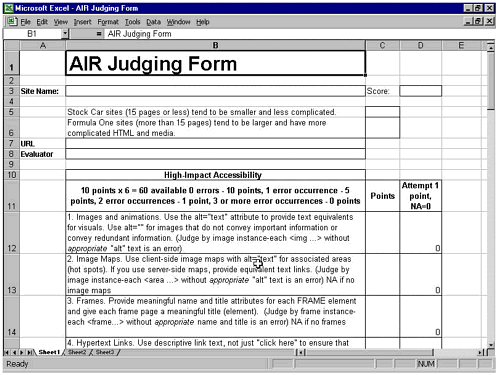 Site information (site name, URL, competition category, evaluator name, total score). Criteria for judging: - High-impact accessibility (6 items, 10 points each). - General accessibility (11 items, 5 points each). - Usability (12 items, 3 points each). - Appropriateness (up to 10 points). - Aesthetics (up to 10 points). - Bonus points (8 items, 1 point each). - Exemplary effort (1 item, up to 5 points). - Discretionary deductions (an arbitrary number of points deducted for major accessibility problems not captured above; requires the consensus of three judges).
The scoring worksheet, which shows how to calculate the score for each section of judging criteria listed above.
The sections for the judging criteria on high-impact accessibility, general accessibility, usability, and appropriateness are formatted in four columns. Column A identifies where to input site information. The name of the item appears in column B along with the judging criteria for that item. Column C provides space for entering any points awarded for the item. Column D allows the evaluator to indicate whether the site contains the feature in question or whether the item does not apply to the current site. Scoring The formula for calculating the final point total is fairly complicated. First of all, there is a different number of items in each category. Second, the items in each category are weighted differently. For each item in the high-impact and general accessibility categories, judges must award a fixed number of points based on the number of errors they find, with three or more errors resulting in a 0 score for the item. In the usability and bonus sections, however, even one error results in a 0 for the item. For each of these categories, moreover, 1 point is awarded for each item attempted, whether or not the attempt was successful. Aesthetics and appropriateness are judged holistically and may be awarded up to 10 points each. Judges may also award up to 5 points for exemplary effort, for example, to acknowledge a particularly ingenious solution. A final option allows judges to deduct an arbitrary number of points for particularly egregious errors that cannot be factored into the scoring in any other way. For example, suppose we have an educational site that contains several Java applets that illustrate dynamic processes of some sort. The applets are inaccessible, and the site does not provide equivalent alternatives either for their functionality or for the data they generate. However, in other respects the site is accessible (ALT text is associated with images, tables are correctly marked up, forms are labeled appropriately, and so on). The judges would award the site's developers 0 points for the scripts and applets item in the general accessibility category. In other words, the developers would lose 5 points. But say those applets constitute the core educational content of the site the site exists primarily for the purpose of making the applets available to students in the class. Students with disabilities would then be denied access to learning opportunities that have been provided for classmates who do not have disabilities. Failure to make such critical content accessible should cost the developers more than 5 points. The judges would decide as a group how many points such a failure would cost. Design Goals So how do we want to improve the judging form? Let's start with what we don't want. We don't want simply to convert the existing spreadsheet to HTML that would simply transfer the difficulties discussed above to another environment. What we do want is to redesign the form in such a way that it: Provides better support for all judges, including those with disabilities who depend on assistive technology devices. Supports administration of the contest by facilitating improved data collection and reporting of results. Supports a judging process that provides useful feedback to contestants so they can use the form to guide later updates of their sites.
Let's explore these design goals further below. Better Support for Judges The desire to provide better support for judges leads to several action items. Reorder the way categories are listed on the form. For example, the list of 8 bonus items should follow the usability section. This would group together all categories where scoring is based on correct handling of specific elements. This kind of grouping of related items is consistent with WCAG Checkpoint 12.3 ("Divide large blocks of information into more manageable groups"). Group all holistically scored items (appropriateness, aesthetics, exemplary effort, and discretionary deductions). This makes it easier to understand that these items are scored on a different basis from those in the previous categories, and it allows judges to "balance" the items against one another if they wish. For items where the number of points awarded is based on the number of errors encountered, allow judges to specify how many errors they've encountered and let the computer total the points. This frees judges from having to keep track of how many points the items in a given category are worth. This facilitates participation by judges with certain cognitive impairments and benefits all judges by reducing cognitive overhead. Make it easier for judges using screen readers, talking browsers, refreshable Braille displays, or screen magnifiers to enter scoring data without error. Allow judges to preview the results page at any point in the process; the preview should include a current score. Make it easier for judges to compare notes. Allow judges to jump directly to specific sections of the form (that is, make the form navigable).
Support for Contest Administration Better support for contest administration can also improve the judging process. This adds more items to our list of enhancements. Create an online "cover sheet" for contestants to use when submitting their sites. Appropriate data from the cover sheet will be transferred automatically to the site information section of the judging form. Enable automatic updating of the scoreboard whenever a judge submits a completed form. This allows contest administrators and judges to see a running tally. The scoreboard will also show sites for which no score has yet been submitted and the names of judges and participants for each site. Judges and administrators will be able to go from the scoreboard to the individual scorecards and the sites themselves.
Support for a Judging Process That's More Useful to Contestants Finally, putting the AIR judging form online will allow us to provide better, faster feedback to contest participants when the AIR program has ended. Bearing this goal in mind, we want to make sure certain features are present on the new judging form. Provide a field on the judging form for judges to use to explain to contest participants what makes specific features of the submitted sites especially effective or problematic. Add a feature so that each team can receive its scores, including judges' comments, via e-mail automatically generated at the end of the competition.
Implementing all these features would require far more than creating a single form, of course, and discussing them would take us far beyond the scope of this chapter. The rest of the chapter focuses on the judging form. However, it's important to keep in mind that users will rarely encounter a page that contains nothing but a form: the form is likely to be just one component of a larger site, and the page that contains it will probably contain other elements as well, includ-ing links to the rest of the site. With this in mind, it's also important to remember that forms usually imply some sort of social interaction, however minimal that interaction may be they're almost always part of a larger process. The goal in designing a form is to provide a tool to facilitate that process. The New Form Grouping Related Items with the <fieldset> Element WCAG 1.0 Checkpoint 12.3 calls for dividing large blocks of material into more manageable groups. That's information design. That's the hard part, and in the case of the AIR form, much of it has already been done. However, we want to rearrange and clarify the groupings on the existing form as we design the new one. HTML 4.0 provides the <fieldset> and <legend> elements for this purpose. The <fieldset> element defines a group of related form controls. The <legend> element works like the <caption> element in a table, associating some onscreen text with the group to facilitate identification and navigation. Figure 10-3 shows the organization of the form into three major groupings: Figure 10-3. Screen shot showing how <fieldset> elements are used to structure the AIR judging form. 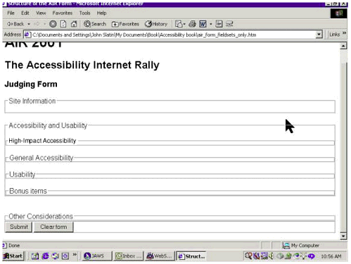 Site information. Accessibility and usability. Other considerations.
Within the accessibility and usability fieldset are four other fieldsets: high-impact accessibility, general accessibility, usability, and bonus items. With this organizational issue resolved, we can move on to consider how to support easier and more accurate scoring. Why Scoring Is Difficult on the Original AIR Judging Form On the existing AIR form, judges mark one of two cells for each item in the high-impact accessibility, general accessibility, usability, and bonus items categories. In each case, the judges must determine what number to enter in the points field: 10 points if there are no errors, 5 points if one error, 1 point if two errors, or 0 points if three or more errors (under high-impact accessibility). The general accessibility category works the same way, but the numbers are different: 5 points if no errors, 3 points if one error, 1 point if two errors, or 0 points if three or more errors. Under usability, things look the same but aren't. Each item is worth 3 points, and there is no partial credit. The bonus items are worth 1 point each, again all or nothing. Items for which no attempt was made receive 0 points in the points field as well as 0 points in the applicability field. This complexity creates a steep learning curve for new judges and causes some confusion even for experienced judges. For someone with short-term memory problems or a cognitive disability, it might well be impossible to keep track of this complex arrangement. For people with limited or no vision, the difficulty of remembering the point system is compounded by the need to keep track of their location in the spreadsheet itself. The following questions are consistent across all these categories. Is the feature present or not? If present, is it used correctly in all instances or are there errors? If there are errors, how many?
We can use this consistency, rather than points, as the basis for handling scoring on the form. If the item is present, judges need only indicate how many errors they encountered (if any); otherwise, they can indicate that the item does not apply. There are two design considerations here: Selecting the most appropriate form controls. Labeling items correctly, as required by Section 508 and WCAG 1.0.
Let's start with the need for correct labeling. For all practical purposes, Section 508, paragraph (n), requires labeling form controls: "When electronic forms are designed to be completed on-line, the form shall allow people using assistive technology to access the information, field elements, and functionality required for completion and submission of the form, including all directions and cues." This Section 508 requirement is stronger than the similar WCAG 1.0 Checkpoints, which are rated only as Priority 2. Checkpoint 10.2 recommends that "Until user agents support explicit associations between labels and form controls, for all form controls with implicitly associated labels, ensure that the label is properly positioned. [Priority 2]." Checkpoint 12.4 urges developers to "Associate labels explicitly with their controls. [Priority 2]." In other words, it may be possible to achieve level A conformance with WCAG 1.0 without fully addressing the accessibility of Web-based forms. Section 508 compliance, on the other hand, requires that forms be accessible. (In many other cases, however, satisfying WCAG's Priority 2 checkpoints benefits more users, though it's also more demanding for developers.) Choosing the Form Controls: Radio Buttons Radio buttons would seem to be ideal for this situation because they're designed to present mutually exclusive options. The judges need only select the appropriate button, and a script will assign the correct number of points. For example, the first high-impact accessibility item refers to images and animations (Figure 10-4). Five radio buttons are displayed in a table nested inside the cell at row 1, column 2 of a larger table used to lay out the form. Figure 10-4. Screen shot of the first high-impact accessibility item on the AIR judging form. Radio buttons for scoring are displayed in a nested table immediately to the right of the text explaining how the item should be judged. The radio button for the last item (N/A for not applicable) is selected. 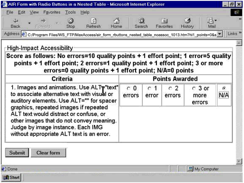 This looks like a plausible, even commonplace solution. The radio buttons allow judges to see all their scoring options at once; they can simply point, click, and move on to the next item. Accessibility Issues with Radio Buttons. But the situation may be somewhat different for people who have disabilities. For example, people using screen readers or talking browsers may find the radio button interface somewhat difficult to use. For them, the chief advantage of the radio buttons is gone: rather than seeing all the options at once, they'll be listening to the radio buttons sequentially. Similarly, someone with a hand tremor, limited hand-eye coordination, or low vision may have trouble pointing the mouse at the correct spot. Labeling Radio Buttons: The <label> Element. The fact that people using screen readers and talking browsers hear the scoring options sequentially raises a host of new problems that have to do with labeling. Visually, it's clear that this set of radio buttons is associated with the criteria for images and animations. But that implicit association will be lost for people using screen readers and talking browsers unless we take pains to label the buttons correctly. The first step is to create an explicit, programmatic association between each radio button and its label, pairing the <label for="inputid"> and <input > elements and attributes, as shown below. <input name="hi1_points" type="radio" value="11"> <label for="hi1a_points">No errors</label> Note that the <input> element's id attribute matches the <label> element's for attribute. Since the id attribute is designed as a unique identifier for HTML elements, this matchup forces screen readers and talking browsers to speak the words "No errors" and then report the status of the form control, like this: "No errors radio button not checked". The <label> element may also be "wrapped around" the <input> element, as shown below. <label for="hi1a_points"><input name="hi1_points" type="radio" value="11">No errors</label> Under many circumstances, this is all that's needed. The site category item in the site information section of the AIR judging form is an example. The word "Category" is in column 1, and the radio buttons are in column 2, as shown in Figure 10-5. Figure 10-5. Site information section of the AIR judging form. Radio buttons for indicating the site's competition category appear at the bottom of the screen shot. 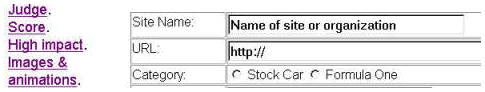 Here is the source code for the Category radio buttons. <td>Category:</td> <td><input name="site_category" type="radio" value="SC">Stock Car <input name="site_category" type="radio" value="FO">Formula One</td> But it isn't always this easy. Implicit Associations for Radio Buttons. Elsewhere on the AIR judging form, for example, it's actually necessary to associate the radio button with two pieces of text: The button label. The item being judged.
We've shown how to create an explicit association between each radio button and the text attached directly to it. But this is only part of the story: we also need an implicit association between the radio buttons as a group and the item that governs all of them. On a multiple-choice test, for example, every question is associated with a list of possible answers. Likewise, on our judging form, each criterion is associated with a set of scoring options, like this: 1. Images and animations. Use ALT="text" to associate alternative text with visual or auditory elements. Use ALT="" for spacer graphics, repeated images if repeated ALT text would distract or confuse, or other images that do not convey meaning. Judge by image instance. Each IMG without appropriate ALT text is an error. 0 errors 1 error 2 errors 3 or more errors N/A (not applicable)
Anyone who's ever taken a multiple-choice test or completed a questionnaire will recognize the association between the item on Images and animations and the scoring options. But assistive technology isn't necessarily smart enough to do that. On the judging form shown in Figure 10-4, the scoring options are represented by radio buttons, and we used the <label> element to create an explicit association between each radio button and the label beside it (for radio buttons, the label should be to the right of the button). But there is no way to create a similarly explicit association between the radio buttons as a group and the images and animations item. So assistive technology has to rely on positioning as a clue (this is the rationale for WCAG 1.0 Checkpoint 10.2). But positioning isn't always good enough. In the form shown in Figure 10-4, screen readers and talking browsers cannot recognize any implicit association between the radio buttons and the item to be scored the text in row 1, column 1 of the outer table. Here's what we heard when we started tabbing through the form from the top of the page, using JAWS. 0 errors radio button not checked 1 error radio button not checked 2 errors radio button not checked 3 or more errors radio button not checked N slash A radio button checked
If JAWS users turn on Forms Mode by pressing the enter key, they'll hear the following: Forms Mode on N slash A radio button checked
If the same JAWS users now press the up arrow key on the keyboard, they'll hear: Three or more errors radio button checked
You get the idea: there's still no reference to the item (images and animations) and the judging criteria. The reason? Assistive technology can't recognize the relationship between the radio buttons and the images and animations item because we used a nested table to lay out the form; consequently, the images and animations item is in a different HTML table than the one that holds the radio buttons. To a screen reader, they might as well be on different planets. There's only one item to worry about in this example not a major problem. But on the real form there are 38 items formatted this way! Judges relying on screen readers and talking browsers would quickly be lost. Solving the Problem: Forcing an Implicit Association between Radio Buttons and Text The screen shown in Figure 10-6 is very similar to the one in Figure 10-4. Now, however, there is a line of text above the five radio buttons. Beneath the radio buttons is another line of text, and beneath that is a small scrolling field where judges can enter their comments. What we're interested in here is the first line of text, the one above the radio buttons, which reads as follows: "Score for images and animations." Figure 10-6. Screen shot of the revised first item for high-impact accessibility. Scoring options are presented as radio buttons in a nested table. A line of text above the radio buttons reads "Score for images and animations." 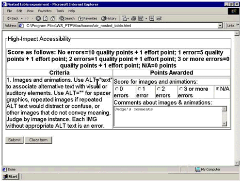 The text above the radio buttons is simply text, inserted as the content of a table cell that spans the five columns of radio buttons in the next row (<td colspan="5">). Because the text is now included in the same <table> element as the radio buttons, screen readers and talking browsers are able to recognize (or create) an implicit association between this text and the radio buttons. This changes what users hear when they tab through the form. The screen reader now goes directly to the default radio button (the one labeled N/A). First it speaks the implicitly associated text, then it identifies the radio button and its status: Score for images and animations N slash A radio button checked
The user then presses the up arrow key on the keyboard to move through the options. Each time, JAWS speaks the implicitly associated text before reporting the radio button and its status. Choosing the Form Controls: Pull-Down Menus The right-hand side of the table in Figure 10-6 is visually quite busy: a line of text followed by a line of five radio buttons (each with its own accompanying text), followed by a line of text, followed by a text area for judges' comments. Figure 10-7 shows a different approach, substituting a pull-down menu (which JAWS calls a combo box) for the radio buttons in the previous example. Figure 10-7. Pull-down menus as an alternative to radio buttons for the AIR judging form. 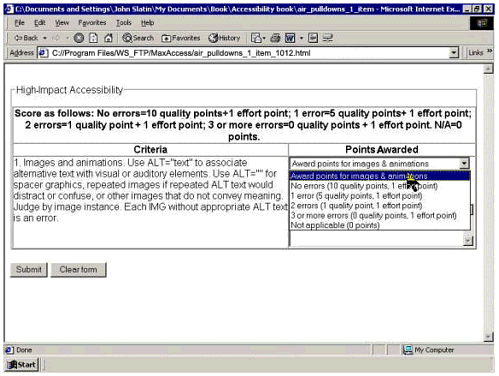 The screen shot in Figure 10-7 isn't quite as busy as the previous version. Where there had been a line of text above five radio buttons and their individual labels, there is now a single element, a pull-down menu. The default selection consists of the words "Award points for images & animations." To see all the options, the judge can pull down the menu, as shown in Figure 10-8. Figure 10-8. AIR judging form showing the options in the pull-down menu. 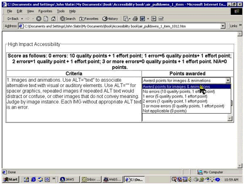 Sighted users with good hand-eye coordination may find the radio buttons slightly faster: this is where the point-and-click method shows its value. However, for people using screen readers and talking browsers and others who don't use a mouse, the pull-down menu has some advantages. The keystrokes are exactly the same. The user would tab from item to item, then use the arrow keys to select radio buttons or menu options. But the pull-down menu has slightly less auditory clutter, and it's easier to be certain of having made the right selection. Labeling <select> Elements: The <label> Element. The technique for associating labels with pull-down menus is very similar to the technique for associating labels with radio buttons and text-input elements. Here's the syntax. <label for="hi1_pts">Images & animations.</label> <select name="hi1_pts" size="1"> <option selected value="">Award points for images & animations</option> <option value="11">No errors</option> <option value="6">1 error </option> <option value="2">2 errors </option> <option value="1">3 or more errors </option> <option value="0">Not applicable</option> </select> Again, note that the <label> element's for attribute matches the <select> element's id attribute. Now, when someone using a screen reader or talking browser tabs through the form, the contents of the <label> element will be spoken and the pull-down menu will automatically be selected. The default item in the menu will be spoken next. A Word of Warning: <select> Menus and Javascript. Developers sometimes go for speed improvements in pull-down menus by using JavaScripts that are triggered by the onChange event handler the instant a user clicks on an item in the menu. This can have surprising effects for people using the keyboard who aren't aware that JavaScript is working behind the scenes. If you tab to a pull-down menu that has an onChange script and press the down arrow key, you'll automatically choose the first item on the menu, without necessarily knowing what that item is and without getting the chance to find out what else is available. Users can avoid falling into this trap by using Alt+Down-arrow to open the menu before starting to explore, but we've found that many people are unaware of this keystroke combination, and developers will get more predictable results by avoiding the onChange handler in this situation. (An analogous problem may occur when onChange handlers are associated with text-input elements. As noted earlier, JAWS users must press the enter key on the keyboard to turn Forms Mode on; however, doing so activates the onChange handler, sometimes submitting an empty form and almost always leading to confusion.) The Uses of Redundancy. We've added a bit of redundancy here as well: the default value is the instruction to award points for images and animations. This provides the necessary cues for people using older assistive technology devices that may not support the <label> element, while making it easier for everyone to recognize items that haven't been scored yet. Labeling the <textarea> Element. The same technique is used to label the <textarea> elements for judges' comments as well. <label for="hi1_comments">Enter judge's comments about images & animations:</label> <textarea id ="hi1_comments" name="hi1_comments" cols="55" rows="4">Judge's comments here</textarea> Again we've added redundant text to the <textarea> element itself, to help people whose assistive technology devices may not support the <label> element. (Note, however, that in some browsers judges may have to manually highlight and replace this default text. Many people and not just people with disabilities find this confusing, so it's a good idea to let test users tell you whether or not such placeholder or default text is useful.) Making the Form Navigable Now that we've worked out the organization of the form and the scoring method and labels for all items are working correctly, we can address the need to make the form itself navigable. In practice, judges don't work through the form item by item. Instead, they jump to different items depending on the features of the Web site they're judging. So they need to be able to move quickly from anyplace on the form to any other place. The screen shot in Figure 10-9 shows the easy way out. We've added a column to the left side of the outer table. This is now column 1. Column 1 provides a list of links to all the items on the judging form, in the order in which the items appear on the form. Figure 10-9. AIR judging form with internal navigation. Links to contest items are listed down the left side of the screen.  We've also provided a simple contest navigation menu (see Figure 10-10) so judges can preview their scorecards before they submit the judging form and so they can check the scoreboard to see current standings as well as sites that remain to be judged. Figure 10-10. Screen shot showing the contest navigation menu at the top of the screen. 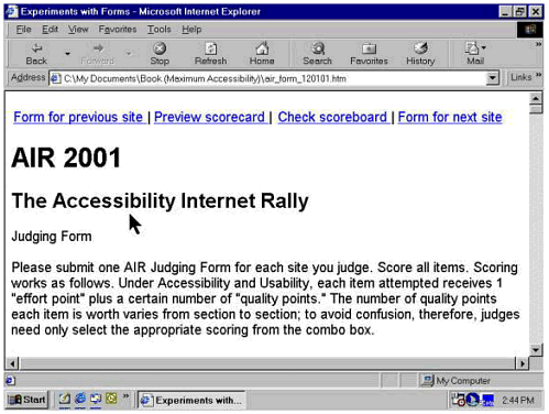 | 