When ALT Text Isn't Enough: Extended Descriptions ALT text works well for simple images, graphical links, and image maps. But there are times when developers must use rich, complex images to convey rich, complex ideas and information. In these cases, ALT text by itself is too short to accomplish this important task. For example, if the page includes a graph or chart representing complex logical or mathematical relationships, or a photograph of a historic event, an extended description should supplement the ALT text. You may include the extended description in the content of the page itself or on a separate page linked to the page that displays the image. (Which of these is the right solution in a given instance depends on the context and on what will best help your audience understand what you want them to understand.) HTML 4.0 includes a longdesc attribute designed for this purpose, but this technique has not been well supported until quite recently. As of March 2002, however, both IBM's Home Page Reader, versions 3.0 and higher, and JAWS 4.01 support the longdesc attribute. The <img> element may include both alt and longdesc attributes, as in the following example. <img src="/books/3/135/1/html/2/images/dillonatflavin.jpg" alt="John and Dillon in front of a Dan Flavin light-sculpture" longdesc="johndill_flavin_description.htm"> There is an important difference between the alt and longdesc attributes: the value of the alt attribute is the text that will be rendered by user agents that cannot display the image, while the value of the longdesc attribute is the name of an HTML file that contains the extended description. In the absence of support for the longdesc attribute, some developers have used a "d-link" (description-link) instead that is, a lowercase letter "d" that serves as a link to the page that contains the text description. The "d" is positioned close to the image. Some developers, however, are reluctant to use the d-link because it's difficult to integrate into the visual design of the page; others have expressed concern that users who aren't familiar with the convention will regard the d-link as some sort of mistake. Still others worry that multiple d-links on a page with multiple images will confuse people using screen readers, talking browsers, refreshable Braille devices, or text-only displays. If you share those concerns, we recommend that you either use the longdesc attribute or integrate the extended description into page content where it may be welcomed by many of your users! An Example: The Institute for Technology and Learning At the top of the home page of the Institute for Technology and Learning (ITAL), with which I (John) am associated, is a heading that reads, "Institute for Technology and Learning at The University of Texas at Austin." An image of the Institute's name as it appears in Grade 2 Braille is displayed above the printed words, and the ITAL logo appears on the right side of the screen (Figure 9-1). Figure 9-1. Screen shot of the home page of the Institute for Technology and Learning. The banner across the top includes graphical text and a logo. Accessed July 14, 2001, at http://www.ital.utexas.edu. Used with permission. 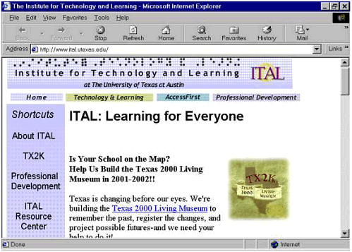 Graphical Text, Textual Text, and Prose: What's the Difference? The whole banner, including the ITAL logo, is a graphic (the ITAL logo is a separate image). This makes no difference to sighted visitors, who simply read the words as they appear on the screen. But from the computer's standpoint, graphical text isn't text at all it's a picture of text, so the words are just part of the banner image. Such graphical text can't be recognized by screen readers, talking browsers, Braille displays, text-only browsers such as Lynx, certain PDAs, and two-way pagers or by conventional browsers with images turned off to speed up Web access for people with older computers or slow modems. And that means that the banner by itself is unintelligible to the people using these devices. Since the banner is "invisible" to so many users and user agents, we attached an alt attribute containing the words "The Institute for Technology and Learning at the University of Texas at Austin" to the image. Here's the source code. <img src="/books/3/135/1/html/2//images/masthead.gif" width="655" height="72" alt="The Institute for Technology and Learning at the University of Texas at Austin"> The only difference between the ALT text and the graphical text displayed onscreen is the word "The" at the beginning of the ALT text. This creates a short auditory "beat" to help listeners orient their attention a little trick learned from years of wearing a talking wrist-watch that precedes its announcements of the time with a little chime and the word "It's," as in "It's nine thirty-nine A.M." By making the ALT text nearly identical to the graphical text in the banner image, we ensure that people visiting our site are able to tell where they are right away, whether they're using conventional browsers like Internet Explorer and Netscape Navigator or other user agents, with or without assistive technologies. But this isn't to say that we haven't lost anything along the way. We included Braille characters in the design of the banner graphic because we wanted to do more than announce our name and university affiliation. We wanted to send a message about our commitment to accessibility and elegant design. But the ALT text doesn't capture this at all. This is as it should be: as we've noted, the alt attribute is supposed to contain short phrases that stand as functional equivalents of the images with which they're associated, not (or not usually) descriptions of those images. ALT Text as Offscreen Text The ALT text for ITAL's banner graphic contains 13 words and 78 characters, including spaces and punctuation. You're probably thinking that this is awfully long, and certainly it's considerably longer than average ALT text. It would be too long much too long if it were meant to be displayed onscreen in addition to the actual banner graphic. But of course it isn't meant to be displayed that way: ALT text is by definition written for people who can't see or comprehend the images and meant only to be picked up by screen readers, talking browsers, and text-only or Braille displays though a side benefit is that it's also available to search engines. ALT Text as Image Replacement It would be hard to overstate the importance of the fact that ALT text isn't meant to be viewed alongside the image. For people using screen readers, talking browsers, refreshable Braille devices, or text-only displays, the ALT text replaces the image. These users will never have a chance to decide whether the ALT text is really a satisfactory "equivalent" for the image. The ALT text is all they have to go on, so it has to stand on its own! The ALT text for the ITAL banner image is well within the 150-character de facto limit imposed by the default line-length setting for JAWS, the most widely used screen reader. But the ALT text is still too short to convey the full meaning of a complex image like the ITAL masthead. Extended Descriptions as Equivalents for Complex Images All of this helps us understand one reason why the requirement to provide equivalent alternatives goes beyond the alt attribute. Since the success of many Web sites depends at least in part on people's ability to grasp the meaning of complex charts, graphs, photographs, and other artwork, including corporate logos, maximum accessibility involves crafting equivalent alternatives for them. These often take the form of prose descriptions like the following description of the ITAL masthead. The masthead graphic displayed on each page presents our name in both inkprint and Braille characters. Adjacent to this is the ITAL logo, consisting of the initials ITAL superimposed on a yellow wireframe globe. This description consists of 34 words and 211 characters, including spaces and punctuation; it's part of an even longer explanation of page layout and navigational design for the ITAL site as a whole. The material resides on a separate page; the link from the home page is attached to a clear image, one pixel high by one pixel wide, which remains transparent to the eye while the screen reader picks up the ALT text. Here's the source code for the ALT text. <a href="/stafftools/access/nav_overview.html"> <img src="/books/3/135/1/html/2//images/clear.gif" width="1" height="1" alt="Please select this link for information about accessible navigation" border="0"></a> Using the alt attribute of an invisible image as a link to an extended description is a "kludge," a clunky workaround to which ITAL's Web designers resorted because browsers and assistive technologies available when the ITAL site was being developed in summer 2001 did not yet support the longdesc attribute though the attribute had been part of the HTML specification since 1997 as a way to manage such extended descriptions. (As we noted above, assistive technology is now beginning to provide support for this attribute, making it a more valuable resource for design.) Another strategy in some ways the simplest is to include the extended description on the same page where the image you're describing is displayed. The Metropolitan Museum of Art site discussed in Chapter 7 employs this technique to excellent effect. | 