| Designing for maximum accessibility often means approaching your projects in a different way than many other designers. For example, many Web designers tend to start with an image in mind once they have a rough idea of the site's subject and purpose, they start working to develop the right "look and feel." In fact, customers may come to a designer with little more than a sense that they want a site that looks a certain way something contemporary, say, something that shows the world that they're smart, hip, competent, cutting-edge. . . . But good design is accessible design. We saw over and over again in our user experience chapters that when design begins with look and feel, it usually ends as bad design, meaning that it's inaccessible it leaves people with disabilities out in the cold, along with people using cell phones and PDAs or others who can't (or don't want to) spend a lot of time working through a site to find what they need. Shortcut Techniques to Avoid Designers who make look and feel their first priority often use one of the following techniques as a shortcut. Using HTML structural elements for visual effect. Using HTML presentation elements to "simulate" structural elements.
These techniques are mirror images of each other. They may be shortcuts for designers, but they can create accessibility barriers, as we explain in the next two sections. Using HTML Structural Elements to Achieve Visual Effects In the days before CSS was introduced, one of the only ways designers could achieve certain visual effects was to use HTML markup that was intended for other things. Frequent candidates included headings (especially <h2> and <h3>), used to change font sizes and styles; lists (especially definition lists, <dl>), used to create a format in which every other line is indented, as in some poems; and block quotations (<blockquote>), used to indent text. There are still plenty of examples around. The home page for Yale University's Collection of Musical Instruments, for instance, uses the <h6> element to format the page heading and the navigation links on the left side of the page, while the <h4> element is used to format the address of the collection (Figure 15-1). Figure 15-1. Screen shot of the home page for Yale University's important collection of historic musical instruments. The home page uses HTML headings for visual effects and not to indicate logical relationships. Accessed December 3, 2001, at http://www.yale.edu/musicalinstruments/. Used with permission. 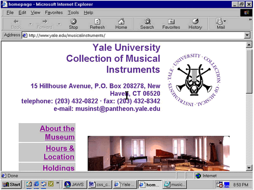 In other words, at least two different header elements are used on this page, but they convey no structural information. They're even somewhat misleading visually: the <h6> element assigned to the text links on the left side of the screen appears to use a larger font than the <h4> element used for the collection's address, even though <h4> is logically higher than <h6>. The better approach would have been to use the CSS font-size property to create the desired typographic effect. Avoid Using HTML Presentation Elements to Simulate Structure Another fairly widespread design practice is basically the mirror image of the one we just discussed. Designers sometimes use <font>, <b>, and other presentation elements such as <center> and attributes like align to do the work that would be better done by structural markup. For example, these presentation tags are used to format subheadings within a page instead of the HTML elements that would define those sections as structural components. In fact, certain presentation tags such as <font> have actually been deprecated in the HTML 4 and XHTML standards. In addition, the font properties defined in CSS1 and CSS2 provide much greater flexibility and control of text presentation. How These Shortcut Techniques Create Accessibility Barriers Why does it matter whether or not you use structural elements and use them correctly, as long as you get the look and feel you're after? It matters because clearly structured Web documents are easier for everyone to understand especially for people with visual impairments or cognitive disabilities. An outline of the document can guide attention to key sections of the page for people with cognitive impairments, some of whom have trouble distinguishing signal from noise critical from noncritical information. People who are blind or who have low vision can benefit as well. The current generation of screen readers and talking browsers uses these structural elements to help blind and visually impaired users navigate the Web. For example, IBM's Home Page Reader (version 3.0) and JAWS (beginning with version 4.01) both allow users to jump from one heading to another. If those headings aren't there, the user loses important clues about the way the document is organized. But it's just as bad if the headings are there and they're being used only for visual effect. In either case, someone using a screen reader or talking browser gets misleading information about the document's structure. Users of handheld and WebTV devices also benefit from proper HTML markup since these devices rely on correct structure for very specialized presentation. Using HTML Headings Correctly The W3C's site offers a good example of how to use headings (Figure 15-2). There are 18 headings on the page. JAWS 4.01 displays them in a scrolling list, much like the Links List discussed earlier. Figure 15-2. Screen shot of the W3C home page with the JAWS Heading List superimposed. Accessed December 3, 2001, at http://www.w3.org. Used with permission. 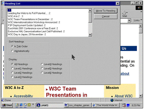 Beyond Headings It's not just about headings, of course. Paying careful attention to HTML structure makes it possible to use CSS for a variety of tasks, as on the Texas School for the Blind and Visually Impaired (TSBVI) Web site (Figure 15-3). Figure 15-3. Partial screen shot of the home page for the Texas School for the Blind and Visually Impaired. Accessed December 3, 2001, at http://www.tsbvi.edu. Used with permission. 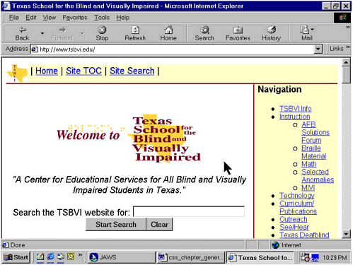 At the very top of the screen are four links, including three text links and a Skip to Main Content link attached to a small image of the Texas map above a horizontal line. In the center of the screen are the words "Welcome to Texas School for the Blind and Visually Impaired"; the school name is superimposed on a larger version of the same Texas map used for the Skip to Main Content link. Below this logo is a search field. To the right is a navigation menu with 15 links in a bulleted list. Visually, the welcome message dominates the screen. But if we simply let JAWS read down the page in Say-all mode, we first hear the links at the top of the screen, then the navigation menu on the right, and then the welcome message. All of this formatting and layout is handled by style sheets, including both an external style sheet referenced via a <link> element in the document's <head> element, as well as a number of style definitions that are embedded in the document itself. The external style sheet governs many pages on the large TSBVI site; the embedded style declarations are local to the current page and aren't needed elsewhere on the site. (This is a good example of how "cascading" works. Suppose you have a document that contains a <style> element and a link to an external style sheet. Now suppose that both the <style> element and the external style sheet include instructions for formatting the <h2> element. Which instructions will the browser follow? The local ones that is, the <style> element in the document will trump the external style sheet.) Color and contrast are also important aspects of visual presentation that can contribute to accessibility. But color and contrast can also create unintended accessibility barriers. We'll address the use of color and contrast below, in relation to the AIR judging form. | 