| Now that you have set up your working environment, it's time to design the user interface, which is the visual part of the program that your user sees and interacts with. Typically, when developing Windows applications, you design the user interface first and then write the code that makes the program come alive. Getting Information from the User Most computer programs are interactive they need to receive information from the user as well as provide information back to the user. A Windows-based Visual Basic program interacts with its user through controls that are placed on the program's form(s). A control is an object that interacts with the user or the program. Many of Visual Basic's controls can be used to obtain input from the user. The user interface for the Loan Calculator program will be responsible for accepting input, displaying output, and initiating the loan calculations. You will utilize three of Visual Basic .NET's most commonly used controls: TextBox controls  accept textual information needed from the user, and display certain information back to the user. accept textual information needed from the user, and display certain information back to the user. Label controls  act as captions, displaying information to the user. Labels are similar to text boxes, except that the user can't edit the information presented in them. act as captions, displaying information to the user. Labels are similar to text boxes, except that the user can't edit the information presented in them. Button controls  the user can click these to initiate program actions. Users of previous versions of Visual Basic should note that Button controls were previously called CommandButton controls. the user can click these to initiate program actions. Users of previous versions of Visual Basic should note that Button controls were previously called CommandButton controls.
All these controls are part of the basic set of controls found in Visual Basic .NET's Toolbox (see Figure 2.7). Figure 2.7. Visual Basic .NET's Toolbox contains the controls needed to build applications. 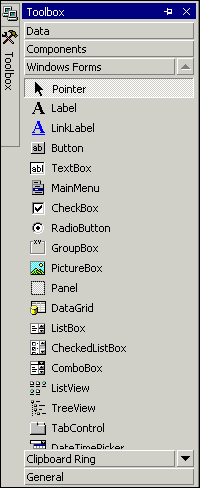 Adding a TextBox Control The TextBox control, also known simply as a text box, is (as its name implies) a box that displays and accepts text. In a way, it's similar to a text box you might find on a survey or application form, which is designed to accept input (from a pen or pencil) as well as display information. The TextBox control is one example of how far programming languages have advanced. Earlier programming environments required a lot of work to exchange information with the user. One of the fundamental concepts of Visual Basic has always been that it works in conjunction with Windows to take care of the mundane details of where text is positioned on the screen, how it's retrieved from the user, and so on. Your Visual Basic program simply needs to be concerned with the text in the text box; the control itself takes care of the rest. Adding a Control to a Form For a Visual Basic program to use a control, that control must be placed on a form. For your Loan Calculator program, begin by placing a TextBox control on the main form: -
By default, the Toolbox automatically hides itself. To make the Toolbox appear, hover your mouse pointer over the vertically oriented Toolbox tab on the left edge of the screen. The Toolbox will "fly in," as shown in Figure 2.8. Figure 2.8. The Toolbox appears when you hover near the left edge of the screen. 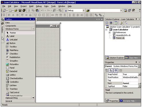 -
| | Click the tool for the TextBox control in the Toolbox. |
-
Move the mouse pointer to the Form1 form, which will probably be partially obscured by the Toolbox window. Note that the pointer changes to a crosshair with a tiny image of a text box attached to it, indicating that you're about to draw a TextBox control. -
Click anywhere in a blank area of Form1. This will cause a default-sized (100 pixels wide by 20 pixels high) TextBox control to appear on Form1 at the point where you clicked (see Figure 2.9). Figure 2.9. The new text box appears on the form and is selected (notice the sizing handles). 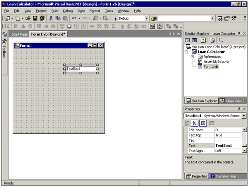
Tip You also can add a control to a form by double-clicking the control's Toolbox icon. This places a control directly on the form. You can then move and resize the control as desired with the sizing handles, as described in the upcoming section, "Moving and Resizing a Control."
The procedures used to add a TextBox control to a form are the same as those for drawing most controls on a form. Setting a Control's Properties After you have added a control to a form, you will usually want to set one or more of the control's properties. Properties are settings that control the appearance and behavior of an object. For the text box you just added, you want to set the Name and Text properties. The Name property is very important. It is used in program code to identify the control. Because a program will likely have many controls of the same type, you can use the control's Name property to identify the particular control for which a particular code statement is written. Every control must have a name, which is represented by the value of its Name property. In addition, every control on a particular form must have a unique name, unless it's part of a control array. (Control arrays are covered in detail in Chapter 10, "Understanding Windows Forms"; for now, just make sure all your controls on a given form have unique names.) Visual Basic assigns a default name to every control placed on a form. Because this is the first text box you've placed on this form, its default name is TextBox1. Subsequently placed text boxes would be named TextBox2, TextBox3, and so on. It's very good programming practice to change the default control names to be more descriptive. Assume, for example, you have three text boxes on a form that are used to accept a customer's last name, first name, and address. If you change the default names of TextBox1, TextBox2, and TextBox3 to something more descriptive, such as txtLName, txtFName, and txtAddress, it will be much easier to remember what each control's purpose is when you (inevitably) must modify your program's code at some future date. Tip Note that the control names I suggested begin with the prefix txt. It's common to begin a control's name with a three-character lowercase prefix denoting the type of control, the rest of the name describing the control's purpose. Thus, when debugging program code, it is immediately clear that txtLName refers to a TextBox control that contains last name information. Other commonly used prefixes include lbl for Label controls and btn for Button controls.
To change the name of the first text box you placed on the form for the Loan Calculator project, you must first make sure the control is selected. The selected control is the one for which properties will be changed in the Properties window, which is found in the lower-right portion of the development environment. As you'll see a little later, multiple controls can be selected at the same time. You can tell whether a control is selected if it has a series of eight sizing handles around its borders. The selected control's name also appears in the Properties window's Object box, which is the drop-down list just below the Properties window's title bar. If the desired control isn't selected, simply click it one time to select it. Now that the control is selected, take a look at the Properties window, which is a list of properties that apply to the selected object at design time and the current values of those properties. The left side lists the names of the properties that apply to the selected object and that can be changed at design time; each property's current value is denoted in the right side of the Properties window. Note  | By default, the properties listed in the Properties window are categorized according to their function. Until you are more familiar with the properties that apply to the various types of controls, I recommend that you switch the Properties window to its other display option, which arranges the properties alphabetically by name. To do so, click the Alphabetic icon just below the Properties window's Object box. Even if you do this, however, the Name property will appear at the top of the window due to its importance. |
Click the Name property. If you have sorted the Properties window alphabetically, the Name property is located near the very top of the list (due to its importance). If your Properties window is in Categorized view, you'll find the Name property in the Design category. Clicking the Name property makes it the current property (note that the property name is highlighted). Note the default value TextBox1 of the Name property on the right side. At this point, you can simply type a new value for the Name property, or edit the existing value. Change the value of your TextBox control's Name property by typing a more descriptive name let's use txtPrincipal, because the user will enter a principal amount here and pressing Enter. Figure 2.10 shows the Properties window after making this change. Figure 2.10. Use the Properties window to set values for your controls' properties. 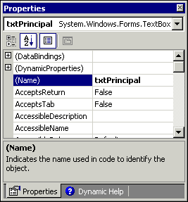 A TextBox control's Text property represents the text that's entered in the box that is, what is displayed inside the box on the screen. As the user types in a text box while a program is running, Visual Basic constantly modifies the text box's Text property to reflect the current contents of the box. By default, a new text box contains its own name; your new text box contains TextBox1 in its Text property (recall that TextBox1 was the control's name when it was created). For the Loan Calculator program, you don't want anything in the Text property when the program starts; in other words, you want the box to start off empty. To accomplish this, locate the TextBox control's Text property in the Properties window. Select the current value (TextBox1), and press the Delete key. Tip Property values appearing in boldface type in the Properties window are an indication that those specific properties' values have been changed from their default (original) values.
Adding the Remaining Text Boxes Now that you've added one TextBox control to the form, it should be a simple matter to add the other text boxes that you need for your Loan Calculator program. Add three more text boxes to the form; name them txtIntRate, txtTerm, and txtPayment. Clear their Text properties as well. The last text box you added, txtPayment, will be used to display the calculated payment to the user. Therefore, the user should not be able to type in that box. A text box's ReadOnly property is designed to prevent the user from being able to change text in a text box at runtime. Locate the ReadOnly property for txtPayment. Note that its default value is False, which allows the user to modify the control's contents. Use the drop-down arrow to change the ReadOnly property to True. Notice that the TextBox control on the form has now become grayed-out. This is a visual clue to the user that he cannot enter that text box. When you're done, your form should look similar to the one shown in Figure 2.11. Figure 2.11. The interface of the Loan Calculator program has four text boxes. 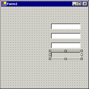 If your form doesn't look exactly like the one in Figure 2.11, don't worry. One nice thing about a visual design environment is that you can change the appearance of objects quite easily. Tip To draw multiple controls of the same type, hold down the Ctrl key when you select the control's tool in the Toolbox. That tool will remain selected in the Toolbox even after you've finished drawing a control. You can keep drawing multiple instances of that control without having to reselect the tool. When you're through drawing that control, select the Toolbox's pointer tool to return the mouse pointer to its normal state.
Moving and Resizing a Control If you don't like where a control is positioned, simply use the mouse to drag it to a new location. If you want to change the size of a control, you must first select it, which causes the sizing handles to appear. You can then use the mouse to change the control's size by dragging the sizing handles. The handles on the control's top and bottom edges change its height. The handles on the control's left and right edges change its width. The handles on the control's corners change its height and width simultaneously. Note By default, some controls (including the TextBox control that we are working with right now) have only two of the eight sizing handles activated; the others are grayed-out. That's because the TextBox control's AutoSize property is set to True by default. The AutoSize property automatically controls the height of a TextBox control based upon the size of the font used for the text that will be displayed by the control. Therefore, the sizing handles that affect the control's height are not available.
You also can change the size and position of objects by modifying their Size and Location properties, respectively, in the Properties window: An object's Size property consists of a pair of two numbers that reflect the object's height and width, respectively (in pixels). Clicking the plus sign next to the name of the Size property in the Properties window will allow you to enter Width and Height properties individually. An object's Location property consists of a pair of two numbers that reflect the object's x-position (distance from the left edge of its container to the left edge of the object) and y-position (distance from the top edge of its container to the top of the object), respectively (in pixels). Clicking the plus sign next to the name of the Location property in the Properties window will allow you to enter X and Y properties individually.
Moving a Group of Controls Now that you have created text boxes for the user's input, you should label them so that the user knows what to enter in each box. This will involve adding Label controls to the form. Depending upon where you drew the TextBox controls, you may need to move them to the right to ensure that there is enough room for the labels on the left. You could drag each text box individually; however, it is quicker to move them all together at the same time. You can easily select them all and move the entire group. To do this, click one of the text boxes to select it, and then hold down Ctrl while you click each of the others. Notice that each text box that you select in this manner gets its own set of sizing handles. After you have them all selected, begin dragging one of them. As you drag, the entire group is dragged at once. Drop the controls on the right side of the form; as you are dragging them, you will see outlines of the selected controls being moved, as depicted in Figure 2.12. Figure 2.12. Selecting multiple controls enables you to move them together as a group. 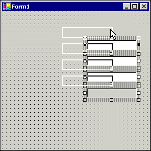 Tip Instead of Ctrl+clicking multiple controls, you can select a group of controls by drawing a rectangle around them. Click and hold down the left mouse button in an empty area of the form. Note that a "rubber-band" box stretches as you move the mouse. Draw the box around all the controls you want to select.
Labeling Your Program's Controls Obviously, the user needs to know which values are to be entered into each of the text boxes. The easiest way to do this is to add a Label control next to each text box. The label will then act as a caption for the text box, containing a brief description of what data is to be entered there. Although the user perceives Label controls and TextBox controls to be quite different, they are very similar from a programmer's perspective. They can both contain the same types of text, although the text in a Label control can't be modified by the user. However, by setting various properties of a Label control, the appearance of the text contained in it can be altered in many ways. Figure 2.13 illustrates several Label controls demonstrating a variety of looks. Figure 2.13. Labels can take on many different sizes and appearances. 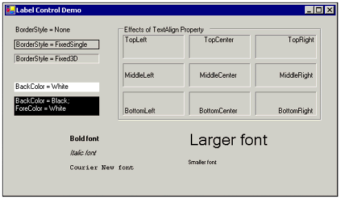 To continue our earlier analogy of a survey form, Label controls are like the words that are preprinted on the form to identify the purpose of the text boxes. The key difference between a Label control and a TextBox control is that a Label control contains text that the user cannot change. As with a TextBox control, the text contained in a Label control is stored in its Text property. Note In previous versions of Visual Basic, the text displayed in a Label control was contained in a property called Caption. Effective with Visual Basic .NET, Label controls have a Text property instead.
To add a Label control to a form, follow these steps: -
Hover over or click the Toolbox tab so the Toolbox is displayed. -
| | Select the Label control's tool in the Toolbox. |
-
Click a blank area of the form to place a Label control on it. -
In the Properties window, change the Label control's Name property to lblPrincipal. -
Change the Label control's Text property to Principal. -
Change the Label control's TextAlign property to MiddleRight, using the drop-down arrow next to the property setting (see Figure 2.14). This makes the label align its caption along the middle of the right side, next to its corresponding text box, as is common with caption labels. Figure 2.14. Clicking the dropdown arrow for the TextAlign property allows you to visually specify the alignment of the label's text. 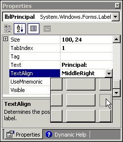 -
Resize and reposition the label so it is fairly well lined up with the first text box.
You should now be able to see how the Label control will aid the user in determining what to type in the first text box. Create three more Label controls, one for each of the remaining text boxes. Use the recommended values for the Name and Text properties outlined in Table 2.1 (don't forget to set the TextAlign property as well). When you're finished, your form should look like the one shown in Figure 2.15. Figure 2.15. The Loan Calculator program's labels show the user what to enter in the text boxes. 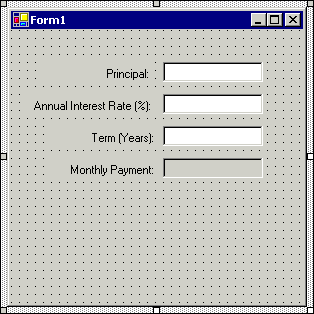 Table 2.1. Name and Text Properties for the Loan Calculator Program's Label Controls| Name Property | Text Property |
|---|
| lblPrincipal | Principal: | | lblIntRate | Annual Interest Rate (%): | | lblTerm | Term (Years): | | lblPayment | Monthly Payment: |
Note Because lblIntRate has a longer caption in its Text property, you may need to resize the label to make it wider so all the text will fit on one line.
Changing a Form's Properties Just as you define a control's appearance and behavior by setting its properties, you also can set the properties of a form to govern its appearance and behavior. Just like controls, forms have a Name property. The default name for a project's first form is Form1; subsequently added forms are named Form2, Form3, and so on. Because there is only one form in this project, we will leave its name as the default Form1. The form's Text property governs what is displayed in the form's title bar. Change the form's title bar for our sample application by setting the Text property to something more descriptive, like Loan Calculator Example. If you need to change the size of your Loan Calculator form to accommodate the controls you added, you can do so using the techniques for resizing objects described earlier in this chapter. Adding Command Buttons So far, your sample application's form has a set of text boxes to accept the user's input and a set of labels to identify those text boxes. You also need some way for the user to initiate actions this is the purpose of Button controls. A user can click a Button control, also commonly known as a command button (or simply a button), to cause something to happen. You can add a button to a form just like you add other controls by using the mouse to draw it. Like text boxes and labels, command buttons have a Text property that enables you to specify the text that will appear on the button's face, so the user will know what the button does. | | To complete the interface of the Loan Calculator program, use the Toolbox's Button control tool to add two buttons near the bottom of the form. Set their Name and Text properties according to Table 2.2. Figure 2.16 shows the completed Loan Calculator interface. |
Figure 2.16. After you have added the Button controls, the Loan Calculator's interface is complete. 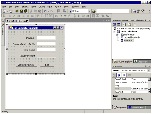 Table 2.2. Name and Text Properties for the Loan Calculator Program's Button Controls| Name Property | Text Property |
|---|
| btnCalculate | Calculate Payment | | btnExit | Exit |
Note As with lblIntRate, you may need to widen btnCalculate to accommodate its wider caption.
Keeping Your Project Safe Now that you've completed designing the Loan Calculator's interface, this would be an excellent time to save your work so far. Because Visual Basic .NET automatically saved your files when the project was created, resaving it is very easy and highly recommended. In fact, it makes sense to save your work regularly throughout the development process. You never know when you'll have problems; a quick save only takes a few seconds, and could save you a lot of work when those problems do happen. To resave your project, choose File, Save All from the menu system, or simply click the Save All button on the toolbar. Because you've already told Visual Basic .NET where to save the files that make up your project, they're automatically saved in the same location, using the same filenames. If you have added new components (forms, modules, and so on) since the last save, you will be prompted for a filename and location for each of the newly added components. | 
