Creating a Master Page
| A master page is similar to the standard ASP.NET pages we've been creating throughout this book. Like ASP.NET pages, master pages consist of Web controls, static HTML markup, and server-side code. The main difference between a master page and a standard ASP.NET page is that a master page's purpose is to define a template for the website. As we discussed earlier in this hour, the master page defines both the user interface elements common to all pages that inherit the master page as well as the regions that are editable on a page-by-page basis. To get started defining a sitewide template, add a master page to your project using the following steps:
After you add the new master page, the Design view shows a page with a single ContentPlaceHolder Web control (see Figure 21.4). This ContentPlaceHolder indicates the region that can be edited by the ASP.NET pages that inherit this master page. You can have multiple ContentPlaceHolders in your master page. To add a new ContentPlaceHolder, simply drag the ContentPlaceHolder control from the Toolbox onto the master page. Figure 21.4. New master pages contain a single Content PlaceHolder control.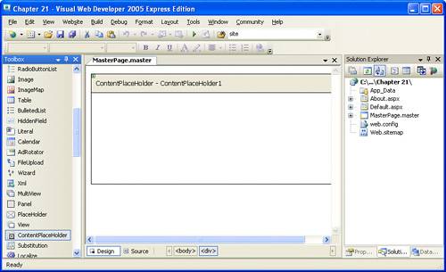
Take a moment to view the declarative markup of the master page by going to the Source view (see Listing 21.1). If you compare the default declarative markup for a master page to that of a regular ASP.NET page, you'll see two differences. The first is that the master page starts with a <%@ Master %> directive (line 1), whereas normal ASP.NET pages start with the <%@ Page %> directive. Furthermore, the master page contains, by default, a ContentPlaceHolder control (lines 12 and 13). Listing 21.1. The Default Declarative Markup for a Master Page
To create the sitewide look and feel, add the appropriate static HTML markup and Web controls to the master page. Again, you can do this by manually entering the HTML markup and control syntax through the Source view, or in a more graphical way through the Design view.
Designing the Sitewide TemplateLet's create a master page that has the look and feel first shown in Figure 21.1a title at the top, a TreeView control along the left, and so on. This design has each page laid out into four regions:
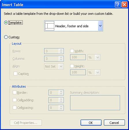
To provide this page layout, let's use tables. A table is an HTML element that can be used to arrange a page into various columns and rows. For this site design, we want a table that takes up the entire page with two columns and three rows, with the top and bottom rows spanning two columns. Figure 21.5 illustrates this design concept graphically. Figure 21.5. The site's design lays out pages using a two-column, three-row table. To create such a layout in HTML, you can manually enter the appropriate HTML table markup, or you can use Visual Web Developer. If you are interested in entering the HTML markup by hand, feel free to do so; Listing 21.2, shown later, contains the complete markup for the master page. If you are not an HTML aficionado and would rather have Visual Web Developer assist with creating the page's layout, follow these steps by going first to the master page's Design view. From the Layout menu, choose Insert Table, displaying the Insert Table dialog box (see Figure 21.6). From this dialog box, you can specify the precise table settings, indicating the number of rows and columns, the alignment, the width and height, and so on, or you can use a preexisting template. For our master page, go ahead and opt to use the "Header, footer, and side" template. Figure 21.6. Add a table to the master page using the Insert Table dialog box. The Insert Table dialog box adds the new table before the ContentPlaceHolder Web control. Because we want the ContentPlaceHolder control in the main region, take a moment to drag the ContentPlaceHolder from beneath the table into the second column in the second row of the table. Creating the Header RegionIn the header region, enter the site's title, such as Welcome to My Website! I've opted to have this title centered and displayed in a 24pt font size. These settings can be specified when typing in the website name, through the myriad of formatting options along the toolbar or through the Format menu. These settings can also be made to apply to the entire content region, rather than just the particular piece of text being entered. To tailor the entire header region, perform the following steps:
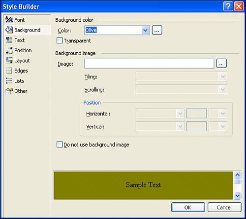
For example, to have the header region display white text on an olive background, from the Font tab, pick White from the Color drop-down list, and from the Background tab, pick Olive from the Color drop-down list. You can also specify font sizes, alignment, and a host of other settings through the Style Builder dialog box.
Crafting the Navigation RegionThe purpose of the navigation region is to provide the visitor with a complete listing of the site's structure, making it easy to quickly move to another page on the site. As we discussed in Hour 19, "Defining a Site's Structure and Providing Site Navigation," the ASP.NET TreeView Web control can be used in tandem with a SiteMapDataSource control to display the site's structure, assuming that there is a properly defined site map. For this hour, I am using the same site map used in Hour 19. After you have created your site map, add the SiteMapDataSource and TreeView controls to the first column in the second row of the table, configuring the TreeView control to use the SiteMapDataSource. By default, the content in a table cell is vertically placed in the middle of the cell. If the navigation region's row is particularly tall, which can happen in pages that include lengthy content in the main region, whitespace will appear between the header region and the TreeView control. In fact, if there is several pages' worth of content in the main region, the visitor may have to scroll down to see the TreeView. Often the common sitewide elements are formatted so that their position is not affected by the page-specific content. To accomplish this, we need to have the navigation region's content appear at the top of the cell, rather than in the middle. This is configurable through the table cell's valign property. To set this property, click inside the cell that makes up the navigation region, go to the Properties window, and set the valign property to top. This will cause the navigation region's content to be vertically aligned with the top of the table cell, regardless of how much or how little content is in the main region.
Creating the Main Region and Footer RegionAt this point the only two regions remaining are the main and footer regions. The main region already has the ContentPlaceHolder control (dragged into it after adding the table) but still needs the SiteMapPath control, which shows a breadcrumb. Drag this control from the Toolbox into the main region, placing it above the ContentPlaceHolder control. Finally, set the main region's table cell's valign property to top, just as we did with the navigation region. This ensures that regardless of how little content is in the main region, it will appear at the top of the cell. Finally, add the content for the footer region in the bottommost row. My footer region contains three links: Legal, About Us, and Privacy Policy. I manually typed in these links, although you could opt to use three HyperLink Web controls, if you'd prefer. Refer back to Figure 21.2 to see the completed master page when viewed through the Visual Web Developer's Design view. Listing 21.2 contains the complete declarative markup of the master page when viewed through the Source view. Listing 21.2. The Master Page's Declarative Markup
|
 /xhtml1/DTD/xhtml1-transitional.dtd"> 4: 5: <html xmlns="http://www.w3.org/1999/xhtml" > 6: <head runat="server"> 7: <title>Untitled Page</title> 8: </head> 9: <body> 10: <form runat="server"> 11: <div> 12: <asp:contentplaceholder runat="server"> 13: </asp:contentplaceholder> 14: </div> 15: </form> 16: </body> 17: </html>
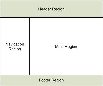
EAN: 2147483647
Pages: 233