The DataList Web Control
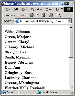
| Like the DataGrid, the DataList is rendered into an HTML table, creating a table row for each row in the DataSource. However, unlike the DataGrid, with its AutoGenerateColumn property, the DataList does not support any kind of automatic column generation. When using the DataList, the developer must specify a template, which can contain both HTML markup and content from the DataSource. When the DataList's DataBind() method is called a new table row is added for each row in the DataSource, with the contents of the template being placed inside the table row. Using the same source code from our previous listings (Listing 1.1 and 1.4), Listing 1.5 displays the last and first names of the authors using a DataList. Note how the DataList's template (ItemTemplate) specifies both HTML markup (the bold tag and a comma) as well as content from the DataSource (via the DataBinder.Eval calls). Listing 1.5 The DataList Renders Templates into an HTML table 1: <%@ import Namespace="System.Data" %> 2: <%@ import Namespace="System.Data.SqlClient" %> 3: <script runat="server"> 4: 5: Sub Page_Load(sender as Object, e as EventArgs) 6: 7: ... Code the same from previous listings. Omitted for brevity ... 8: 9: 'Finally, specify the DataSource and call DataBind() 10: dlAuthors.DataSource = objDS 11: dlAuthors.DataBind() 12: End Sub 13: 14: </script> 15: 16: <asp:datalist runat="server"> 17: <ItemTemplate> 18: <b><%# DataBinder.Eval(Container.DataItem, "au_lname") %>, 19: <%# DataBinder.Eval(Container.DataItem, "au_fname") %></b> 20: </ItemTemplate> 21: </asp:datalist> The HTML output of Listing 1.5, when viewed through a browser, can be seen in Listing 1.6. A screenshot can be seen in Figure 1.3. Figure 1.3. The list of authors is presented in an HTML table. Listing 1.6 An HTML table Has Been Rendered 1: <table cellspacing="0" border="0" style="border-collapse: collapse;"> 2: <tr><td> 3: <b>White, 4: Johnson</b> 5: </td> 6: </tr><tr> 7: <td> 8: <b>Green, 9: Marjorie</b> 10: </td> 11: </tr><tr> 12: <td> 13: <b>Carson, 14: Cheryl</b> 15: </td> 16: </tr> 17: ... some lines removed for brevity ... 18: </table> The templates in a DataList allow for both HTML markup and values from the DataSource. Adding HTML markup is a matter of simply adding the HTML tag(s) in the template. For example, in Listing 1.5, a bold HTML tag is used on lines 18 and 19. Furthermore, a comma is placed between the author's last name and first name. To display a value from the DataSource, data-binding syntax is employed. This syntax has the form <%# ... %> To grab a value from the DataSource, we use the DataBinder.Eval() method, which takes two parameters: an object and a string. In our examples, we'll be using Container.DataItem as the object, which is, in essence, the current row of the DataSource that's being enumerated. For the string parameter, specify the name of the column you want to have displayed. Hence, in order to output the value of the au_fname column using data-binding syntax in a template, one would use <%# DataBinder.Eval(Container.DataItem, "au_fname") %> We will discuss the use of templates and the DataBinder.Eval method in much greater detail in both the next chapter and Chapter 3. For now, realize that the ItemTemplate is only one kind of template. As we will see when discussing the Repeater control, there are other types of templates, including the following:
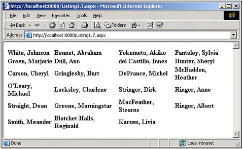
These are the templates that can be used by the DataList. The Repeater, however, can use only a subset of these templates; likewise, the DataGrid, with its TemplateColumn control, can only use a subset of these templates. Before moving onto the Repeater control, let's take a moment to note some of the DataList's features. Although the DataList does not have the DataGrid's built-in paging and sorting support, it does allow for editing of the data. One especially cool feature of the DataList is in its RepeatColumns property. By tweaking this property, you can give the DataList a grid-like effect, where you can specify how many columns wide the grid should be. For example, Listing 1.7 shows an altered DataList declaration, with its RepeatColumns property set to 4 (line 2). (All other code from Listing 1.5 has remained unchanged.) Listing 1.7 The RepeatColumns Property "Stretches" the DataList1: <asp:datalist runat="server" 2: RepeatColumns="4"> 3: <ItemTemplate> 4: <b><%# DataBinder.Eval(Container.DataItem, "au_lname") %>, 5: <%# DataBinder.Eval(Container.DataItem, "au_fname") %></b> 6: </ItemTemplate> 7: </asp:datalist> Notice how the screenshot of Listing 1.7 (shown in Figure 1.4) depicts an HTML table with four columns per row, as opposed to one column per row (as in Figure 1.3) specifically, the HTML table in Figure 1.4 has four td tags per tr. Figure 1.4. The RepeatColumns specifies the number of columns per row in the HTML table. We'll be examining some of the DataList's other features in future chapters. For now, though, let's turn our attention to the last of the three data Web controls: the Repeater control. |
EAN: 2147483647
Pages: 111