Editing and Adding to Chart Information
3 4
Creating your chart is only half the fun. Once you decide on the basic style you want, you can add to, edit, and enhance your chart by using chart options to add titles and labels, and you can make other modifications as well. You use the Chart Options dialog box to add titles, axes controls, gridlines, legends, labels, and more. To display the Chart Options dialog box, double-click the chart in your document; then choose Chart, Chart Options (see Figure 19-8).
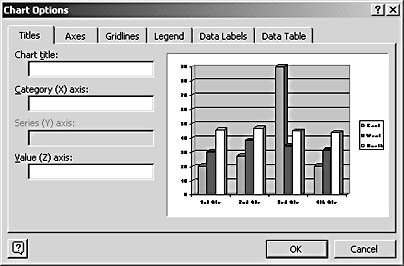
Figure 19-8. You add titles, labels, and other chart elements in the Chart Options dialog box.
Although most of the elements you'll find in the Chart Options dialog box apply to all the different chart types, some controls are disabled for certain charts. For example, the Series (Y) Axis box is disabled in a default column chart, shown in Figure 19-8. And the only tabs available in the Chart Options dialog box for a pie chart are Titles, Legend, and Data Labels.
Titling the Chart and Axes
When you first display the Chart Options dialog box, the Titles tab is selected by default. In this tab, you'll add an overall title for your chart and specify titles for each axis, as desired. Click in the Chart Title box and type your title. The preview window is automatically updated to reflect your change.
Tip - Choose chart titles that work
Chances are that you won't have a lot of room in your document for lengthy chart titles. Try to choose a title that pulls out key words reflecting what the chart's portraying. If you're comparing product sales, "Product Sales Comparison" works. If you're comparing your private school's test results with the local public school system, "Test Score Comparison" would be accurate. Not exciting, but accurate. If you can think of something exciting too, all the better.
The process of naming the axes is similar to naming the chart; simply click in the appropriate box and type your title. The Category (X) Axis is the horizontal axis; the Value (Z) Axis is the vertical axis. Remember that each title you enter takes up space around your chart and you run the risk of giving the readers too much to read—so make sure your axes titles, if you choose to use them, truly add to the information you're trying to convey.
After you name the chart and the axes, click OK to return to the document in Microsoft Graph. You can now edit and format the chart title as you would any other text; you can change the font, style, color, and size.
Controlling the Axes
You can further customize the way information is displayed in your chart by changing what's shown along the chart axes. When you first create a chart, Microsoft Graph notches off the axes by adding tick marks, small marks that indicate increments, or categories by which your data is measured.
If you want to suppress the display of the tick marks used along the axes, choose Chart, Chart Options to display the Chart Options dialog box and click the Axes tab (see Figure 19-9). The Axes tab gives you the choice to display or hide the marks and labels along the Category (X) axis and the Value (Z) axis. (If your chart has a Series (Y) axis, like the one in Figure 19-9, this option will be enabled as well.) By default, all labels and marks are displayed. To suppress the display, clear the check box beside the axis items you want to hide.
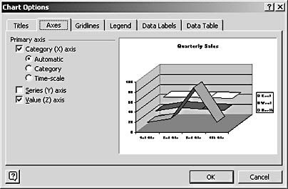
Figure 19-9. If you're pressed for space in your document, you can suppress the display of axis labels and tick marks.
Troubleshooting
I Can't See Axis Titles in My Chart
If you're having trouble seeing the axis titles along the Category and Values axes on your chart, the chart area might be too small to display all the chart information successfully. Try resizing the chart by clicking it and dragging one of the resize handles outward, enlarging the chart. If that doesn't do the trick, click the axis title while editing the chart and choose a smaller Font Size in the Formatting toolbar.
To Gridline or Not to Gridline
For complicated charts with multiple data series especially, gridlines can help clarify the comparisons and conclusions you want readers to draw from your chart. Gridlines are easy to both add and remove, so there's no reason not to experiment with them to see whether they suit your needs for your current chart type.
To add gridlines to your chart, select the chart in Microsoft Graph and click one of the following buttons on the Standard toolbar:
- Category Axis Gridlines adds vertical gridlines that correspond to the categories of your data.
- Value Axis Gridlines adds horizontal gridlines that correspond to the value data segments along the Value axis.
By default, Microsoft Graph adds gridlines at each major category or value mark in your chart. But you can add additional gridlines in smaller increments, if you find that your data needs warrant it. With the chart selected, choose Chart, Chart Options to display the Chart Options dialog box and click the Gridlines tab. You'll find a series of options that enable you to select both Major and Minor gridlines for your chart.
Be forewarned, however: With gridlines, a little goes a long way. Be sure to add only what your reader needs in order to understand your data—too many lines will clutter up your chart and make it more difficult for readers to decipher.
Tip - Get the particulars right
If you want more control over where gridlines are placed and how tick marks appear, select the axis you want to change and then right-click and choose the Format Axis command on the shortcut menu. In the Format Axis dialog box, click the Scale tab and enter the settings you want for the display and number of tick marks used.
Working with a Legend
Microsoft Graph assumes that you want a legend for your chart when you first create it. If this is a mistaken assumption, you can have Graph remove the legend by clicking the Legend button on the Standard toolbar. This hides the legend and causes your chart to be enlarged to fill the space the legend previously occupied.
You can control where in the chart the legend is placed by selecting the chart in Microsoft Graph and choosing Chart, Chart Options to display the Chart Options dialog box. Click the Legend tab, and you'll see a number of options that enable you to hide the legend (simply clear the Show Legend check box) or, in the Placement section, place it by clicking Bottom, Corner, Top, Right, or Left. Microsoft Graph repositions or hides the legend after you click OK.
Entering Data Labels
Data labels are helpful in those instances when you need to give the reader further clues about which data items go with which series or category. Microsoft Graph gives you the ability to add several different kinds of data labels to your charts. You might want to add percentages to pie slices, for example, or category labels to stacked bars.
To add data labels, choose Chart, Chart Options to display the Chart Options dialog box and click the Data Labels tab (see Figure 19-10). The options you see will depend on the type of chart you're working with, but you'll see at least the Series Name and Category Name labels if you're working with a chart that has horizontal and vertical axes. Choose the labels you want to display by selecting the check box to the left of the label type:
- Series Name adds the name of the data series (in the example, East, West, and North).
- Category Name displays the name of the category, which in this example is already listed along the Category (X) axis.
- Value displays the actual numeric value of the data plotted at each category.
- Percentage (available for pie and doughnut charts) displays the percentage of the whole each data item represents.
- Bubble Size (available for bubble charts) lists the size of each bubble, which is tied to the value.
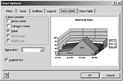
Figure 19-10. Data labels can add a bit of extra description to the data series in your chart.
Tip - Choose multiple labels
You can choose to display more than one type of label if you choose. For example, you might want to display both percentages and category names on a pie chart. If you select more than one label type, use a separator to separate the labels. Click the Separator down arrow to display a list of choices and click the separator you want to use.
One more way you can make sure readers get the connection between your data trends and the categories being plotted: You can use the Legend Key feature to add small legend tags to the left of each data label. Readers will be able to see at a glance which items relate to the categories displayed in your chart legend.
Tip - Change labels in the datasheet
The data labels Microsoft Graph uses are taken right from your datasheet. If you want to change a data label on the chart, it's best to go back to the datasheet and make the change. Otherwise, the label change might not "stick" and you might see the same old label displayed the next time you display your chart.
Creating a Data Table from Chart Options
There's yet another way to make sure your readers understand how the data in your chart directly relates to the values they've seen in your document. You can create a data table in Microsoft Graph to show the numeric data beneath the actual chart. This gives readers different ways to understand the data being graphed.
To create a data table for your chart, click the Data Table button on the Standard toolbar. A data table is added, as Figure 19-11 shows.
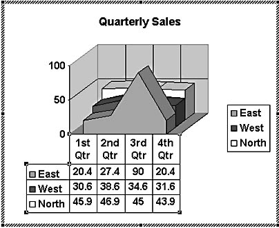
Figure 19-11. Data tables display the actual data used to create your chart in table format beneath the chart area.
Tip - Add a data table within a chart
You can also add a data table from within the Chart Options dialog box. Simply click the Data Table tab and select the Show Data Table check box. Click OK to return to your chart and the data table will be added.
EAN: 2147483647
Pages: 337