Tool 175: Scatter Diagram
| AKA | Scatter Analysis, Scatterplot |
| Classification | Analyzing/Trending (AT) |
Tool description
The scatter diagram is an analysis tool that plots related pairs of variables (factors) to display a pattern of relationship or correlation. This tool is extremely useful in detecting possible causes of a problem, the strength of the relationship, and how the change of one variable can affect the other.
Typical application
-
To determine if a relationship exists between two sets of data.
-
To demonstrate that a change in one activity or condition will affect the other.
-
To verify a possible cause to an observed effect.
-
To illustrate process improvement.
Problem-solving phase
| Select and define problem or opportunity | |
| → | Identify and analyze causes or potential change |
| Develop and plan possible solutions or change | |
| → | Implement and evaluate solution or change |
| → | Measure and report solution or change results |
| Recognize and reward team efforts |
Typically used by
| 1 | Research/statistics |
| Creativity/innovation | |
| Engineering | |
| Project management | |
| 3 | Manufacturing |
| 5 | Marketing/sales |
| Administration/documentation | |
| 4 | Servicing/support |
| 2 | Customer/quality metrics |
| 6 | Change management |
before
-
Checksheet
-
Data Collection Strategy
-
Events Log
-
Defect Map
-
Cause and Effect Diagram (CED)
after
-
Presentation
-
Information Needs Analysis
-
Trend Analysis
-
Potential Problem Analysis (PPA)
-
Cost of Quality
Notes and key points
-
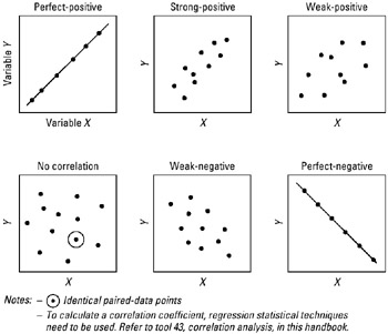
Scatter patterns of correlation:
Step-by-step procedure
-
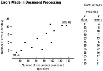
STEP 1 Select two sets of data (variables) for plotting. See example Errors Made in Document Processing.
-
STEP 2 Sort or rank the data pairs from low to high for both data sets.
-
STEP 3 Construct a diagram and scale both axes in accordance with observed data pairs, from low numbers to high numbers of occurrence. For example, the X axis reflects a scale from 0 to 140 documents processed per day, the Y axis shows a scale from 0 to 25 errors made per day.
-
STEP 4 Plot related data pairs on the grid—the diagram. Be careful in measuring the exact location of the intersecting point.
-
STEP 5 Label and date the scatter diagram.
Example of tool application
EAN: 2147483647
Pages: 326