Tools - L - O
Tool 101: Line Chart
| AKA | Line Graph |
| Classification | Analyzing/Trending (AT) |
Tool description
A simple line chart is an ideal method for showing trends in quality, quantity, cost, customer satisfaction, and so on. It is often a first indication that some problem exists during the monitoring and tracking of quality performance data.
Typical application
-
To monitor and track data over a period of time.
-
To show a trendline analysis.
-
To display change in quality performance.
-
To identify shifts from predetermined averages.
Problem-solving phase
| → | Select and define problem or opportunity |
| → | Identify and analyze causes or potential change |
| Develop and plan possible solutions or change | |
| → | Implement and evaluate solution or change |
| → | Measure and report solution or change results |
| Recognize and reward team efforts |
Typically used by
| Research/statistics | |
| Creativity/innovation | |
| Engineering | |
| 1 | Project management |
| 2 | Manufacturing |
| 3 | Marketing/sales |
| Administration/documentation | |
| Servicing/support | |
| 4 | Customer/quality metrics |
| Change management |
before
-
Frequency Distribution (FD)
-
Checksheet
-
Observation
-
Focus Group
-
Surveying
after
-
Stratification
-
Multivariable Chart
-
Trend Analysis
-
Pie Chart
-
Pareto Chart
Notes and key points
-
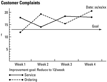
To enhance the interpretation of a line chart, a "goal for improvement" or a "standard" line should be drawn to verify actual performance to the desired goal or standard.
Step-by-step procedure
-
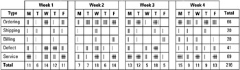
STEP 1 Collect data from some source, such as a checksheet. See example Customer Complaints.
-
STEP 2 Construct a line chart and apply the 3:4 ratio rule: The height of the Y axis must be 75 percent of the length of the X axis.
-
STEP 3 Label the axes, plot and connect the data points, and draw the line as encoded in the legend. Date the line chart.
Example of tool application
Customer Complaints
EAN: 2147483647
Pages: 326