Section 8.3. Borders
8.3. BordersInside the margins of an element are its borders. The border of an element is simply one or more lines that surround the content and padding of an element. Thus, the background of the element will stop at the outer border edge, since the background does not extend into the margins, and the border is just inside the margin. Every border has three aspects: its width, or thickness; its style, or appearance; and its color. The default value for the width of a border is medium, which is not explicitly defined but is usually two pixels. Despite this, the reason you don't usually see borders is that the default style is none, which prevents them from existing. If a border has no style, it doesn't need to exist. (This lack of existence can also reset the width value, but we'll get to that in a little while.) Finally, the default border color is the foreground color of the element itself. If no color has been declared for the border, it will be the same color as the text of the element. If, on the other hand, an element has no textlet's say it has a table that contains only imagesthe border color for that table will be the text color of its parent element (due to the fact that color is inherited). That element is likely to be body, div, or another table. Thus, if a table has a border, and the body is its parent, given this rule: body {color: purple;} by default, the border around the table will be purple (assuming the user agent doesn't set a color for tables). Of course, to get that border to appear, you have to do a little work first. 8.3.1. Borders and BackgroundsThe CSS specification strongly implies that the background of an element extends to the outside edge of the border, since it mentions borders being drawn "on top of the background of the element." This is important because some borders are "intermittent"for example, dotted and dashed bordersand the element's background should appear in the spaces between the visible portions of the border. When CSS2 was released, it stated that the background extends only into the padding, not the borders. This was later corrected, and CSS2.1 explicitly states that the element's background is the background of the content, padding, and border areas. Most browsers are in agreement with the CSS2.1 definition, although some older browsers may act differently. Background color issues are discussed in more detail in Chapter 9. 8.3.2. Borders with StyleWe'll start with border styles, which are the most important aspect of a bordernot because they control the appearance of the border (although they certainly do that) but because without a style, there wouldn't be any border at all. CSS defines 10 distinct non-inherit styles for the property border-style, including the default value of none. The styles are demonstrated in Figure 8-20. Figure 8-20. Border styles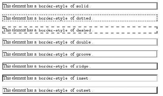 The style value hidden is equivalent to none, except when applied to tables, where it's used for border-conflict resolution. (See Chapter 11 for more details.)
The most unpredictable border style is double. It's defined such that the width of the two lines, plus the width of the space between them, is equal to the value of border-width (discussed in the next section). However, the CSS specification doesn't say whether one of the lines should be thicker than the other, or if they should be the same width, or if the space should be thicker or thinner than the lines. All of these things are decided by the user agent, and the author has no way to influence the decision. All of the borders shown in Figure 8-20 are based on a color value of gray, which makes the visual effects easier to see. The look of a border style is always based in some way on the color of the border, although the exact method may vary between user agents. For example, Figure 8-21 illustrates two different ways of rendering an inset border. Figure 8-21. Two valid ways of rendering inset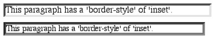 So let's assume you want to define a border style for images that are inside any unvisited hyperlink. You might make them outset, so they have a "raised button" look, as depicted in Figure 8-22: a:link img {border-style: outset;} Figure 8-22. Applying an outset border to a hyperlinked image Again, the color of the border is based on the element's value for color. In this circumstance, that value is likely to be blue (although it won't show in print) because the image is contained with a hyperlink, and the foreground color of hyperlinks is usually blue. If you so desired, you could change that color to silver, like this: a:link img {border-style: outset; color: silver;} The border will now be based on the light-grayish silver, since that's now the foreground color of the imageeven though the image doesn't actually use it, it's still passed on to the border. We'll talk about another way to change border colors later in this chapter. 8.3.2.1. Multiple stylesIt's possible to define more than one style for a given border. For example: p.aside {border-style: solid dashed dotted solid;} The result is a paragraph with a solid top border, a dashed right border, a dotted bottom border, and a solid left border. Again we see the top-right-bottom-left order of values, just as we saw in our discussion of setting different margins with multiple values. All of the same rules about value replication apply to border styles, as they did with margins and padding. Thus, the following two statements would have the same effect, which is depicted in Figure 8-23: p.new1 {border-style: solid dashed none;} p.new2 {border-style: solid dashed none dashed;} Figure 8-23. Equivalent style rules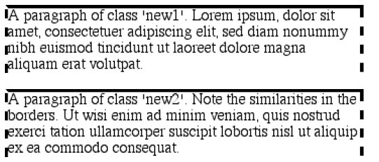 8.3.2.2. Single-side stylesThere may be times when you want to set border styles for just one side of an element box, rather than all four. That's where the single-side border style properties come in.
Single-side border style properties are fairly self-explanatory. If you want to change the style for the bottom border, for example, you use border-bottom-style. It's not uncommon to see border used in conjunction with a single-side property. Suppose you want to set a solid border on three sides of a heading, but not have a left border at all, as shown in Figure 8-24. Figure 8-24. Removing the left border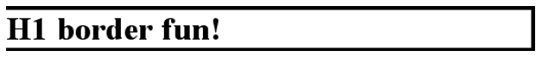 There are two equivalent ways to accomplish this: h1 {border-style: solid solid solid none;} /* the method above is the same as the one below */ h1 {border-style: solid; border-left-style: none;} What's important to remember is that if you're going to use the second approach, you must place the single-side property after the shorthand, as is usually the case with shorthands. This is because border-style: solid is actually a declaration of border-style: solid solid solid solid. If you put border-style-left: none before the border-style declaration, the shorthand's value will override the single-side value none. You may have noticed that, so far, your border examples have used borders of exactly the same width. This is because you didn't define a width, so it defaulted to a certain value. Next, you'll find out about that default, and much more. 8.3.3. Border WidthsOnce you've assigned a border a style, the next step is to give it some width using the property border-width.
You can also use one of its cousin properties.
Each of these properties is used to set the width on a specific border side, of course, just as with the margin properties.
There are four ways to assign width to a border: you can give it a length value such as 4px or 0.1em or use one of three keywords. These keywords are thin, medium (the default value), and thick. These keywords don't necessarily correspond to any particular width but are simply defined in relation to one another. According to the specification, thick is always wider than medium, which is in turn always wider than thin. However, the exact widths are not defined, so one user agent could set them to be equivalent to 5px, 3px, and 2px, while another sets them to be 3px, 2px, and 1px. No matter what width the user agent uses for each keyword, it will be the same throughout the document, regardless of where the border occurs. So, if medium is the same as 2px, then a medium-width border will always be two pixels wide, whether the border surrounds an H1 or a p element. Figure 8-25 illustrates one way to handle these three keywords, as well as how they relate to each other and to the content they surround. Figure 8-25. The relation of border-width keywords to one another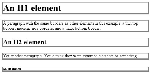 Let's suppose a paragraph has margins, a background color, and a border style set: p {margin: 5px; background-color: silver; border-style: solid;} By default, the border's width is medium. You can change that easily enough: p {margin: 5px; background-color: silver; border-style: solid; border-width: thick;} Of course, border widths can be taken to fairly ridiculous extremes, such as setting 50-pixel borders, as depicted in Figure 8-26: p {margin: 5px; background-color: silver; border-style: solid; border-width: 50px;} Figure 8-26. Really wide borders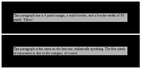 It's also possible to set widths for individual sides, using two familiar methods. The first is to use any of the specific properties mentioned at the beginning of the section, such as border-bottom-width. The other way is to use value replication in border-width, which is illustrated in Figure 8-27: h1 {border-style: dotted; border-width: thin 0;} p {border-style: solid; border-width: 15px 2px 7px 4px;} Figure 8-27. Value replication and uneven border widths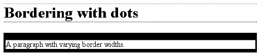 8.3.3.1. No border at allSo far, we've talked only about using a visible border style such as solid or outset. Let's consider what happens when you set border-style to none: p {margin: 5px; border-style: none; border-width: 20px;} Even though the border's width is 20px, the style is set to none. In this case, not only does the border's style vanish, so does its width. The border simply ceases to be. Why? If you'll remember, the terminology used earlier in the chapter was that a border with a style of none does not exist. Those words were chosen very carefully because they help explain what's going on here. Since the border doesn't exist, it can't have any width, so the width is automatically set to 0 (zero), no matter what you try to define. After all, if a drinking glass is empty, you can't really describe it as being half-full of nothing. You can discuss the depth of a glass's contents only if it has actual contents. In the same way, talking about the width of a border makes sense only in the context of a border that exists. This is important to keep in mind because it's a common mistake to forget to declare a border style. This leads to all kinds of author frustration because, at first glance, the styles appear correct. Given the following rule, though, no h1 element will have a border of any kind, let alone one that's 20 pixels wide: h1 {border-width: 20px;} Since the default value of border-style is none, failing to declare a style is exactly the same as declaring border-style: none. Therefore, if you want a border to appear, you must declare a border style. 8.3.4. Border ColorsCompared to the other aspects of borders, setting the color is pretty easy. CSS uses the single property border-color, which can accept up to four color values at one time.
If there are less than four values, value replication takes effect. So if you want H1 elements to have thin black top and bottom borders with thick gray side borders, and medium gray borders around p elements, the following markup will suffice. The result is illustrated in Figure 8-28: h1 {border-style: solid; border-width: thin thick; border-color: black gray;} p {border-style: solid; border-color: gray;} Figure 8-28. Borders have many aspects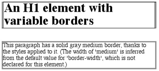 A single color value will be applied to all four sides, of course, as with the paragraph in the previous example. On the other hand, if you supply four color values, you can get a different color on each side. Any type of color value can be used, from named colors to hexadecimal and RGB values: p {border-style: solid; border-width: thick; border-color: black rgb(25%,25%,25%) #808080 silver;} As I mentioned earlier in the chapter, if you don't declare a color, the default color is the foreground color of the element. Thus, the following declaration will be displayed as shown in Figure 8-29: p.shade1 {border-style: solid; border-width: thick; color: gray;} p.shade2 {border-style: solid; border-width: thick; color: gray; border-color: black;} Figure 8-29. Border colors based on the element's foreground and the value of the border-color property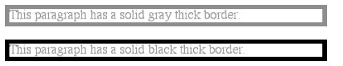 The result is that the first paragraph has a gray border, having taken the value gray from the foreground color of the paragraph. The second paragraph, however, has a black border because that color was explicitly assigned using border-color. There are single-side border-color properties as well. They work in much the same way as the single-side properties for style and width. One way to give headings a solid black border with a solid gray right border is as follows: h1 {border-style: solid; border-color: black; border-right-color: gray;}
8.3.4.1. Transparent bordersAs you remember, if a border has no style, then it has no width. There are, however, situations where you'll want to create an invisible border. This is where the border color value TRansparent (introduced in CSS2) comes in. This value is used to create an invisible border that has width. Let's say you want a set of three links to have borders that are invisible by default, but appear inset when the link is hovered. You can accomplish this by making the borders transparent in the nonhovered case: a:link, a:visited {border-style: solid; border-width: 5px; border-color: transparent;} a:hover {border-color: gray;} This has the effect shown in Figure 8-30. Figure 8-30. Using transparent borders In a sense, TRansparent lets you use borders as if they were extra padding, with the additional benefit of being able to make them visible should you so choose. They act as padding because the background of the element extends into the border area, assuming there is a visible background.
8.3.5. Shorthand Border PropertiesUnfortunately, shorthand properties such as border-color and border-style aren't always as helpful as you'd think. For example, you might want to apply a thick, gray, solid border to all h1 elements, but only along the bottom. If you limit yourself to the properties we've discussed so far, you'll have a hard time applying such a border. Here are two examples: h1 {border-bottom-width: thick; /* option #1 */ border-bottom-style: solid; border-bottom-color: gray;} h1 {border-width: 0 0 thick; /* option #2 */ border-style: none none solid; border-color: gray;} Neither is really convenient, given all the typing involved. Fortunately, there's a better solution: h1 {border-bottom: thick solid gray;} This applies the values to the bottom border alone, as shown in Figure 8-31, leaving the others to their defaults. Since the default border style is none, no borders appear on the other three sides of the element. Figure 8-31. Setting a bottom border with a shorthand property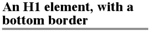 As you may have already guessed, there are a total of four such shorthand properties.
It's possible to use these properties to create some complex borders, such as those shown in Figure 8-32: h1 {border-left: 3px solid gray; border-right: black 0.25em dotted; border-top: thick silver inset; border-bottom: double rgb(33%,33%,33%) 10px;} Figure 8-32. Very complex borders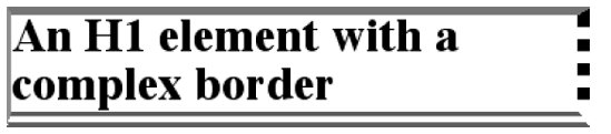 As you can see, the order of the actual values doesn't really matter. The following three rules yield exactly the same border effect: h1 {border-bottom: 3px solid gray;} h2 {border-bottom: solid gray 3px;} h3 {border-bottom: 3px gray solid;} You can also leave out some values and let their defaults kick in, like this: h3 {color: gray; border-bottom: 3px solid;} Since no border color is declared, the default value (the element's foreground) is applied instead. Just remember that if you leave out a border style, the default value of none will prevent your border from existing. By contrast, if you set only a style, you will still get a border. Let's say you simply want a top border style of dashed, and you're willing to let the width default to medium and the color be the same as the text of the element itself. All you need in such a case is the following markup (shown in Figure 8-33): p.roof {border-top: dashed;} Figure 8-33. Dashing across the top of an element Another thing to note is that since each of these "border-side" properties apply only to a specific side, there isn't any possibility of value replicationit wouldn't make any sense. There can be only one of each type of value: that is, only one width value, only one color value, and only one border style. So don't try to declare more than one value type: h3 {border-top: thin thick solid purple;} /* two width values--WRONG */ In such a case, the entire statement will be invalid and a user agent would ignore it altogether. 8.3.6. Global BordersNow, we come to the shortest shorthand border property of all: border.
This property has the advantage of being very compact, although that brevity introduces a few limitations. Before we worry about that, let's see how border works. If you want all h1 elements to have a thick, silver border, it's very simple. This declaration would be displayed as shown in Figure 8-34: h1 {border: thick silver solid;} Figure 8-34. A really short border declaration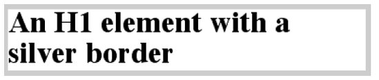 The values are applied to all four sides. This is certainly preferable to the next-best alternative, which would be: h1 {border-top: thick silver solid; border-bottom: thick silver solid; border-right: thick silver solid; border-left: thick silver solid;} /* same as previous example */ The drawback with border is that you can define only "global" styles, widths, and colors. In other words, the values you supply for border will apply to all four sides equally. If you want the borders to be different for a single element, you'll need to use some of the other border properties. Of course, it's possible to turn the cascade to your advantage: H1 {border: thick silver solid; border-left-width: 20px;} The second rule overrides the width value for the left border assigned by the first rule, thus replacing thick with 20px, as you can see in Figure 8-35. Figure 8-35. Using the cascade to one's advantage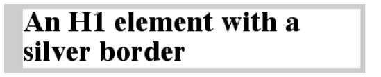 You still need to take the usual precautions with shorthand properties: if you omit a value, the default will be filled in automatically, which can have unintended effects. Consider the following: h4 {border-style: dashed solid double;} h4 {border: medium green;} Here, you've failed to assign a border-style in the second rule, which means that the default value of none will be used, and no H4 elements will have any border at all. 8.3.7. Borders and Inline ElementsDealing with borders and inline elements should sound pretty familiar since the rules are largely the same as those for margins and inline elements, as well as for material covered in Chapter 7. Still, I'll briefly touch on the topic again. First, no matter how thick you make your borders on inline elements, the line height of the element won't change. Let's set top and bottom borders on boldfaced text: strong {border-top: 10px solid gray; border-bottom: 5px solid silver;} Once more, this syntax is allowed in the specification, but it will have absolutely no effect on the line height. However, since borders are visible, they'll be drawnas you can see for yourself in Figure 8-36. Figure 8-36. Borders on inline nonreplaced elements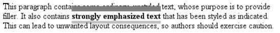 The borders had to go somewhere; that's where they went. Again, all of this is true only for the top and bottom sides of inline elements; the left and right sides are a different story. If you apply a left or right border, not only will it be visible, but it will displace the text around it, as you can see in Figure 8-37: strong {border-left: 25px double gray; background: silver;} Figure 8-37. An inline nonreplaced element with a left border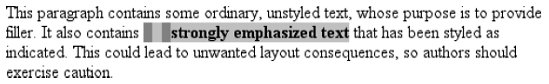 With borders, just as with margins, the browser's calculations for line-breaking are not directly affected by any box properties set for inline elements. The only effect is that the space occupied by the borders may shift portions of the line over a bit, which may in turn change which word is at the end of the line.
|

 The Definitive Guide")
EAN: 2147483647
Pages: 130