6.6 Text Shadows
| CSS2 includes a property for adding drop shadows to text, but this property did not make it into CSS2.1 because no browser had implemented full support for it by the time CSS2.1 was finished. When you consider the effort necessary to make a web browser determine the outlines of text in an element and then compute one or more shadows, all of which would have to blend together without overlapping the text itself, the lack of drop shadows in the specification is perhaps understandable.
The obvious default is not to have a drop shadow for text. Otherwise, it's theoretically possible to define one or more shadows. Each shadow is defined by a color and three length values. The color sets the shadow's color, of course; so it's possible to define green, purple, or even white shadows. The first two length values determine the offset distance of the shadow from the text, and the optional third length value defines the "blur radius" for the shadow. To define a green shadow offset five pixels to the right and half an em down from the text, with no blurring, you would write: text-shadow: green 5px 0.5em; Negative lengths cause the shadow to be offset to the left and upward from the original text. The blur radius is defined as the distance from the shadow's outline to the edge of the blurring effect. A radius of two pixels would result in blurring that filled the space between the shadow's outline and the edge of the blurring. The exact blurring method is not defined, so different user agents might employ different effects. As an example, the following styles might be rendered something like Figure 6-31: p.cl1 {color: black; text-shadow: silver 2px 2px 2px;} p.cl2 {color: white; text-shadow: 0 0 4px black;} p.cl3 {color: black; text-shadow: 1em 1em 5px gray, -1em -1em silver;} Figure 6-31. Dropping shadows all over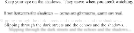
6.6.1 Handling WhitespaceTo wrap up this chapter, let's talk about the property white-space, which can greatly impact how text is actually displayed.
Using this property, you can affect how a browser treats the whitespace between words and lines of text. To a certain extent, XHTML already does this: it collapses any whitespace down to a single space. So given the following markup, the rendering in a web browser would be to show only one space between each word and to ignore the linefeed in the elements. <p>This paragraph has many spaces in it.</p> You can explicitly set this default behavior with the following declaration: p {white-space: normal;} This rule tells the browser to do as browsers have always done discard extra whitespace. Any extra spaces and carriage returns are completely ignored by the browser. Should you set white-space to pre, however, the whitespace in an affected element is treated as though the elements were XHTML pre elements; whitespace is not ignored, as shown in Figure 6-32: p {white-space: pre;} <p>This paragraph has many spaces in it.</p> Figure 6-32. Honoring the spaces in markup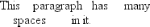 With a white-space value of pre, the browser will pay attention to extra spaces and even carriage returns. In this respect, and in this respect alone, any element can be made to act like a pre element. The opposite property is nowrap, which prevents text from wrapping within a block-level element, except when you use a <br/> element. Using nowrap in CSS is much like setting a table cell not to wrap in HTML 4 with <td nowrap>, except the white-space value can be applied to any block-level element. The effects of the following markup are shown in Figure 6-33: <p style="white-space: nowrap;">This paragraph is not allowed to wrap, which means that the only way to end a line is to insert a line-break element. If no such element is inserted, then the line will go forever, forcing the user to scroll horizontally to read whatever can't be initially displayed <br/>in the browser window.</p> Figure 6-33. Suppressing line wrapping with the white-space property You can actually use white-space to replace the nowrap attribute on table cells: td {white-space: nowrap;} <table><tr> <td>The contents of this cell are not wrapped.</td> <td>Neither are the contents of this cell.</td> <td>Nor this one, or any after it, or any other cell in this table.</td> <td>CSS prevents any wrapping from happening.</td> </tr></table> CSS2.1 introduced the values pre-wrap and pre-line, which were not present in earlier versions of CSS. The effect of these values is to allow authors to more finely control whitespace handling. If an element is set to pre-wrap, then text within that element has whitespace sequences preserved but text lines that are wrapped normally. With this value, line-breaks in the source and those that are generated are also honored. pre-line is the opposite of pre-wrap and causes whitespace sequences to collapse as in normal text but honors new lines. For example, consider the following markup, which is illustrated in Figure 6-34: <p style="white-space: pre-wrap;"> This paragraph has a great many s p a c e s within its textual content, but their preservation will not prevent line wrapping or line breaking. </p> <p style="white-space: pre-line;"> This paragraph has a great many s p a c e s within its textual content, but their collapse will not prevent line wrapping or line breaking. </p> Figure 6-34. Two different ways to handle whitespace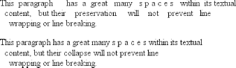 Table 6-1 summarizes the behaviors of white-space properties.
6.6.2 Text DirectionIf you're reading this book in English or any number of other languages, then you're reading the text left to right and top to bottom, which is the flow direction of English. Not every language runs this way, though. There are many right-to-left languages such as Hebrew and Arabic, and CSS2 introduced a property to describe their directionality.
The direction property affects the writing direction of text in a block-level element, the direction of table column layout, the direction in which content horizontally overflows its element box, and the position of the last line of a fully justified element. For inline elements, direction applies only if the property unicode-bidi is set to either embed or override. (See later in this section for a description of unicode-bidi.)
Although ltr is the default, it is expected that if a browser is displaying right-to-left text, the value will be changed to rtl. Thus, a browser might carry an internal rule stating something like the following: *:lang(ar), *:lang(he) {direction: rtl;} The real rule would be longer, encompassing all right-to-left languages not just Arabic and Hebrew, but it serves to illustrate the point. While CSS makes an attempt to address writing direction, Unicode has a much more robust method for handling directionality. With the property unicode-bidi, CSS authors can take advantage of some of Unicode's capabilities.
Here we'll simply quote the value descriptions from the CSS2.1 specification, which do a good job of capturing the essence of each value:
|

EAN: 2147483647
Pages: 135