Simplifying Interaction
Web pages simplify interaction through two techniques: single-clicking and eliminating menus. Let's look at each in more detail.
Single-Clicking
The most basic form of interaction in Windows is the mouse click. But what does a single mouse click do? The problem is that it depends on what is being clicked. For example, single-clicking a command button gives the command, but single-clicking an icon on the desktop doesn't open the shortcut but selects the icon instead. In this case, you have to double-click to open the shortcut. So, the clicking rules are:
- Buttons perform their action with a single click.
- Nonbuttons are selected with a single click, whereas double-clicking selects the object and performs the default action.
For a user to understand how an object is going to behave when clicked, the user needs to understand these rules and the visual distinction between a button and a nonbutton, which isn't easy to do. To help make this visual distinction, program icons should not look like buttons—they should not have raised rectangular 3-D borders. Not surprisingly, many users don't understand these distinctions. Some users single-click everything, some double-click everything, and others (like my two-year-old son Philippe) just keep blasting at it until they get what they want. These users are confused by the most basic form of Windows interaction. Such confusion cannot be good.
Web pages eliminate this problem by using single-clicking for everything. (This is true for HTML at least—Microsoft ActiveX controls can do whatever they want.) They can do this because there is no notion of selection in a Web page, so there is no need to distinguish between single clicks and double clicks. Selection is usually accomplished through check boxes, as with this example from Amazon.com:
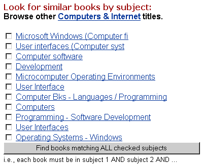
Note that in this example you can immediately view a subject by clicking its hyperlink or you can select several subjects and click the Find button. Another selection technique used by Windows Explorer in the Web-style mode is hovering: an item is selected when you hover the cursor over the item for about a second. I don't know about you, but using this selection technique for any length of time drives me nuts, since I am constantly selecting objects accidentally. Clearly, selection in Web pages is fairly primitive.
So what should you do? I recommend the following:
- Consider single-clicking when selection isn't necessary. You can visually indicate that an object uses single-clicking by giving it a raised rectangular 3-D border, as done with command buttons, or by underlining its caption and using the visited or unvisited links color, as done with hyperlinks.
- When selection is necessary, make sure that selectable objects are visually distinct from objects that are not selectable. In other words, selectable objects should never have raised rectangular 3-D borders or underlined captions.
TIP
Consider single-clicking when selection isn't necessary, but make sure that there is a clear visual distinction between single-clickable objects and double-clickable objects.
Eliminating Menus
Menus are fundamental to basic interaction in modern user interfaces, yet Web pages don't have menus. (OK, Web pages can have menus, but Web page menus are supported by scripting, not through HTML.) Web pages compensate for not having menus by embedding the commands directly in the context of the page where they are needed. This technique establishes a clear relationship between what is on the screen and what you can do with it.
In Chapter 6, "Beginning vs. Advanced Users" and Chapter 10, "Good User Interfaces Are Visible" I explained that menu bars are the best way of showing beginning users how to use your program because the menu bar is effectively a hierarchically organized catalog of all the program's features. (This makes menu bars an excellent teaching tool.) But there are exceptions to this rule. For example, dialog boxes don't use menu bars because all the controls needed to use the dialog box already appear in the immediate context where they are needed. The command technique used by Web pages is simply an extension of this approach. If done well, placing commands right where they are needed eliminates the need for the user to go through a learning process to use the program.
If you do decide to put commands in context, you should review the commands you leave in the menu bar. You don't want to constantly change the contents of the menu bar, because this can be disorienting. You want the menus to appear stable. Consequently, you should use the menu bar for universal commands that apply in most contexts.
TIP
Consider embedding commands directly in the context where they are needed. If you do, use the menu bar for universal commands that apply in most contexts.
EAN: 2147483647
Pages: 334