8.6. Tutorial: Creating a Photo Gallery A photo gallery's a perfect example of an eye-catching Web page. This tutorial brings together a variety of image styling techniques. You'll format images with frames and captions, create a photo gallery that's flexible enough to look great in a variety of window sizes, and use background images to create professional-looking drop shadows. To get started, you need to download the tutorial files located on this book's companion Web site at www.sawmac.com/css/. Click the tutorial link and download the files. All of the files are enclosed in a ZIP archive, so you need to unzip them first. (There are detailed instructions on the Web site.) The files for this tutorial are in the chapter_08 folder. 8.6.1. Framing an Image -
Launch a Web browser and open the file chapter_08  image_ex image.html . image_ex image.html . As usual, you'll be working on a Web page from CosmoFarmer.com (Figure 8-10). In this case, there's already an external style sheet attached to the page, adding some basic text formatting. Figure 8-10. Before and afterCSS, that is. If you rely just on HTML, images take up lots of space (left). With a little CSS (right) you can nicely frame an image and move it out of the way. 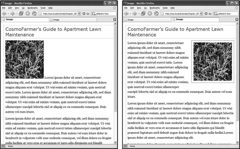 -
Open the file image.html in your favorite text editor . Start by adding an internal style sheet and an empty class style.
Note: The same caveat that you've read in previous tutorials about creating internal style sheets applies here. (See the box in Section 3.1.) In the final tutorial in this chapter, you'll go through the process of converting an internal style sheet into an external style sheet.
-
Click directly after the <link> tag (used to attach the external style sheet), hit Return, and then type the following : <style type="text/css"> img.figure { } </style> This CSS adds a new internal style sheet just above the closing </head> tag. The selector img.figure targets any <img> tag with the figure class applied to it. You'll use this to selectively format only the images you want. -
Add float and margin properties to the style you just created, like so : float: right; margin-left: 10px; margin-bottom: 10px; The right float moves the image to the right side of the page, letting the text move up and wrap around the photo's left edge. The left and bottom margins give the photo a little breathing room and move it away from the text. Next , you'll add a border and some padding to make the image look more like a real snapshot. -
Add border and padding, so that the finished style looks like this : img.figure { float: right; margin-left: 10px; margin-bottom: 10px; border: 1px solid #666; padding: 10px; } If you preview the page right now, you won't see a change, since the class style has no effect until you've added the class to a tag. -
Locate the <img> tag and add class="figure" so that the tag looks like this : <img src="../ images/grass.jpg" alt="Apartment Grass" width="200" height="200" class="figure" /> Now that image takes on all of the formatting properties you defined for the .figure class style. -
Preview the page in a Web browser. It should look like the right image in Figure 8-10 . You can find the completed version of this exercise, image_finished.html in the chapter_08_finishe image_ex folder. A picture may be worth a thousand words, but sometimes you still need a few words to explain a picture. So in the next part of this tutorial, you'll add a caption below the photo.
Note: Internet Explorer 5 for Windows doesn't display the padding between the photo and its border. D'oh!
8.6.2. Adding a Caption You'll frequently want to add a caption to an image or photo to provide more information about the subject, where the photo was taken, and so on. Instead of just floating the image, as you did in the previous exercise, you want the caption text to float as well. The best way to float both is to wrap the image and the text in a containera <div> tagthat's floated as a single unit. This method keeps the photo and its related text together. If you decide later that you want to change their layoutperhaps float them to the leftno problem: You simply change the formatting for the entire container. -
In a text editor, open the file chapter_08 caption_ex caption.html folder . Begin by adding a little HTML to create the container. -
Locate the <img> tag in the code, and add <div class="figure"> before that tag . This marks the beginning of the container. Now close the <div> to indicate the end of the container. -
Find the closing </p> tag of the paragraph directly after the image and type </div> . The code should now look like this : <div class="figure"> <img src="../ images/grass.jpg" alt="Creeping Bentgrass" width="200" height="200"/> <p>Figure 1: Creeping Bentgrass is best suited for outdoor use and should be avoided by the indoor farmer.</p> </div> In previous tutorials you created a new, internal style sheet. In this exercise, you'll edit the existing external style sheet ( styles.css ) that's linked to this Web page. -
Open the file chapter_08 caption_ex styles.css . Because this is an external style sheet, you'll notice there's no <style> tag. That tag's necessary only for internal style sheets. -
Scroll to the bottom of the file and add the following style to the end : .figure img { border: 1px solid #666; padding: 10px; } This descendent selector (Section 3.1) affects any <img> tag inside any other tag with the figure class applied to itin this case, the <div> you just added. Since you're using a descendent selector here (and in step 7), you don't need to add a class to the <img> tag. As a result, you save a little typing, cut down on HTML code, and make the page load faster for your site's visitors . Next, you'll format the <div> so that it floats the photo and caption text to the right edge of the page. -
Add this style to the styles.css file : div.figure { float: right; width: 222px; margin: 15px 10px 5px 10px; } You've already used the float: right property in this tutorial, and the margin adds a little white space around all four edges of the <div>. But what's the width for, you ask? Although the photo has a set width (200 pixels; see step 3) the caption paragraph doesn't. When you don't set a width, the paragraph makes the <div> expand wider than the photo. In this case, you want the caption to be just as wide as the photo and its frame. The 222 pixels comes from a little math used to calculate the entire area taken up by the photo on the page: while the photo is only 200 pixels wide, the 10 pixels of left and right padding as well as the image's 1-pixel left border and 1-pixel right border, make the entire width of the photo equal to 222 pixels, from border to border. Next, spruce up the look of the caption text. -
Add the following style to the styles.css style sheet : .figure p { font: bold 1em/normal Verdana, Arial, Helvetica, sans-serif; color: #333; text-align: center; } This style uses some of the properties you learned about in Chapter 6 to create a center-aligned, bold, and gray caption using the Verdana font. Fortunately, the font shorthand property (see Section 6.4.3) in the first line lets you roll four different properties into a single style declaration. Again, you're taking advantage of a descendent selector ( .figure p ) to target just the caption paragraph. To make the caption stand out even more, add a background color and border. -
Add three properties to the .figure p style, like so : .figure p { font: bold 1em/normal Verdana, Arial, Helvetica, sans-serif; color: #333; text-align: center; background-color: #e6f3ff; border: 1px dashed #666; padding: 5px; } The purpose of the background-color, border , and padding properties should be clearto create a colored box around the caption. Now it's time to preview your work. -
Save both the caption.html and styles.css files and preview the caption.html file in a Web browser . (Now you see one reason why it's easier to develop a design using an internal style sheetyou need to work in and save only one file instead of two.) The page looks great: The photo and caption float to the right, and the caption stands out boldly. There's one small problem, though: If you look at the left and right edges of the paragraph, you'll notice they're indented slightly and aren't as wide as the photo. Here's an example of one of the many head-scratching situations you'll find as you work with CSS. In this case, you've run into a problem with the cascade. The caption text is inside a <p> tag, and, as it happens, there's a tag style for the <p> tag in the styles.css file. When you look at that style, you see it sets margins10 pixels on the top and bottom and 8 pixels on the left and right. You want to override those margins, and you can do so by adding new margins to a more specific style. (See Section 5.2 for a discussion of specificity and the cascade.) Fortunately, you already have a more specific style .figure p so you need only add margins to that style to override the margins from the more generic p style. -
Add a margin property to the .figure p style, like so : .figure p { font: bold 1em/normal Verdana, Arial, Helvetica, sans-serif; color: #333; text-align: center; background-color: #e6f3ff; border: 1px dashed #666; padding: 5px; margin: 10px 0 0 0; } This removes margins on all sides of the caption except the top, which adds 10 pixels of space between the caption and the photo above. -
Save the caption.html and styles.css files. Preview caption.html file in a Web browser . The page should now look like Figure 8-11. (You can find a completed version of this page in the chapter_08_finished caption_ex folder.) 8.6.3. Building a Photo Gallery Folks used to rely on the HTML <table> tag to create rows and columns for holding the pictures in a photo gallery. But you can achieve the same effect with a little CSS and far less HTML. Figure 8-11. With the use of a containing <div>, a right float, and a little style, it's easy to add captions to photos. 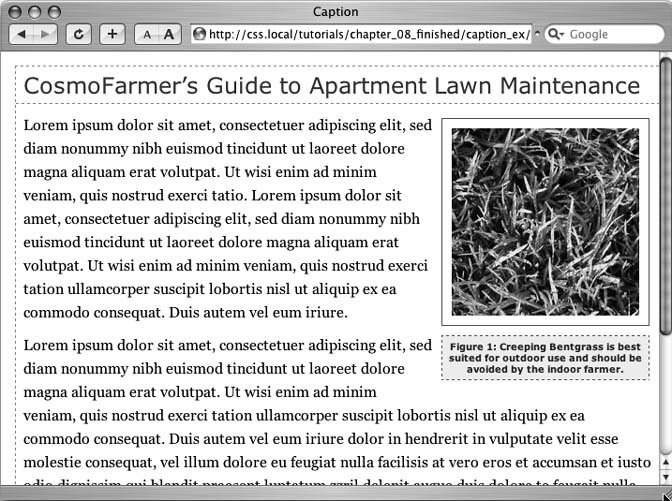
-
Open the file chapter_08 gallery_ex gallery.html . First, a quick review of the HTML used to construct the photo gallery. The page contains nine photos and photo captions. Each photo and caption is contained in a <div> with a class named figure applied to it. This <div> functions just like the similar <div> used in the previous exercise for adding a caption. The photo itself is contained in another <div> with a class of photo : <div class="figure"> <div class="photo"> <img src="../ images/dandelion.jpg" alt="Dandelion" width="200" height="200" /> </div> <p>Figure 6: The dandelion: scourge of the apartment farmer. </p> </div>
Note: That second <div> will come in handy for the next exercise, when you learn to add drop shadows to the photos.
-
Locate the <link> tag near the top of the file, place your cursor after that tag, and then press Enter (Return) to create a new blank line . The <link> tag attaches an external style sheet containing some basic formatting. -
Add an internal style sheet. Then add two new styles, as follows : <style type="text/css"> . photo img { border: 1px solid #666; background-color: #FFF; padding: 4px; } .figure p { font: 1.1em/normal Arial, Helvetica, sans-serif; text-align: center; margin: 10px 0 0 0; } </style> These two styles add a border to each image in the gallery, and set the font, alignment, and margins of the captions. They use descendent selectors to target just the images and paragraphs inside the gallery. All of the images and captions are themselves wrapped in one <div> with an ID of gallery , since enclosing the group of photos in another <div> provides even more formatting options. You could set a specific width for the gallery or add a border around it. But that enclosing <div> also provides another way to target the photos and paragraphs using descendent selectors. For example, # gallery img and # gallery p are also valid descendent selectors in this case. The main difference between the two approaches is the specificity of the styles (see Section 5.2). Because # gallery img is more specific than .photo img , its formatting options override the .photo img style. Next, place the photos side by side.
Note: When you insert the internal style sheet, make sure to place it in the page's head section, between the link tag and the closing </head> tag.
-
Add the following style to the internal style sheet you just created : .figure { float: left; width: 210px; margin: 0 10px 10px 10px; } This style floats each photo/caption pair to the left. In effect, it places the photos side-by-side until there's no more room in the row. The browser then drops the next photos down a row, until all of the photos are displayed one row on top of the next. The width is the total width of the photo plus padding and borders. In this example, it's 200 pixels for the photo, 8 pixels for left and right padding, and 2 pixels for left and right borders.
Tip: In this fictitious photo gallery, each picture's the same width. In the real world, you may have pictures of varying sizes. See the box below for a trick that lets you arrange rows of pictures of different widths. Using different height images won't work (as you'll see in step 5). When you've got images with differing heights, stick with HTML tables.
POWER USERS' CLINIC
When One Width Doesn't Fit All | | It's a breeze to set up a photo gallerylike the CosmoFarmer onewhen the photos are conveniently all the same width. But what if you have photos of differing widths? One solution's to create a style for each different width and apply the style to the <div> with the figure class. (That's tons of work, so it would pay to do some photo editing work to standardize your photos to just a handful of different widths first.) You can take advantage of CSS's ability to apply two classes to one tag like this: <div class="figure w300"> . This <div> tag has both the figure and w300 class styles applied to it. Then create a class style, for example .w300 , and set the width to the width of the image (in this case, 300) plus 10 to cover the padding and borders: .w300 { width: 310 } . For this trick to work, you must either remove the width setting on the .figure style or add the .w300 style after the .figure style in the style sheet. Here's why: The two width definitions conflict (one's 210 the other's 300), so the browser has to break the tie using the cascade (see Chapter 5). Since .figure and .w300 have the same specificity, the one that's defined last in the style sheet wins. | -
Save the file and preview the gallery.html page in a Web browser. It should look like the left image in Figure 8-12 . Adjust the width of your browser window to make it thinner and wider and watch how the images reflow into the space. Ahasomething's not quite right. The second row of images has two empty spaces where photos should be. This problem occurs because the caption for the second image on the first line is taller than the other captions on the line. Images that jump down to another row bump into that caption and can't get by it. (You can read more about this float property snafu in Section 7.6.2.) Fortunately, there's a simple fix to this dilemma. -
Return to your text editor and the gallery.html file. Locate the .figure p style and add a height to it. The finished style should look like this : .figure p { font: 1.1em/normal Arial, Helvetica, sans-serif; text-align: center; margin: 10px 0 0 0; height: 5em; } Adding this property sets a uniform height for each caption. In this case, it's tall enough to support the lines of caption text. (If you needed more text, you'd just increase the height.)
Note: You don't need the height property if you're sure each floated element is the same height. This could happen if you don't have captions and all of the photos are the same height, or each caption has the same number of lines of text.
-
Save the file and preview the page in a Web browser. See the right side of Figure 8-12 . If you resize the browser window, the gallery reformats itself. With a wider window you can fit four or even five images on a row, but if you make it smaller you'll see only one or two images per row. The gallery looks good, but if you're using Internet Explorer you may have noticed another problem. If you resize the browser window, the dashed border on the left edge of the page disappears. There's a fix for this crazy bug, too. Figure 8-12. Floating elements next to each other is one way to simulate the column and row appearance of a table. But it doesn't work well if the elements are of varying heights (left). Using the height property can help you enforce equal heights and make sure elements line up correctly (right). 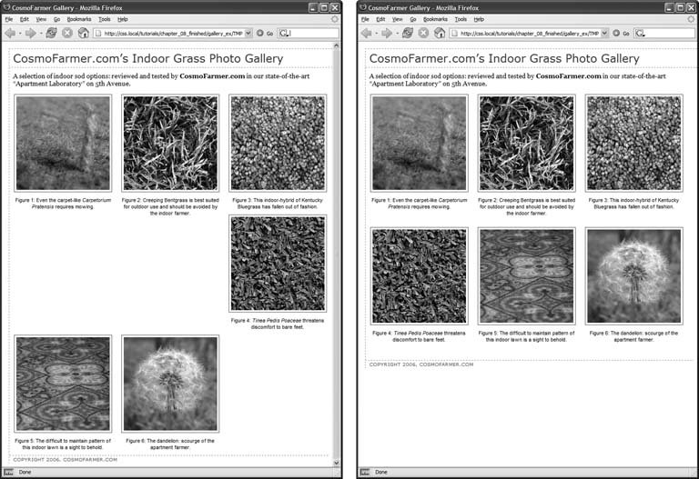 -
At the end of the internal style sheet (after all other styles), add the following : /* IE 5/6 border erase bug */ * html #gallery { width: 100%; } As always, when adding styles to an internal style sheet, be sure to put the CSS code in between the opening <style> tag and its matching closing </style> tag. This style uses the * html hack (see Section 7.6) to target just IE 6 and earlier and apply a property that miraculously fixes the problem. The first line of code/* IE 5/6 border erase bug */is a CSS comment. It's just a note that lets you know the purpose of the following style.
Tip: The end of a style sheet is a good place to group any styles like this one that fix browser bugs . This way, you can quickly identify and remove these weird styles when the buggy browser finally falls into disuse. Another good idea is to put browser hacks like this into their own external style sheet, as discussed in Section 14.5.2.
-
Save the file . You'll improve on the gallery's look in the next exercise. 8.6.4. Adding Drop Shadows Your gallery looks good, but you can make it even more impressive. Adding drop shadows under each photo lends the page an illusion of depth and a realistic 3-D quality. But before you fire up Photoshop, you'll be glad to know there's no need to add individual drop shadows. Instead, you can make CSS automatically add a shadow to any image you want. First you need a drop shadow graphicjust an image with fuzzy right and bottom black edges. There's one in the chapter_08 gallery_ex folder, but you can make your own in Photoshop, Fireworks, or any other image editing program that has a blur or drop shadow filter. (In Fireworks, for example, youd create a white box and apply the drop shadow filter to it. Then save the file in GIF format.) -
In a text editor, open the gallery.html file you completed in the previous exercise . First, add a background image to the <div> tag that surrounds each image. -
Add this style to the gallery page's style sheet : .photo { background: url(/books/2/835/1/html/2/drop_shadow.gif) right bottom no-repeat; } This .photo style adds a background image drop_shadow.gif to the lower-right corner of the photo <div>. The no-repeat value means the graphic won't tile. If you preview the page now, you won't see much. That's because the drop shadow appears in the background. On top is the photo itself, which you styled in step 3 in Section 8.6.3 to have a white background, a black border, and four pixels of padding. What you need is a way to reveal that background image. One clever technique pioneered by Richard Rutter (www.clagnut.com )is to move the image up and to the left a littleessentially moving it outside of its containing <div> tag. CSS provides a mechanism known as positioning that lets you control the exact placement of an element. You'll learn more about positioning in Chapter 12, but for now you need to add only three properties to the .photo img style you created in step 3 in Section 8.6.3 to reveal the drop shadow.
Note: Negative margins are another way to achieve the drop shadow shift. For details, see http://1976design.com/blog/archive/2003/11/14/shadows/.
-
Locate the . photo img style, and add three positioning properties like so : .photo img { border: 1px solid #666; background-color: #FFF; padding: 4px; position: relative; top: -5px; left:-5px; } In a nutshell , these three properties simply move the photo up and to the left five pixels, exposing the underlying drop shadow graphic of the <div>. In fact, the very reason for using a <div> here is to provide an element to hold a background image. -
Save the file and preview the page. It should look like Figure 8-13 . Each image has its own drop-shadow, and you didn't even have to open Photoshop!
Note: The graphic you used here is around 375x375 pixels, so it accommodates images only up to that size . You can use this same technique for larger images, but you'll need to create your own drop shadow.
Of course, you're not completely doneunless you don't care about supporting Internet Explorer 5. That browser doesn't place the shadow correctly. -
To fix the display problem in IE 5, add one last style to the end of the internal style sheet : /* IE 5 placement bug */ * html #gallery img { width: 100%; } You can use this drop-shadow method on any graphic, not just those inside a gallery. The key is surrounding the <img> tag with a container <div>, applying a drop shadow graphic to that <div> and offsetting the <img> tag with negative top and left placement. Use this same effect to add a drop shadow to any box element, such as a sidebar or pull-quote. You can find a completed version of this tutorial in the chapter_08_finished gallery_ex folder. Figure 8-13. Adding drop shadows to photos gives a page a 3-D look, and increases the visual appeal of any photo gallery. Fortunately, using CSS you can easily add a drop shadow to any picture without even touching Photoshop. 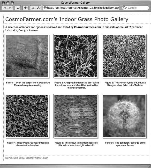
Note: You may have noticed that the drop shadows you just created have abrupt left and top endings. They don't fade like actual drop shadows. To learn how to create more sophisticated drop shadows, check out www.alistapart.com/articles/cssdrop2/ and www.ploughdeep.com/onionskin/.
|
![CSS[c] The Missing Manual](/icons/6360-small.jpg "CSS[c] The Missing Manual")