Section 9.4. Chart Types
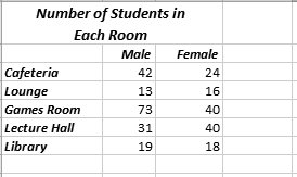
9.4. Chart TypesAlthough there's a lot to be said for simple column chartsthey can illuminate trends in almost any spreadsheetthere are a few other basic chart types worth getting to know. 9.4.1. ColumnBy now, column charts probably seem like old hat. But column charts actually come in several different variations (technically known as subtypes ). The main difference between the basic column chart and these subtypes is how they deal with data tables that have multiple series. The quickest way to understand the difference is to look at Figure 9-13, which shows a sample table of data, and Figure 9-14, which charts it using several different types of column charts. Note: In order to learn about a chart subtype, you need to know its name. The name appears when you hover over the subtype thumbnail, either in the Insert  Charts list (Figure 9-2) or the Insert Chart dialog box (Figure 9-3). Charts list (Figure 9-2) or the Insert Chart dialog box (Figure 9-3). | ||
|
|
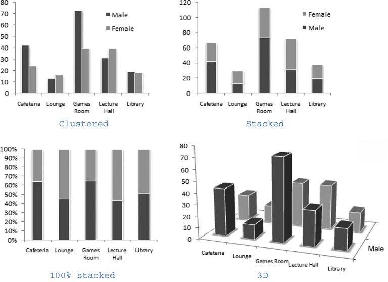
Here's a quick summary of your column chart choices:
-
Clustered Column . In a clustered column, each value is shown in its own separate column. To form a cluster, the columns are grouped together according to category.
-
Stacked Column . In a stacked column, each category has only one column. To create this column, Excel adds together the values from every series for each category. However, the column is subdivided (and color -coded), so you can see the contribution each series makes.
-
100% Stacked Column . The 100% stacked column is like a stacked column in that it uses a single bar for each category, and subdivides that bar to show the proportion from each series. The difference is that a stacked column always stretches to fill the full height of the chart. That means stacked columns are designed to focus exclusively on the percentage distribution of results, not the total numbers.
-
3-D Clustered Column, Stacked Column in 3-D , and 100% Stacked Column in 3-D . Excel's got a 3-D version for each of the three basic types of column charts, including clustered, stacked, and 100 percent stacked. The only difference between the 3-D versions and the plain- vanilla column charts is that the 3-D charts are drawn with a three-dimensional special effect, that's either cool or distracting, depending on your perspective.
-
B 3-D Column . While all the other 3-D column charts simply use a 3-D effect for added pizzazz, this true 3-D column chart actually uses the third dimension by placing each new series behind the previous series. That means if you have three series, you end up with three layers in your chart. Assuming the chart is tilted just right, you can see all these layers at once, although it's possible that some bars may become obscured, particularly if you have several series.
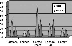
Along with the familiar column and three-dimensional column charts, Excel also provides a few more exotic versions that use cylinders , cones, and pyramids instead of ordinary rectangles. Other than their different shapes , these chart types work just like regular column charts. As with column and bar charts, you can specify how cylinder, cone, and pyramid charts should deal with multiple series. Your options include clustering, stacking, 100% stacking, and layering (true 3-D). See Figure 9-15 for an example.
|
9.4.2. Bar
The venerable bar chart is the oldest form of data presentation. Invented sometime in the 1700s, it predated the column and pie chart. Bar charts look and behave almost exactly the same as column chartsthe only difference being that their bars stretch horizontally from left to right, unlike columns, which rise from bottom to top.
Excel provides almost the same set of subtypes for bar charts as it does for column charts. The only difference is that there's no true three-dimensional (or layered) bar chart, although there are clustered, stacked, and 100% stacked bar charts with a three-dimensional effect. Some bar charts also use cylinder, cone, and pyramid shapes.
Tip: Many people use bar charts because they leave more room for category labels. If you have too many columns in a column chart, Excel has a hard time fitting all the column labels into the available space.
9.4.3. Line
People almost always use line charts to show changes over time. Line charts emphasize trends by connecting each point in a series with a line. The category axis represents a time scale or a set of regularly spaced labels.
Excel provides several subtypes for line charts:
-
Line . The classic line chart, which draws a line connecting all the points in the series. The individual points aren't highlighted.
-
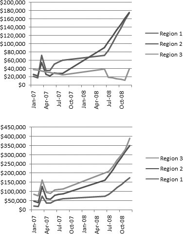
Stacked Line . In a stacked line chart, Excel displays the first series just as it would in the normal line chart, but the second line consists of the values of the first and second series added together. If you have a third series, it displays the total values of the first three series, and so on. People sometimes use stacked line charts to track things like a company's cumulative sales (across several different departments or product lines), as Figure 9-16, bottom, demonstrates . (Stacked area charts are another alternative.) Stacked line charts aren't as common as stacked bar and column charts.
Note: Lines can never cross in a stacked line chart because each series is added to the one (or ones) before it. You can change which line is stacked at the top by changing the order of the series. To do this, rearrange your table of data on the worksheet (Excel places the rightmost column on top).
-
100% Stacked Line . A 100% stacked line chart works the same as a stacked line chart in that it adds the value of each series to the values of all the preceding series. The difference is that the last series always becomes a straight line across the top, and the other lines are scaled accordingly so that they show percentages. The 100% stacked line chart is rarely useful, but if you do use it, you'll probably want to put totals in the last series.
-
Line with Markers, Stacked Line with Markers, and 100% Stacked Line with Markers . These subtypes are the same as the three previous line chart subtypes, except they add markers (squares, triangles , and so on) to highlight each data point in the series.
-
3-D Line . This option draws ordinary lines without markers but adds a little thickness to each line with a 3-D effect.
|
9.4.4. Pie
Pie charts show the breakdown of a series proportionally, using "slices" of a circle. Pie charts are one of the simplest types of charts, and one of the most recognizable.
Here are the pie chart subtypes you can choose from:
-
Pie . The basic pie chart everyone knows and loves, which shows the breakup of a single series of data.
-
Exploded Pie . The name sounds like a Vaudeville gag, but the exploded pie chart simply separates each piece of a pie with a small amount of white space. Usually, Excel charting mavens prefer to explode just a single slice of a pie for emphasis.
-
Pie of Pie . With this subtype, you can break out one slice of a pie into its own, smaller pie (which is itself broken down into slices). This chart is great for emphasizing specific data.
-
Bar of Pie . The bar of pie subtype is almost the same as the pie of pie subtype. The only difference is that the breakup of the combined slice is shown in a separate stacked bar, instead of a separate pie.
-
Pie in 3-D and Exploded Pie in 3-D . This option is the pie and exploded pie types in three dimensions, tilted slightly away from the viewer for a more dramatic appearance. The differences are purely cosmetic.
Note: Pie charts can show only one series of data. If you create a pie chart for a table that has multiple data series, you'll see just the information from the first series. The best solution is to create separate pie charts for each series.
9.4.5. Area
An area chart is very similar to a line chart. The difference is that the space between the line and the bottom (category) axis is completely filled in. Because of this difference, the area chart tends to emphasize the sheer magnitude of values rather than their change over time. Figure 9-17 demonstrates.
Area charts exist in all the same flavors as line charts, including stacked and 100% stacked. You can also use subtypes that have a 3-D effect, or you can create a true 3-D chart that layers the series behind one another.
|
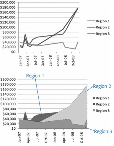
Tip: Stacked area charts make a lot of sense. In fact, they're easier to interpret than stacked line charts because you can easily get a feeling for how much contribution each series makes to the total by judging the thickness of the area.
EAN: N/A
Pages: 75