Fundamentals of Color Printing
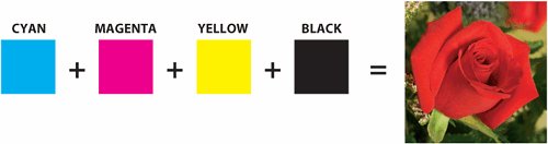
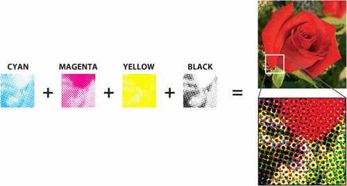
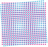
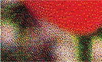
| While a printed color image may appear to contain thousands of individual colors, it usually consists of just four inks, referred to as process colors: cyan, magenta, yellow, and black (CMYK). The process inks are transparent, so when they are combined on paper, they produce other colors (Figure 2.4). Thus, cyan plus yellow makes green. Cyan plus magenta make violet. Yellow and magenta make red, and yellow and magenta combined with cyan makes an unattractive muddy brown. That's still a fairly small box of crayons. How can you make all the colors you need? Figure 2.4. The four process inks combine to create much more than just four colors. In traditional offset printing, the illusion of so many colors is the result of varying sizes of halftone dots, which allow different amounts of the four process colors to interact in a given area. Other printing methods use different ruses to fool the eye into seeing more than four colors, but the concept is the same: Use varying amounts of CMYK to approximate a wide range of colors (Figure 2.5). Figure 2.5. Varying sizes of halftone dots add up to an optical illusion (section of image greatly enlarged). Note the rosette pattern formed by the dots. It's important to avoid unsightly patterns, called moiré (Figure 2.6). To see the moiré effect, put one piece of window screen on top of another, and then rotate one piece of screen. It's a challenge to eliminate an obvious pattern. That's why there are time-honored intervals of 30 degrees between the angles of the inks to create the desired rosette pattern (Figure 2.7). Yellow, being the lightest color, falls at a 15-degree angle away from other colors. Figure 2.6. Incorrect intervals between screen angles can result in a distracting moiré. This can also be caused by a combination of screen angles and image content such as woven fabric. Figure 2.7. Optimal screen angles add up to form a rosette pattern. Yes, it's a pattern, but it's usually not noticeable. Screen angle preferences vary between print service providers and may sometimes be chosen to accommodate job content (Table 2.1).
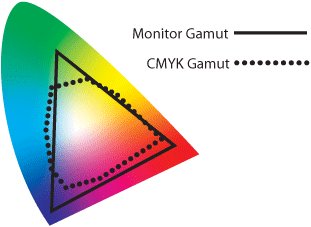
Limitations of CMYKWhile an extensive range of colors can be rendered with various combinations of cyan, magenta, yellow, and black ink, there's still a limit to what CMYK can create. The human eye can see a huge range of colorslarger than even the large gamut of a computer monitor. But the total gamut of the process inks is considerably smaller than the human eye can see, or even the range that the monitor can display. Consequently, images that are quite vibrant on your monitor may print disappointingly dull. It's not because your print service provider is incompetent. It's because of the limitations of the printing-ink spectrum. In Figure 2.11, the large, colorful toe is an approximation of the range of colors perceived by the human eye. The solid triangular line corresponds to the range of colors that can be displayed on an RGB (red-green-blue) computer monitor. The much smaller dotted shape indicates the approximate gamut of CMYK inks. Note that the CMYK blob, while rather constricted, does not fall entirely within the RGB gamut. Some colorsbright yellows and cyan shadesfall outside the range that can be displayed faithfully on a monitor. Even a finely tuned and color-managed monitor has its limitations. Figure 2.11. A rough comparison of monitor and CMYK gamut to the range of visible light. This is not intended to plunge you into despondency over the limitations of the printing process. After all, disappointment is all about expectations. If your expectations are unrealistic, you're bound to be disappointed. But if your expectations are realistic, you can be prepared for the limitations of CMYK. And, equally importantly, you'll know when you need to step outside the world of cyan, magenta, yellow, and black to get what you want. Spot ColorsA spot color is used when it is necessary to print colors that fall outside the range of CMYK inks. While it's fairly intuitive that inks such as fluorescent colors and metallics can't be faithfully imitated by process colors, there are also some rather common colors that fall outside the CMYK universe, such as bright orange and navy blue. You're probably familiar with the Color Formula Guides from Pantone® Inc. The terms spot color and Pantone are often used interchangeably, although that's not strictly correct. A resource such as the Pantone Matching System swatchbook is actually a recipe book for print service providers. It provides ink-mixing formulas for creating over 1,000 standard colors, many of which cannot be accurately rendered in process colors. It's forgivable that the name Pantone has become synonymous with spot color, since the fan-like Pantone swatchbooks are probably the most common reference for specifying color. But there are other spot-color resources, such as the Toyo Color Finder from Toyo Ink, and the DIC guide from Dainippon Ink and Chemicals, Inc., (used predominantly in Japan). And there are Pantone swatchbooks that don't depict spot colors, such as the Pantone 4-Color Process Guide, which contains only colors created by combinations of cyan, magenta, yellow, and black. While adding a spot color to a four-color job may slightly increase the cost of printing because of the need to create an additional plate and purchase additional ink, it ensures that important colors will print as desired. Using a spot color can also eliminate problems caused by slight misregistration on press. Consider a job containing elements in a burgundy color consisting of a process-color build of C10-M100-Y35-K50. Even the most conscientious pressman can find it challenging to keep fine elements such as small type and narrow rules in register across a large press sheet. It can also be difficult to keep the balance of four inks consistent from one part of the paper to another or from one press sheet to another in a long, multipage job. Any variation will result in color shifts, which would be especially noticeable in facing pages. Replacing the process build with a single ink, such as Pantone 209, simplifies both registration and color-consistency issues. The small increase in printing costs (as opposed to a four-color job) might be justified by the improved outcome.
Approximating Spot Colors with ProcessIt's a widespread practice to pick colors from a swatchbook such as the Pantone Color Formula Guide, even for jobs that are intended to print as process. Just because everyone does it doesn't mean it's right. (Sorry. That sounds like your mother.) The problem with this approach (as with so many things your mother warned you about), is that it can lead to disappointment. Remember that the purpose of spot colors is to render colors that fall outside the range of CMYK. Understandably, process approximations of spot colors are often unsatisfactory. For example, a CMYK translation of a dark blue such as Pantone 286 can become a purplish blue (Figure 2.12). It's unfortunate, but this is as close as a combination of cyan, magenta, yellow, and black can get to the navy blue that should be used for the Brand X logo. As long as you know to expect this color approximation, you aren't shocked by the printed piece. But the president of Brand X will certainly be disappointed. Figure 2.12. The Brand X logo is supposed to print in Pantone 286, a navy blue. But approximating that color with CMYK results in an unsightly purple. If you have a Pantone swatch book, compare the real Pantone 286 swatch with the CMYK version at left. In the interest of realism on process jobs, consider selecting colors from a purely CMYK-based swatchbook instead, such as the TRUMATCH Colorfinder or one of the Pantone process guides. If you want a single-source swatchbook showing Pantone spot-color formulas next to their closest process equivalents, the Pantone Color Bridge™ provides helpful, side-by-side swatches. | ||||||||||||||||||


EAN: 2147483647
Pages: 132