Applying Color Variations
Applying Color Variations
Let's start things off with the most straightforward and unusual correction function in all of Photoshop, which also happens to be the last command in the Image Adjustments submenu. Known simply as Variations, this ambitious command lets you correct colors and brightness values inside an image without troubling yourself with a lot of technical-sounding options and numerical values. The irony is that if you do possess a little technical knowledge, you can make better use of the command and better anticipate its outcome.
When you choose Image Adjustments Variations, Photoshop displays the dialog box shown in Figure 11-4, which enables you to adjust colors and brightness values in an image by clicking one or more thumbnails that look more like the image you're hoping to achieve. To infuse color into the image, click one of the More thumbnails in the central portion of the dialog box. To lighten or darken the image, use the thumbnails on the right-hand side. Figure 11-5 shows how the buttons affect a typical high-resolution, CMYK photograph. In each case, the slider bar was set to its default position midway between Fine and Coarse, and the Midtones radio button was selected.
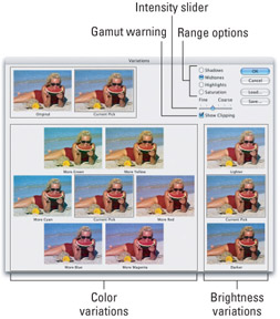
Figure 11-4: The Variations dialog box thumbnails shift colors in a certain direction. The slider bar in the upper right corner changes the thumbnail's sensitivity. The radio buttons control which colors in the image are affected.
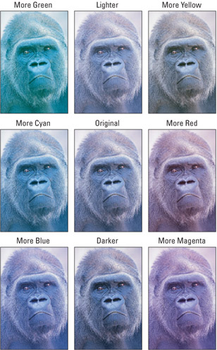
Figure 11-5: The results of applying each of the color thumbnails to the photo of our distant cousin.
How hues work
On first glance, the colors selected for the Variations thumbnails ” red, yellow, green, cyan, blue, and magenta ” may seem highly arbitrary. I mean, where's orange, indigo, and violet ? If they're good enough for the rainbow, surely they should rate inclusion in the Variations dialog box. And as long as we're including magenta, we might as well throw in carmine, mauve, lilac, and fuchsia. But as it turns out, these are very specific, industry-accepted labels for six evenly spaced colors in the visible color spectrum.
To fully understand how these thumbnails work, turn your attention to the diagram in Figure 11-6. Here we see all the hues in the visible color spectrum represented along a continuous circle. We've placed monitor icons next to Red, Green, and Blue because these are the primary colors of light. Spaced evenly between them arethe print pigments Cyan, Magenta, and Yellow, which get little printer icons. (The missing CMYK ink, black, is not actually a primary, but rather a "key" color used to reinforce shadows.) In a perfect world, cyan ink exactly absorbs red light and reflects green and blue; magenta absorbs green and reflects red and blue; and yellow absorbs blue and reflects red and green. Therefore, opposite colors, such as cyan and red, are theoretical opposites (often called complements ).
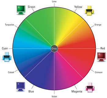
Figure 11-6: Photoshop and other graphics applications map the visible color spectrum onto a continuous circle. Red, green, and blue are the primary colors of light. Cyan, magenta, and yellow are their complementary opposites, representing the primary printed pigments.
In the real world, things aren't quite this cut and dried . But inside the Variations dialog box, theory becomes reality. Because you don't actually modify the image until you click the OK button, Variations can calculate its adjustments in a pure and perfect world. This means each thumbnail serves two purposes ” to add one color and subtract its complement. If you click More Cyan, you add cyan and subtract red. If you then click More Red, you undo More Cyan and restore the original image. This means you can use More Cyan to add cyan to an image or remove a red color cast.
Intensity and range
The More thumbnails aren't the only options in the Variations dialog box; they're just the most important ones. Here are the other settings you should know about (many of which were labeled back in Figure 11-4):
| |
Here's an odd and rare interface difference between the Mac and Windows versions of Photoshop: Under Windows, there are seven different intensity levels (five levels between Fine and Coarse), but on the Mac there are only six, with four intermediate levels between Fine and Coarse. Coarse is equally coarse on both Mac and Windows. And one tick to the left of Coarse is equal on both platforms. And so it goes, until we get to Fine on the Mac, which is actually equal to one tick up from Fine on Windows. And so, Windows' Fine level is actually finer than the Mac's.
| |
-
Intensity slider: To control the amount of color shifting that occurs when you click a thumbnail, move the slider triangle in the upper-right portion of the dialog box. The far left Fine setting produces very minute changes; Coarse creates massive changes, as illustrated in Figure 11-7. Each tick mark setting produces exactly twice the effect of the tick mark to the left of it, so each example in the figure is four times as blue as the example that precedes it.
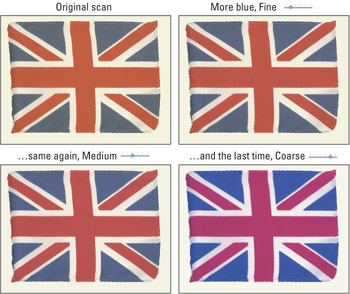
Figure 11-7: This original Union Jack has a distinct yellow color cast (top left). You remedy this using yellow's opposite, the More Blue thumbnail, at each of three intensity settings. In this case, medium intensity (bottom left) works best. -
Range options: The radio buttons at the top control what colors in the image are affected. Select Shadows to change the darkest colors, Highlights to change the lightest colors, and Midtones to change everything in between. Figure 11-8 shows four examples.
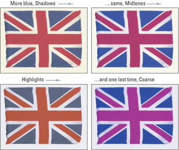
Figure 11-8: The effects of clicking the More Blue thumbnail when each of the first three range options is in effect, as well as all three together (bottom right). In all cases, the intensity slider triangle is one tick over from Coarse.Note If you're familiar with Image Adjustments Levels ” as you most assuredly will be after you read Chapter 12 ” you know that the first three radio buttons have counterparts in the first set of slider triangles in the Levels dialog box. So, when you click the Lighter thumbnail with the Highlights option selected in the Variations dialog box, you perform roughly the same action as moving the white triangle in the Levels dialog box to the left ” that is, you make the lightest colors in the image even lighter.
-
Saturation: The Saturation radio button lets you increase or decrease the saturation (vibrancy) of colors in an image. Only one thumbnail appears on each side of the Current Pick image. One decreases the saturation and the other increases it.
Tip In Figure 11-9 notice that lowering saturation has the side effect of lightening the image and increasing saturation darkens the image. If you want to edit saturation but maintain consistent brightness levels, use Image Adjustments Hue/Saturation (discussed later in this chapter).
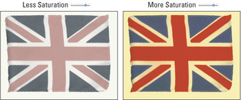
Figure 11-9: Clicking the Less Saturation thumbnail not only leeches away color but also increases brightness (left). More Saturation increases saturation by darkening colors (right). -
Show Clipping: As you click the options ” particularly when modifying saturation ” you may notice that weird colors spring up inside the thumbnails. These brightly colored pixels are gamut warnings, Photoshop's way of highlighting colors that exceed the boundaries of the printable color space. Even if you're working in the RGB mode, the clipped pixels indicate colors that extend beyond the CMYK gamut. Although the colors won't actually appear inverted as they do in the dialog box, it's not a good idea to exceed the color space when preparing print graphics because it can result in large flat-colored regions . When creating RGB images for the Web or even for inkjet printing, turn off the Show Clipping check box to view the thumbnail representations of the image as it will really appear.
When to use Variations
On balance, the Variations command is a mixed bag. On one hand, you can adjust hues and luminosity levels based on the brightness values of the pixels, something other commands cannot do. And there's no denying that the thumbnails take much of the guesswork out of the correction process.
On the other hand, the Variations dialog box takes over your screen and prevents you from previewing corrections directly inside the image window. Also frustrating, you can see at most a limited area outside a selection, which proves disconcerting when making relative color adjustments. By default, Variations lacks a keyboard shortcut (though the new Keyboard Shortcuts feature lets you assign a shortcut to it). And you cannot apply Variations as an adjustment layer.
The Variations dialog box, for our money, is best suited to removing a color cast from a photograph or shifting its hues to achieve a more natural color balance. Although Variations can fix lighting problems, this is a job better suited to Levels or Curves (see the next chapter). And for more sophisticated color adjustments, choose Image Adjustments Hue/Saturation, as explained in the next section.
Variations is remarkably adept at one more task that you don't hear discussed very often, and that's creating quick and easy duotones, which are grayscale images colorized with two or more colors according to their brightness values. Figure 11-10 shows a grayscale scan so colorized using Variations. Convert the grayscale image to RGB by choosing Image Mode RGB Color. Then choose Variations, set the intensity and range as listed in the first example, and click the More Yellow thumb- nail. To give the image an amber tint, reduce the intensity setting and then click More Red. Lastly, select the Shadows option, raise its intensity, and then choose More Blue to achieve the final effect.
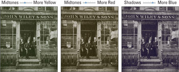
Figure 11-10: A vintage photograph first colorized with yellow (left) and amber (middle) and then imbued with deep blue shadows (right). The result is a quick and easy duotone.
| Note | If you're serious about creating "real" duotones that separate out to exactly two spot-color inks, Variations is not the ticket. Instead, Photoshop provides a command specifically designed for this purpose: Image Mode Duotone. But if all you're looking for is a two-color effect that's both intuitive and a breeze to apply, then Variations is the best tool on the block. |
| Cross-Reference | The Duotone command is discussed at length in Chapter 18 of the softbound Photoshop CS2 Bible, Standard Edition. |
EAN: 2147483647
Pages: 95
- Chapter I e-Search: A Conceptual Framework of Online Consumer Behavior
- Chapter II Information Search on the Internet: A Causal Model
- Chapter XIII Shopping Agent Web Sites: A Comparative Shopping Environment
- Chapter XIV Product Catalog and Shopping Cart Effective Design
- Chapter XVIII Web Systems Design, Litigation, and Online Consumer Behavior