Central Work Area
| The central work area (technically called the Dynpro) lies between the application toolbar and status bar of every screen. This is the principal working environment for the SAP application. It contains many different screen elements for navigating between screens, setting up transactions, and working with their output. We describe the design and operation of these screen elements in the remaining pages of this introduction. Panels and PanesThe central work area can contain one or more panels. Single-panel work areas are most common, but two- and three-panel work areas can also be found on the SAP Easy Access screen and some initial and output screens (Figure I.14). Wherever you find multiple panels, you can adjust their sizes by clicking-and-dragging the dividers or panes between them (Figure I.14A). Figure I.14. A two-panel central work area, with the button (B) for closing the left panel.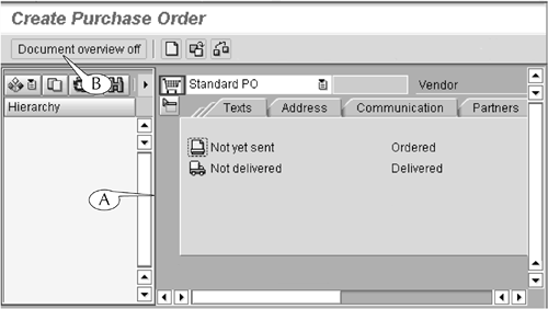 Some multipanel screens have buttons in their main application toolbars (or in secondary toolbars above the panels themselves) for displaying and hiding panels. For example, the initial screen for the Create Purchase Order transaction (Figure I.14) has a side panel that can be used for searching for older requisitions. You can hide this panel, which is not required for running the transaction, by clicking the Document overview off button[2] (B) in the main application toolbar of the screen. When this panel is hidden, this button changes into the Document overview on button (Figure I.15A), which can be used to display the panel.
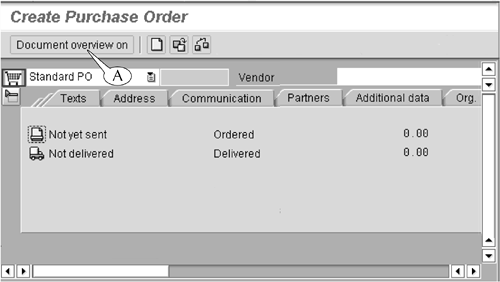
Figure I.15. The same central work area as in Figure I.14, with the side panel closed.
Storage FoldersStorage folders are present in the central work areas of two screens: the SAP Easy Access screen, the "home page" of the system (Figure I.1) and the SAP Business Workplace screen (Figure 17.17 on page 243), where you can create and manage your e-mail. The folders of the first screen contain links to the initial screens of transactions (see Lesson 5), and the folders of the second screen store e-mails and their attached documents. The storage folders of these two screens are exactly the same in their design and operation as the file storage folders in your personal computer. They are organized in a hierarchical or multilevel structure of folders and subfolders that you can open and close by clicking the arrows to their left or double-clicking their names. We describe the design and operation of the storage folders of the SAP Easy Access and SAP Business Workplace screens in more detail in Lessons 5 and 17. Data FieldsData fields are rectangular boxes that are found on nearly every initial and output screen in the SAP system (Figure I.16). There are two types of these elements.
Figure I.16. Examples of data entry (A) and data display (B) fields.
Data fields are always accompanied by a label that identifies the class of data or datatype that they can display or hold. These data can consist of object codes, which are assigned to all activities and objects tracked by SAP; calendar dates, such as 01/01/2005; and alphanumerical text, such as USD or Vehicle needs an oil change.[3]
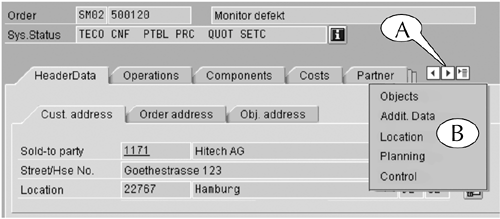
We describe the design and operation of data entry fields in more detail in Part II of this book. Field Areas and Tabbed SubscreensSome initial and output screens contain dozens and sometimes hundreds of data fields. When this occurs, the fields are typically parceled out into separate field areas, sometimes called frames, and tabbed subscreens (Figure I-17). Figure I.17. Large amounts of data are organized on subscreens and in field areas.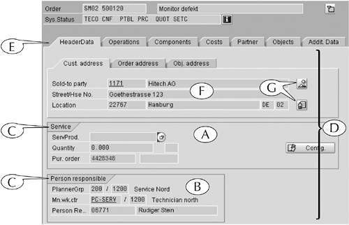 Field areas are groupings of data of related types (for example, Figure I.17 A and B). Each field area is surrounded by a border and headed by a label (C), which describes in general terms the contents of its fields. Where there are many field areas, they are further separated onto subscreens (D). You can display one subscreen at a time by clicking its tab (E), which identifies its contents. For example, Figure I.17 illustrates the central work area of the output for the Display Equipment (IE03) transaction, which displays data about the installation and maintenance of equipment. This output contains a huge volume of technical and logistical data about the equipment and its history. This mass of data is organized by parceling out the data onto ten subscreens, including the HeaderData subscreen, which is shown in this figure. This particular subscreen contains field areas for service data (A) and the name of the physical plant and plant manager responsible for the equipment (B), as well as its own tabbed subscreen for address data (F). Incidentally, the application window for the screen in Figure I.17 is wide enough to display all the tabs of its subscreens (E). When the application window is too narrow, the tabs on the right end of the subscreens are cut off and replaced by left and right control arrows and a list menu icon (Figure I.18A). You can display a subscreen, despite the fact that its tab might be cut off, in one of two ways.
Figure I.18. By clicking the list menu icon, you can display a list of those subscreens whose tabs are hidden.
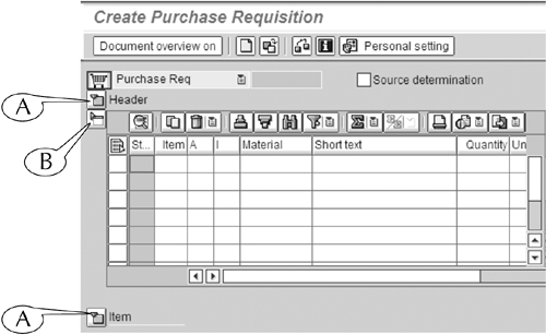
Finally, you can display or hide some field areas and tabbed subscreens by using the Expand/close button, which lies directly outside their upper-left corner. For example, the initial screen for the Create a Purchase Requisition (ME51N) transaction (Figure I.19) contains two tabbed subscreens (Header at its top, Item at its bottom) and a line-item table (at mid-screen) for entering data about the requisitioned materials. When they are all displayed, this screen is fairly long, and part of its content is hidden from view. Figure I.19. The Expand (A) and Close (B) buttons display and hide (respectively) parts of the central work area. In this image, the Header and Item subscreens are both hidden, and only their names appear.
Therefore, it is common practice to display and work on only one part of this screen at a time and keep the other two areas hidden from view. This can be done with the Expand button (Figure I.19A), which displays an area when it is hidden, and the Close button (B), which hides an area when it is displayed. We have displayed the line-item table and hidden the Header and Item subscreens above and below it (so that only their names appear) by these means in our example. Selection Boxes, Check Boxes, and Radio ButtonsSelection boxes (Figure I.20) and check boxes (Figure I.21) are found on the initial and output screens of many transactions, where they can be used to select one or more options, objects, or commands from a roster of items. You can select and deselect items in these rosters by clicking these boxes. Figure I.20. When a selection box is clicked, the name of the selected item is highlighted (A).
Figure I.21. Check boxes.
The difference between selection boxes and check boxes is simply the result of clicking them. When you click a selection box, it highlights the name of the selected item (Figure I.20A); when you click a check box, a check appears inside it. Radio buttons (Figure I.22) serve a similar function to selection and check boxes: they allow you to select an option, object, or command from a roster of such items. However, they differ in one key regard: you can only select one item from the roster with a radio button. Figure I.22. Radio buttons.
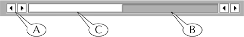
Command ButtonsCommand buttons can often be found in the central work areas of screens (see Figure I.17G). Like the buttons of the standard and application toolbars, they execute a specific task, which you can identify by placing your cursor over them to display their label. Scroll BarsScroll bars appear along the bottom and right margin of especially long or wide screens. You use them to shift the scene in the central work area in the horizontal or vertical direction (Figure I.23) in one of three ways.
Figure I.23. Scroll bar.
You can also use the four page control buttons in the standard toolbar (Figure I.5 on page 7) to shift the scene in a long central work area in the vertical direction. The first and last buttons, which have a design of double arrows over a page icon, shift the scene to the very top and very bottom, respectively, of the central work area. The two middle buttons, which have single arrows imposed over a page icon, shift the scene to the next full scene above and below the present one. |
EAN: 2147483647
Pages: 132