Section 3.2. Elements
3.2. ElementsAll XAML elements are an XML representation of CLR classes, but not all CLR classes are represented in XAML. Most of those represented are user-interface elements and are ultimately derived from System.Windows.UIElement, which provides basic visual user-interface properties that are shared by most XAML elements . A System.Windows.UIElement can render itself, receive input via the keyboard and mouse, visually size and position its child elements, and raise events. Not all XAML elements are derived from System.Windows.UIElement. Some, such as LineBreak, TableColumn, and Document, are derived from System.Windows.Frame-workContentElement. System.Windows.FrameworkContentElement elements cannot render themselves but are instead rendered by another class, usually the container in which they have been placed. Most XAML elements can be organized into five basic categories:
3.2.1. Root ElementsRoot elements function as the page's base container for all user-interface elements. A page is required to have one root element. The most commonly used root elements are the panel elementsStackPanel, DockPanel, Canvas, and Gridand Page, a root element that allows you to declaratively control a number of the properties of the window containing the XAML page. To be considered a root element, the element must be a container for at least one other element. (When displaying XAML output in XamlPad, you don't have to include a root element because XamlPad provides it on your behalf.) You can create custom root elements by deriving new classes from Page or Window and exposing them as XAML elements. The root element must contain a reference to the appropriate namespace (in most cases, the default Avalon namespace, http://schemas.microsoft.com/winfx/avalon/2005). As with all XML documents, unless otherwise specified, it is assumed that all elements in the page are associated with the default namespace declared on the root element. The declaration in XAML is the same as in any XML document. <Page xmlns="http://schemas.microsoft.com/winfx/avalon/2005" .../> 3.2.2. Control ElementsControl elements handle user interaction. Controls are interactive and allow the user to enter data, make choices, and perform other interactive tasks. They can be broken up into five categories: simple controls, content controls, item controls, header item controls, and header content controls. They are differentiated by the attributes they support, namely Content, Headers, and Items. Attribute support is determined by the underlying CLR class represented by the XAML element. Even if you don't use the Header attribute supported by a header item control, it doesn't become an item control because the CLR class it represents still has a Header whether or not you assign it a value. Table 3-1 summarizes this information neatly.
<MenuItem Header="First Menu Item"> <MenuItem Header="First Child Item" /> <MenuItem Header="Second Child Item" /> </MenuItem> Header item controls include MenuItem and ToolBar.
3.2.3. Panel ElementsPanel elements handle page layout and act as containers for elements, such as controls or other panels. Some panel -derived elements are used as root elements, but the primary purpose of the panel is to provide support for layout and placement of elements on the page. Some panel classes are intended for designing the user interface, while others are special panels designed specifically for special layout scenarios. An example is the bullet panel, which is used specifically to display only two child elements (usually a text element and a glyph representing a checkbox or a radio button), and is used as a component of other elements such as RadioButton and CheckBox. When you declare a RadioButton, a BulletPanel is one of the underlying components that is rendered on the screen. The panel elements designed for user-interface design are DockPanel, StackPanel, Canvas, WrapPanel, and Grid. 3.2.4. Shape and Geometric ElementsShape and geometric elements represent 2-D vector graphics . Shapes derive from the Shape class and represent predefined geometric shapes. WPF shapes available for use with XAML are Ellipse, Line, Path, Polygon, Polyline, and Rectangle. Shapes are a type of UIElement, which means they can be used inside panels and most other controls. Geometric elements, while also representing 2-D vector graphics, are more flexible than shape elements and can also be used for hit-testing and clipping purposes. Geometry elements can be simple vector graphics such as circles or polygons, or more complex elements comprised of Bezier lines and arcs. Geometries cannot render themselves. They must be drawn by another element, such as Drawing or Path. The attributes common to shapeFill, Stroke, and StrokeThicknessare attached to the element that draws the geometries rather than the geometry element itself. Geometry elements are CombinedGeometry, LineGeometry, EllipseGeometry, GeometryGroup, PathGeometry, RectangleGeometry, PathSegment, ArcSegment, LineSegment, BezierSegment, QuadraticBezierSegment, PolyQuadraticBezierSegment, PolyLineSegment, PolyBezierSegment, StartSegment, and CloseSegment. There are some similarities between respective shape and geometric entities. For example, Ellipse and EllipseGeometry provide the same basic functionality, i.e., both declare an ellipse. However, the way in which these elements are interpreted differs. An Ellipse is a standalone element. Its attributes provide all the information necessary to render a complete ellipse. EllipseGeometry, however, does not. Because it is designed to be a part of an ordered collection of geometric types, EllipseGeometry relies on attributes defined on the element appearing before it in the collection. Similarly, attributes assigned to EllipseGeometry will be used to render the next geometry instance in the collection. This trait is shared by all the geometry objects and differentiates them from their Shape-based counterparts. 3.2.5. Document ElementsDocument elements handle document presentation. Documents are categorized as either flow or fixed. The FixedDocument element is designed to be What You See Is What You Get (WYSIWYG) and is intended to appear in all formats (print, browser, application) with exactly the same layout. A FlowDocument element provides more flexibility in appearance to enhance readability. Flow documents dynamically reformat content based on a variety of factors, including screen and page size, font size, and optional user preferences. Flow documents are comprised of one or more elements derived from Block or Inline. Block elements such as Block, Figure, Floater, List, ListItem, Paragraph, Section, Table, and TableCell are used to organize and format blocks of text. Inline elements are used to format text within a block. Inline elements are Bold, AccessKey, LineBreak, Hyperlink, Italic, Subscript, Superscript, and Underline. Some of these elements might look familiar, such as Paragraph, Table, and Italic. Similar formatting elements exist in other user-interface markup languages, such as <p>, <table>, and <i>, respectively, in HTML. These elements are virtually identical in execution but have structural differences as well as an abundance of attributes in XAML that do not exist in their HTML counterparts. While the core syntax of XAML is very similar to markup languages such as HTML, XAML user-interface elements are not restricted to containing traditional content. For example, a Button is not required, nor restricted, to present text-based content as a prompt. The flexibility of XAML and its object-oriented nature offer unlimited possibilities. You can just as easily decorate the face of a Button with any UIElement-derived element. Example 3-6 declares three circlesdefined by an Ellipse element with equivalent x- and y-axis radiias the content element of a Button. While content control-derived classes may only have one child element, that child element may contain additional elements, such as the DockPanel or StackPanel. Example 3-6. Using alternate elements as the content of a Button
The result of evaluating Example 3-6 is shown in Figure 3-2. Figure 3-2. Defining a content control with multiple child elements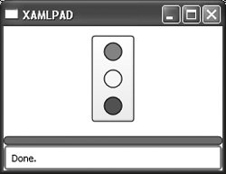 |
EAN: 2147483647
Pages: 217
- Chapter I e-Search: A Conceptual Framework of Online Consumer Behavior
- Chapter II Information Search on the Internet: A Causal Model
- Chapter III Two Models of Online Patronage: Why Do Consumers Shop on the Internet?
- Chapter V Consumer Complaint Behavior in the Online Environment
- Chapter XVI Turning Web Surfers into Loyal Customers: Cognitive Lock-In Through Interface Design and Web Site Usability