Section 6.3. Conditional Formatting
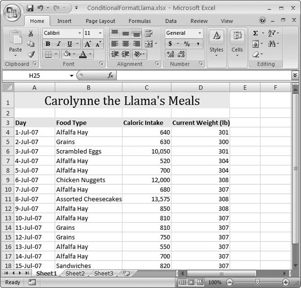
6.3. Conditional FormattingA good worksheet highlights the most important information, thereby making it easy to spot. For example, if you look at a worksheet that shows the last year of a company's sales, you want to be able to find underperforming products without having to hunt through hundreds of cells . And even if you're not using Excel in the business world, you still need to hone in on key details in a spreadsheetwhether it's a budget-busting dinner in your monthly expense worksheet or a skipped week at the gym in your exercise log. All too often, these essential details are buried in an avalanche of data. As you learned in Chapter 5, you can use formatting tricks to make important data stand out from the crowd . But the problem with formatting is that it's up to you to track down the cells that need to be formatted. Not only is this a time-devouring task, you also run into trouble when you start using formulas (as discussed in Part 2). Formulas let you set up elaborate calculations that link cells together, which means that a change to a single cell can cascade through your worksheet, altering data everywhere else. If you're highlighting important information by hand, you just might need to repeat the whole formatting process each time a value changes. Fortunately, Excel has a feature that's designed to spare you the drudgery. It's called conditional formatting , and it allows Excel to automatically find and highlight important information. In this section, you'll learn to master conditional formatting to make sure important bits of data stick out for all to see. You'll also see how, with conditional formatting, you can use shaded bars and mini-pictures to give a graphical representation of different values, which is one of the Excel's funkiest new features. Note: Conditional formatting has always been a favorite trick of Excel experts. However, Excel 2007 boosts conditional formatting with new power (you can use more conditions at once), better support (you can create popular conditions with a couple of clicks), and slick new frills (you can highlight data with pictures and shaded bars). 6.3.1. The Basics of Conditional FormattingIn Chapter 5, you learned how to create custom format strings. As you saw, Excel lets you create up to three different format strings for the numbers in a single cell (Section 5.1.4.4). For example, you can define a format string for positive numbers, a format string for negative numbers, and another format string for zero values. Using this technique, you could create a worksheet that automatically highlights negative numbers in red lettering while leaving non-negative numbers in black. This ability to treat negative numbers differently from positive numbers is quite handy, but it's obviously limited. For example, what if you want to flag extravagant expenses that top $100, or you want to flag a monthly sales total if it exceeds the previous month's sales by 50 percent? Custom format strings can't help you there, but conditional formatting fills the gap. With conditional formatting, you set a condition that, if true, prompts Excel to apply additional formatting to a cell. This new formatting can change the text color , or use some of the other formatting tricks you saw in Chapter 5, including modifying fill colors and fonts. You can also use other graphical tricks, like data bars (shaded bars that grow or shrink based on the number in a cell) and icons. 6.3.2. Highlighting Specific ValuesOne of the simplest ways to use conditional formatting is to use a little formatting razzle- dazzle to highlight important values. For example, consider the daily calorie intake log shown in Figure 6-10. To apply conditional formatting, select the cells that you want to examine and format. Next , you need to pick the right conditional formatting rule. A rule is an instruction that tells Excel when to apply conditional formatting to a cell and when to ignore it. For example, a typical rule might state, "If the cell value is greater than 10,000, apply bold formatting." Excel has a wide range of conditional formatting rules, and they fall into two categories (each of which has a separate menu):
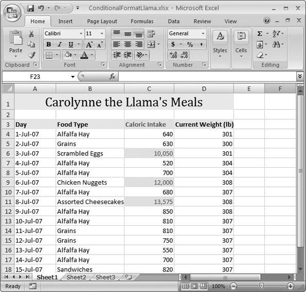
For example, here's how you can quickly pick out big eating days in the llama food table (Figure 6-10):
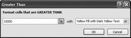
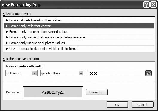
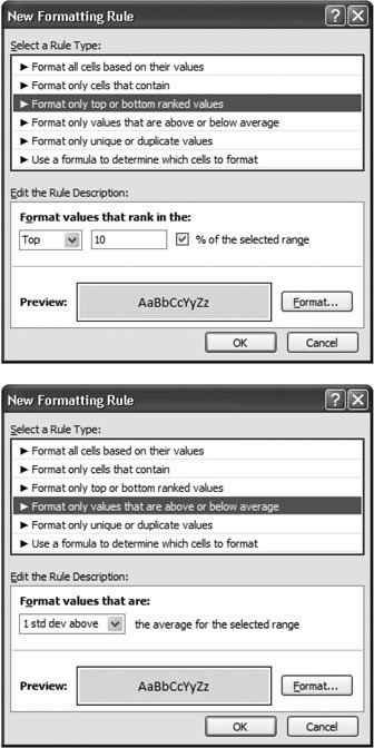
Tip: To remove any type of conditional formatting, select your cells, and then choose Home  Styles Conditional Formatting Clear Rules Clear Rules from Selected Cells. You can also use Home Styles Conditional Formatting Clear Rules Clear Rules from Entire Sheet to wipe out all the conditional formatting on your entire worksheet. Styles Conditional Formatting Clear Rules Clear Rules from Selected Cells. You can also use Home Styles Conditional Formatting Clear Rules Clear Rules from Entire Sheet to wipe out all the conditional formatting on your entire worksheet. Styles Conditional Formatting New Rule. You see the New Formatting Rule dialog box (Figure 6-13).
The New Formatting Rule dialog box is surprisingly intuitive (translation: it's not just for tech jockeys). The "Format only cells that contain" rule is by far the most versatile. It lets you pick out specific numbers, dates, blank cells, cells with errors, and so on. Most people find this formatting rule satisfies most of their conditional formatting needs. There are also two rules that work well with values that change frequently; these are "Format only top or bottom ranked values" and "Format only values that are above or below average." Both of these rules pick out values that stand out in relationship to the others. For example, if you didn't know that 10,000 calories is the threshold for llama overeating, you might use one of these rules to pick the largest meals, as shown in Figure 6-14.
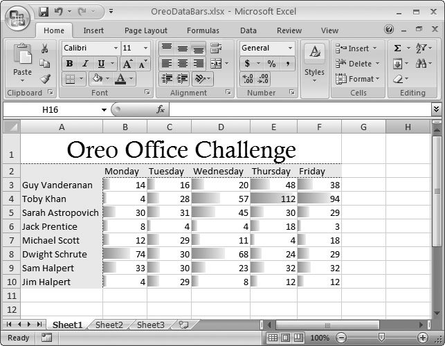
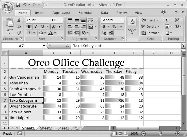
These rules are the foundation of conditional formatting. In the following sections, you'll learn about three more specialized conditional formatting features that use unique formatting to distinguish between different values. 6.3.3. Data BarsData bars a feature that places a shaded bar in the background of every cell you selectare one of the simplest and most useful forms of conditional formatting. The trick is that the data bar's length varies depending on the content in the cell. Larger values generate longer data bars, while smaller values get smaller data bars. To see how this works, consider the worksheet shown in Figure 6-15, which shows a boring grid of numbers with no formatting.
To use data bars, select the cells you want to format (in this example, that's cells B3 to F10), and then choose Home When using data bars, Excel finds the largest value and makes that the largest data bar (so it fills the cell almost completely). Excel then finds the smallest value and uses that for the smallest data bar (which just barely fills the cell). It then creates a proportionately sized data bar for all the other cells.
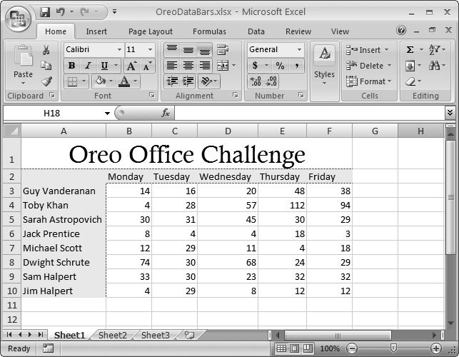
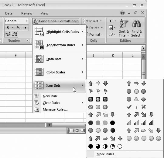
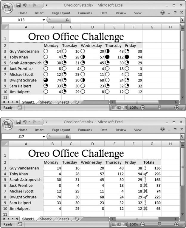
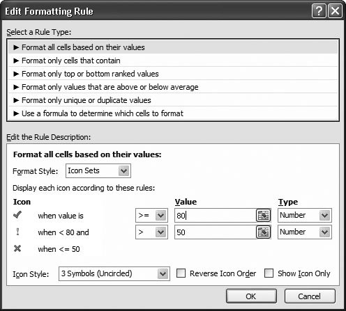
The best part about data bars is that Excel keeps them synchronized with your data. In other words, if you change the worksheet shown in this example by filling in the numbers for the next week, Excel automatically adjusts all the data bars. Data bars work best with groups of numbers that are evenly spread out. This feature makes sense for recording the Oreo cookie extravaganza because the Oreo consumption of most employees falls into the same basic range. However, when you have one or two values that are dramatically higher or lower than the rest, they skew the scale and make it hard to see the variance between the other values. 6.3.4. Color ScalesColor scales allow you to format different cells with different colors. As with data bars, Excel automatically chooses the right color for each cell. Excel assigns a predefined color to the lowest value, and another predefined color to the highest value, and it uses a weighted blend of the two for all the other values. For example, if 0 is blue and 100 is yellow, the value 50 gets a shade of mid-green. To apply a color scale, select your cells, choose Home Color scales aren't used as often as data bars because they tend to create a more visually cluttered worksheet. If you do decide to use color scales, you may want to customize how they work so they're applied only to specific cells, or so that they use a less obtrusive pair of colors (like white and light red). You can learn more about these techniques in Section 6.3.6.2. 6.3.5. Icon SetsSo far, you've seen how to highlight different values with a different graphical representation using shaded bars and colors. Both these tricks are called data visualizations . Excel has one more data visualization tool up its sleeve: icon sets. The idea behind icon sets is that you choose a set of three to five icons. Excel then examines your cells, and displays one of these icons next to each value, depending on the value. For example, if you choose an icon set with three icons, the bottom 33 percent of all values get the first icon, the middle 33 percent get the second icon, and the top 33 percent get the third icon. To see the available icon sets, choose Home
Sadly, you can't create your own icon sets in this version of Excel. However, there's a lot you can accomplish by using the existing icon sets with a little imagination . Figure 6-18 shows two options with the table of Oreo eaters. The top example ranks each competitor's performance each day, while the bottom one calculates per-person totals (using the SUM( ) function described in Section 9.2), and then adds icons to those totals.
6.3.6. Fine-Tuning a Formatting RuleWhen you apply data bars, color scales, or icon sets to a group of numbers, Excel creates a new conditional formatting rule. It's this rule that tells Excel how to format the group of cells you've selected. To fine-tune the way conditional formatting works, you can tweak your rule. Here's how:
6.3.6.1. Fine-tuning data barsIf you're editing a data bar, there are three details you can change:
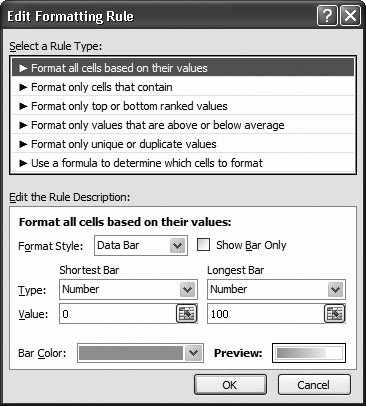
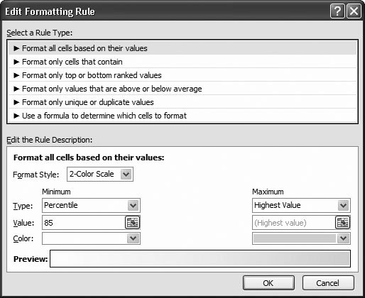
The last option is the most interesting. Ordinarily, the lowest value gets the shortest bar and the highest value gets the longest bar. However, this isn't always the best approach. For one thing, it can wipe out fine distinctions if there are a few very large or very small values in your selection. Figure 6-19 shows the problem. To fix this problem, you can set a specific minimum or maximum value. To do so, change the Shortest Bar setting from Lowest Value to Number, and change the Longest Bar setting from Highest Value to Number, as shown in Figure 6-20. That way, you can focus the scale on the range of values that's most important. Along with the Number setting, you can also set the Shortest Bar and Highest Bar setting to Percent, Percentile, and Formula. Percent allows you to supply the minimum and maximum values as percentages instead of fixed numbers. Ordinarily, the lowest value is 0 percent and the highest value is set to 100 percent. So, if you want to cut off the ends of the scale, you might start the smallest bar at 10 percent and cap the highest at 90 percent. If your actual values range from 0 to 500, the bottom value (at 10 percent) becomes 50, and the top value (at 90 percent) becomes 450.
The Percentile number works similarly, but in a way that's more satisfying for mathematically minded statisticians. This number arranges all the values in order from lowest to highest, and then slots them into different percentiles . In a set of 10 ordered values, the 40th percentile is always the fourth value, regardless of its exact number. In other words, when you're using percentiles, Excel isn't all that interested in how high or low the exact value isinstead, it pays attention to how that value falls in relationship to everything else. If you set a data bar minimum to a percentile value of 10, the bottom 10 percent of values get the shortest bar. If you set the maximum to 90, the top 10 percent of values get the longest bar.
Tip: The nice thing about percentiles is that you always get a good range of short, medium, and long data bars, even if your numbers are spread about unevenly. Finally, the Formulas option is an advanced trick that lets you use a formula that tells Excel what the highest or lowest value should be. You can learn more about formulas in Chapter 8. 6.3.6.2. Fine-tuning color scalesYou can fine-tune color scales in much the same way you adjust data bars. Here are the settings you have to play with:
One reason you might fine-tune a color scale is to use less obtrusive formatting by using white as your minimum value color, and choosing a light color for the maximum. You can also use percentiles to make a more reserved-looking worksheet, where most values get no color and the highest values get just a tinge (see Figure 6-22).
6.3.6.3. Fine-tuning icon setsWith icon sets, you have several settings to play with:
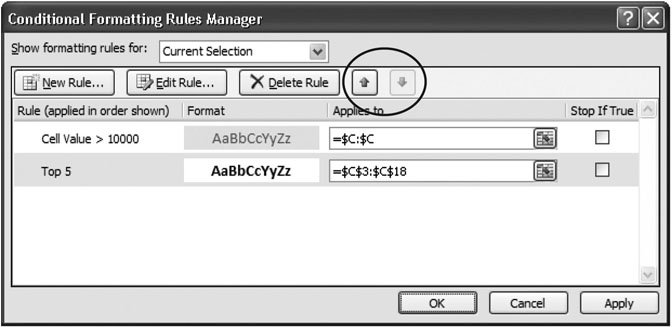
6.3.7. Using Multiple RulesSo far, you've seen examples that use only one conditional formatting rule. However, there's actually no limit to the number of conditional formatting rules you can use at the same time. (Older versions of Excel don't have the same abilitythey top out at three conditions.) Excel gives you two basic ways to use multiple rules:
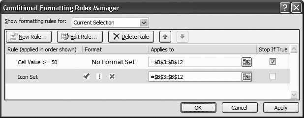
If you use conditional rules that overlap, there's always the possibility of conflict. For example, one conditional formatting rule might apply a red background fill while another sets a yellow background fill. If both these rules affect the same cell, only one can win. In this situation, it all depends on the order in which Excel applies conditional formatting rules. If there's a conflict, rules that are applied later override rules that are applied earlier. Ordinarily, Excel applies rules in the same order that you created them, but if this isn't what you want, you can change the order using the Conditional Formatting Rules Manager, which is shown in Figure 6-24. To get to the Conditional Formatting Rules Manager, select one of the cells that uses the conditional formatting, and then choose Home
Note: Ordinarily, the Conditional Formatting Rules Manager shows only the conditional formatting rules that apply to the currently selected cell (or cells). However, you can choose a specific worksheet in the "Show formatting rules for" list to see everything that's defined on that worksheet. Now you have a nice way to review all the conditional formatting rules that you've created, but it can be a little confusing. When showing all the formatting on a worksheet, it's important to remember that the order of rules isn't important if the rules apply to different sets of cells. The Conditional Formatting Rules Manager isn't just for reordering your rules. It also lets you:
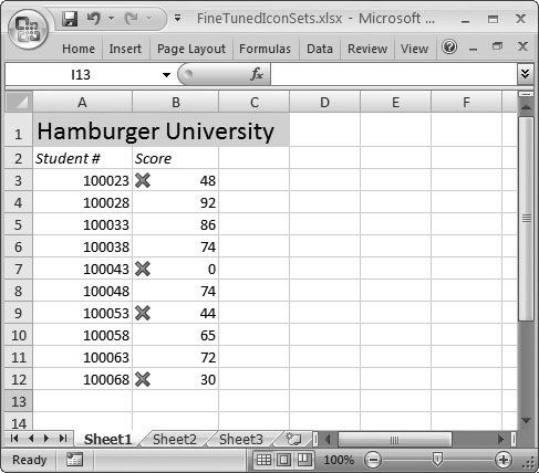
Finally, there's one easily overlooked gem: the Stop If True column. You can use this setting to tell Excel to stop evaluating conditional formatting rules for a cell. This setting is a handy way to limit where Excel shows data bars, color scales, and icon sets. For example, imagine you have a worksheet that shows test scores for a top culinary school. You want to show an X icon next to all the failing grades, but you don't want to bother showing any icon next to the others, as shown in Figure 6-25.
You may think the solution is to select just the cells you want to use (the failing grades), and then apply the conditional formatting rule. But doing that takes away all the benefits of conditional formatting. Instead of getting Excel to find the cells you want, you're stuck hunting for the right ones. This approach also runs into trouble if the grades change, in which case you need to painstakingly reapply your formatting to the right cells. What you really want is a way to take a bunch of cells, give them all icons, and then hide the icons that don't interest you. Here's a case where Stop If True can solve your problem. To whip up this concoction, you need two rules. Here's how to create them:
|