Section 9.2. Style-Based Layout
Although the table-based approach seems perfect at first, it has a few frustrating quirks . One of the most daunting problems is that once you've perfected your table-based layout, you need to painstakingly copy the exact table structure to every other page in your Web site. This is tedious , and tables are notorious for going haywire when a single tag goes missing. Even worse , what happens once you've copied your table-based layout into a hundred different pages, and then decide you want to improve it with a minor change?
|
In the early lawless days of the Web, HTML tables went unchallenged. But when styles appeared, leading Web designers began to explore new layout options. For most Web-heads, style-based layout takes a little bit longer to grasp, but causes fewer long- term headaches . Here are some of the benefits:
-
The HTML for a page that uses style-based layout is cleaner and easier to read.
-
Ideally, all the style information is stored in a separate style sheet so that it can be applied to multiple pages with little effort.
-
When you modify the style sheet, you can reconfigure the layout of every linked page in one (immensely gratifying) fell swoop.
You've already taken your first tentative steps towards this nirvana by learning about style-based layout using boxed text and floating images (Chapter 7). But before you go any further, you need to consider a few more style sheet features that make it all possible.
Tip: Many of the layout features you'll read about below are more recent than the meat-and-potatoes properties for text formatting, colors, and borders. Some are a part of CSS2 (rather than the original CSS1 standard). As a result, it's even more important to test a page on as many different browsers as possible when you use style-based layout. As a rule of thumb, don't expect perfect layout if you're dealing with browsers that are older than Internet Explorer 5 and Netscape Navigator 6.
| POWER USERS' CLINIC Nested Tables |
| In sophisticated Web sites, the show doesn't end with a single table. Instead, tables are placed inside of other tables, which are then placed in yet more tables. For example, you might create a basic three-column setup using one table, and then divide the right column into a series of distinct ads using a second table. When a table is placed in another table, it's called a nested table . Creating this design is easy (although it can be a little difficult to keep track of everything). The trick is to define a table inside one of the cells in an existing table. For example, if you have this table with three columns : <table> <tr> <td class="Left"></td> <td class="Middle"></td> <td class="Right"></td> </tr> </table> You can slide a table right into the <td> tags for the third column: <table> <tr> <td class="Left"></td> <td class="Middle"></td> <td class="Right"> <table> <tr></tr> <tr></tr> </table> </td> </tr> </table> Resizing all the parts of these two tables can get confusing. It's easiest to size the nested table using a relative size of 100 percent. This way, the nested table expands or shrinks to fit the column that contains it. |
9.2.1. The <div> Tag
Before you can start placing elements in the right positions , you need a way to bundle up all the related content into a single neat package. In the HTML table examples, that package was the table cell . When you're using styles, that package is the <div> tagthe all-purpose container described on Section 5.2.7.
For example, imagine you want to create a box with several links on the left side of your page. Trying to position each link separately is as much fun as peeling grapes. By using the <div> tag, you can group everything together:
<div class="Menu"> <a href="">Home Page</a> <a href="">Buy Our Products</a> <a href="">File a Lawsuit</a> </div>
Whenever you create a <div> tag, choose a class name that describes the type of content (like LeftPanel, Menu, Header, AdBar, and so on). Later on, you can create a style rule that positions this <div> tag and sets its font, colors, and borders.
Remember, a <div> doesn't define any formatting. In fact, on its own, it doesn't do anything at all. The magic happens when you combine your <div> with a style sheet rule.
9.2.2. Even Better Selectors
In Chapter 6, you learned a variety of different ways to write selectors . A selector is the part of a style sheet rule that identifies what you want to format. The most common type of selectors are type selectors, which format every occurrence of a specific HTML tag, and class selectors, which format every tag that uses the same class name. However, there are a few ways you can get even craftier.
9.2.2.1. Contextual selectors
Contextual selectors are stricter than ordinary type selectors. Whereas a type selector matches a tag, a contextual selector matches a tag inside another tag . To understand the difference, take a look at this type selector:
b { color: red; } This selector formats all bold text in red. But what if you want to work only on bold text that appears inside a bulleted list? You can do this using the following contextual type selector, which matches the unordered list tag (<ul>) and then finds any bold tags inside it:
ul b { color: red; } To create a contextual type selector, you simply need to put a space between the two tags.
Contextual selectors are useful, but thinking through the different possibilities for combining tags can get a little dizzying. The real benefit occurs when you use a contextual selector to match a specific type of tag inside a specific type of class.
For example, imagine you want to change how all the links look inside the menu panel described above. The menu panel is represented by a <div> tag with the class name Menu. Here's the rule you need:
div.Menu a { color: red; } The first part of this selector gets all the <div> tags in your page. The second part limits the matches to <div> tags that have the Menu classwhich is exactly one. The third and final part of the selector extracts the <a> tags inside the menu panel.
The end result is that this rule changes every anchor in the menu panel to have red lettering. However, the anchors in the rest of the Web page are left alone. This technique is frequently used in Web pages that use CSS-based layout, because contextual selectors make it easy for you to define formatting rules for different sections of a page.
9.2.2.2. id selectors
There's one other type of selector that you need to know about: the id selector . The id selector is actually a lot like the class selectors you've been using up until now. Like a class selector, the id selector lets you pick a descriptive name for your rule. But instead of a period (.), you separate the tag name from the id name with a hash character (#), as shown here:
div#Menu { border-width: 2px; border-style: solid; } This example defines a rule named Menu that can apply only to <div> tags.
Like a class rule, id rules aren't applied unless you specifically indicate that they should be used in your HTML. However, instead of using the class attribute to switch them on, you use the id attribute.
For example, here's a <div> tag that uses the Menu style:
<div id="Menu"></div>
At this point, you're probably wondering what's the point of all thisafter all, the id selector seems almost exactly the same as the class selector. The only difference you've seen so far is in the name of the attribute that links the tag to the style rule.
But there is one more restriction: You can have only one tag in a page with a given id. In other words, if you define an id selector for formatting a menu, you can use it in your Web page only once. This restriction doesn't apply to classes, which you can reuse inexhaustibly.
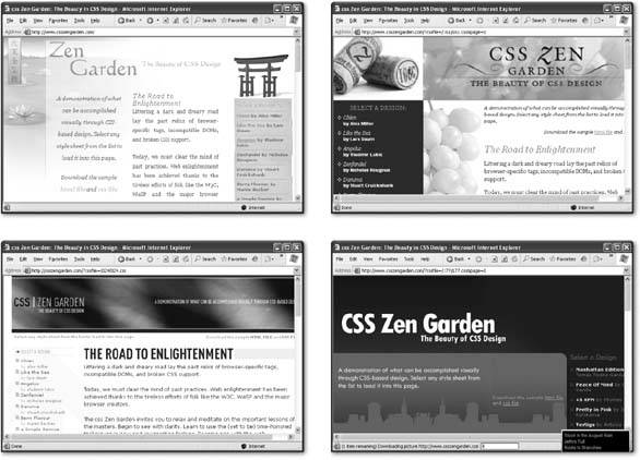
Web designers like the id selector for page elements that occur only once, because they're clearer. For example, a page has only one menu, or one navigation bar. By using the id attribute, you clearly communicate this fact. Of course, the reason you need to understand id attributes is because you'll frequently see them in the wild (for example, you'll find them in the www.csszengarden.com examples shown in Figure 9-12). Now that you know they're just a version of class attributes, you won't have any trouble understanding how they work.
Incidentally, you can use id selectors in all the same ways as other selectors. That means you can combine them with the comma (,) or you can create contextual selectors like the one shown here, which acts only on anchors inside a <div> menu:
div#Menu a { color: red; } 9.2.3. Floating Boxes
Most of the example pages in previous chapters used relative positioning , which is the original HTML model. When you use relative positioning, elements are ordered based on where they appear in the document. For example, if you have one <div> followed by another <div>, the second <div> is placed below the first one.
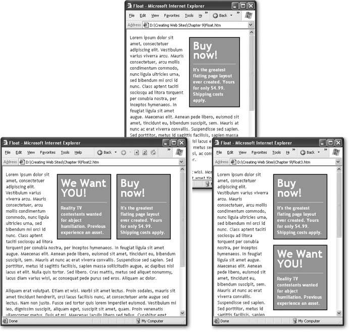
To get richer layoutsfor example, to create either of the pages you see in Figure 9-10, bottomyou need different ways to position content. One option is a floating layout , which you used to make pictures float off to the side in Chapter 7. A floating layout works just as readily with <div> tags, with one exceptionyou need to supply the correct width for the box.
Note: When you float an image, the floating box is automatically made as wide as the image in the box. When you float a text box, it's up to you to choose how wide you want it.
Here's an example that defines a box that floats on the right side of some text:
.Float { float: right; width: 150px; background-color: red; border-width: 2px; border-style: solid; border-color: black; padding: 10px; margin: 8px; font-weight: bold; color: white; } With floating content, text wraps around the edges (see Figure 9-10).
|
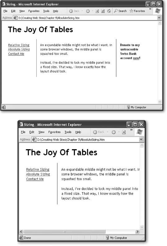
9.2.4. Absolute Positioning
Style sheets also let you place elements at fixed locations on a page, with no wrapping involved. This technique is handy for creating multi-columned pages (see Figure 9-11).
To use absolute positioning, you simply need to set the position property of your <div> tag to absolute . Then, you set the location of your <div> tag using a combination of the top, left, right , and bottom properties.
For example, the following style rule defines a panel that's 150 pixels wide and positioned along the left side of the page. The left edge of the box is 10 pixels from the edge of the browser window, and the top edge of the box is 70 pixels from the top of the browser window.
.LeftPanel { position: absolute; top: 70px; left: 10px; width: 150px; } It's just as easy to create a fixed panel on the right side. Just use the top and right position properties to space the box out from the right edge of the browser window:
.RightPanel { position: absolute; top: 70px; right: 10px; width: 150px; } The final step is to define a content section that sits between the two panels. You can't use absolute positioning for this part, because you don't know how large the browser window will be. Fortunately, you don't need toall you need is to create enough spacing from either edge with the margin properties. Given that the panels are both 150 pixels wide, left and right margins of 151 pixels will do the trick:
.CenterPanel { margin-left: 151px; margin-right: 151px; padding-left: 12px; padding-right: 12px; } This panel also adds some padding to make sure the text isn't too crowded along the left and right edges.
Once you've defined the main regions of your page, you can insert content into them using <div> tags. But because the <div> tags are placed precisely on the page, it doesn't matter how you order the <div> tags in your Web page. For example, you might want to define the content for your left and right panels, and then your center panel. The point is, the order that you lay down your <div> tags doesn't matter. Here's an example:
<div class="LeftPanel"> <h1>Links</h1> <a href="">Page 1</a><br> <a href="">Page 2</a><br> </div> <div class="RightPanel"> <h1>Contact Us</h1> </div> <div class="CenterPanel"> Styles are remarkably powerful. All you need to do is position a few <div> tags, and your content flows </div>
Figure 9-11 shows the results.
|
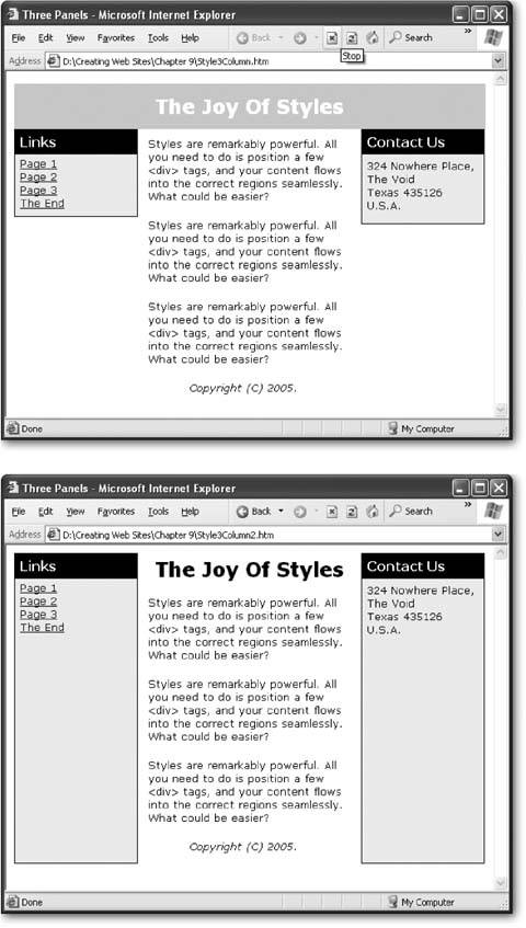
The remarkable part about this example is that the HTML code is completely free of the messy formatting details. Instead, it's a small miracle of clarity, with content divided into several easy-to-understand sections. The same structure in a table would be cluttered with table tags, making it more difficult to interpret. And if you've saved your styles into an external style sheet (Section 6.1.1), you can start building a second page that uses the same layout without spending any time puzzling out the correct formatting.
To use style-based layouts, begin by planning your page as a collection of separate regions. Next, put every region into a <div> tag with a different class, even if you don't intend to apply style sheet rules for the section yet. Finally, write the style sheet rules that position and format each element. This part is the most time-consuming , but don't worryyou can tweak your rules at any time without disturbing the HTML content. Figure 9-12 shows a Web site that takes this concept to the extreme.
|
9.2.5. Layering
It may have occurred to you that you need to position elements very carefully when using absolute positioning, to make sure you don't overlap one element over another. Interestingly, advanced Web pages sometimes overlap elements deliberately to create dramatic effects. For example, you might overlap two words to create a logo, or create a heading that partially overlaps a picture. These tricks use overlapping layers .
When using overlapping layers, the browser needs to know which element goes on top. This is accomplished through a simple number called the z-index . Elements with a high z-index are placed in front of elements with a lower z-index.
For example, here are two elements that are positioned absolutely so that they overlap:
.Back { z-index: 0; position: absolute; top: 10px; left: 10px; width: 150px; height: 100px; background-color: orange; border-style: dotted; border-width: 1px; } .Front { z-index: 1; position: absolute; top: 50px; left: 50px; width: 230px; height: 180px; font: xx-large; border-style: dotted; border-width: 1px; } The first class (Back) defines an orange background square. The second class (Front) defines a large font for text. The z-index is set so that the Front box (which has a z-index of 1) is superimposed over the Back box (which has a z-index of 0). A dotted border is added around both elements to make it easier to see how they overlap on the page.
Tip: The actual value of the z-index isn't important, only how it compares to other elements. For example, if you have two elements with the z-indexes of 48 and 100, you'll have the same effect as two elements with the z-indexes 0 and 1the second element overlaps the first.
In your HTML, you need to create both boxes with <div> tags. It also makes sense to supply some text content for the Front box:
<div class="Back"> </div> <div class="Front"> This text is on top. </div>
In the browser, you'll a block of text that stretches over part of the orange box and out into empty space (see Figure 9-13, left).
|

| DESIGN TIME Become a Style Sheet Guru |
| Style sheets are one of the hottest topics in Web development today. The Web is buzzing with discussion groups, articles, and tutorials that show how to create slick style- powered designs. If you want to become a style guru, there's still quite a bit to learn, including the ins and outs of browser quirks, workarounds for style sheet limitations, and innovative ways to combine graphics and text. Here are a few of the best resources:
|
You can also reverse the z-index to change the example:
.Back { z-index: 1; } .Front { z-index: 0; } 
EAN: N/A
Pages: 135