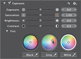
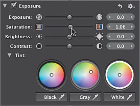
Adjusting Tint and Saturation
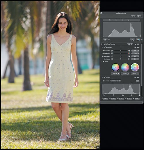
| The color values of skin tones vary by subject. In addition, ideal skin tone values are affected by the environment where the image was shot and by any overall aesthetic color considerations that the photographer prefers (such as, for example, going for a sepia-toned image). Our particular model's fair skin should have a blue value just below the midtone value of 128, a green value 10 percent or so above midtone, and a relatively high red value that is closer to three-quarter tone than midtone. This will give her a nice healthy skin tone that is imbued with the warm light of the Florida sun.
Comparing ImagesBefore we adjust the sidewalk image, let's quickly see how our adjusted tropical image compares.
|
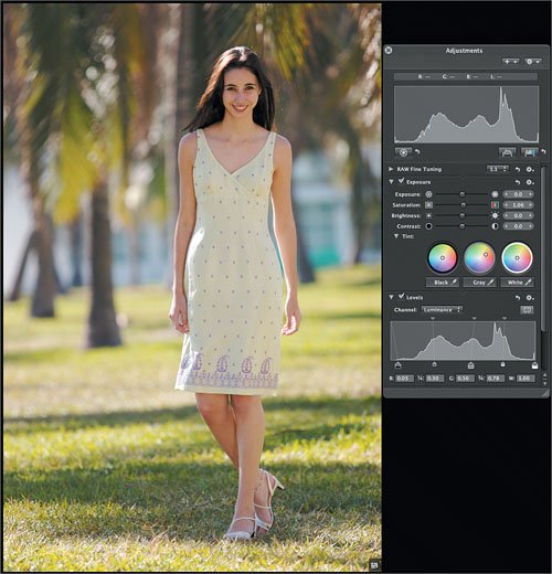 It looks greatthe image is finished. The Grande Agency may make other adjustments, but your job is done.
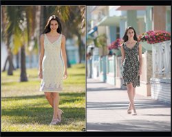
EAN: 2147483647
Pages: 190