7.7 The JComboBox Class
| JComboBox combines a button or editable field and a drop-down list. It is very similar to the AWT Choice component and even implements the ItemSelectable interface for backward compatibility. By default, the JComboBox component provides a single text edit field adjacent to a small button with a downward arrow. When the button is pressed, a pop-up list of choices is displayed, one of which can be selected by the user. If a selection is made, the choice is copied into the edit field, and the pop up disappears. If there was a previous selection, it is erased. You can also remove the pop up by pressing Tab (or Esc, depending on the L&F) while the combo box has the focus. Figure 7-11 shows combo boxes as they appear in four different L&Fs. Figure 7-11. The JComboBox component in four L&Fs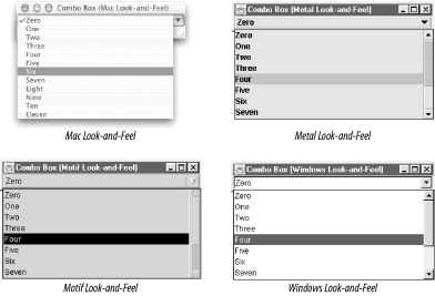 The text field in the JComboBox component can be either editable or not editable. This state is controlled by the editable property. If the text field is editable, the user is allowed to type information into the text box (which may not correspond to anything in the list), as well as make selections from the list. If the component is not editable, the user can only make selections from the list. Unless you specify a set of objects in the constructor, the combo box comes up empty. You can use the addItem( ) method to add objects to the combo box list. Conversely, the removeItem( ) and removeItemAt( ) methods remove a specified object from the list. You also have the ability to insert objects at specific locations in the combo box list with the insertItemAt( ) method. If you wish to retrieve the current number of objects in the list, use the getItemCount( ) method, and if you wish to retrieve an object at a specific index, use the getItemAt( ) method. Note that the list component inside the JComboBox is not part of the component itself but rather part of its UI delegate. Hence, there is no property to access the list component directly. However, you should be able to get any information you need through the component properties or the ComboBoxModel. As with regular pop-up menus, you have the ability to specify whether the pop up in the JComboBox component should be drawn as a lightweight or a heavyweight component. Lightweight components require less memory and computing resources. However, if you are using any heavyweight components, you should consider forcing the combo box to use a heavyweight pop up, or else the pop up could be obscured behind your heavyweight components. This can be done by setting the lightWeightPopupEnabled property to false. If the property is set to true, the combo box uses a lightweight pop up when appropriate. Combo boxes use the same ListCellRenderer as the JList component (discussed earlier in this chapter) to paint selected and nonselected items in its list. 7.7.1 The Key Selection ManagerWith combo boxes, you have the ability to map keystrokes to item selections in the list. In order to do this, you can create an object that implements the interface JComboBox.KeySelectionManager. This interface contains only one method:
Here is a short code excerpt that uses a key selection manager to map the numerals 0-9 on the keyboard to the first 10 elements in the combo box list: class myKeySelectionManager implements JComboBox.KeySelectionManager { public int selectionForKey(char aKey, ComboBoxModel aModel) { if ((aKey >= '0') && (aKey <= '9')) return (aKey - '0'); else return -1; } } You can install the key selection manager using the setKeySelectionManager( ) method of JComboBox: myComboBox.setKeySelectionManager(new myKeySelectionManager( )); If you do not install your own, a default key selection manager selects items in the list whose first character matches what you've typed on the keyboard. (This is not as sophisticated as what JList now supports, in that only the first character is ever considered, but the interface was defined prior to JList's keyboard navigation capability.) 7.7.1.1 PropertiesTable 7-15 shows the properties that can be found in the JComboBox component. As we mentioned earlier, the editable property defines whether the text field of the combo box allows text to be entered manually. The lightWeightPopupEnabled property allows you to specify whether JComboBox should use a lightweight component to draw the list pop up. The popupVisible property controls whether the pop up associated with the combo box is visible. The maximumRowCount property represents the total number of list elements that can be displayed in the pop up. If the list contains more than maximumRowCount, a scrollbar provides access to the rest of the items.
Some properties mimic those in JList. The selectedItem property represents the object currently selected in the combo box. If you call the setSelectedItem( ) method with an object that does not exist, the first object in the list is selected instead. The selectedIndex property gives the index of the selected item, or -1 if there is none. The selectedObjects property holds an array of size 1 the object currently selected. The getSelectedObjects( ) method is present to provide backward compatibility with the AWT Choice component. The read-only itemCount property tells how many elements are currently in the combo box's list. The enabled property overrides that of the java.awt.Component class. If the property is set to false, the method prevents the user from selecting items from the list and typing text into the text field or editor. The opaque property is always true to indicate that the component uses all of its drawing region. The actionCommand property is coupled to an ActionEvent that is fired when the user makes a selection inside the list. The actionCommand typically contains a string-based representation of the selected item. SDK 1.3 introduced the more powerful action property, which allows you to tie the combo box to an Action object so that its enabled state and tooltip text are automatically updated if the Action is changed. Finally, the prototypeDisplayValue property, added in SDK 1.4, allows you to greatly speed up the display of the combo box. If you set this property, the combo box uses the prototype object you supply when trying to calculate its size in the layout. If you don't set this, it has no choice but to iterate over all the contents of its data model and find the biggest size among them, which takes much longer. (Of course, if you're supplying a prototype, it's your responsibility to make sure it's the right size for the entire list.) 7.7.1.2 EventsCombo boxes fire both an ItemEvent and an ActionEvent when the selection in the list has changed. The ItemEvent is fired when there is a change in the current selection of the list, from any source. The ActionEvent is fired when the user explicitly makes a selection; it is coupled with the actionCommand property. (Note that the actionCommand does not by default tell you the item that was selected.) The ItemEvent and its listener list maintain backward compatibility with the ItemSelectable interface of AWT 1.1.
In developing real applications, many developers wanted to have the contents of a combo box react to the current state of the application (items might be added or removed depending on the modes or documents that the user had active). The most convenient way to achieve such context-sensitivity is to update the content of the combo box right before it is displayed. Unfortunately, there was no public API for doing this, so some developers chose to dive into the details of the actual L&F-specific UI delegate implementations and hook their applications into the "guts" of Swing. Starting with SDK 1.4, the Swing API provides an official, public way to update your combo box before its list pops up for the user. You can now express interest in being notified before the combo box shows a pop-up menu by registering a PopupMenuListener . (Note that if the L&F does not use a pop-up menu to implement the list portion of the combo box, you may not receive any notifications. So far, all standard L&Fs do use pop-up menus and do fire these events).
7.7.1.3 Constructors
7.7.1.4 Methods
7.7.1.5 List methodsThese methods require that the combo box use a MutableComboBoxModel; otherwise, an exception is thrown:
7.7.1.6 Key selection
7.7.1.7 Internal methodsBecause the JComboBox uses a number of other components to build its interface (often a text field, a pop-up menu, and a list), it implements several methods needed to interact with these constituent components. These methods must be public so the components can call them, but they are not intended to be invoked by you or me. But if you are tempted to use one of these anyway, be aware that since the previous publication of this book, a number of such methods have been removed, and your code would have broken had you relied on them.
7.7.2 Java Books RevisitedHere is the list of some O'Reilly Java books implemented as a combo box. We use our new combo box editor to allow the user to see which book is selected. // EditableComboBox.java // import java.awt.*; import java.awt.event.*; import java.util.*; import javax.swing.*; public class EditableComboBox extends JPanel { private BookEntry books[] = { // Include same book information as in ListExample above. }; Map bookMap = new HashMap( ); public EditableComboBox( ) { // Build a mapping from book titles to their entries. for (int i = 0 ; i < books.length; i++) { bookMap.put(books[i].getTitle( ), books[i]); } setLayout(new BorderLayout( )); JComboBox bookCombo = new JComboBox(books); bookCombo.setEditable(true); bookCombo.setEditor( new ComboBoxEditorExample(bookMap, books[0])); bookCombo.setMaximumRowCount(4); bookCombo.addActionListener(new ActionListener( ) { public void actionPerformed(ActionEvent e) { System.out.println("You chose " + ((JComboBox)e.getSource( )). getSelectedItem( ) + "!"); } }); bookCombo.setActionCommand("Hello"); add(bookCombo, BorderLayout.CENTER); } public static void main(String s[]) { JFrame frame = new JFrame("Combo Box Example"); frame.setDefaultCloseOperation(JFrame.EXIT_ON_CLOSE); frame.setContentPane(new EditableComboBox( )); frame.pack( ); frame.setVisible(true); } } The code to initialize the combo box is relatively simple. After the combo box is instantiated, we set the editable property to true and inform the combo box of our custom editor. Finally, we set the maximumRowCount property to 4, ensuring that the user cannot see more than four books in the list at a time. If the user types in a book that cannot be found in our list, the example displays a question mark instead of a cover. Whenever a selection is made, the results are printed on the screen. Figure 7-12 shows the result. Figure 7-12. A custom JComboBox component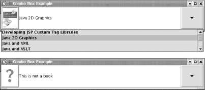 |
EAN: 2147483647
Pages: 289