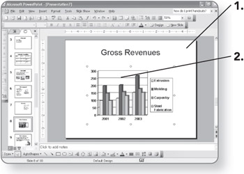
Entering Data for the Chart
Before building a chart, organize the data you'll be depicting. Most charts compare two types of data, such as a budget where the amount spent on certain items is listed for a range of dates. PowerPoint provides a small example to get you started. Just replace the sample data with your own information.
-
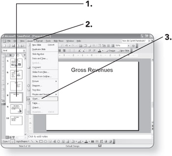
Display the slide on which you want to insert the chart. The slide will appear in Normal view.
-
Click on Insert. The Insert menu will appear.
-
Click on Chart. The sample chart and chart datasheet will appear on the slide.
-
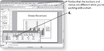
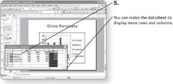
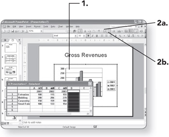
Click in a cell on the datasheet. The cell's contents will be selected.
-
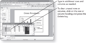
Type the data that you want to appear in the chart.
Exiting and Entering Microsoft Graph
The tools you use to create the chart, as in the preceding section, are called Microsoft Graph. You enter Microsoft Graph by starting a new chart or double-clicking an existing one. You exit it by clicking on the slide area outside the chart.
-
Click on a blank area of the slide. The datasheet will close and your information will appear in the chart.
-
Double-click on the chart. The Microsoft Graph tools will reopen, including the different menus and toolbar buttons.
Changing How the Data is Plotted
You can change the meaning of a chart by changing how the data is plotted in the worksheet grid—either by rows or by columns.
-
Double-click on the chart. The chart will be selected and the charting tools will appear in the toolbar.
-
-
Click on the By Rows button. The data will be plotted by rows.
OR
-
Click on the By Columns button. The data will be plotted by columns.
-
EAN: 2147483647
Pages: 158