Too Much of a Good Thing: Recognizing Overcorrection
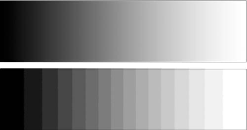
| Levels (along with several other tools that you'll see later) allows you to make dramatic changes to your images. As you work with these tools more, you'll probably be surprised by how much detail you can pull out of what may appear to be a useless image. However, it is possible to go too far in your edits. As you've already seen, you can drag those sliders a long way and change your image a lot. So how do you know how much is too much? Obviously, any type of correction is a subjective exercise. What looks great to you may look lousy to someone else. There are, however, some objective guidelines that you can observe while editing that will help you maintain a certain level of technical quality. What missing data looks likeAs you've seen, when you use editing tools such as Levels, you compress and expand the tonal information in your image, and this invariably results in some data loss. A well-exposed image will provide enough latitude for a good amount of editing, but it is possible to push edits to the point where you visibly degrade your image. This degradation is a good, nonsubjective benchmark for determining when you've performed too much adjustment In Figure 3.1, you saw how an overexposed image lacks the detail that is necessary to produce smooth-looking highlights. When you throw out too much data in the course of an edit, you end up with a situation that's similar to the problem you face with overor underexposure. Let's look a little more closely at what happens to your image when you throw out data. Consider Figure 3.30, which shows two black-to-white gradients. Below the smooth gradient on top is a black-to-white gradient that has been edited so that it has only 16 shades of gray. Figure 3.30. A grayscale ramp (top) and a posterized grayscale ramp (bottom).
With only 16 shades to work with, it is impossible to create a smooth transition from black to white. The overall tonal range is the samethe image still goes from black to whitebut now the smooth gradient has turned into stark bands of gray. By reducing the number of colors that represent the gradient, we have thrown out a substantial amount of data, making it impossible to create a smooth transition from one tone to the next. The process of reducing the number of tones in an image is called posterization. Too much data loss yields posterization, and posterization appears in your images as banding or breaks in what should be a smooth transition of tones. Tone breaks will rarely be as obvious as shown here. In fact, this type of artifact will often be concealed by other image details in your picture. However, even a little bit of tone break can be annoying and distracting, depending on where it appears in your image. Clouds and skies are often subject to bad banding, as are highlights and bright gradients. Similarly, shadow tones can often suffer from bad data lossrelated banding. When pushing your Levels sliders around, keep your eye peeled for banding artifacts like those described here. In particular, pay close attention to those areas of your image, such as clouds or subtle highlights, that are already composed of only a few tones. With little room to spare for data loss, these are the areas that will suffer the most once you start throwing out image data. Out-of-gamut colorAll color devicesincluding your eyeshave a particular gamut, or range, of colors that they are capable of displaying or capturing. Unfortunately, your monitor, eyes, camera, and printer all have very different gamuts, and a color that's within the range of one device may not be in the range of another. This problem is particularly troublesome when you're preparing images for print. When you edit an image, it's actually possible to push the color in your image beyond the gamut of your printer. This can result in annoying artifacts in your final print, because your printer will try to bring the out-of-gamut colors back to something that it knows how to print. Rather than letting your printer make these kinds of decisions for you, it's better to try to stay within the printer's gamut while working in Photoshop. This will allow you to stay in control of what colors should look like. Similarly, when you edit photos destined for video or a particular web-based color space, you'll want to ensure that you don't push your colors too far. Photoshop's color management tools provide gamut warning features that make it easier to stay within a particular printer gamut. However, color management is a complex, sometimes bewildering subject that is way beyond the scope of this book. Nevertheless, it's worth at least reading the color management sections in Photoshop's help files to get an idea of how to use Photoshop's color management workflow to ensure that you don't edit your colors into colors that aren't legal for your target device. |
EAN: 2147483647
Pages: 76