Looking into Windows
A window is literally a portal that displays information for your perusal. There are many different kinds of windows. Each serves a particular function; each offers options for control and interaction. Some windows show the contents of disks and folders. Some windows show the text of a written document, or the content of a photograph. Certain windows alert you to conditions requiring your input. Other windows even offer interaction with tools that are used to modify the contents of other windows. Most windows are rectangular and many are malleable. You can reshape them to maximize your screen real estate. This section describes how different types of Mac OS windows look and operate.
Recognizing different window types
There are several types of Mac OS X windows, and each is designed to display a specific kind of information. Some windows display the files and other items stored on disks. Other window types display the actual contents of files, which may be text, pictures, movies, or other kinds of information. Figure 2-9 shows examples of the different types of Aqua windows. The different types of windows are as follows:
-
Finder windows: A window that shows the content of folders and disks. These windows are generated by the Finder, covered in Chapter 3.
-
Document: A document window displays the content of a particular document, be it a photograph, a movie or text.
-
Dialogs: Windows that display options that you can set and actions you can perform.
-
Sheets: A dialog that applies to, and is attached to, another window. A sheet ensures you won’t lose track of which window the dialog applies to.
-
Alerts: Dialogs in which the Mac OS or an application program notifies you of a hazardous situation, a limitation in your proposed course of action, or an error condition.
-
Palettes: Also called panels or utility windows, palettes contain controls or tools or display auxiliary information for the application that you’re currently using.
Window controls
As mentioned, windows are portals that display important data. They are made up of numerous control surfaces and other objects, including buttons and more. There are many different types of windows in Mac OS X, as was discussed in the previous Chapter, but there are a slew of common control surfaces and buttons available within most windows. Of course, you won’t find all types window controls on every kind of window. For example, document windows have all or most of the available controls, whereas dialogs generally have fewer window controls available, and alerts have fewer still. Figure 2-10 shows a standard document window with the most commonly found items indicated.
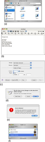
Figure 2-9: The Mac OS X Aqua environment has several different types of windows: a Finder window (a), a document (b) a dialog (c), a sheet (d), an alert (e), and a palette (f).
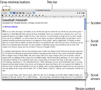
Figure 2-10: Windows are made up of numerous controls and objects. Learning what they all do is crucial to an efficient computing experience. These highlighted items are common to many windows.
-
Title bar: The title bar is the usually the home of the stoplight cluster of close, minimize and zoom on the left side, as well as the location of the name of the active window (the Title). The title indicates which document is currently being displayed (or which folder is being displayed in the case of a Finder window, discussed later in this Chapter). Click and drag on the title bar to move the window. Double-clicking the title bar minimizes the window into the Dock just as the minimize button described below.
-
Close: The close button is the uppermost and leftmost item in every window. The color scheme of the close button and his two partners, the minimize and the zoom buttons, are based on a stoplight. The close button is typically a round red button found at the top left of a window and when you move the pointer near this button, an X appears in its center. Red usually means stop after all, and this button will close the window to which it is attached. In some applications, notably the Finder, press the Option key and click this button to close all of the application’s windows. Please note that unlike Microsoft Windows, this will NOT usually quit the active application, but will simply close the displayed window. Quitting applications is covered in Chapter 5.
-
Minimize: The minimize button is usually a round yellow button, found to the right of the close button, and when you move the pointer near it, a minus sign (–) appears in it. In keeping with the stoplight theme, clicking this button will minimize the attached window, sucking it down into the Dock, for easy retrieval later (its sort of like “slow down”, isn’t it?). Minimizing too many windows will result in a cluttered Dock, so be careful!
-
Zoom: The zoom button is typically a round green button, found to the right of the minimize button, and when moving the pointer near it, a plus sign (+) appears inside it. Its function is to make a window first as large as is required to display all items within, or to make that window as large as possible, without stretching off screen if too many items are present to be displayed at once. A zoomed window may leave a margin at the bottom or sides of the screen for the Dock. After the first zoom-button click, this button will then reduce the window to its original size. If a window cannot be resized, its zoom button is dim, and a plus sign does not appear in its center. (This fits into the stoplight theme of these three buttons as in “Zoom! Hit the gas!”)
-
Scroller: The scroller is both an indicator as well as a control item. The scroller indicates a given window’s current focused position of the displayed folder contents with both its size as well as its position in the Scroll Track. For example: If the scroller is at the top of the Scroll Track, and is taking up about one third of the scroll track, the window is displaying on third of the total folder’s viewable material, and is showing the top third portion. Click and drag the scroller to move quickly to a desired position within a displayed folder. This is the fastest way to shift your window’s list of displayed items. Like Scroll Arrows, the scroller will not be available if all of a folder’s contents are displayed by the current window’s size.
-
Scroll track: The scroll track is the container for the scroller. As with the scroller, the Scroll Track is an indicator as well as a control surface. The scroll track can be clicked to refocus the window one full window display area at a time. For example: If the scroller is half the size of the scroll track and at the top of the scroll track, a single click in the scroll track will move the window’s focus to the bottom half. This method is useful to quickly scan a folder’s contents.
-
Scroll arrow: The scroll arrows will shift a windows focus in the arrow’s indicated direction slightly with each mouse click. Clicking and holding on a scroll arrow will shift the window’s focus both smoothly and more quickly. These buttons are useful when trying to slowly scan through a large grouping of items. Note: Scroll arrows will only be available for use if the window is not large enough to display all items within it.
-
Resize control: The bottom-right corner of a window is typically the resize control surface. This is usually indicated with a slightly rougher texture or indentation to that corner that would suggest grabbing it. Click and drag the resize corner to adjust the size of the window. Hold down shift before clicking to resize the window equally in both length and width, forming a neat square.
| Note | The color of the Close, Minimize, Zoom, and Scroller controls may be gray instead of red, yellow, green, and blue. You set the color by using the General pane of System Preferences application, as described in Chapter 4. |
Buttons and other controls
Window controls, as covered in the previous heading, afford you means of controlling the window itself. But, within many of the windows encountered day to day are a wide variety of controls that you also operate by clicking or dragging with the mouse. These other controls perform various functions, hopefully clearly labeled by the software designers! Examples of these other controls include push buttons, checkboxes, radio buttons, sliders, little arrows for increasing or decreasing numeric values, disclosure triangles, scrolling lists, and tabs.
Using push buttons
A push button causes an action to take place when clicked. A label on the button indicates the action that the button performs. The label may be text or graphic. Push buttons with text labels are generally rectangular with rounded ends. Buttons with graphic labels may be any shape. Figure 2-11 illustrates push buttons.
Figure 2-11: Click a push button in an Aqua window to cause an action to take place.
Using standard OK and Cancel buttons
Many dialogs have buttons labeled OK and Cancel. Clicking OK accepts all the settings and entries in the dialog. Clicking Cancel rejects any changes you may have made in the dialog and restores all settings and entries to their state before the dialog appeared. A shortcut for clicking the Cancel button is pressing the Escape key (the Escape key is labeled esc) or pressing the z and Period (.) keys in combination.
Using radio buttons
Radio buttons let you select one setting from a group. They’re called radio buttons because they work like the station presets on a car radio. Just as you can select only one radio station at a time, you can select only one radio button from a group. To select a radio button, click it. The selected radio button is darker than its unselected neighbors. Figure 2-12 illustrates radio buttons.
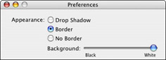
Figure 2-12: Click a radio button in an Aqua window to select one setting from a group.
 |
One button in an Aqua dialog, alert, or sheet may pulsate, going from light gray to a darker color (initially blue, but you can change colors as described in Chapter 13). The other buttons are all light gray. This is the default button.
The default button represents the action that you most often want to take. However, if the most common action is dangerous, then a button representing a safer action may be the default button. As a shortcut for clicking the default button, you can press the Return key or the Enter key.
|
Using checkboxes
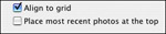
A checkbox lets you turn a setting on or off. When a setting is on (or selected), a check mark appears in the checkbox. When a setting is off (or deselected), the checkbox is empty. When a setting is partly on and partly off because it indicates the state of more than one thing, such as the format of a range of text, a dash appears in the checkbox. Unlike radio buttons, checkboxes are not mutually exclusive. You can turn on checkboxes in any combination. That being said, some applications may use check symbols in their radio button fields, allowing only one check to be seen at a time, just to confuse us all. Be careful. Clicking a checkbox reverses its state. Figure 2-13 shows examples of checkboxes.
Figure 2-13: Click checkboxes in Aqua windows to turn settings on and off individually.
Using sliders
A slider consists of a track that displays a range of values or magnitudes and the slider itself, also known as the thumb, which indicates the current setting. You can change the setting by dragging the slider. An Aqua slider is a dark color (initially blue, but you can change colors as described in Chapter 4). Figure 2-14 shows examples of sliders.
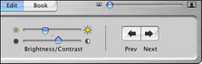
Figure 2-14: Drag a slider in an Aqua window to change a setting across a range of values.
Using little arrows
Little arrows, which point in opposite directions, let you raise or lower a value incrementally. Clicking an arrow changes the value one increment at a time. Pressing an arrow continuously changes the value until it reaches the end of its range. Figure 2-15 illustrates little arrows.
Using disclosure triangles
A disclosure triangle controls how much detail you see in a window. When the window is displaying minimal detail, clicking a disclosure triangle reveals additional detail and may automatically enlarge the window to accommodate it. Clicking the same triangle again hides detail and may automatically shrink the window to fit. Figure 2-16 shows an example of disclosure triangles.
Figure 2-15: Click or press a little arrow in an Aqua window to change a value incrementally.
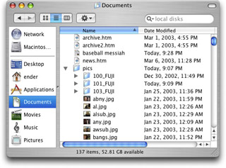
Figure 2-16: Click a disclosure triangle to adjust the amount of detail shown.
Using scrolling lists
A scrolling list displays a list of values in a box with an adjacent scroll bar. If there are more values than can be displayed at once, the scroll bar becomes active and you can use it to see other values in the list. Clicking a listed item selects it. You may be able to select multiple items by pressing Shift or z while clicking. Figure 2-17 illustrates scrolling lists.
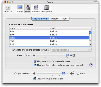
Figure 2-17: Scroll a list to see an item you want and then click to select it (Shift-click or z-click to select multiple items) in an Aqua window.
Using tabs
Tabs in Mac OS windows perform the same function as tabs on dividers used in card files or ring binders. They divide the contents of a window into discrete pages or sections, with each tab presenting one section of window content. Apple calls each tabbed section a pane. You can see only one pane at a time, and users switch to a different pane by clicking the appropriate tab. Figure 2-18 shows an example of tabs.
EAN: 2147483647
Pages: 290
- Article 100 Definitions
- Article 338 Service-Entrance Cable Types SE and USE
- Article 348 Flexible Metal Conduit Type FMC
- Article 406: Receptacles, Cord Connectors, and Attachment Plugs (Caps)
- Example No. D10 Feeder Ampacity Determination for Adjustable-Speed Drive Control [See 215.2, 430.24, 620.13, 620.14, 620.61, Tables 430.22(E), and 620.14]
- Chapter V Consumer Complaint Behavior in the Online Environment
- Chapter IX Extrinsic Plus Intrinsic Human Factors Influencing the Web Usage
- Chapter XIII Shopping Agent Web Sites: A Comparative Shopping Environment
- Chapter XVI Turning Web Surfers into Loyal Customers: Cognitive Lock-In Through Interface Design and Web Site Usability
- Chapter XVII Internet Markets and E-Loyalty