Why It s Bulletproof
Why It's BulletproofSo, all in all, we have an attractive (and yes, I suppose I'm speaking for myself here) one-page design that, when deconstructed, will reveal its bulletproofness. We'll be going step by step through the evolution of this design, but first let's talk about why it is bulletproof. FLUID LAYOUTUsing the CSS techniques explained in Chapter 8, "Fluid Layouts," this two-column design achieves a fluid, flexible layout. Expanding or contracting the browser window will, in turn, modify the layout to fit whatever screen width the user desires (Figure 9.2). Figure 9.2. With a fluid layout, the columns and everything within them can expand and contract as necessary.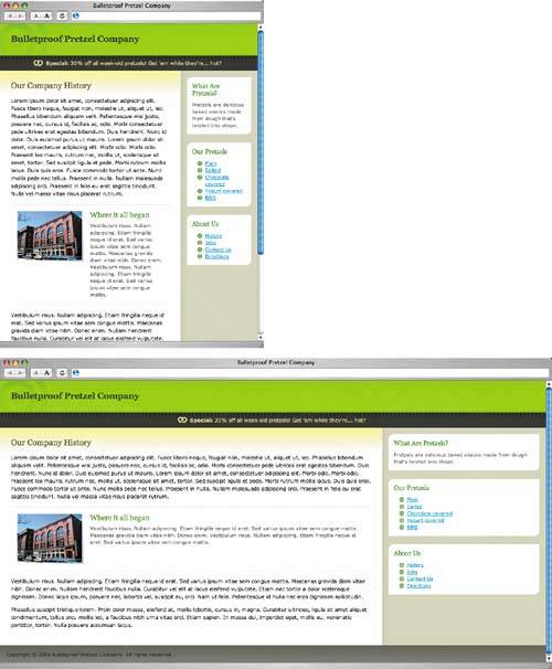 As you know, choosing between a fixed-width and a fluid layout can be difficult. Although each style has its pros and cons, a fluid layout is a great way to give your reader that extra bit of controlnot to mention, it prepares your layout design for a multitude of screen resolutions. You'll notice in Figure 9.2 that design elements remain intact on the page even when the user expands or contracts the browser window. For example, the box design in the sidebar stretches and/or contracts as necessary, all the while maintaining the original design details. We'll explain in depth how this is done a bit further along in the chapter. FLEXIBLE TEXTThis design also applies what you learned in Chapter 1; as you can see in Figure 9.3, increasing the text size a few notches does nothing to hinder the design. The page components expand with ease, while the design details throughout remain intact. For instance, the header and promotional message rows expand, allowing larger text or additional content to live within those rows. Also, the half-rounded boxes in the sidebar retain their shape. Figure 9.3. Increased text size does nothing to hinder the design of each component within the design. Most important, though, is that the page allows readers to adjust the size of text on the page as they see fit. Those with low-vision are able to bump up the font size to increase its readability, regardless of the browser or device they are using.
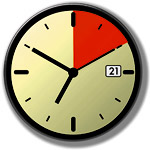
Making sure the design of the page holds up in as many scenarios as possible, we can also test for the absence of images and CSS, as discussed in Chapter 6 (which shares this section's title). Figure 9.4 shows the page with images turned off. Readers who visit the page over slow connections can still view the content immediately while images load. Should the reader disable images purposefully to save bandwidth and speed up downloading, the page still operates perfectly and remains readable thanks to the background color equivalents specified behind any background images. Figure 9.4. With images turned off, the entire page is still readable due to the background color equivalents we specified.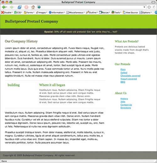 Similarly, if we disable CSS, we can get a quick glance at the underlying structure of the page with the "10-second usability test," also described in Chapter 6. Text browsers, assistive software (like a screen reader), or any device that doesn't support CSS will interpret the page this way. As Figure 9.5 shows, even without styles applied the page remains very readable and logically structured. Figure 9.5. The "10-second usability test" reveals a well-structured page, suitable for a wide range of devices.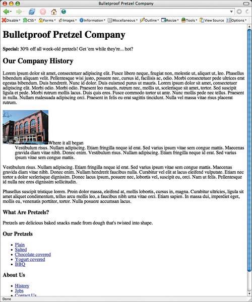 Take away CSS and/or images, and our Bulletproof Pretzel Company is ready for itall the while remaining readable, functional, unflappable, and arguably delicious. |
 Improving flexibility and protecting against worst-case scenarios with XHTML and CSS")
EAN: N/A
Pages: 97