Why It s Not Bulletproof
Why It's Not BulletproofGetting back to my helpful reader's e-mailyou know, the one who wisely disables images when he browses on a slow dial-up connectionthe reason for his note was to inform me that the content on my site was either hard to read or just plain not there at all. Oh my. I have to admit this was rather embarrassing, but let's take a look at why this happened. Because the content's text color was two shades of gray, when the tiled image was removed (or disabled by the reader) the text was left sitting on the default background color, which was also a dark gray. The result was a semi-unreadable page; one could barely make out the text in the wider main column, and even worse, the text in the smaller right column was invisible. The text in this column shared the same color gray as the background, leaving the text completely hidden. Figure 6.5 shows what happens when the tiled image is removed. There's not exactly an optimal contrast between the text in the main column and the background color, which makes it difficult to read. But even worse, the right column's text disappears completely because it's the same color as the background. Figure 6.5. It's difficult to read and, wait, where did the right column go?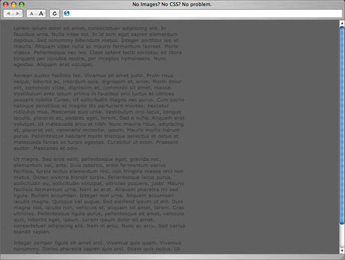 For users who browse with images turned off to conserve bandwidth, or for those on slow connections that make image loading seem to take forever, this scenario can certainly be frustrating. Text can even be unreadable, depending on your color combinations. Fortunately, there's an easy step to keep in mind to prevent this unreadable state. |
EAN: N/A
Pages: 97