A Bulletproof Approach
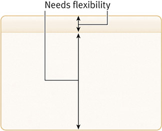
| To cure the box's plague of inflexibility and excess code, let's rebuild the style of this box using a fraction of the markup and taking advantage of CSS to control the design elements that make the box unique. To begin, we need to develop a strategy for making two areas of the box vertically flexible. The gradient fade behind the box's heading will have to be able to expand down as more or larger text is placed within the heading. In addition, the rest of the box below the heading needs to be able to expand or contract vertically, depending on how much content it contains, with the rounded-corner bottom always sitting below everything else (Figure 5.7). Figure 5.7. These two areas of the box will need to be vertically flexible.
note
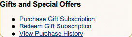
To accomplish this, we need to employ some crafty use of background images and CSS. But first, let's come up with a compact markup structure. THE MARKUP STRUCTUREIn deciding how best to structure the rounded box, we must keep in mind the following requirements: fixed-width, a heading on top, variable amounts of content below. That said, I think it makes the most sense to wrap each box in a containing <div>, followed by a heading element for the box title, and then any content below. For this example, I'll simplify the contents of the box to include just a list of three links (since we're really just focusing on the box's rounded style here). Because this particular box style is used repeatedly throughout a single page, we should come up styles we can reusemeaning we'll want to use a class (for multiple occurrences) rather than an id (used once per document) to label the <div> that sets up the box style, as shown here: <div > <h3>Gifts and Special Offers</h3> <ul> <li><a href="/purchase/">Purchase Gift Subscription</a></li> <li><a href="/redeem/">Redeem Gift Subscription</a></li> <li><a href="/view/">View Purchase History</a></li> </ul> </div> There you have it. Pretty darn simple, isn't it? Just a simple <div> labeled with a , with a heading level 3 and an unordered list of three links contained inside. As far as lean markup goes, this is optimal. The outer <div> element will help us give the fixed width we need to the box, as well as provide a contextual flag that will allow us to uniquely style the heading and content within the box. tip
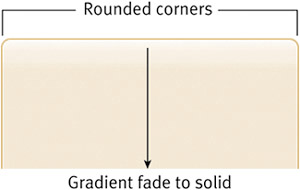
AN IMAGE STRATEGYThe trickiest and most important step to rebuilding this example involves separating the graphic elements from the design so that they will accommodate varying amounts of content and text sizes. We need to build in a height that is larger than we think we need for both the heading area and the main body of the box. For instance, looking at the heading area of the box first, we must create an image that will accommodate large or multiple lines of text. Since we'll reference the image as a background for the <h3> in our markup (with more or less of this image appearing behind whatever text is used), this image will also contain the rounded corners for the top of the box. Figure 5.8 shows the image I've created (h3-bg.gif); as you can see, I've made it tall enough for several lines of heading text. Notice that I've left out the darker bottom border that separates the heading from the body of the box. We'll use CSS to create this one-pixel line that flanks the bottom of the heading. Doing so will enable us to align this image at the top, creating the rounded corners for the top of the box and leaving a variable area for the heading text, followed by a one-pixel border created by CSS. Figure 5.8. The background that will be used behind the box's heading is tall enough to accommodate several lines of text.
The second image we'll need creates the rounded corners on the bottom of the box, as well as the one-pixel borders on each side. Just as we did with the heading image, we'll want to build in extra vertical space to account for varying lengths of content that might be placed within the box. Figure 5.9 shows the finished image (div-bottom.gif); as you can see, I've given it a substantial height, thus planning ahead for whatever happens to fill it later on. Figure 5.9. The background image that will sit behind the box's content includes sufficient height to accommodate a large amount of content.
With the images created, we're ready to use CSS as the glue that holds the design and content puzzle together. APPLYING STYLESNow that we've structured the markup optimally and have strategically created images that will allow for expansion, we're ready to put all the pieces together by applying the CSS. Our example has a base font-size of small and a default font-family of Arial. To begin, let's give the box (and therefore its contents) a width. .box { width: 273px; } As far as referencing the two images we've created, we first want to attach div-bottom.gif as the background of the entire <div>. The reason is that the rounded corners cap off the box at the very bottombelow whatever content is inside. .box { width: 273px; background: url(img/div-bottom.gif) no-repeat bottom left; } tip
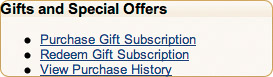
So, by aligning the image at the bottom, we ensure that those rounded corners appear in the right spot: under everything else in the box. Figure 5.10 shows our results thus far, with the width and single background image applied. Figure 5.10. With the background image aligned at the bottom, the upper portion of the image is hidden until it's needed to
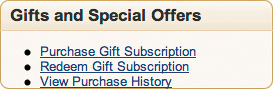
Our next step is to fold in the background image for the heading, aligning it to the top to create the top-left and -right rounded corners. .box { width: 273px; background: url(img/div-bottom.gif) no-repeat bottom left; } .box h3 { background: url(img/h3-bg.gif) no-repeat top left; } Figure 5.11 shows the addition of the background image behind the text of the <h3>, completing the rounded border around the box. Next, we'll want to add back in that one-pixel border that rides along the bottom of the heading, in addition to margins, padding, and font adjustments. .box { width: 273px; background: url(img/div-bottom.gif) no-repeat bottom left; } .box h3 { margin: 0; padding: 6px 8px 4px 10px; font-size: 130%; color: #333; border-bottom: 1px solid #E0CFAB; background: url(img/h3-bg.gif) no-repeat top left; } Figure 5.11. The background image behind the heading completes the rounded corners on all four sides.
By giving the <h3> elements within the box some padding, and adjusting the size and color, we leave room for the background image, which we've aligned top and left. The border-bottom will sit below the heading's text, while the image behind it will show only the part of itself that's needed (Figure 5.12). Figure 5.12. The heading's background and border work together to allow the heading's text to expand and contract, revealing more of the image as necessary.
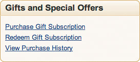
Our last task is to provide some padding around the unordered list that sits inside the box by removing the default bullets from each list item. .box { width: 273px; background: url(img/div-bottom.gif) no-repeat bottom left; } .box h3 { margin: 0; padding: 6px 8px 4px 10px; font-size: 130%; color: #333; border-bottom: 1px solid #E0CFAB; background: url(img/h3-bg.gif) no-repeat top left; } .box ul { margin: 0; padding: 14px 10px 14px 10px; list-style: none; } .box ul li { margin: 0 0 6px; padding: 0; } By turning off default margins and bullets (via the list-style property) and giving the unordered list some padding, we're left with the finished box design (Figure 5.13). That was rather painless, was it not? Figure 5.13. Here is our finished, bulletproof box.
With the box design completed, let's now talk a bit about why this particular method is bulletproof. Later, we look at a few other techniques for achieving cornered boxes using CSS. |
 Improving flexibility and protecting against worst-case scenarios with XHTML and CSS")
EAN: N/A
Pages: 97