A Bulletproof Approach
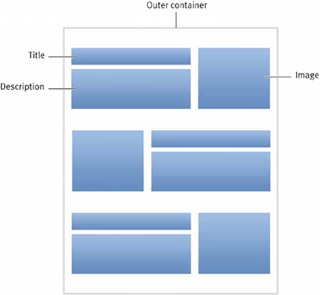
| To simplify the structure of this box, we'll strip away the tables in favor of minimal markup. We'll then turn to our friend CSS to replicate the grid-like layout of the teasers (the image/title/description grouping), while still creating a compelling design. As always, to get things started, let's decide how best to structure the box with markup. THE ENDLESS CHOICES FOR MARKUPIn assessing what we need in terms of markup for this design, let's refamiliarize ourselves with our goal by sketching out what we need in the way of structure. Figure 4.5 illustrates the basic framework we're dealing with. We'll need an outer container for the box to hold everything and create the border. Inside, the three teasers each contain an image floated to one side, alongside a title and short description. Figure 4.5. This wireframe of the structure will help us lay out our example.
Because I know what we'll be up against further on, I know we need an element that also surrounds each teaser. This element will group each image, title, and description together as a unit. And semantically, this makes sense as well, isolating each discrete chunk (or teaser) with a containing element. With that said, we can weigh our options in terms of the markup we choose here. As in most things Web design, there are no wrong choicesonly choices and better choices. USING DEFINITION LISTSDefinition lists are underused in my opinion, especially for applications that aren't an obvious title and description pairing (as they are commonly used for). A definition list consists of an outer <dl> element, with any number of definition terms <dt> and descriptions <dd>: <dl> <dt>This is the Term</dt> <dd>This is the description.</dd> </dl> In its specification for definition lists (www.w3.org/TR/html4/struct/lists.html#h-10.3) the W3C hints at other uses for these elements, by suggesting that a) definition lists can contain multiple terms and/or definitions and b) that definition lists can also be used for other applications, for example a dialogue that could be marked up like so:
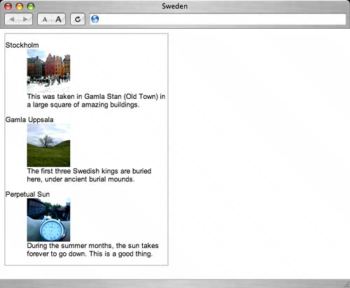
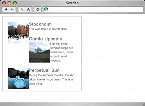
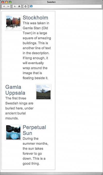
It's b) that I (and other designers) have taken to heart, using definition lists for a variety of markup applications to provide a more meaningful and clearly organized structure. So, with that in mind, I've chosen to use a series of definition lists to structure each image, title, and description. THE MARKUP STRUCTURETo make things more interesting (although I suppose furniture can be interesting), I'll be swapping out the Furniture Shack content for something of my own, featuring a few photos from a recent trip to Sweden. Each tease will consist of a definition list containing the title as the definition term and the image and description as… well, descriptions of that title. As mentioned earlier, we'll also need an outer containing element to set a width and the border that surrounds the entire component. With all of that mapped out, our simple markup structure looks like this: <div > <dl> <dt>Stockholm</dt> <dd><img src="/books/2/68/1/html/2/img/gamlastan.jpg" width="80" height="80" alt="Gamla Stan" /></dd> <dd>This was taken in Gamla Stan (Old Town) in a large square of amazing buildings.</dd> </dl> <dl> <dt>Gamla Uppsala</dt> <dd><img src="/books/2/68/1/html/2/img/uppsala.jpg" width="80" height="80" alt="Gamla Uppsala" /></dd> <dd>The first three Swedish kings are buried here, under ancient burial mounds.</dd> </dl> <dl> <dt>Perpetual Sun</dt> <dd><img src="/books/2/68/1/html/2/img/watch.jpg" width="80" height="80" alt="Wristwatch" /></dd> <dd>During the summer months, the sun takes forever to go down. This is a good thing.</dd> </dl> </div> We've given the outer container an id of sweden, and inside we have three definition lists, each containing a title, followed by an associated image and short description. At this point, you may be wondering why we chose to use three separate <dl>s as opposed to one big list. The reasoning here will be revealed a bit later. note
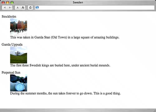
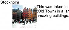
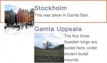
SANS STYLEWithout any style applied to our markup, the structure is still apparent when viewed in a browser (Figure 4.6). Figure 4.6. With CSS disabled, or not applied, the structure of the example is still readable and easily understood.
Typically, a browser will indent <dd> elements, making it easier to view the relationship between them and the <dt> elements that precede them. Because we've chosen lean, simple markup, any device or browsing software should have no problems whatsoever understanding what we're delivering here. But it doesn't exactly look the way we want it to yet. Let's start adding some style. STYLING THE CONTAINERTo begin, let's add a declaration that will set a width and blue border around the entire list. We'll add these styles to the outer <div> previously marked with . #sweden { width: 300px; border: 2px solid #C8CDD2; } By setting a width of 300px and a colored border around our entire box, we end up with the results shown in Figure 4.7. Figure 4.7. Setting a width of 300 pixels contains everything within the main <div>.
note
We could have assigned padding to this outer container as well, but since we're declaring a set width, we can avoid having to use the Box Model Hack (see Chapter 1, "Flexible Text") to prevent IE5/Win from calculating the wrong dimension. Instead, we'll assign margins to the definition lists that live within #sweden. (Would these lists be considered Swedes? Sorry...) IDENTIFYING THE IMAGETo make things easy to control later on, one step we need to take before going any further is to add a class to each <dd> element that holds the image. Because we'll float the image (and not the second <dd> that holds the description text) we need a way to uniquely identify that element in the markup, so that we may later apply style to it with CSS:
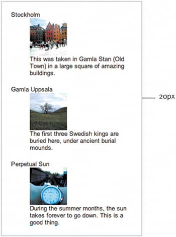
With each <dd> that contains the image flagged with a , we're now prepared to move on. APPLYING BASE STYLESLet's now apply base styles for each tease, leaving only the positioning of the image to be done a bit later. To evenly apply 20 pixels of space around the teasers as well as the inside of the box (Figure 4.8), we'll break up the margins between the containing <div> and the teasers themselves. First, let's apply 10 pixels of padding to the top and bottom of the containing <div >. Then, we'll apply 10-pixel margins on the top and bottom of each <dl>, as well as 20-pixel margins on both the left and right of each <dl>. Applying left and right margins around the lists rather than padding to the sides of the <div> avoids the box model problem that plagues the IE5/Win browser. #sweden { width: 300px; padding: 10px 0; border: 2px solid #C8CDD2; } #sweden dl { margin: 10px 20px; padding: 0; } Figure 4.8. Our goal is a consistent gutter of 20 pixels that flows around the inside of the box and its teasers.
note
Figure 4.9 shows the results of adding the margins and padding. We've also zeroed out any default padding that may be attached to definition lists. And the box is already looking better. Figure 4.9. With margins and padding distributed among the elements, the box begins to take shape.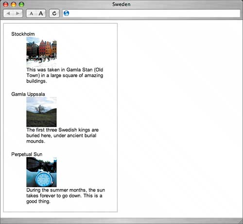 Next, let's introduce color and custom text treatment to the title of each tease by styling <dt> elements within our box: #sweden { width: 300px; padding: 10px 0; border: 2px solid #C8CDD2; } #sweden dl { margin: 10px 20px; padding: 0; } #sweden dt { margin: 0; padding: 0; font-size: 130%; letter-spacing: 1px; color: #627081; } Looking at Figure 4.10, you'll notice that we've increased the size of the title, added the lovely slate-blue shade, and increased space between letters by a fraction using the letter-spacing property, mimicking the style from the Furniture Shack example, where images were used in place of styled text. Figure 4.10. Simply text styling can do wonders for a component's design, and often eliminates the need for image-based type.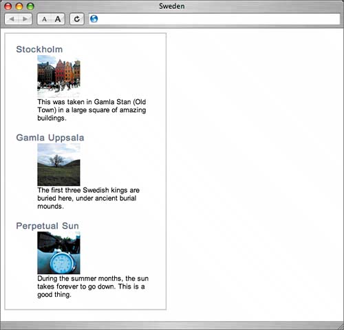 note
We'll also want to add a bit of style to the <dd> elements as well, matching the smaller, gray text from the Furniture Shack example: #sweden { width: 300px; padding: 10px 0; border: 2px solid #C8CDD2; } #sweden dl { margin: 10px 20px; padding: 0; } #sweden dt { margin: 0; padding: 0; font-size: 130%; letter-spacing: 1px; color: #627081; } #sweden dd { margin: 0; padding: 0; font-size: 85%; line-height: 1.5em; color: #666; } Figure 4.11 shows the results, with the short description text now looking smaller and gray. We've also increased the line-height (the space between lines of text) to one and a half times the height of normal text. This lets the description breathe a bit more. Also important is the removal of the default indenting that's often applied to <dd> elements by the browser. We've overridden that by zeroing out margins and padding. Figure 4.11. To match the Furniture Shack example, we've decreased the size of the description and made the text gray.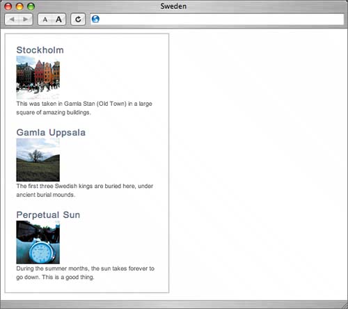 POSITIONING THE IMAGEOur next challenge is to position the image to one side of both the title and description. For now, let's worry about lining things up on the left only. Later, we'll address how best to alternate the alignment as seen in the Furniture Shack example. Because of the order in which things appear in the markuptitle, image, then descriptionif we simply just float the image to the left we'll have the title always sitting above everything else (Figure 4.12). What we really want is the top of the image and title to be aligned at the same level. Figure 4.12. With the image coming after the title in the markup, just floating it to one side leaves the title above everything.
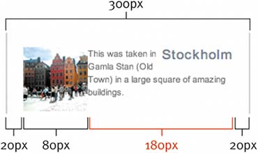
In the past, I've swapped the order of elements to make this work, putting the image in the <dt> element and using <dd> elements for both the title and description. Because the image appeared first, floating to either side would allow us to line it up just right. But semantically, it makes far more sense to have the title be the definition term, followed by an image and text that describe that title (as we've done in our markup structure for this example). It takes only a little more CSS magic to have the best of both worlds: optimal markup structure and the image to one side of both the title and description. OPPOSING FLOATSYou may remember the "opposing floats" method explained in Chapter 3, "Expandable Rows." Essentially, we used the float property to place two elements on opposite ends of a container. We use the same method here, allowing us to align the image to the left of both the title and the short description while keeping the markup in an optimal order. Remember that we've previously tagged <dd> elements that contain the image with a which allows us to float images within those elements to one side while keeping the descriptions in place. So, to begin let's float <dt> elements right and images left: #sweden { width: 300px; padding: 10px 0; border: 2px solid #C8CDD2; } #sweden dl { margin: 10px 20px; padding: 0; } #sweden dt { float: right; margin: 0; padding: 0; font-size: 130%; letter-spacing: 1px; color: #627081; } #sweden dd { margin: 0; padding: 0; font-size: 85%; line-height: 1.5em; color: #666; } #sweden dd.img img { float: left; } By using the opposing floats method, we can position the image to the left of both the title and description, regardless of the fact that the description comes first in the markup (Figure 4.13). Figure 4.13. Here we see opposing floats at work, aligning the tops of the image and title.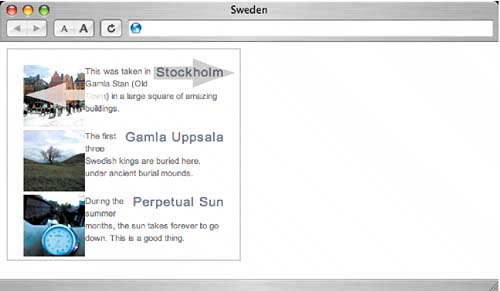 Notice that, while we've successfully positioned the image the description has slipped in between the image and title. To fix this, we need to apply a little math to set up a grid-like layout for each tease. Quite simply, we just need to assign a width on the <dt> elements, forcing them to span across the top of each description on their own line. To calculate this width, let's start with the total width of the box (300 pixels), minus the margins around each definition list (20 pixels times 2), minus the width of the image (80 pixels). The result is 180 pixels (Figure 4.14). Figure 4.14. Determining the width for the <dt> elements involves a little calculation.
By simply adding a width of 180px to the declaration for <dt> elements, we ensure that things start falling into their intended places: #sweden dt { float: right; width: 180px; margin: 0; padding: 0; font-size: 130%; letter-spacing: 1px; color: #627081; } Figure 4.15 shows where we are at this point, having successfully positioned the image, title, and description via opposing floats. Figure 4.15. With the width assigned for <dt> elements, the items fall into place.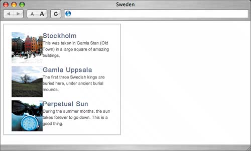 CLEAR THE WAY FOR ANY DESCRIPTION LENGTHThus far in the example, each description has been long enough to roughly meet the bottom of each image. Because of this length, we haven't yet had to worry about clearing the floats. To illustrate what could happen when the description is shortened, take a look at Figure 4.16. Not exactly bulletproof, is it? Figure 4.16. With a shorter description, the floated images can lead to undesired results.
When you are first learning how to use floats, understanding how they need to be properly cleared can be tricky. When an element is floated, it is taken out of the normal flow of the document and doesn't affect the vertical stacking of elements that follow it. Floated elements will always extend beyond the height of their containers. If the description happens to be long enough to meet or exceed the bottom of the floated image, then all is right with the world. But if the content next to the floated image is shorter, that's when you'll run into problems. Figure 4.17 shows the outline of the definition list marked in red. You can see that the image is taller than the title and description combined in the first tease. And since the image is floated left, the next definition list in line will attempt to wrap around it. What we need is a way to clear the floated image before going on to the next tease. For example, in the old days one might add the following to clear any previously declared in the markup: <br clear="all">. This works, but is rather unnecessary when we're dealing with CSS-based designs, not to mention that the clear attribute is considered invalid in recent XHTML specifications (XHTML 1.0 Strict, XHTML 1.1). Figure 4.17. The red box shows where the <dl> containing the float really ends.
There are several ways to clear floats using CSS, and to get a handle on many of them, I encourage you to read CSS guru Eric Meyer's article, "Containing Floats" (www.complexspiral.com/publications/containing-floats/). tip
For this example, we'll use the "Set a Float to Fix a Float" method that Eric describes in his article. Essentially, a container will stretch to fit around floated elements within itif the container is also floated. Float to fixTaking Eric Meyer's advice, we want to float each <dl> left in order to force each teaser below the floated image above it. In addition, we need to float the entire containing <div>, ensuring that the border will enclose all of the floated elements within it: #sweden { float: left; width: 300px; padding: 10px 0; border: 2px solid #C8CDD2; } #sweden dl { float: left; margin: 10px 20px; padding: 0; } #sweden dt { float: right; width: 180px; margin: 0; padding: 0; font-size: 130%; letter-spacing: 1px; color: #627081; } #sweden dd { margin: 0; padding: 0; font-size: 85%; line-height: 1.5em; color: #666; } #sweden dd.img img { float: left; } Adding the previous rules to our example, we have properly cleared floats, with each tease ending up below the otherregardless of description length (Figure 4.18). Figure 4.18. Even with a short description, we have properly cleared floats.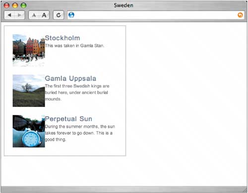 Our next step is to add a quick fix for both IE/Win and IE/Mac. A margin fix for IE/WinWhen adding a left or right margin to a floated element, IE/Win can have the unfortunate tendency to double the margin on the same side as the float direction (i.e., right-hand margin for right floats, left margin for left floats, www.positioniseverything.net/explorer/doubled-margin.html). We of course appreciate the free pixels, but we'd like IE/Win to display the margins correctly. In this example, the bug affects the 20-pixel margin on the left and right of each <dl> that we've previously assigned. In IE/Win, 20 pixels become 40 pixels (Figure 4.19). Figure 4.19. IE/Win doubles the margin from 20 pixels to 40 pixels on the floated <dl> elements. Luckily, there's an easy fix, described in an article on the "Position Is Everything" Web site (www.positioniseverything.net/explorer/doubled-margin.html). The article explains that adding the rule display: inline; to the floated element mysteriously triggers IE/Win to correctly apply margins. Fortunately, this rule also has no ill effects on other browsers, so simply slide this little rule in and we're ready to move on. We've labeled the fix with a comment, so that others might understand why we added it. You could even go a step further and quarantine this browser-specific fix to a separate part of the stylesheet or even a separate file altogether. I'll go more in-depth on the subject of hack management in Chapter 9, "Putting It All Together." #sweden dl { float: left; margin: 10px 20px; padding: 0; display: inline; /* fixes IE/Win double margin bug */ } A width fix for IE/MacTo cure IE/Mac's affliction of stretching floated elements wider than the specified width of their container, we need to add a width to each <dl> element if we want to play nice with IE/Mac fans. Specifying a width here is rather harmless, since we're already locking this box down to a fixed width. We're more concerned with leaving room to breath vertically, which we still allow for, even with this fix. #sweden dl { float: left; width: 260px; margin: 10px 20px; padding: 0; display: inline; /* fixes IE/Win double margin bug */ } note
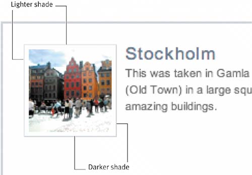
With the clearing of our floats solved for all major browsers, we're now ready to put the finishing touches on our example. THE FINISHING TOUCHESTo put the final polish on this example, let's adjust the spacing between images and text, and later allow for floating the image both to the left and right. To adjust the spacing between the images and text, we'll just have to add a right margin to the image, then subtract that amount from the width we've defined for the <dt> elements. While we're at it, let's also add a little framed border around each image. We can fold these additions into the master style sheet for this example, where you can see that the CSS remains rather compact: #sweden { float: left; width: 300px; padding: 10px 0; border: 2px solid #C8CDD2; } #sweden dl { float: left; width: 260px; margin: 10px 20px; padding: 0; display: inline; /* fixes IE/Win double margin bug */ } #sweden dt { float: right; width: 162px; margin: 0; padding: 0; font-size: 130%; letter-spacing: 1px; color: #627081; } #sweden dd { margin: 0; padding: 0; font-size: 85%; line-height: 1.5em; color: #666; } #sweden dd.img img { float: left; margin: 0 8px 0 0; padding: 4px; border: 1px solid #D9E0E6; border-bottom-color: #C8CDD2; border-right-color: #C8CDD2; background: #fff; } Figure 4.20 shows the results of the new styles added. We've added an 8-pixel margin to the right of each floated image, as well as 4 pixels of padding and a 1-pixel border around the image itself to create a frame. Since we've added this extra width, we have to add all that up, then subtract that total from the width we previously set on <dt> elements. The math goes like this: 8-pixel right margin + 4-pixel padding on both sides + 1-pixel border on both sides = 18 pixels. So, as you can see, we've dropped the width for <dt> elements down to 162 pixels to accommodate the extra space that the image will now take up. Figure 4.20. We've achieved proper spacing between images and text.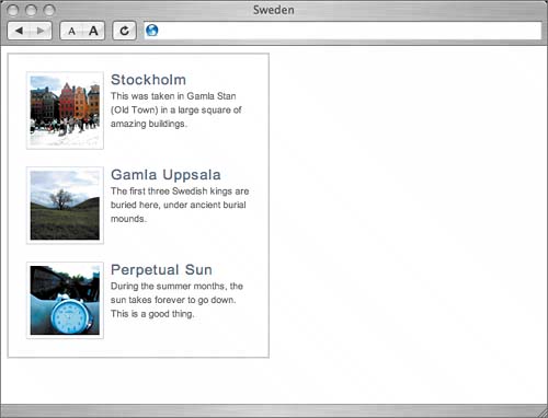 For the border around the image, we've chosen to make the right and bottom edges a slightly darker shade than the top and left. This creates a subtle three-dimensional effect on the photo, as if it's lying on top of the box (Figure 4.21). Figure 4.21. A simple trick for creating dimension is to use darker right and bottom borders.
TOGGLING THE FLOAT DIRECTIONAnother aspect of the original Furniture Shack example that we'll want to replicate is that the side to which each image floats swaps back and forth. One tease will have the image aligned left, while another will have it aligned right. We want to build in the ability to change this at will, with a simple added to the <dl> when a swap is desired. First, we tag the <dl> that we'd like to change float direction on. We've chosen the second teaser:
Having added the alt class to the second tease, we can now include a few rules at the end of our style sheet that will override the default, which currently aligns the image to the left. The alt style will reverse the direction, floating the image on the right. This class could be swapped in and out at will, giving site editors easy control over the layout of the box. The following CSS should be placed after the previous declarations we've already written: /* reverse float */ #sweden .alt dt { float: left; } #sweden .alt dd.img img { float: right; margin: 0 0 0 8px; } Here we're telling the browser that it should do the following:
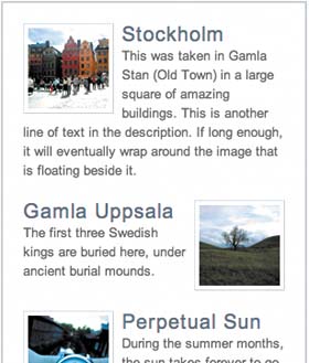
Figure 4.22 shows the results of adding these two little declarations to the style sheet. Because the second tease is marked with the alt class, its image is aligned to the right. The idea here is that we can add or remove a simple class at any time to assign the float direction for a particular image. Figure 4.22. Toggling the image alignment is as simple as adding or removing the alt class.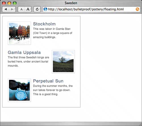 THE GRID EFFECTIf we were dealing with longer descriptions (or if the user increased the text size), we'd find that the description text would wrap down around the image. That's the nature of a float: It will take up as much space as it needs to but will let content flow around it (Figure 4.23). Figure 4.23. Longer descriptions will wrap around the floated image.
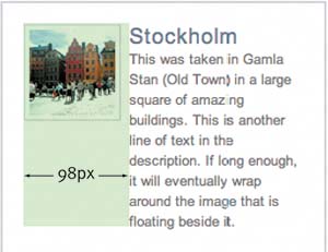
This could be the intended effect, but if a more column-like grid is what you're after, applying a margin to the description will keep the text and images away from each other. The width of the margin that we'll add to the description should equal the width of the image, plus padding, borders, and margin already specified between the image and description (Figure 4.24). Figure 4.24. Adding the image width, margin, padding, and border together comes to 98 pixels.
So by adding a left margin of 98px to all <dd> elements, and then overriding that value to 0 for <dd > elements (since we don't want the image to have a margin, yet it resides inside a <dd>) we'll in a sense be creating columns on either side. To reverse the margins for the alt class when the image is floated right instead of left, we need to add another rule to our "reverse float" section at the end of the style sheet: #sweden { float: left; width: 300px; padding: 10px 0; border: 2px solid #C8CDD2; } #sweden dl { float: left; width: 260px; margin: 10px 20px; padding: 0; display: inline; /* fixes IE/Win double margin bug */ } #sweden dt { float: right; width: 162px; margin: 0; padding: 0; font-size: 130%; letter-spacing: 1px; color: #627081; } #sweden dd { margin: 0 0 0 98px; padding: 0; font-size: 85%; line-height: 1.5em; color: #666; } #sweden dl dd.img { margin: 0; } #sweden dd.img img { float: left; margin: 0 8px 0 0; padding: 4px; border: 1px solid #D9E0E6; border-bottom-color: #C8CDD2; border-right-color: #C8CDD2; background: #fff; } /* reverse float */ #sweden .alt dt { float: left; } #sweden .alt dd { margin: 0 98px 0 0; } #sweden .alt dd.img img { float: right; margin: 0 0 0 8px; } Notice that we've added a declaration that resets the margin value to 0 for <dd> elements that are flagged with . This will override the right margin set in the "reverse float" section further down the style sheet. It will also save us from repeating the override after the #sweden .alt dd declaration assigns a right margin that we again don't want showing up on <dd> elements that contain our floated image. Figure 4.25 shows the results of the previous additions to the style sheet. You can see that with the text size significantly increased, and/or with longer descriptions, the text and image both stick to their respective "columns," as if we'd used a table here for layout. Figure 4.25. With a margin applied to the description, it's as if the text is held within columns.
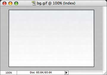
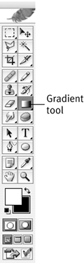
AN ALTERNATE BACKGROUNDAs a final touch to this example, let's trade in the solid blue border that surrounds the box for a background image that fades to white. We'll create the image in Photoshop, at a width of 304 pixels (300 pixels + a 2-pixel border on both sides). Figure 4.26 shows the completed image, which we created by filling a bordered box with a lighter shade of blue and then using the Gradient tool (Figure 4.27) to fade white to transparent from bottom to top. Figure 4.26. We created a blue background by using the Gradient tool.
Figure 4.27. You'll find the Gradient tool in the Tools palette in Photoshop.
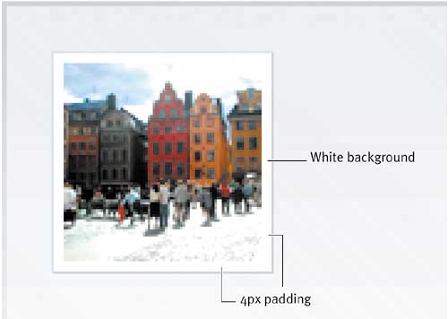
To reference this image in our style sheet, we just adjust the declaration for the main containing <div>: #sweden { float: left; width: 304px; padding: 10px 0; background: url(img/bg.gif) no-repeat top left; } We've adjusted the width of the container from 300 pixels to 304 pixels to account for the loss of the 2- pixel border (which is now part of the background image) and we've aligned the fade top and left. Because it fades to white (the background color of the page) and is aligned at the top, we need not worry about what's contained in the box; it will accommodate any height, with its contents just spilling out of the fade. Another plus is that I happen to think it just looks cool (Figure 4.28). Figure 4.28. Here is our completed, bulletproof example.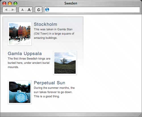 If we zoom in on the top image, you can see that the padded frame remains white on top of the blue background (Figure 4.29). You may remember that we assigned a background: #fff; in addition to 4px of padding on the floated images to accomplish this. If we hadn't specified a background color here, then the blue fade would show through the image's frame. Figure 4.29. Combining padding and a background color creates a frame around the image.
|
 my briefcase.</dd> <dt>Younger Cop</dt> <dd>[expectant pause] In the briefcase?</dd> <dt>The Dude</dt> <dd>Uh, uh, papers, um, just papers, uh, you know, uh, my papers, business papers.</dd> <dt>Younger Cop</dt> <dd>And what do you do, sir?</dd> <dt>The Dude</dt> <dd>I'm unemployed.</dd> </dl>
 Improving flexibility and protecting against worst-case scenarios with XHTML and CSS")
EAN: N/A
Pages: 97