A Bulletproof Approach
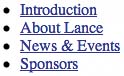
| With the disadvantages of the traditional techniques for designing image-based navigation behind us, let's take the tab design from LanceArmstrong.com and rebuild it employing a clean and lean standards-based method using CSS. The goal here is to address the previously outlined downsides to the traditional approach. As with any ideal project, we first need to decide how to make the markup as meaningful and accessible as possible. For navigation, it makes perfect sense to structure a list of links as, you guessed it, a list. <ul > <li ><a href="/">Introduction</a></li> <li ><a href="about.html">About Lance</a></li> <li ><a href="news.html">News & Events</a></li> <li ><a href="sponsors.html">Sponsors</a></li> </ul> A simple, unordered list is all we need to create our bulletproof set of tabs. The simple markup will ensure easy readability across all browsers, devices, and assistive softwarenot to mention it's lightweight and compact. Compare the amount of code used here with the traditional, nested-table approach, and the difference between the two becomes rather obvious. Notice the unique id given to each list item. This will come in handy later on when we want to signify which page we're on by giving the tab a selected state. SANS STYLEUnstyled, an unordered list normally appears as a vertical list, with a bullet to the left of each item (Figure 2.4). A device or text browser that does not support CSS could render this navigation list without any problems. Figure 2.4. Here you see the untouched beauty of an unstyled, unordered list.
tip
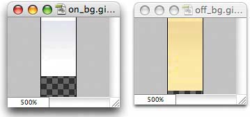
TWO TINY IMAGESYou recall that the common approach uses a separate image for each entire tab setactually there are four images, one for each area of the site where a specific tab is selected. To simplify things, we plan to get by with just two small images that we'll tile horizontally within each tab. Because they'll tile, we won't worry about widths and heights of each iteman important topic we return to a bit later in the chapter, in the section called "Why It's Bulletproof." If you take a look at the original tabs again, you'll notice that the gradient fade starts at the top of the tab and then blends into a solid background color. Using our favorite image editor, Adobe Photoshop, we've created the two images (one for selected states and one for the unselected states) that re-create that gradient fade into a transparent background (Figure 2.5). We've chosen the color at the bottom of each image to be knocked out in favor of transparency. We'll be able to fill that empty transparency in using CSS later on. Figure 2.5. This is a close-up of the two images we'll use to tile the gradient fade behind each tab state. The color at the bottom of each image has been knocked out as transparent (the checkerboard area), to be filled in later by a color with CSS.
Notice that each image is only 10 pixels wide, and includes the one-pixel highlight along the top, followed by the gradient into a transparent background. APPLYING STYLEWe have the ingredients. Now we just need to take our unordered list and two tiling images and apply some CSS to pull the whole thing together. Our first step is to add CSS rules that will make the navigation list horizontal, rather than its default vertical presentation: #nav { width: 100%; margin: 0; padding: 10px 0 0 46px; list-style: none; background: #FFCB2D; } #nav li { float: left; margin: 0; padding: 0; font-family: "Lucida Grande", sans-serif; font-size: 55%; } We're using the float property to stretch the navigation horizontally, and at this point we've also declared the yellow background color that the tab set will sit on top of. It's important to include that yellow background, since it will be integral to ensuring that the whole system (yellow container and tabs) is scalable. We've also gone ahead and zeroed out default margins and padding, as well as set a typeface and font-size that is 55% of the page's default. Using what we've learned in Chapter 1, "Flexible Text," we've used the small keyword on the <body> element to set the base size for the page. Now we'll sleep well at night, knowing that IE/Win users will be able to adjust the tab text size at will. Figure 2.6 shows what our navigation system looks like so far. Figure 2.6. The initial navigation design looks quite disheveled. Hmm. I know, not even close. But with a few more declarations, we'll be doing victory laps around the Champs-Elysées. FLOAT TO FIXThe first issue we need to tackle is that because we're floating the <li> elements, they're taken out of the natural flow of the document and won't fill up the outer <ul>, which defines our background color. In other words, because we float the inner elements, the outer <ul> doesn't know how tall to be. To fix this, let's also float the entire <ul> along with everything else. This allows the <li> items to fill up the space, stretching the yellow background behind it (Figure 2.7). #nav { float: left; width: 100%; margin: 0; padding: 10px 0 0 46px; list-style: none; background: #FFCB2D; } #nav li { float: left; margin: 0; padding: 0; font-family: "Lucida Grande", sans-serif; font-size: 55%; } Figure 2.7. By floating the <ul> element along with each list item, we stretch the background behind it.
tip
Now, that's a little better. We can rest assured that whatever the dimensions, the yellow background will expand along with its contents, protecting this component of the design. This float-to-fix method is a handy way of avoiding the addition of extra wrapper <div>s that could be used to compensate for the background. It also means not having to set a height on the listsomething we want to avoid to be as flexible as possible. MAKING THE TABS TAKE SHAPENext, let's add some definition to the links themselves by adding padding, borders, and background color: #nav a { float: left; display: block; margin: 0 1px 0 0; padding: 4px 8px; color: #333; text-decoration: none; border: 1px solid #9B8748; border-bottom: none; background: #F9E9A9; } We've chosen to use the display: block; rule here on the <a> elements to help make the entire tab clickable. Block-level elements will force each other to be on their own separate lines, so we use the float property to again make things horizontal. We've also spaced the tabs one pixel apart on their right sides, supplying padding around each link, changing the color and text decoration, and adding a border to all but the bottom of each side. It's important to apply padding to the <a> elements, since this ensures that the entire tab, not just the link text, will be clickable. Amazingly, the tab appearance is starting to take shape as a result of the few extra CSS rules that we just added (Figure 2.8). Figure 2.8. By adding padding the <a> element, we make the entire button area clickable, making it easier for people to navigate the site.
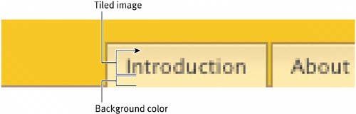
ALIGNING THE BACKGROUND IMAGESOur next step is to fold in the images we created earlier, assigning them as backgrounds that will tile within each tab: #nav a { float: left; display: block; margin: 0 1px 0 0; padding: 4px 8px; color: #333; text-decoration: none; border: 1px solid #9B8748; border-bottom: none; background: #F9E9A9 url(img/off_bg.gif) repeat-x top left; } We've used the shorthand method for declaring a color and image in the same rule, allowing that specified color (#F9E9A9) to shine through the transparent areas of the image. This is the color at the bottom of the image that we removed in the image editor in favor of transparency. We've also aligned the image to the top of the tab, and repeat-x is doing the horizontal tiling (Figure 2.9). Where the tiled image ends (including its transparent area) is where the specified background color will take over. Figure 2.9. Tile the background image horizontally to add the highlight and gradient detail. Because the image is tiled, it means any width and/or height will not hinder the design.
Our remaining steps include adding a declaration for hovered and selected states (which we combine for this design). But first, let's add a solid border under the tabs that gets knocked out when a tab is selected, creating the illusion that the tab is part of the white page below it. I've found that the simplest and most successful way of dealing with a border that at times you wish to overlap is to use a tiny tiled image that is the height you wish the border to be. This is where that third image comes into play; however, it's so tiny that it almost doesn't count (Figure 2.10). Figure 2.10. This one-pixel-tall image is used as the bottom border for the tabs, allowing the active tab to overlap it, blending the bottom of the tab with the rest of the white page.
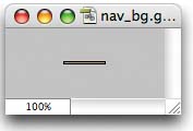
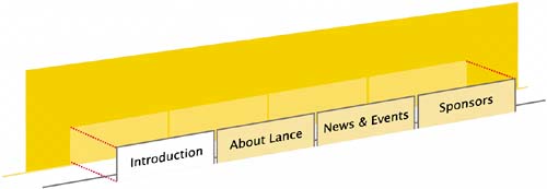
This 1 x 37-pixel GIF image will tile horizontally along the bottom edge of our tab set. The width is arbitrary in this case, since we tile it horizontally, and for the life of me, I cannot remember why the odd width of 37 pixels was chosen for this particular image. Figure 2.11 shows the stacking order of the navigation thus far, with the background color, one-pixel tiled border, and tab content coming together to complete the design. Figure 2.11. A 3D view of how the tiled background image is placed to create the bottom border of the navigation.
tip
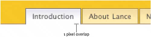
ADDING THE BOTTOM BORDERSo, to our previous #nav declaration, let's add the following call to the small background image: #nav { float: left; width: 100%; margin: 0; padding: 10px 0 0 46px; list-style: none; background: #FFCB2D url(img/nav_bg.gif) repeat-x bottom left; } We're telling the image to tile horizontally while aligning it to the bottom. Because the image is only one pixel tall, the yellow background color we've also declared here (#FFCB2D) will shine through the remaining parts of the navigation bar (Figure 2.12). Figure 2.12. With the bottom border tiled as a background image, we're getting close to the finish line.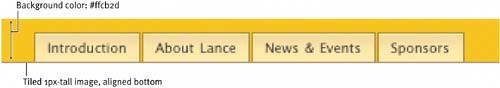 HOVERING SWAPFor hover and selected states, let's replicate the alternate gray tab color that's used on LanceArmstrong.com by just swapping out the beige background image we've set by default. All this takes is one simple declaration to handle both scenarios: #nav a:hover, body#intro #t-intro a { color: #333; padding-bottom: 5px; border-color: #727377; background: #fff url(img/on_bg.gif) repeat-x top left; } Notice that we've darkened the text and border colors and have referenced the gray background, which fades into white (#fff). We've also increased the bottom padding by one pixel (from 4 pixels to 5 pixels). This extra pixel will force the selected and hovered tabs to overlap the background border (which is also one pixel tall), giving it the appearance that it's connected to the rest of the page (Figure 2.13). Figure 2.13. By increasing the bottom padding from 4px to 5px on the active tab only, we'll cover up the bottom border, creating the illusion that the tab is in the foreground.
SELECTED STATEHow does the tab know when to stick on? That's where the descendant selector we've added comes into play: #tabs a:hover, body#intro #t-intro a A descendant selector provides of way of targeting specific elements based on their parent elements. By specifiying elements separated by spaces, we can narrow down a target based on the order in which they appear within the document tree. For more on selectors, see www.w3.org/TR/REC-CSS2/selector.html. So, if we were to add an id to the <body> element of a page with a value of intro like so <body > then the declaration would read "on pages where there is a body id of #intro, also use the alternate background, darker colors, etc."a handy way to let CSS handle the "you are here" effect common in most navigation designs. And in this particular case, we combined the tab's changed state for both hovering and selection into one CSS declaration. |
 Improving flexibility and protecting against worst-case scenarios with XHTML and CSS")
EAN: N/A
Pages: 97