Two and Sometimes Three Columns
|
| < Day Day Up > |
|
When we redesigned the website for Fast Company using a CSS-based layout, one of the challenges was that while sections like navigation and footer information were shared on every page, we needed to create two different page layouts.
One layout would be used for "index pages" (see Figure 15-1)—pages that have navigational purposes, allowing the user to drill further down into the directory structure of the site. These pages we decided should have a three-column layout.
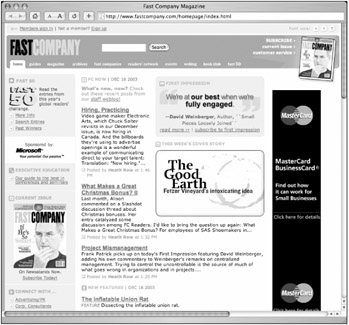
Figure 15-1: Example of a Fast Company "index page" with three columns
The second type of page layout was an "article page" (see Figure 15-2). Any page that was considered a destination had this type of layout. For increased readability, we chose to omit the left column, leaving two—one large column for content, and one for advertising.
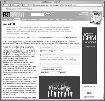
Figure 15-2: Example of a Fast Company "article page" with two columns
The reason I explained all of that wasn't to prove that we had cracked some brilliant layout puzzle—but rather to show how applying a class to the <body> element allowed us to adjust the column widths and drop or omit a third column depending on the page type. All of this was done without duplicating any rules or without importing additional style sheets.
Markup and Style Structure
This will start to make more sense when I describe a distilled version of the markup structure that was used for both types of pages. To achieve the columnar layout, I used the absolute positioning method, as described earlier in Chapter 12.
Article Page
For article pages, a simplified look at the markup structure went something like this:
<div > ...header info here... </div> <div > ...content here... </div> <div > ...right column info... </div> <div > ...footer info... </div>
CSS rules were put in place to give the #content and #footer a right margin wide enough for the #right column to be placed using absolute positioning; in this case, 190 pixels was just enough.
#content, #footer { margin: 10px 190px 10px 10px; }
Index Page
For index pages, the markup structure was kept exactly the same, saving the need for duplicating shared CSS rules—yet an additional <div> is added for a third column (#left) to the left of the #content.
<div > ...header info here... </div> <div > ...content here... </div> <div > ...left column info... </div> <div > ...right column info... </div> <div > ...footer info... </div>
For this three-column structure, we'll need not only a right margin on #content and #footer to accommodate the right column, but also a left margin to accommodate the new left column.
But we've previously already specified the left margin being only 10 pixels for the default article-style layout that only contains two columns. We're stuck.
This <body> Has Class
Here is where the <body> element comes into play. By assigning a class to the <body>, signifying that this is an index-style page, we can write rules that are specific only to that class.
For example, to override the default left margin of 10 pixels, we add the following class to the <body> element on index-style pages only:
<body >
Following the original rule that sets the margin for the #content and #footer, we can add the following to the CSS:
#content, #footer { margin: 10px 190px 10px 10px; } body.index #content, body.index #footer { margin-left: 190px; } For pages with the index class attached to the <body> element exclusively, an increased left margin of 190 pixels (matching the right column) is applied to accommodate a left column. If the index class isn't present, the left margin will be 10 pixels as designated in the default declaration.
Now we can toggle between two-and three-column layouts, simply by assigning the class to the <body> element and dropping in the additional <div> to the markup when desired. Additional classes could be set up as well, with no limit to how many page types can be included.
Markup sections and names can remain the same, while being slightly customized depending on page type.
Not Just for Columns
While I've used the toggling of columns for the Fast Company website as an example, this same idea can be applied to customize any element on the page.
For instance, if on index-style pages you would also like all page titles marked up with an <h1> tag to be orange instead of their default color, you could add an additional CSS declaration following the default.
For all pages, you'd use the following:
h1 { font-family: Arial, Verdana, sans-serif; font-size: 140%; color: purple; } And this would apply to index-style pages only:
body.index h1 { color: orange; } You'll notice that in the index-specific declaration we need only put rules that we want to differ from the default values. In this case, on pages where <body > is specified, <h1> elements will be styled in Arial at 140 percent and orange—without the need to add a class to the <h1> elements or any other additional markup.
I'm using pretty simplistic examples here—but you can start to imagine the possibility of creating multiple page types by assigning an appropriate class to the <body> element. In turn, the classes could trigger entirely different layouts, color schemes, and designs—all using similar markup structure and a single CSS file.
|
| < Day Day Up > |
|
EAN: 2147483647
Pages: 119