Extra Credit
|
| < Day Day Up > |
|
For extra credit, let's look at two instances in which image replacement just might have a legitimate place in the real world. First up, we'll take on the useful act of logo swapping, first explained to me by Douglas Bowman, who popularized the original Fahrner Image Replacement technique of Method A. Secondly, I'll share how the navigation system tabs on Fast Company's site was designed using JavaScript-free image replacement.
Logo Swapping
Previously in this chapter, we looked at how CSS can be used to replace text with an image. Certain drawbacks are attached to each of those methods—but these drawbacks will fall by the wayside when using one of the methods to replace an image ... with another image.
But why would you want to do that?
Hi-fi and lo-fi
One reason for swapping an image with another image would be to serve varying site logos—one for browsers that handle CSS properly (referenced with the background property) and one that's served to old browsers, handheld devices, screen readers, etc.
This is especially handy when your fancy, CSS-friendly logo has transparency or colors that are specific to the CSS design of the site. You may want to have the unstyled version display a lo-fi version of the logo that still looks good when CSS isn't supported or enabled.
The Example
To skirt around copyright lawyers, I'll use my own personal site yet again as an example, which not only swaps logos, but also takes into account that on any page other than the home page the CSS-enabled version of the logo is still clickable as a hyperlink back to the index page.
Let's look at the markup that I use for the logo on my home page, as well as the markup used on subsequent pages.
For the home page:
<div > <span><img src="/books/2/67/1/html/2//images/logo_lofi.gif" width="173" height="31"  alt="SimpleBits" /></span> </div>
 All other pages have a clickable logo to direct users back to the home page.
<div > <span><a href="/"><img src="/books/2/67/1/html/2//images/logo_lofi.gif" width="173" height="31" alt="SimpleBits" /></a></span> </div>
A Pair of Logos
Figures 14-6 and 14-7 show the two logos I use—the former one that's marked up inline on the page for the unstyled version (lo-fi), and the latter one that'll be referenced by the CSS for the modern browser version (hi-fi).
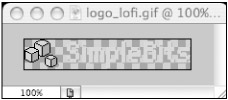
Figure 14-6: logo_lofi.gif that unstyled viewers will see (lo-fi)
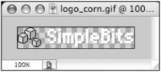
Figure 14-7: logo_corn.gif that CSS-enabled viewers will see (hi-fi)
The text of the hi-fi logo is white with a transparent background that is meant to sit on a corn backdrop, and therefore would look odd for viewers of the unstyled version of the site. This is the reason I've chosen to use CSS to swap logos—to allow me to serve one or the other, depending on the browser's capabilities.
The CSS
So let's pull this all together with the CSS that makes everything possible.
First, we'll hide the inline image by setting its width to 0—remember that by not using the display property to hide the lo-fi logo, we have a better chance of screen-reading software reading the image that's being hidden (by way of the alt text provided):
#logo img { display: block; width: 0; } Next, let's assign the hi-fi logo by way of the background property on the <span> element that I snuck in there. Yes, it's meaningless and semantically meaningless—let's make an exception in this case.
#logo span { width: 173px; height: 31px; background: url(../images/logo_corn.gif) no-repeat; } You'll notice that all we must do is assign height and width that is equal to the logo that we're using for replacement and set the background image to the hi-fi version.
Regain the Hyperlink
Finally, for pages other than the home page, we still want people to be able to click the logo to get back to the index. But how can we do this, if we've set the image's width to 0? There would be literally no clickable area.
We can add a declaration for the logo's <a> element that will "stretch" its clickable area over the background image. The width will equal that of the replaced image.
#logo a { border-style: none; display: block; width: 173px; } By setting the width of the <a> in CSS, we could conceivably serve two logos that were of different dimensions as well. In this example, they are the same size.
We've also added the top rule to get rid of the default border that most browsers place around hyperlinked images (see Figure 14-8).
Figure 14-8: Hyperlinked logo, with clickable area shown
The Results
By taking a look at Figures 14-9 and 14-10, you can see that with the markup and style just demonstrated, two logos can be served for both unstyled and CSS-enabled users. For times when the logo is hyperlinked, we can still specify the clickable area using a simple CSS rule.

Figure 14-9: Hi-fi logo for CSS-enabled browsers
Figure 14-10: Lo-fi logo for unstyled viewers
I believe this example shows how image replacement can be used without guilt in the real world—specifically for replacing an existing inline image with another image that's referenced in CSS.
Next, let's take a look at another real-world case study, a navigation system I designed for the Fast Company website that combines an unordered list with image replacement ... and a twist.
|
| < Day Day Up > |
|
EAN: 2147483647
Pages: 119