Extra Credit
|
| < Day Day Up > |
|
For this extra credit session, we'll take a look at more things anchor-related—specifically the benefits of using the title attribute as well as styling anchor links with CSS.
The Title Attribute
While previously we were talking explicitly about anchors for creating page sections, let's shift gears slightly and talk about anchor links in general—when pointing to other destinations.
As an added accessibility feature, adding the title attribute to anchor links can provide a richer and more specific description of the destination that you're pointing the user to. With this added information, it becomes clearer to users as to where they are going—and they need not base their decision for clicking a link solely on just the text or image that is being anchored.
How does this added information become available to the user? We'll find that out.
Title in Action
Let's take a look at the title attribute in action. We'll mark up an ordinary hyperlink like this:
I just read <a href=http://www.downwithwallpaper.com/tips.htmltitle="How to Take Down Wallpaper">a great article</a> that gave me
a few home improvement tips.
While the text is intentionally a bit vague in this example, the title attribute gives us an additional nugget of information about the link—in this case, the actual title of the article that's being pointed to.
Another common practice when inserting title attributes is to simply use the page's <title> (which is usually displayed in the browser's title bar). This, of course, should only be used if the title bar's text makes sense—ideally that includes both the site's title as well as the page-specific title.
For instance, let's say that for the preceding example, the page's title was "DownWithWallpaper.com | How to Take Down Wallpaper". Besides potentially being the only article necessary for the site, it could be used in the title attribute of our example as follows:
I just read <a href=http://www.downwithwallpaper.com/tips.htmltitle="DownWithWallpaper.com | How to Take Down Wallpaper">a great
article</a> that gave me a few home improvement tips.
We now have a richer description of what's being linked to. But how do users receive the information contained within the title attribute?
Tooltip Titles
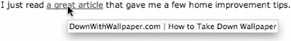
Most modern browsers support the title attribute by turning the value into a "tooltip"— a small colored box that pops up when the mouse is hovered over the link. Visually, it'll give users that extra useful bit of information, just before they click the link. This has obvious benefits in letting the user know exactly where they're going.
Figure 7-2 shows our example in a browser, with the tooltip being exposed by the hovering mouse.
Figure 7-2: An example with the title attribute revealed by the mouse hover
Titles are Spoken
Another benefit to adding title attributes to links is that screen readers will read out the value along with the linked text. Sighted and nonsighted users alike will gain better understanding of the destinations you're taking them to, and that is certainly a good thing.
Styling Links
Earlier in the chapter, I'd mentioned "beware of global link styling"—that there was a way to avoid unintentional styling of named anchor tags and instead narrow our focus to hyperlinks that use the href attribute only.
Gone are the days of defining link colors in the HTML of a document. We can separate those design details from the markup by using the pseudo-classes :link, :visited, :active, and :hover to uniquely style hyperlinks in a variety of ways.
Let's take a look at a few different CSS styles that we can apply to normal everyday links:
a:link { color: green; text-decoration: none; font-weight: bold; } Quite simply, the preceding declaration will make all anchor tags that use the href attribute green, bold, and not underlined.
Instead of text-decoration: none;, we could've said underline (the default), overline (for the rebels out there), or a combination of the two, as shown here:
a:link { color: green; text-decoration: underline overline; font-weight: bold; } Figure 7-3 shows how the underline overline combination would appear in a typical browser. Sort of unconventional—but possible!
Figure 7-3: A link example with underline-overline text decoration
Backgrounds
The possibilities for uniquely styling links are just about endless. Most CSS rules that we've applied to other elements are available for anchors as well. For instance, we can apply background colors to links and/or even background images as well—perhaps a small icon, aligned to the left or right of the link text as shown in Figure 7-4.
Figure 7-4: A link with a right-aligned icon as a background image
The CSS needed for achieving Figure 7-4 goes something like this:
a:link { padding-right: 15px; background: url(link_icon.gif) no-repeat center right; } We're setting the icon to align center (vertically) and to the right of the link text. Extra padding is added to the right side as well, to allow the icon to show through without any overlapping of text.
Dotted Borders
Tired of the plain, solid underlines of links that we've been seeing for years now? By using the dotted or dashed value of the border property, we can create ... you guessed it, dotted or dashed link borders.
First, we'll need to turn off default underlining with the text-decoration property to get it out of the way, and then we'll add a 1-pixel border-bottom that's both dotted and green.
a:link { color: green; text-decoration: green; border-bottom: 1px dotted green; } It's important to note that, if you'd like the dotted border to be the same color as your link text, you'll need to declare that color in the border-bottom property as well. The results can be seen in Figure 7-5.
Figure 7-5: A link with a dotted border
Using the preceding method, you could also mix and match border colors, giving your link text one (with the color property) and your border another (with the border-bottom property). Furthermore, you could use the solid or dashed value for the border-bottom property.
 |
| Note | Internet Explorer for Windows gets the dotted property a bit wrong when using a 1-pixel width. Using 1px as the value for a dotted border ends up looking exactly like the "dashed" style border. Fear not, just a small glitch. |
|
Where you Been?
Don't forget to add an a:visited declaration to help users see where they've been before. All the usual CSS rules can be applied to this pseudo-class as well, giving visited links their own unique style, with a different color, border, background, etc.
The CSS goes like this:
a:visited { color: purple; } At the very least, the preceding declaration will alert users that they've visited a link by changing its color to purple. It's very important to make even just a slight change, as the preceding one.
Hovering
Similarly, we can use the :hover pseudo-class to add powerful effects to links when they're hovered over by the mouse. This could be a color change or an addition of a border, background, or icon. The possibilities are endless.
a:link { color: green; text-decoration: green; border-bottom: 1px dotted green; } a:hover { color: blue; border-bottom: 1px solid blue; } The two preceding declarations give us links that are green with a dotted border, but then on hovering, the link turns blue, with a solid bottom border (also blue).
This is just one example of a simple hover effect. You can imagine that by trying different combinations of CSS rules on both links and hovered links, you can start to design sophisticated mouseover effects without the need for JavaScript or extra markup.
Active State
The :active pseudo-class handles the state of a link when the mouse button is clicked. The same rules can be applied here—changing the color, text-decoration, background, etc. For instance, if you had the link turn red when the mouse button is clicked, this could be an extra visual cue to users that they've chosen to head to that particular destination, and have indeed clicked.
The following declaration does just that:
a:active { color: red; }
LoVe/HAte your Links
Ordering the four pseudo-classes mentioned becomes important in order for all of them to behave properly—without one overriding the other.
LoVe/HAte is a handy way to remember the correct order to place your declarations (www.mezzoblue.com/css/cribsheet/):
-
a:link (L)
-
a:visited (V)
-
a:hover (H)
-
a:active (A)
You could of course, make up your own abbreviation for this—whatever it takes to help you remember. Love Vegetables? Have Asparagus!
To demonstrate, here are four of the preceding examples, assembled in the right order, as a complete package:
a:link { color: green; text-decoration: green; border-bottom: 1px dotted green; } a:visited { color: purple; } a:hover { color: blue; border-bottom: 1px solid blue; } a:active { color: red; } |
| < Day Day Up > |
|
EAN: 2147483647
Pages: 119