The Font-Family Property
| The font-family property lets you specify the font families that will be used in your documents. Here is the formal definition of the property:
Each CSS property has a "data sheet" like the one just shown, which describes key characteristics of the property. Also, on the left, there is a "button bar" that gives you an overview of how widely supported the property is. Throughout this book, you can find definitions like this for each new CSS property that is introduced. Learning what the different fields represent saves you time when encountering new properties or reviewing old ones. The following sidebar describes how to read the property definitions. Even when you learn to read the property data sheet, you need to read the textual description of the property to understand how the property changes a document's presentation.
The font-family property accepts a list of font families as value. The font families are separated with commas, and there are two different kinds:
For example, a document that is to be displayed in Times might have a style sheet that looks like this: BODY { font-family: Times }A document that is to be displayed in Garamond, if possible, and Times if Garamond is not available, would have a style sheet like this: BODY { font-family: Garamond, Times }where Garamond and Times are both family names. It's important to remember the comma when you specify a list of font families. Some font-family names have spaces in them (for example, "New Century Schoolbook"), and the space character is therefore not sufficient for separating different font families. In addition, you may use quotation marks around family names, as in this example rule: BODY { font-family: "new century schoolbook", serif }The quotation marks are necessary if the name contains characters other than letters, digits, dashes, and spaces. For example, if a font were named "Dollar$," the browser might get confused by the dollar sign. The value can also be the name of a generic font family instead of or in addition to the specific font families. Use of generic font families is a partial solution to the problem of dealing with unavailable fonts. A browser may not have any of the fonts listed in the value. To ensure that something is displayed in the worst case of no match, you can add a generic font family, such as serif, to the list. In this case, if the browser does not have any of the given families, it has to use any font it has that has serifs. Here are the generic names:
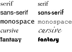
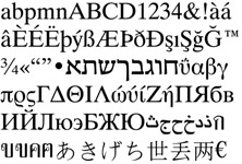
Look familiar? They correspond to the font categories defined earlier in this chapter. Here's an example rule that includes a generic family name: BODY { font-family: Garamond, Times, "New Century Schooolbook", serif }In this example, the browser first checks to see if it has Garamond. If it doesn't, it checks for Times. If it doesn't have Times either, it tries New Century Schooolbook. And, if that fails, too, it uses any fonts it has in a serif style that it can use to display the document. The use of generic font families is encouraged. Each browser has a list of fonts that it can display. Those lists usually differ among browsers. However, all browsers must understand the previous five category names. Hence, when a requested font is not available on a particular browser, and you told the browser which category the font is in, the browser is expected to substitute a font from the same category. Although the resulting translation may be a bit rough, it is usually a font that looks at least somewhat like the intended one. Figure 5.7 shows sample fonts from the five generic type families. Figure 5.7. Examples of the five generic font families. Don't put quotes around the generic name! The generic family names are special keywords in CSS, not real font families. If you write font-family: "serif", the browser thinks you mean a font named "serif." Design Tips Using Font FamiliesGood document design generally involves using just two or three different font families. When there are more, finding ones that look good together soon becomes a problem. Unless you are a skilled graphics designer, restricting your creative urges to two or three families gives your document a professional look. Unless you want a document that looks like a A typical, time-proven scheme is to set all text in a serif font and the headings in a sans serif font. Popular choices are Times Roman and Helvetica, respectively, or their clones, such as Times New Roman and Arial. You may want to use a monospace font for some text if you are writing about computer software. For example, code is often set in a monospaced font, as may be filenames, function names, method names, and so on. The rest of the variation in your document should be created by using different font styles, weights, and sizes within the same two or three families. People writing multilingual documents, in which they may be using two or more alphabets, know that it is difficult to find two fonts that look well together, let alone three or more. Some alphabets, such as Thai and Devanagari (which is a script from India), have very different conventions for a letter's baseline and, therefore, its height and depth. For example, a 12pt Devanagari font may look too big next to a 12pt Latin font. But, because only a few multilingual fonts exist, there is often not much choice. Figure 5.8 shows a sample of Bitstream Cyberbit, a family with more than 8,000 characters. Bitstream made the normal style and weight available for free; for italic and bold, you'll have to pay. See www.bitstream.com. Figure 5.8. Sample of Bitstream Cyberbit family, which has over 8,000 characters. Restraint is the key to good design. There are so many possibilities in CSS that it is easy to overdo and spoil your design. |
EAN: 2147483647
Pages: 215