Case 3: The Form of the Book
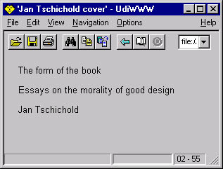
Case 3: "The Form of the Book"Figure 11.3 shows a recreation in CSS of the cover of a bundle of essays by one of the great typographers of this century, Jan Tschichold (1902 1974). He didn't design this particular cover, but in one of the essays, he describes some similar ones. Great reading! Just for fun, we created an alternative cover for our own book in the same style. Figure 11.3. "The form of the book." in a non-CSS browser.
Here is the HTML source that we will work with. Nearly every word will be positioned individually, so we need many SPAN elements: <html> <title>Jan Tschichold cover</title> <body> <p class=title> <span id=th>The</span> <span id=fo>form</span> <span id=of>of the</span> <span id=bo>book</span> <p class=subtitle> <span id=es><span id=es2>Essays</span></span> <span id=on><span id=on2>on the</span></span> <span id=mo><span id=mo2>morality of</span></span> <span id=go><span id=go2>good design</span></span> <p class=author> <span id=ja>Jan Tschichold</span> </body> </html> Let's start with the basic fonts and colors. The background of the BODY will be black, and the text color will be white. We use a serif font and center all text: BODY { background: black; color: white; font-family: serif; text-align: center; line-height: 1.0; margin: 1em 4em } The reason the line height is set to 1 is to make the following computations easier. One line of text will be 1em high. Next, we set the font size and text attributes of the three paragraphs: title, subtitle, and author. The title's font is four times the size of the subtitle's font, and the author's font is twice the size. The title and subtitle are also converted to uppercase: .title { font-size: 400%; text-transform: uppercase } .subtitle { text-transform: uppercase; letter-spacing: 0.2em } .author { font-size: 200% } Now, we are ready to attack the vertical positioning. The trick is to make all the SPAN elements into blocks, give the four parts of the title plenty of padding (and a bottom border), and then use a negative margin to move back to the top of the page, before doing the same to the four parts of the subtitle: #th, #fo, #of, #bo, #es, #on, #mo, #go, #ja { display: block } All SPANs are now blocks. (We use SPAN, not DIV because in a non-CSS browser, we want the words to be on one line, not below each other; see Figure 11.4.) Next, add padding and a border to the parts of the title: #th, #fo, #of, #bo { padding: .6em 0 .4em 0; border-bottom: .025em solid white } Figure 11.4. "The form of the book."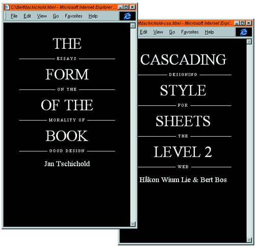 A negative margin at the bottom of the last part of the title brings us back to the top of the page. The sum of the text, padding, and border so far is 8.1 em (8.1 times the font size of the title): #bo {margin-bottom: -8.1em} /* back to top */ Between the four parts of the subtitle, there is just a little over 7 times the font size. Remember that this is the base font size, or one quarter the size of the main title. We have backed up all the way to the top, so now there is nearly 8em above the first part of the subtitle. The subtitle is printed right on top of the border of the title: #es {margin-top: 7.9em} #on, #mo, #go {margin-top: 7.1em} #ja {margin: 0.8em 0} You're nearly done. If you wonder why we needed two SPAN elements around the parts of the subtitle, here is the answer: The horizontal rules should not be visible behind the words of the subtitle, so we give them a black background: #es2, #on2, #mo2, #go2 { background: black; padding: .3em } |
EAN: 2147483647
Pages: 215