Case 2: Cyberspazio
| The original design uses some common HTML extensions to create this simple, balanced page seen in Figure 11.2. First, the background and text colors are set as attributes on the BODY tag. Second, the image (there is only one image on the page) has text wrapping around by way of an attribute on the IMG element. Third, to give the page more white space (actually, it's "black space" on this page), the entire page except the headline and horizontal rule has been put inside a table to set margins on the sides. A chain of BR elements has also been used to set more space around the headline. Fourth, TT elements have been used to set a monospace font. Figure 11.2. Original design: Construct Internet Design.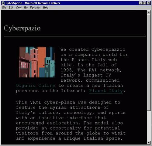 Still, compared to most pages on the Web, this is a good page with a distinct design. No text has been put inside images, so the page downloads quickly and prints well. The main purpose of using CSS on a page like this is to simplify the HTML markup. We follow the same strategy as in the first example: find design features that are used throughout the page and list the exceptions. Let's start by converting the attributes in the BODY element. ColorsThe BODY element of the Cyberspazio page looks like this: <BODY bgcolor="#000000" text="#999999" link="#006666" vlink="#993300"> In Chapter 15, "Other approaches," you find the full set of guidelines on how to convert these attributes into CSS rules. Here is the resulting style sheet: BODY { background: #000000; color: #999999 } A:link { color: #006666 } A:visited { color: #993300 } Because CSS allows color to be specified in only three digits, you can shorten the previous style sheet: BODY { background: #000; color: #999 } A:link { color: #066 } A:visited { color: #930 } ImagesThe only image on this page is found in the first paragraph. Text floats around it because of the ALIGN attribute on the IMG element: <IMG ALIGN=LEFT src="/books/2/664/1/html/2/.."> It's easy to express the same in CSS: IMG { float: left } To set some space around the image, the original design uses the VSPACE and HSPACE attributes on IMG. In CSS, the margin property allows you to express the same: IMG { margin: 5px 10px 10px 10px } FontsThe dominant font family on the page is monospace. In the original design, this is expressed with a TT (see Chapter 1, "The Web and HTML," for a description) element, but because each element has a font family value in CSS, there is no need for an extra element. By setting it on the BODY element, it inherits to all other elements: BODY { font-family: monospace } The font size of the two paragraphs has been increased using the FONT element with a SIZE attribute. Chapter 15 describes the FONT element as defined in HTML 3.2 and gives examples of how it can be used. We would, however, recommend not using it at all and instead set CSS properties on existing elements. For example, to increase the document's default font size, you could say the following: BODY { font-size: x-large } If you hand-craft your style sheets (i.e., write them in a text editor), you will appreciate the font property, which allows you to combine the two declarations into one: BODY { font: x-large monospace } The headline ("Cyberspazio") uses another font family. The original design does not specify a font family, so the browser default will be used. This is fine, but most designers would probably set a font as follows: H1 { font: 20pt serif } (The original design does not use the H1 element, but the presentational FONT element. Because the role of "Cyberspazio" is to be the main headline, the use of H1 is recommended.) White SpaceThe original design uses empty columns in a table to create margins on the side of the text. In CSS, margins are more easily expressed as the following: BODY { margin-left: 10%; margin-right: 10%; } Because the margin properties are set on the BODY element, they establish document-wide margins that also apply to the H1 element. In the original design, the headline (and the horizontal rule) has only a small left margin. You can accomplish the same by setting a negative margin on the headline: H1, HR { margin-left: -8%; margin-right: -8%; } Alternatively, we could have set only a small document-wide margin and then added extra margins on the P element: BODY { margin-left: 2%; margin-right: 2%; } P { margin-left: 8%; margin-right: 8%; } This solution assumes that the paragraphs have been marked as P elements. To set some extra white space around the headline, the original design uses chains of BR elements to add blank lines. CSS offers a better solution by allowing you to declare exactly how much white space you want above and below the element. To replicate the effect shown in Cyberspazio, you could write the following: H1 { margin-top: 3em; margin-below: 0.5em; } Recall from Chapter 5 that em units refer to the font size in use in the element itself. The previous example therefore gives you three blank lines above the element and half a line below it. Similarly, you would want to set extra space below the horizontal rule: HR { margin-below: 1em } It may seem weird to use the em unit on the HR element. The em unit refers to the font size of the element, but the HR element has no text it simply draws a horizontal line. For CSS, however, this is natural. All elements have a value for the font-size property even if the element never results in text being displayed. |
EAN: 2147483647
Pages: 215